Visiting the Estonian Museum of Applied Art and Design
During my trip to Estonia, I visited the Museum and was drawn the curation style of the jewellery section. The premise of the museum was to showcase and lead the viewer through different influential figures and styles of different periods of Estonian applied arts and design. There were several floors which lead the viewer across different material specialism.
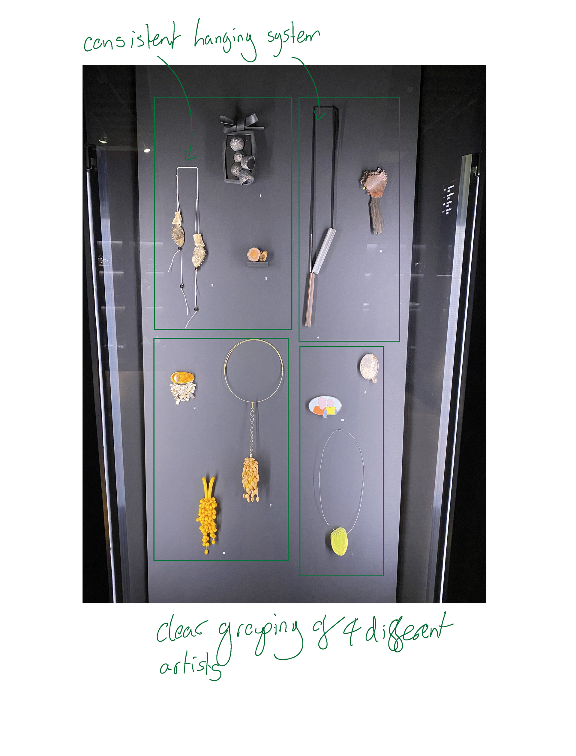

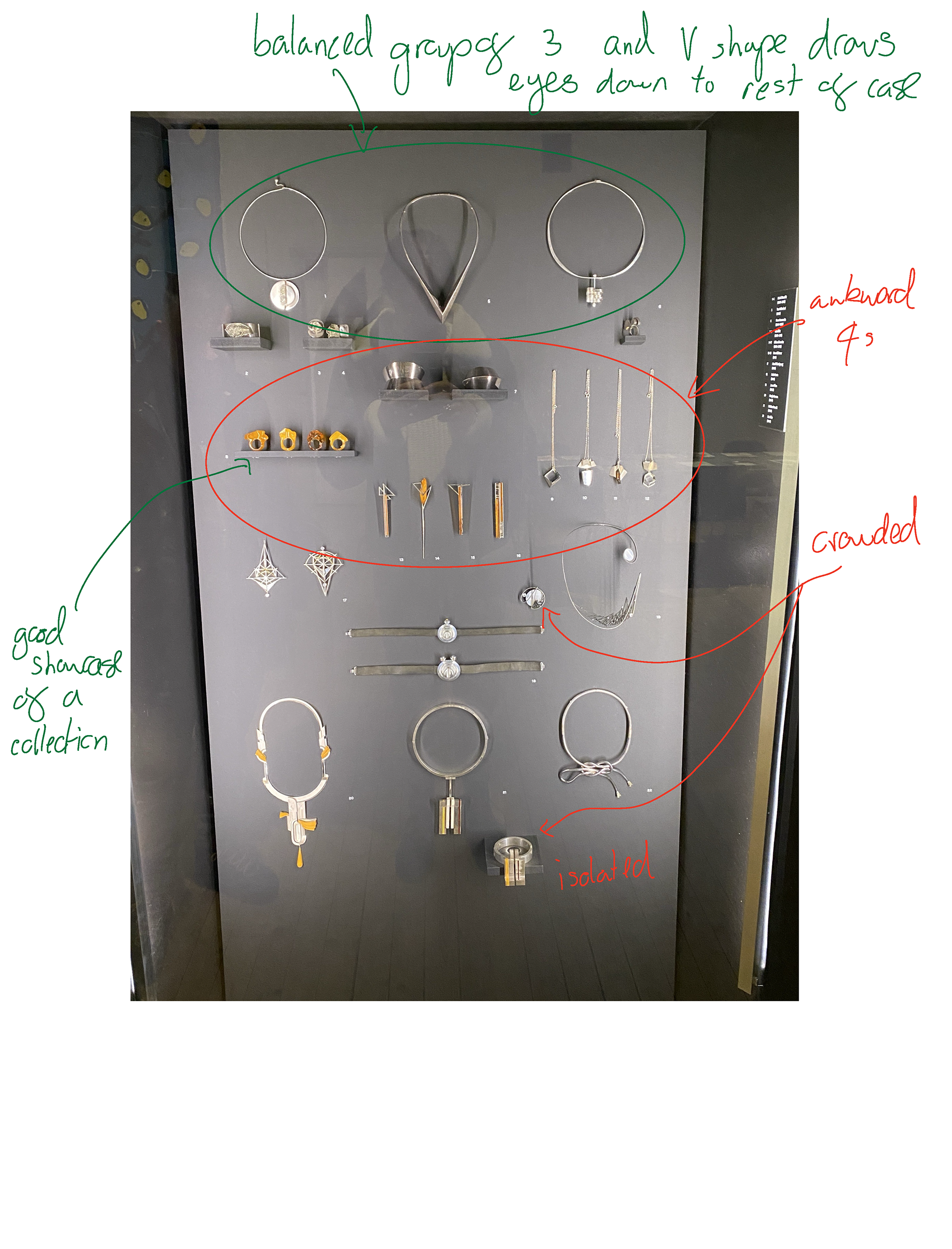
The jewellery, glass and book design were showcased in lines/walls of cabinets. I found that the simplicity of the display allowed the work to shine through. The combination of museum glass, LED lighting and the black backdrops created a clean and consistent stage for the pieces. Additionally, the use of small numbers placed next to the work that corresponds with the label on the right side of the case, provided clear information. However, this only stated the date and maker which reduced the context and didn't help to state the significance of the work for the period. I particularly liked the use of 3s and the shelves in the photos above.
Visiting Collect
During my visit I was primarily focusing on the work however I did spend some time analysing the ways different galleries displayed the work.
Objects Beautiful

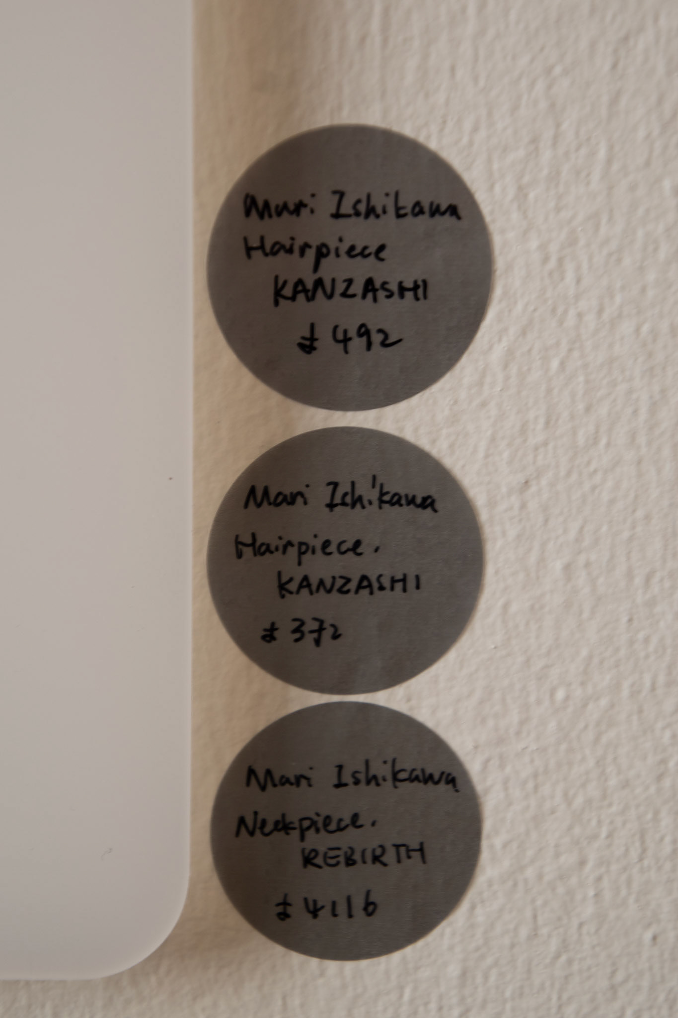
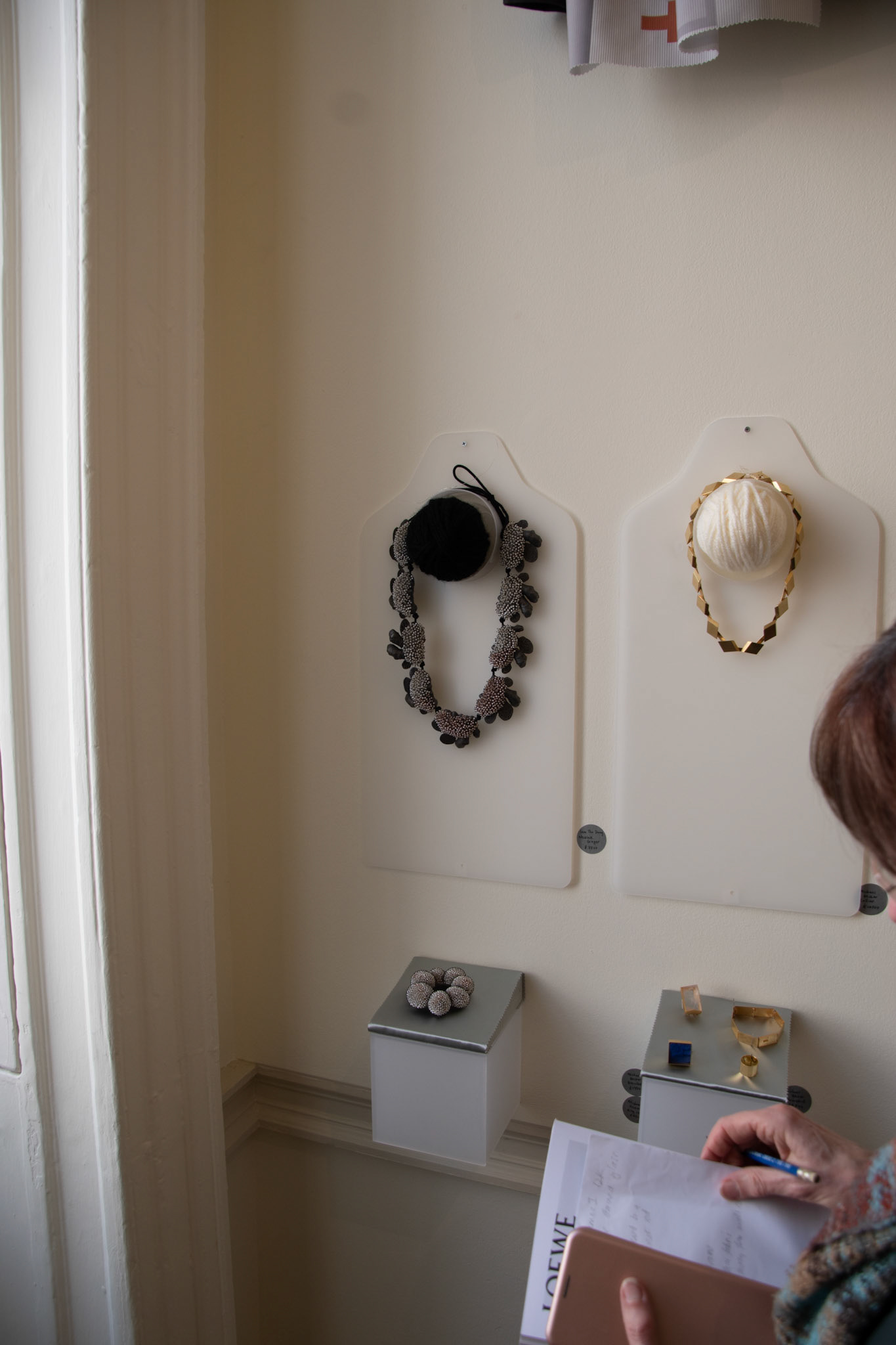
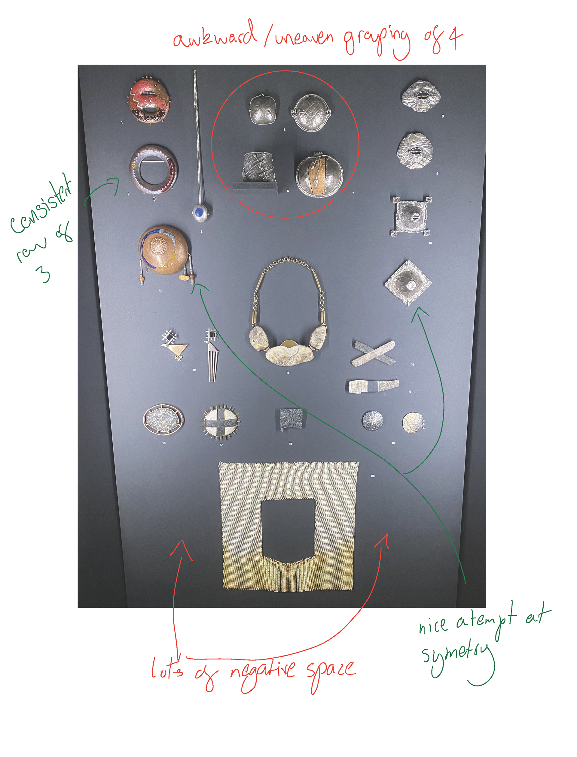
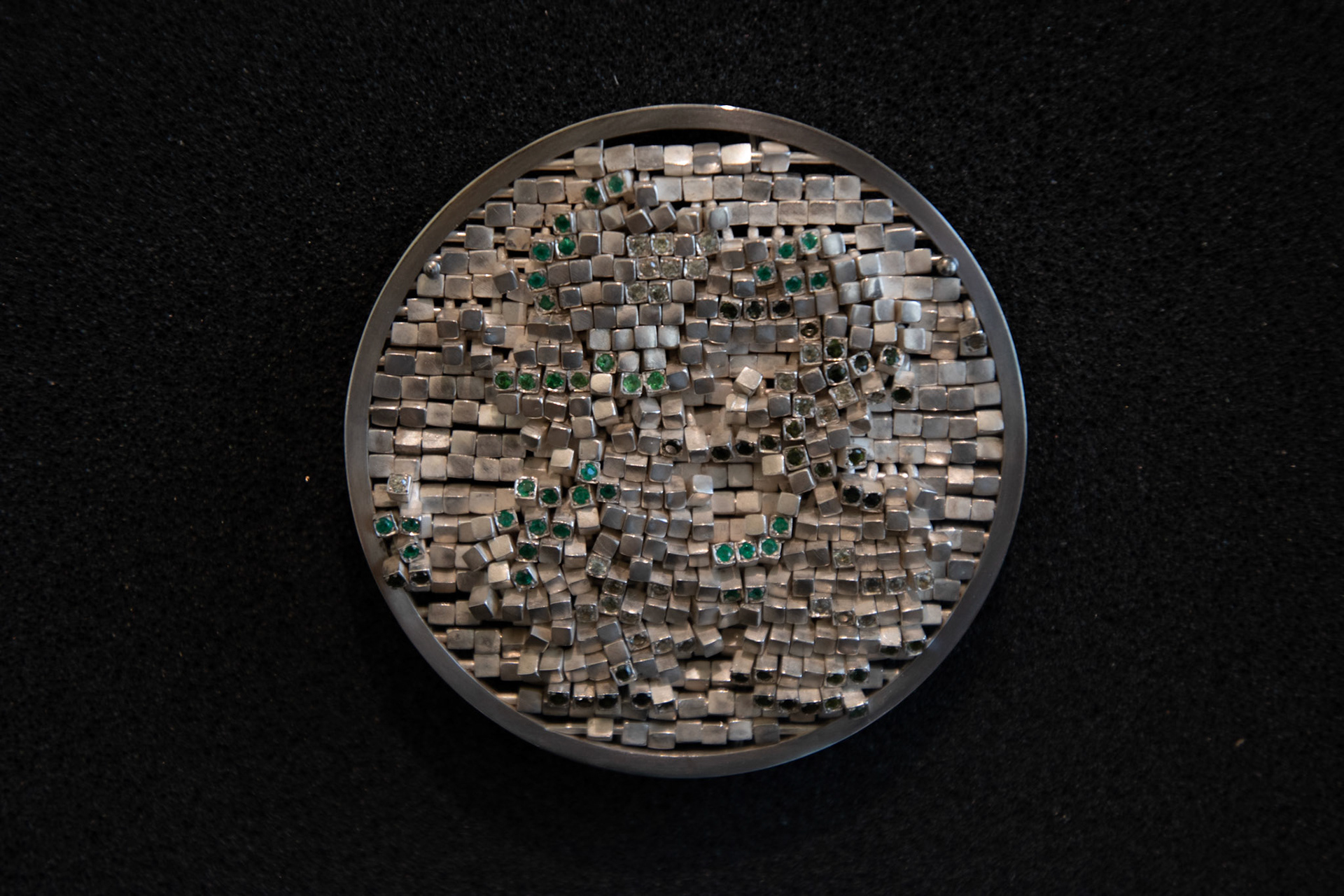
The exhibition was a collection of many different jewellers from across the world all challenged to make their own hair pin. I liked the use of the balls of yarn to represent the hair tied up in a bun however the rest of the display felt too very overwhelming. I thought that the large acrylic shapes hung on all were distracting and unnecessary. Also, the small box shelves were very cramped and the use of the silver paper on top clashed with the gold and blended in with the silver jewellery. Finally, the use of handwritten stickers to label the work were too small and hard to read with the quantity of people in the gallery.
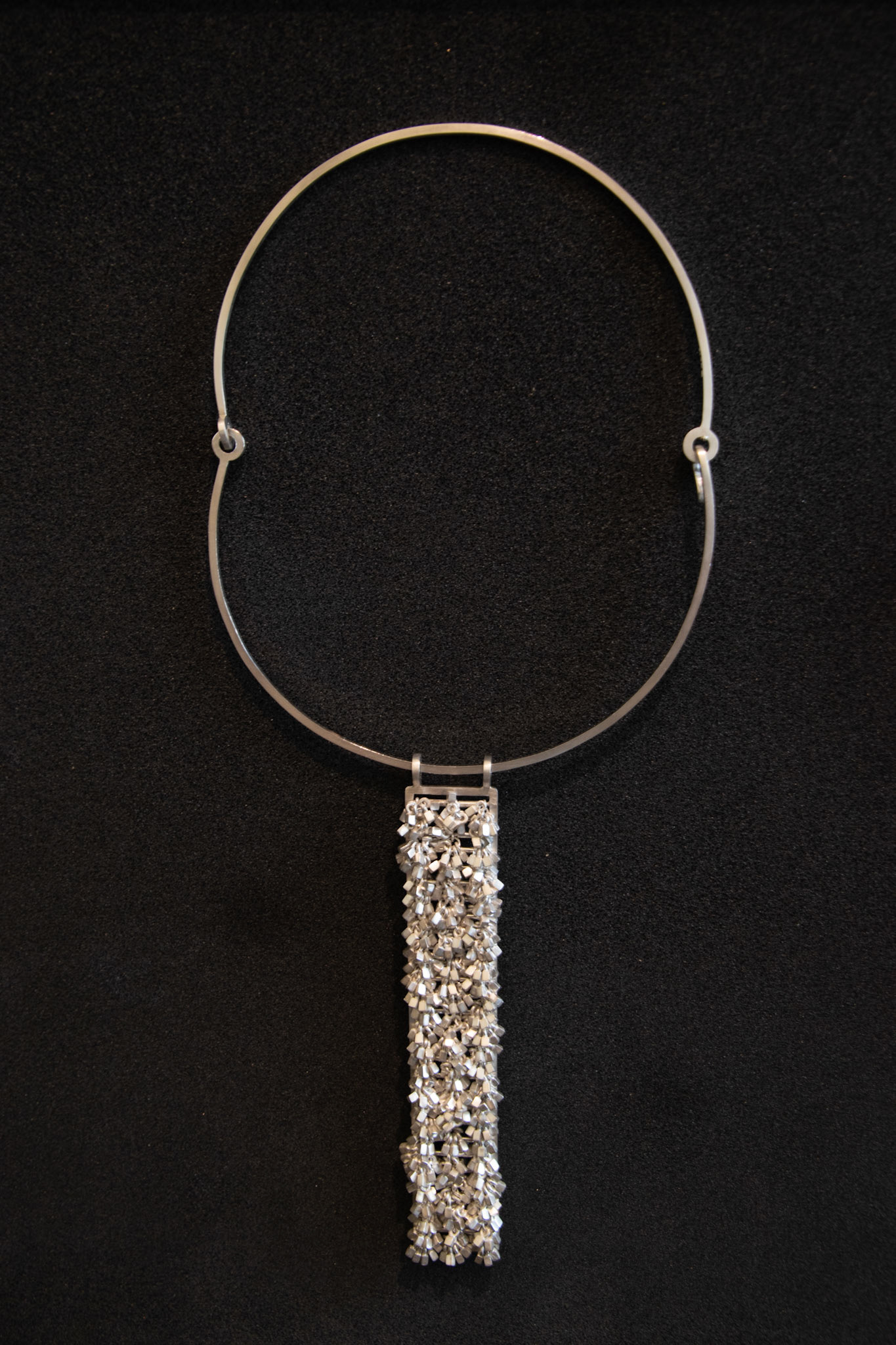
Goldsmiths' Fair
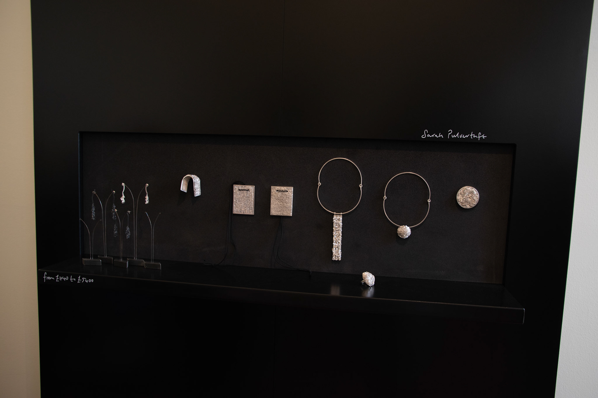
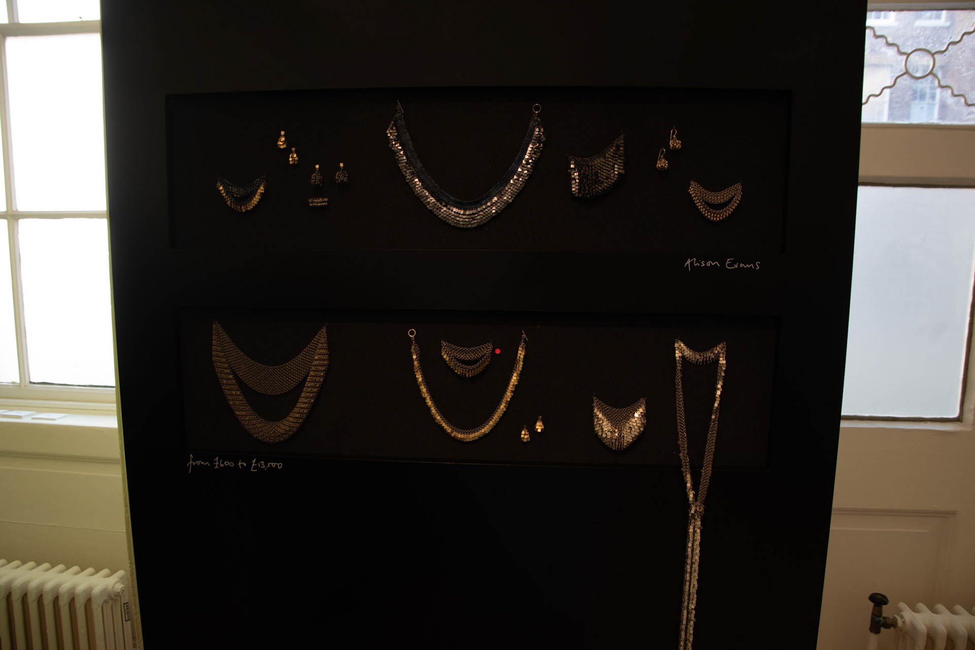

I had mixed opinions on the Goldsmiths' Fair layout, there were techniques which I thought were very successful and others that let the display down. I thought that the use of black really helped the work and especially colour pop. Also, the use of the foam inserts meant that the work could be discreetly pined and taken off if a viewer wanted to try the piece on or look closer before purchasing. I did think that the black was maybe a little too dominant covering the whole walls they built. I think having it directly around the pieces works well but maybe if they explored using a grey or white the walls wouldn't impose on the room too much.
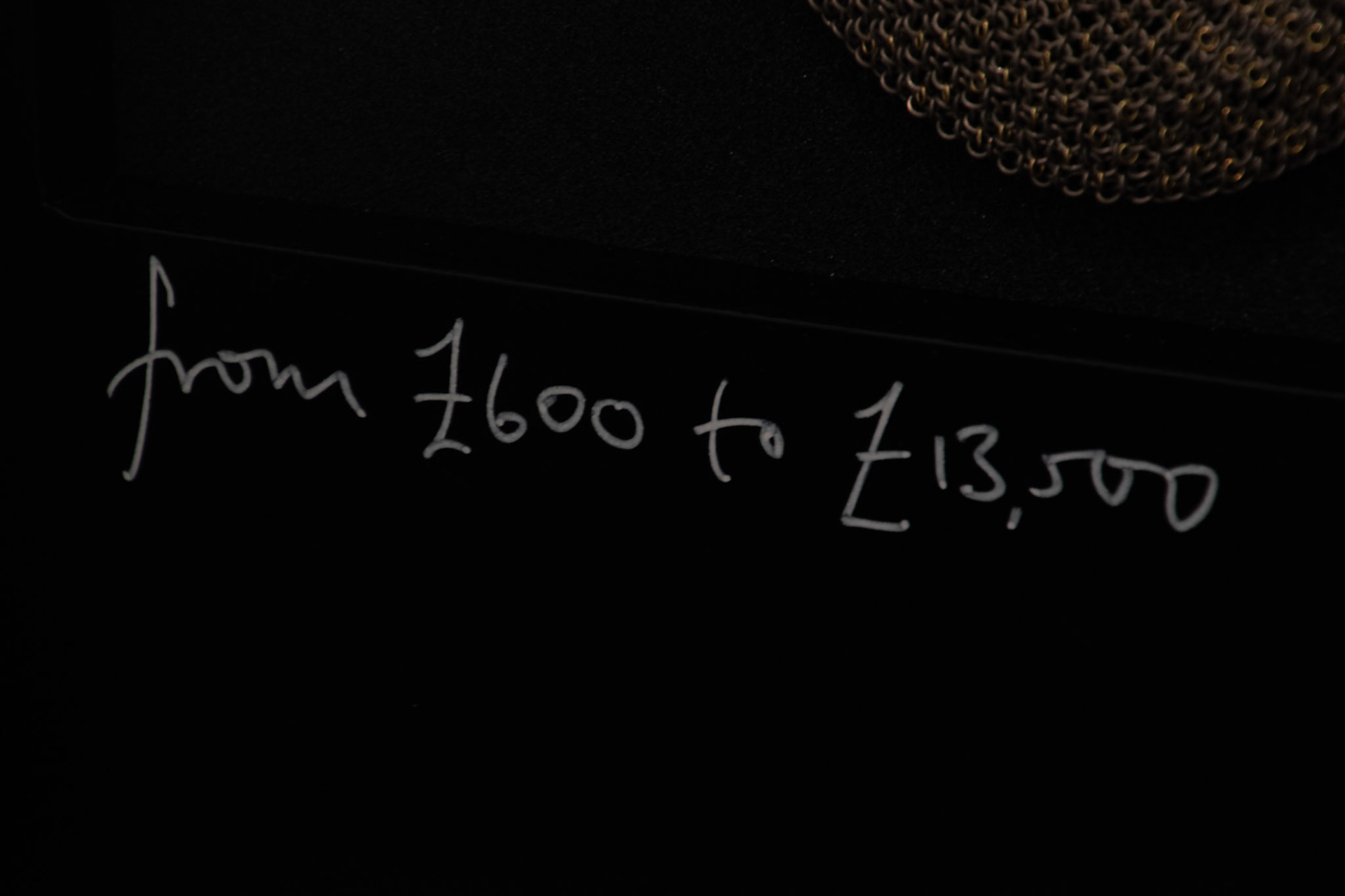
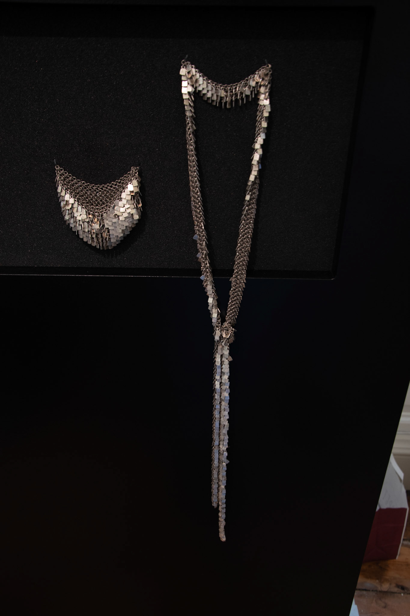
I thought that that the labelling was the main downfall as there was very little information and the handwriting felt rough and ready compared to the overall display. Also, the long necklace that appeared to fall out of the display area clashed with the set system.
Finaly, I thought that the wall of rings was a poor decision as it was impossible to get near and look at the pieces, resulting in me not even taking one photo. I think that spacing them out around the room would have enabled interaction but also multiple groups to look at the same time.
Gallery Marzee
Marzee had a range of different jewellers on display, and I liked their use of tables to lay out all the makers. Additionally, I liked the use of different colours to separate and enhance the pieces. Despite this I think that having the necklaces hung showcases the drape and how it would interact with the body. Therefore, if this was important to the piece some could have been hung. Finaly, I liked the quantity of information on the labels however, I thought that the pictures were unnecessary and cluttered the display.
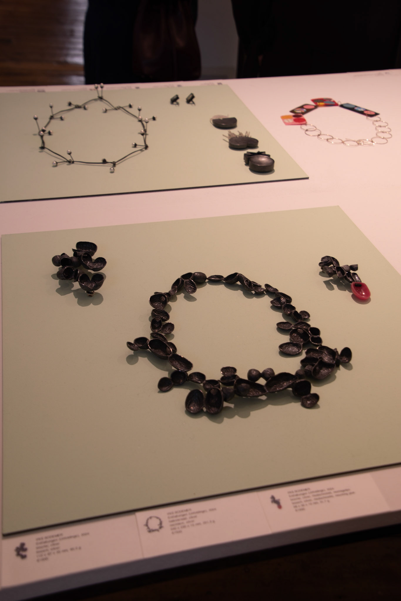
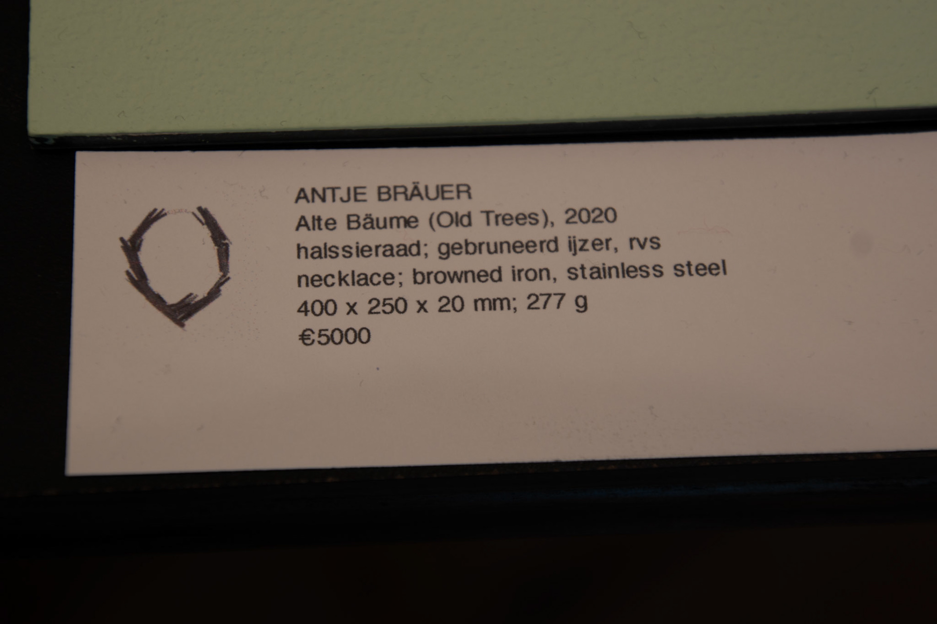
Collect Open
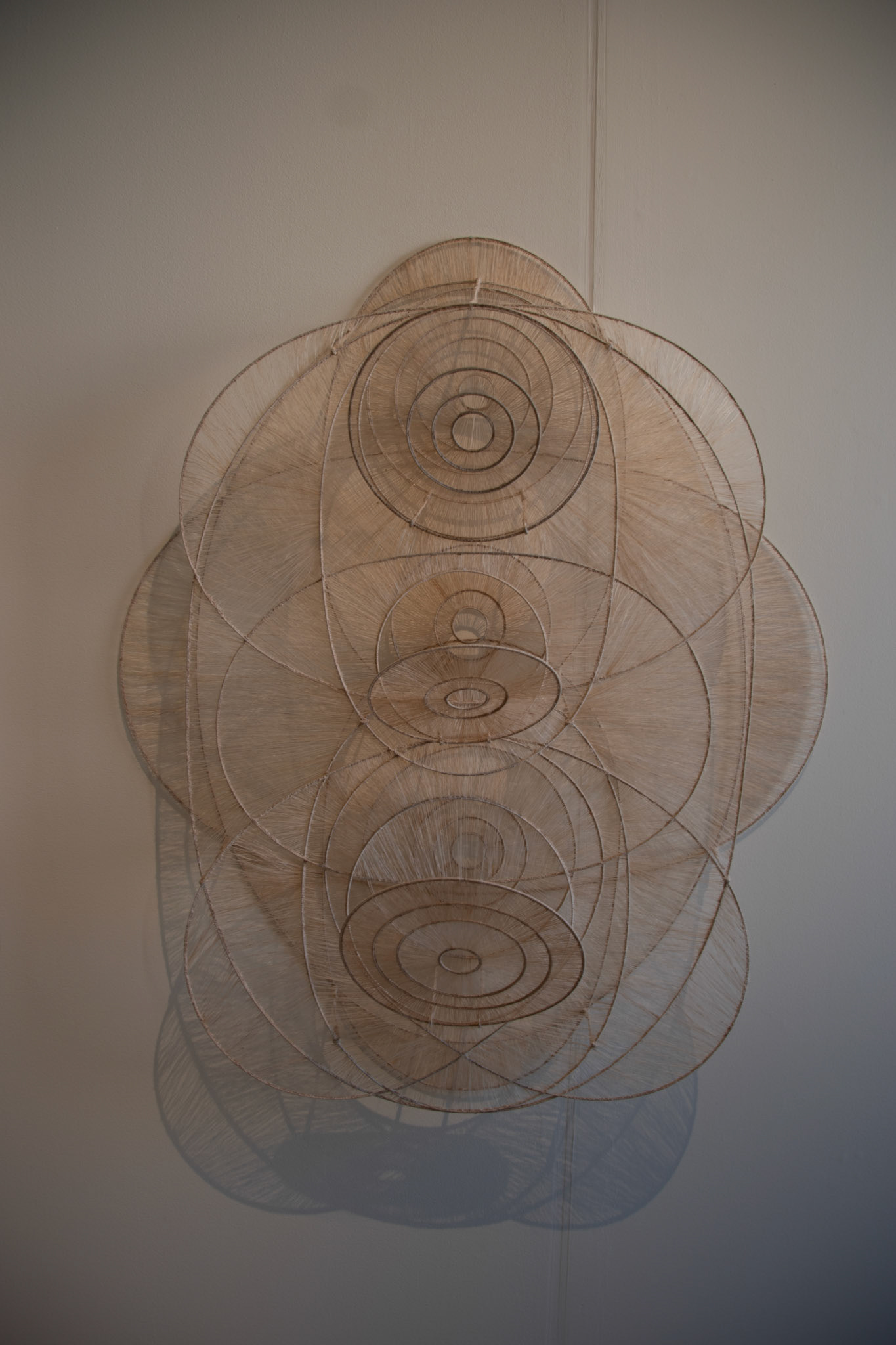
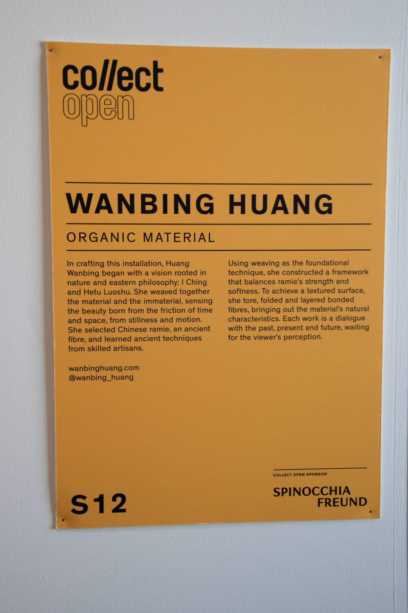
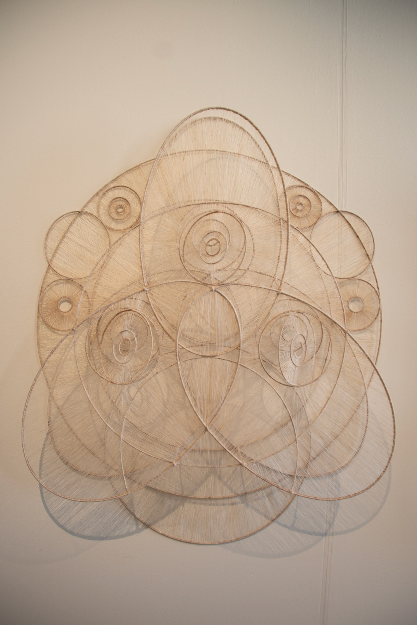
I thought the way that these pieces were very simply mounted onto the wall with no need for additional display stands. This helped to showcase how the work would sit in the home or room once purchase. Also, any additional backing would have created a frame breaking the composition. I thought that the lighting was good at creating the shadows and extending the pieces across the wall, although it was subtle. Finally, I thought the way that Collect Open labelled and added an artist statement next to the work helped drive the narrative of the work.
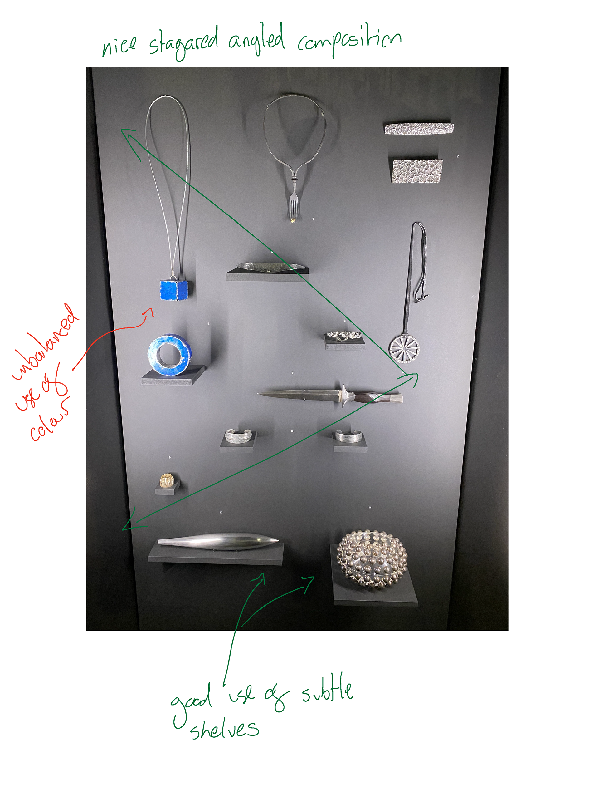
FIVE
FIVE stood out to me as one of the best curations of the work on plinths and walls. There was a consistent and considered border around the work and often the use of a secondary small plinth or sheet of material helped to separate different pieces. However, I felt that there wasn't enough room between the plinths making the lower half of the display very busy with lots of differing shadows. I think reducing the number and increasing the size of the plinths could have solved this issue. Finaly, the labelling was clean and consistent providing only the essential information.
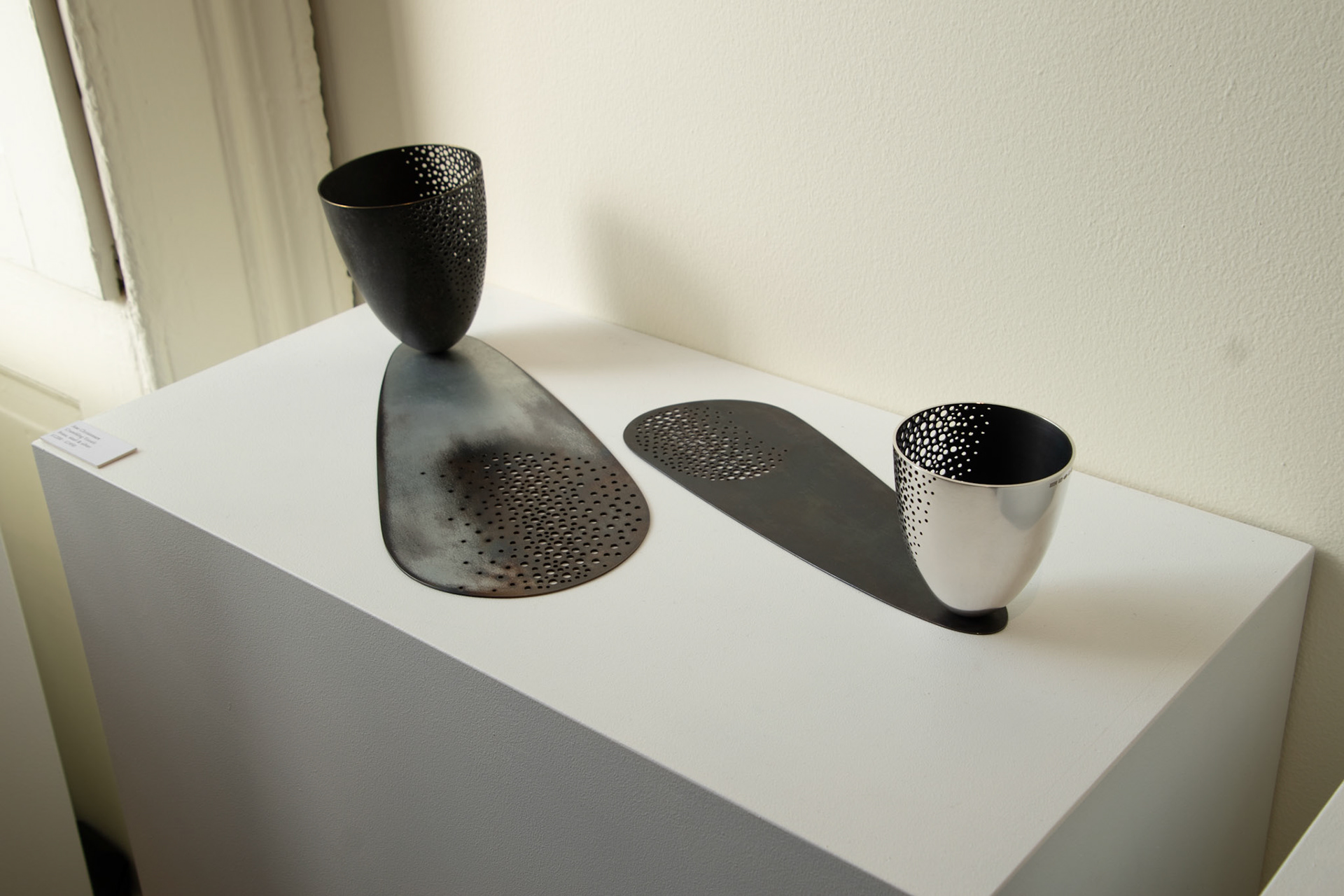
SHAM Gallery

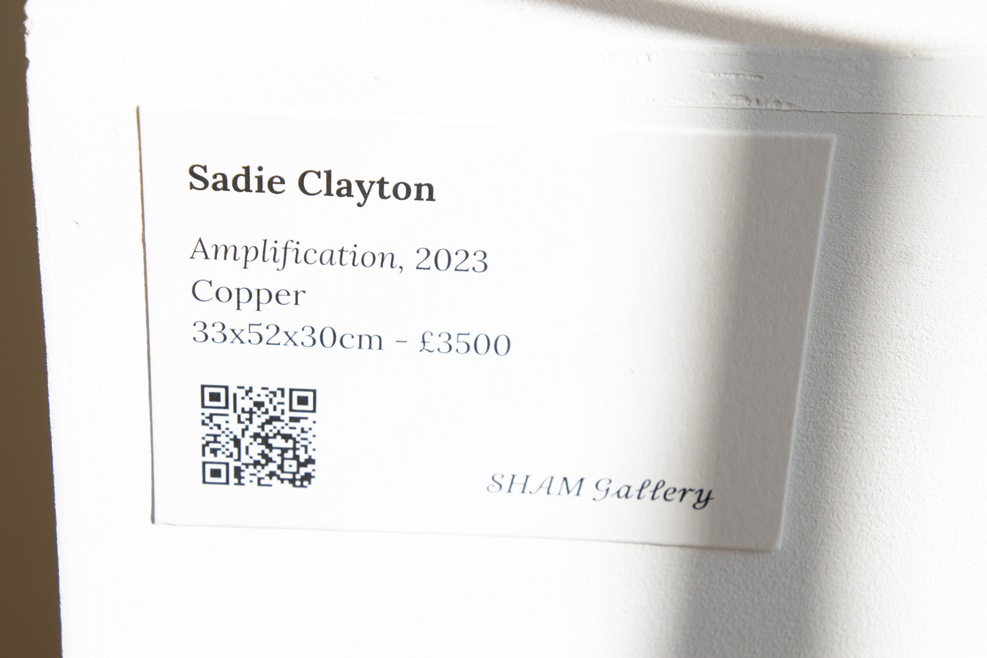
SHAM Gallery stood out to me for their use of natural day light to make the pieces pop. Additionally, I thought that the white plinth and clean label supported the work rather than distract from it. I thought the placement of the QR code was considered but don't feel that it really needed.
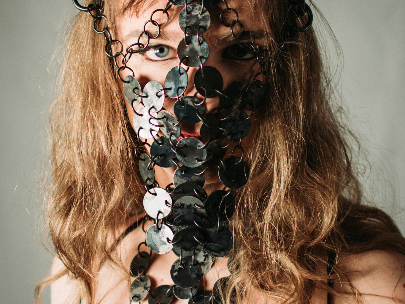
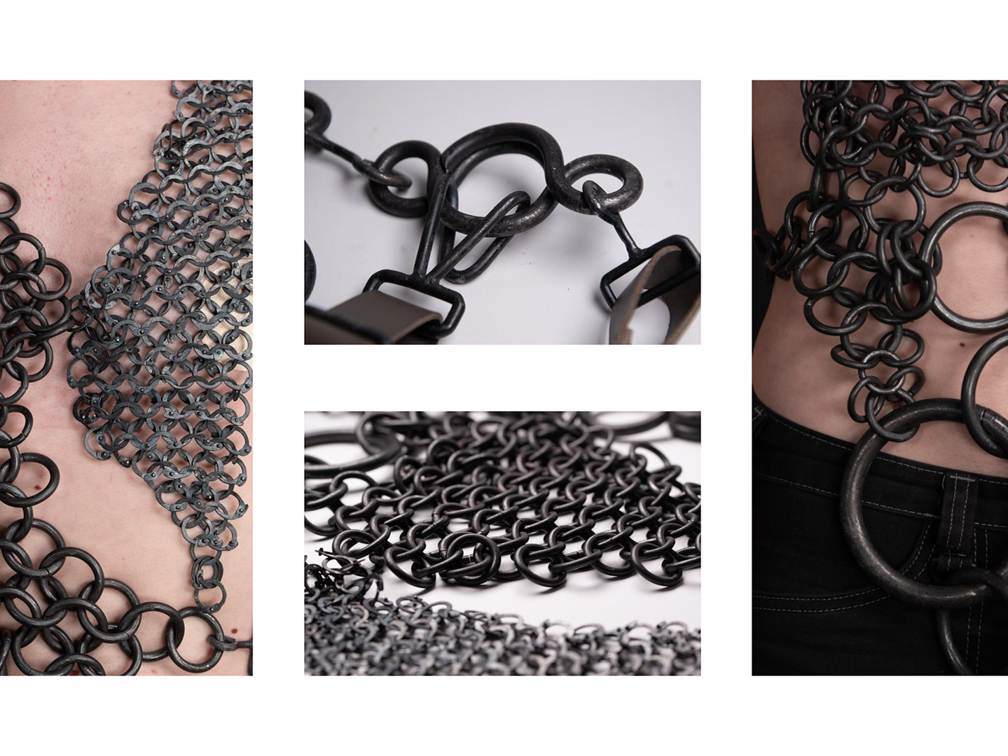
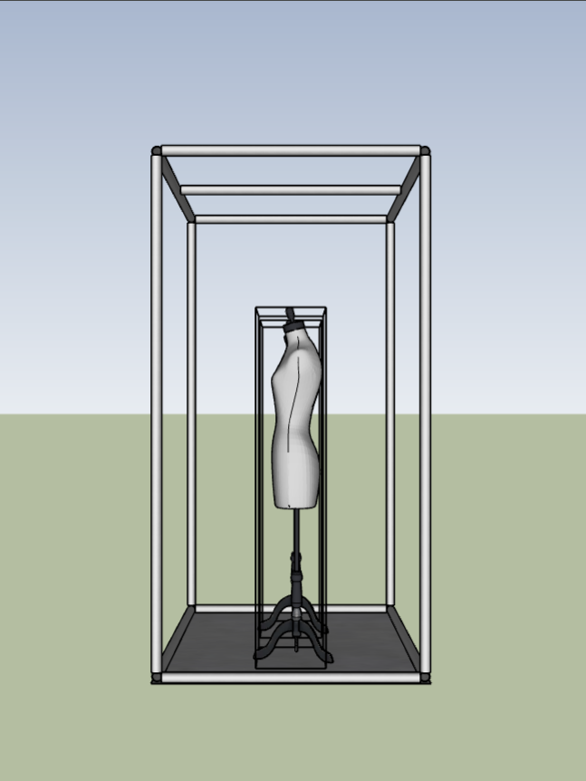
Mock up exhibition in the box
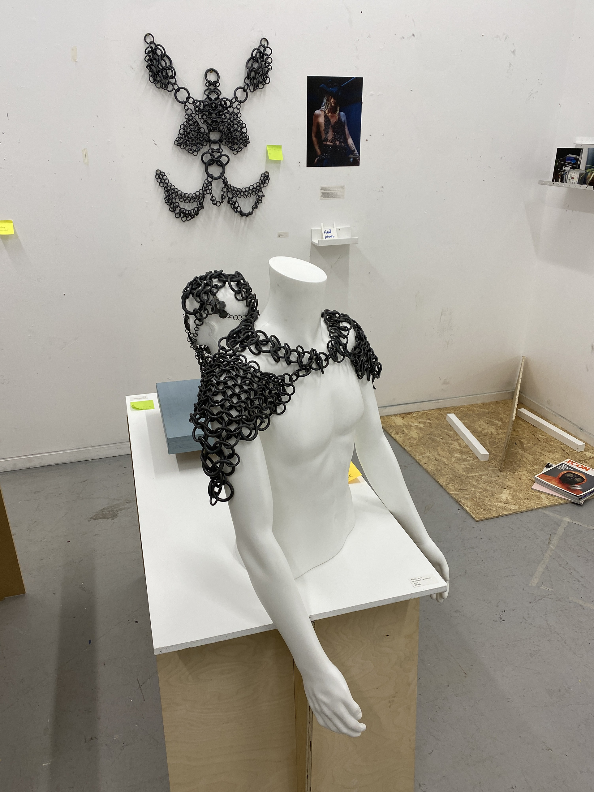
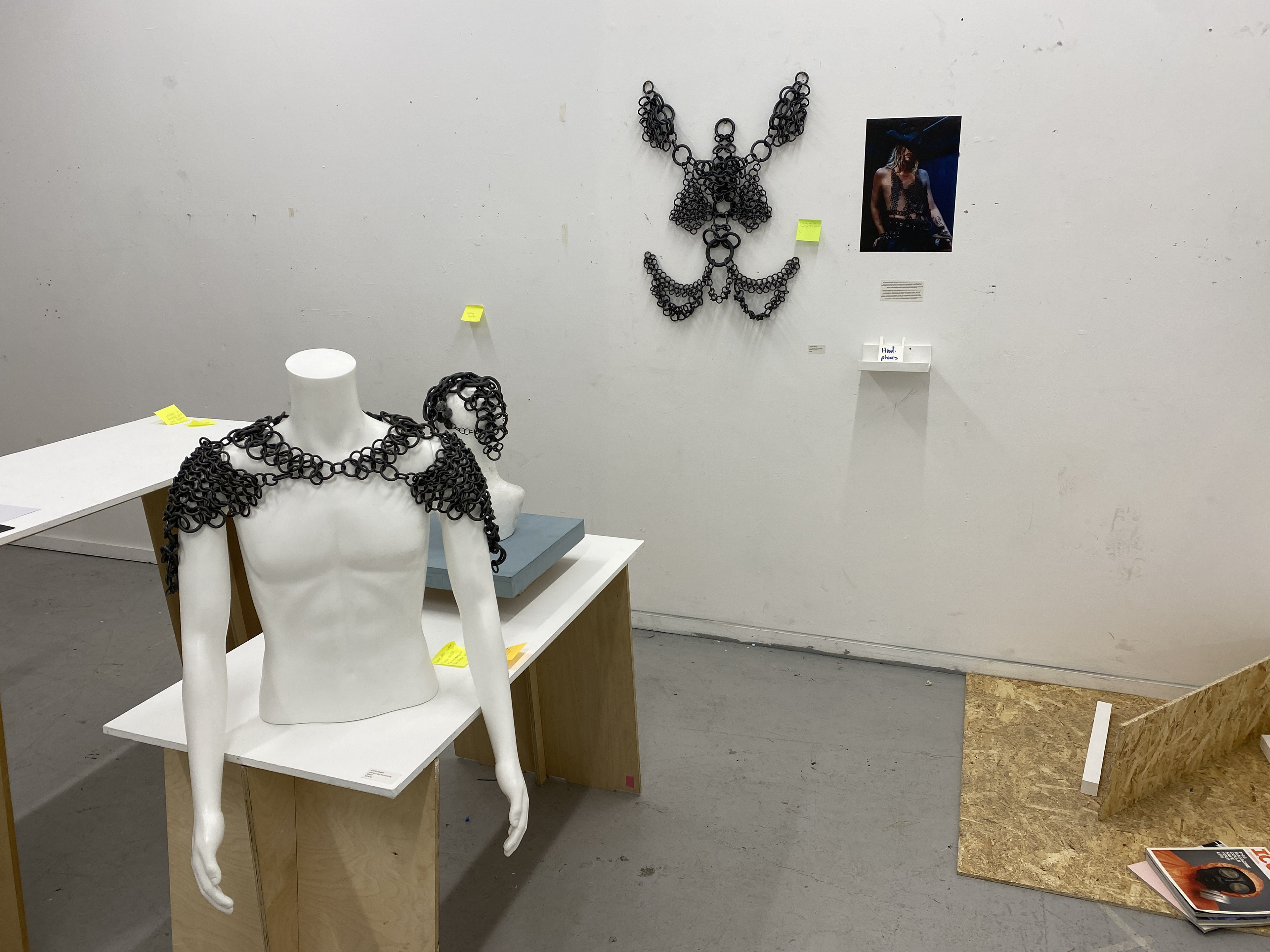

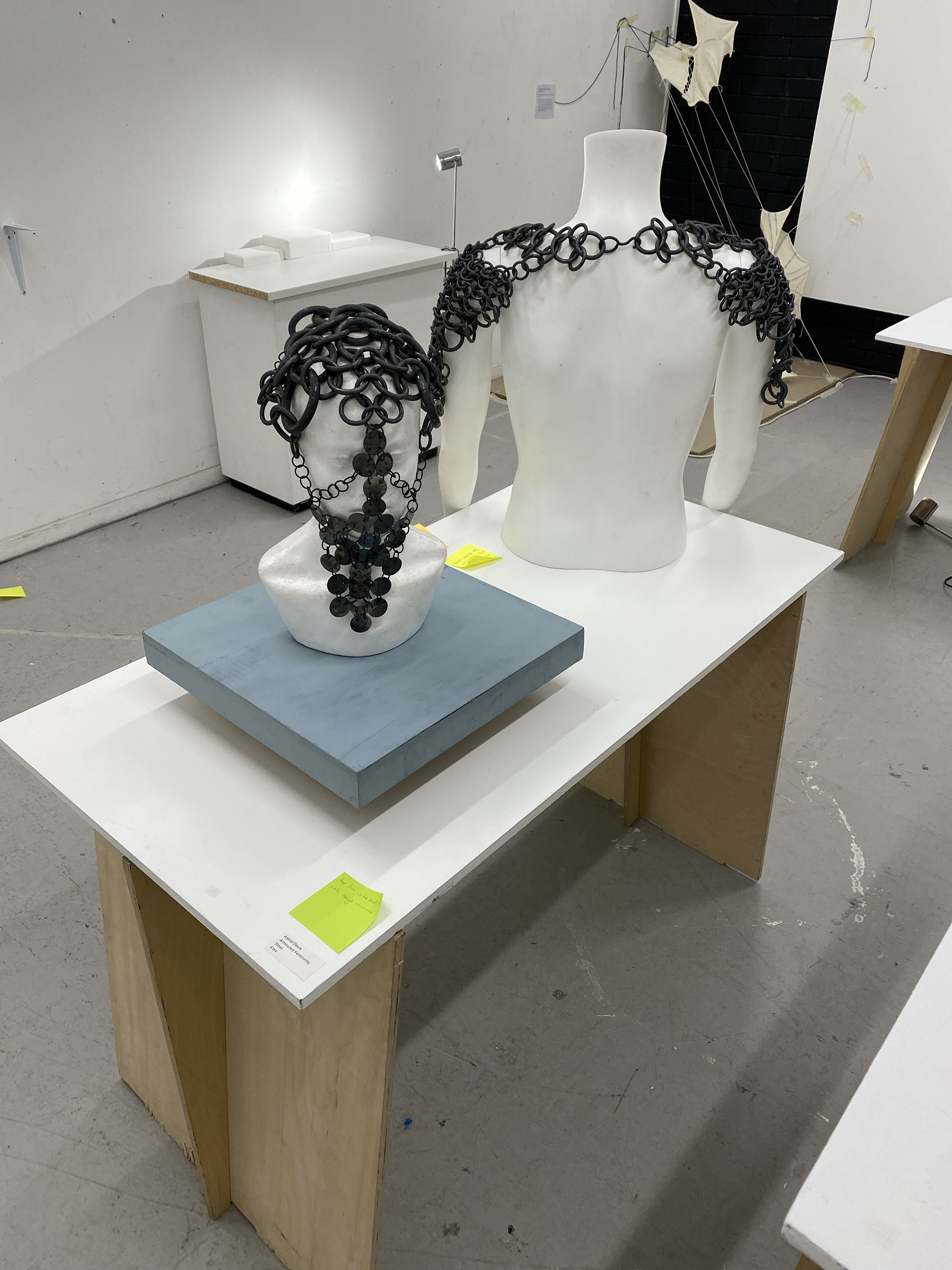
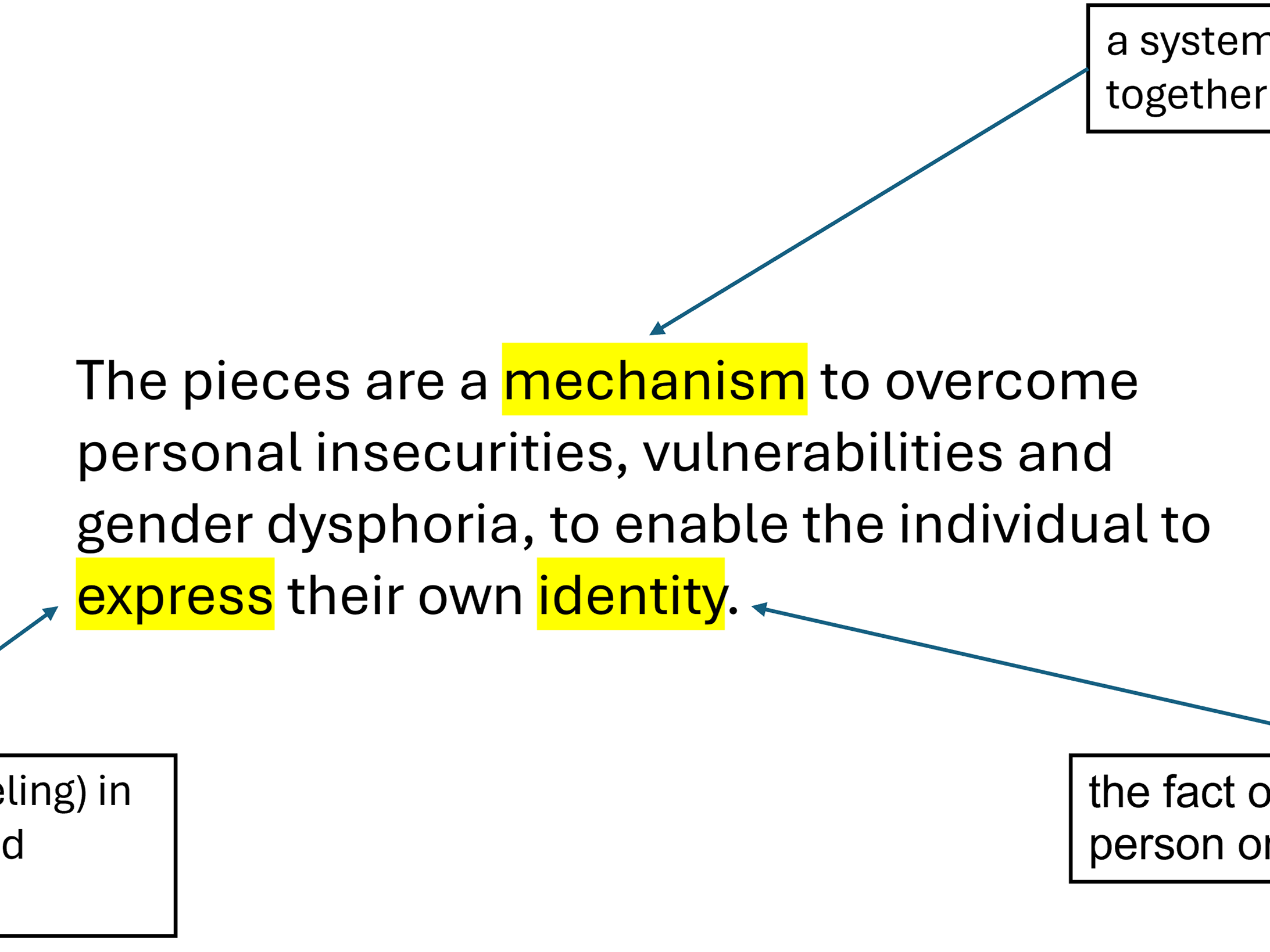
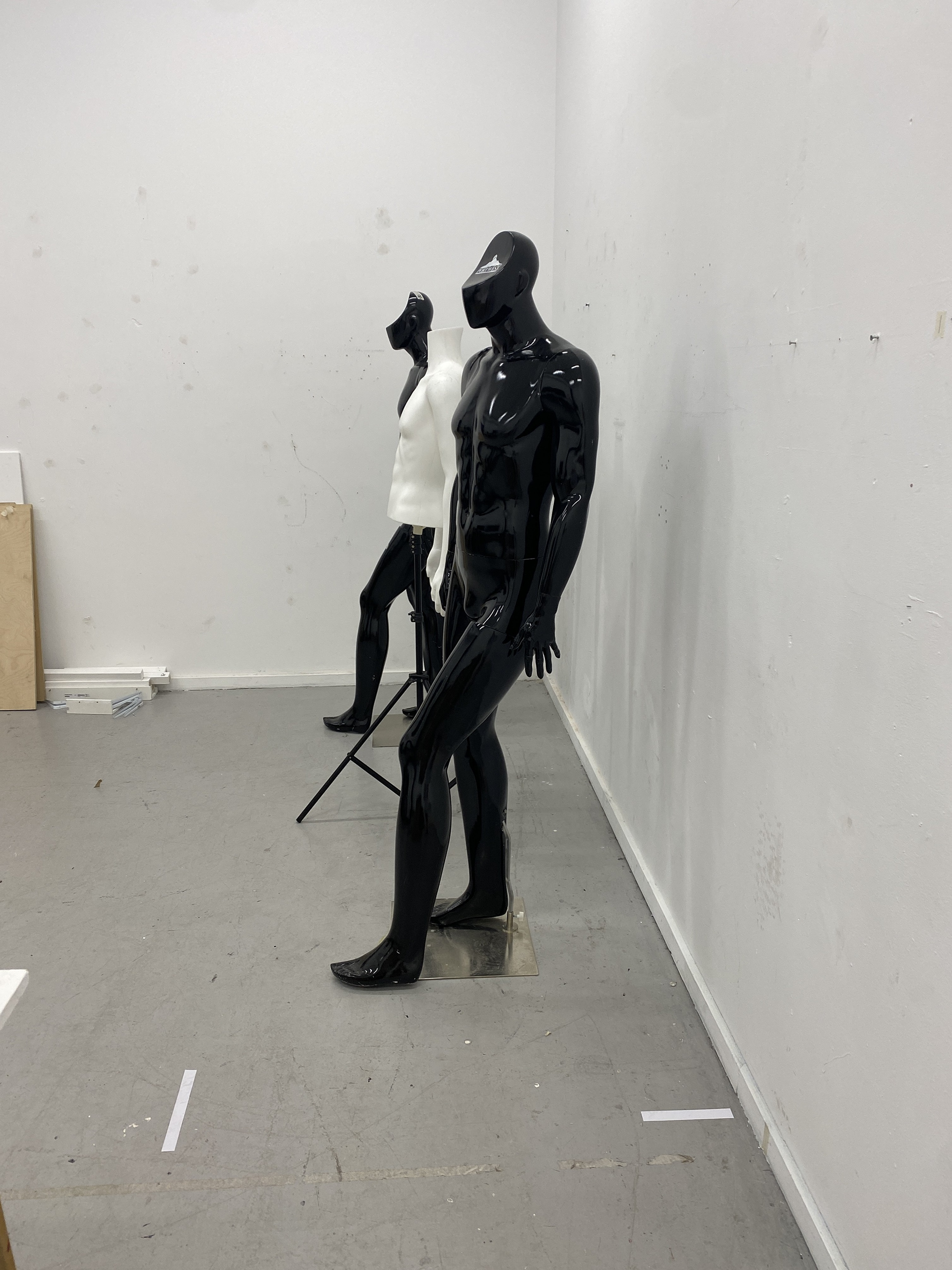
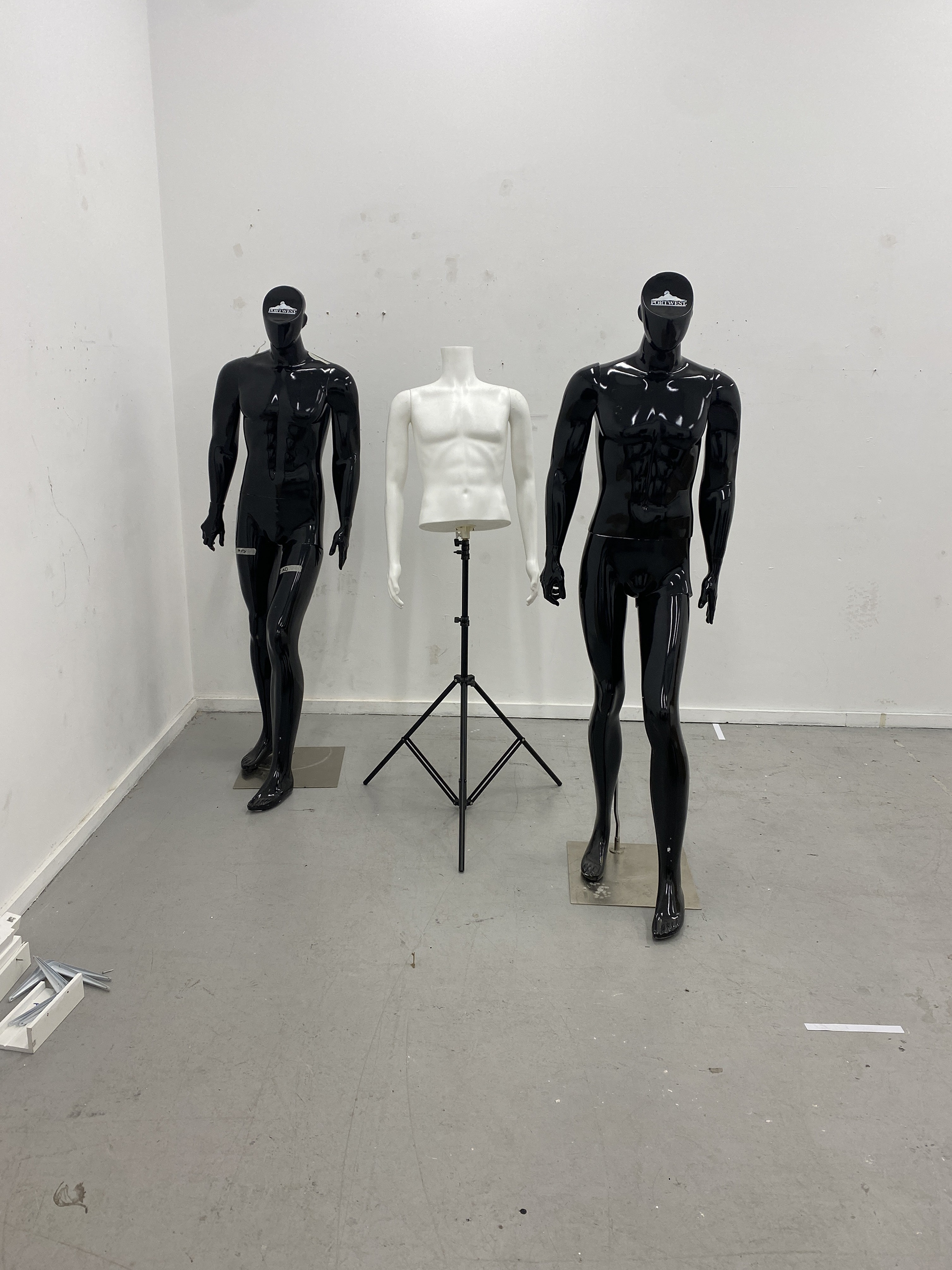
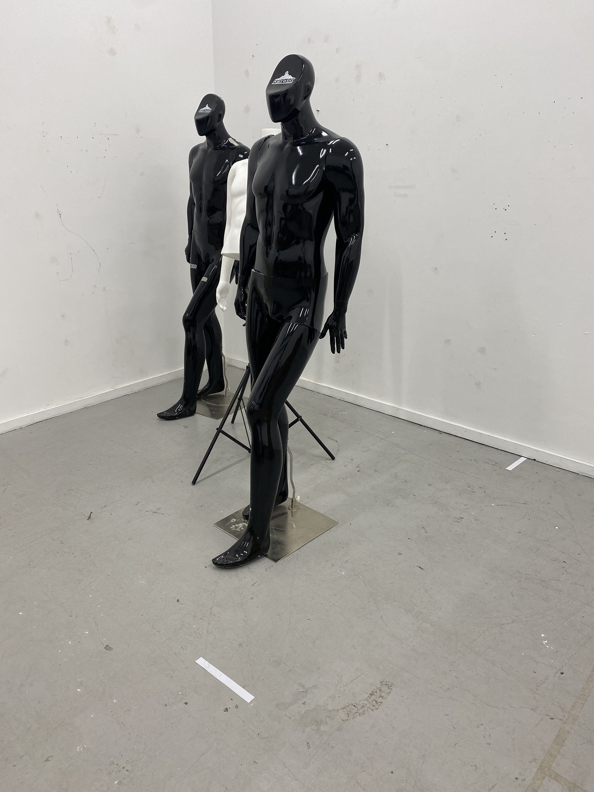
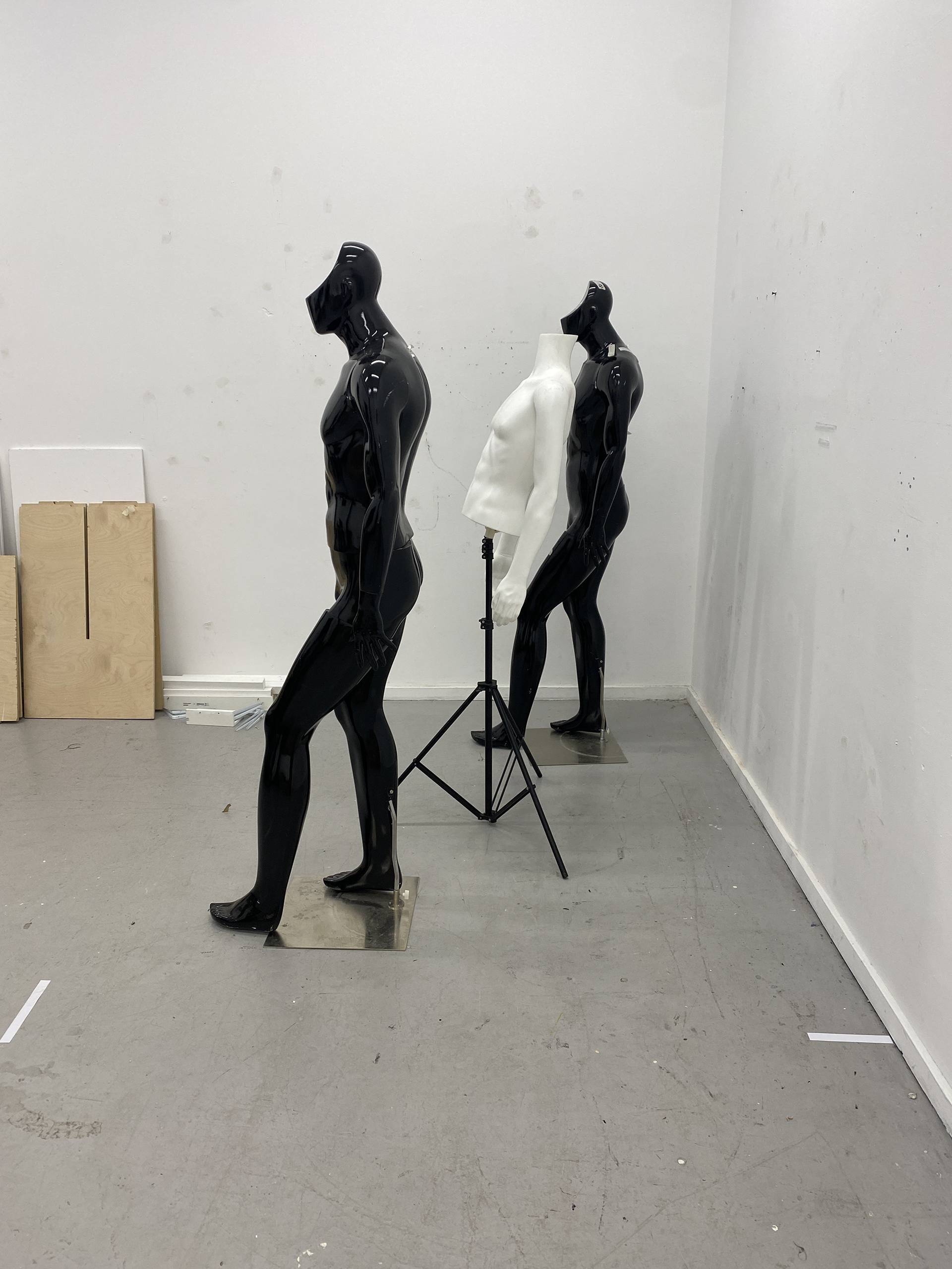
During this exercise, we explored potential ways to display our final pieces in a gallery setting. I wanted to test two different curation styles: displaying the work on mannequins and hanging it on a wall.
When placed on a mannequin, the piece was shown in context, demonstrating how it would sit on the body. However, the mannequins were bold and large forms in the room, drawing too much attention away from the work itself. Additionally, the mannequin I used had a masculine body, which detracted from the intended trans-feminine narrative. Replacing it with a feminine mannequin, however, would also misrepresent the conversations about the relationship with the body that the pieces explore.
Whereas, when I hung the piece on the wall, the context was stripped away. The back and front of the piece interfered with each other, muddying the forms and design choices. This method focused purely on craftsmanship, which was valuable but lacked the necessary context. To address this, I decided that a supporting image, taken from the editorial shoots, would help give that context. Additionally, incorporating audio from the questionnaires would add depth and clarity to the narrative of the collection.
Although both display styles worked to display the collection, neither fully celebrated the work’s intentions. After discussions with lecturers and other students, we decided to explore hanging the pieces in a way that maintained their positioning and structure on the body while avoiding the visual distraction of large mannequins. To further convey the narrative and context of the collection, I plan to display editorial photos and supporting audio on a separate wall.
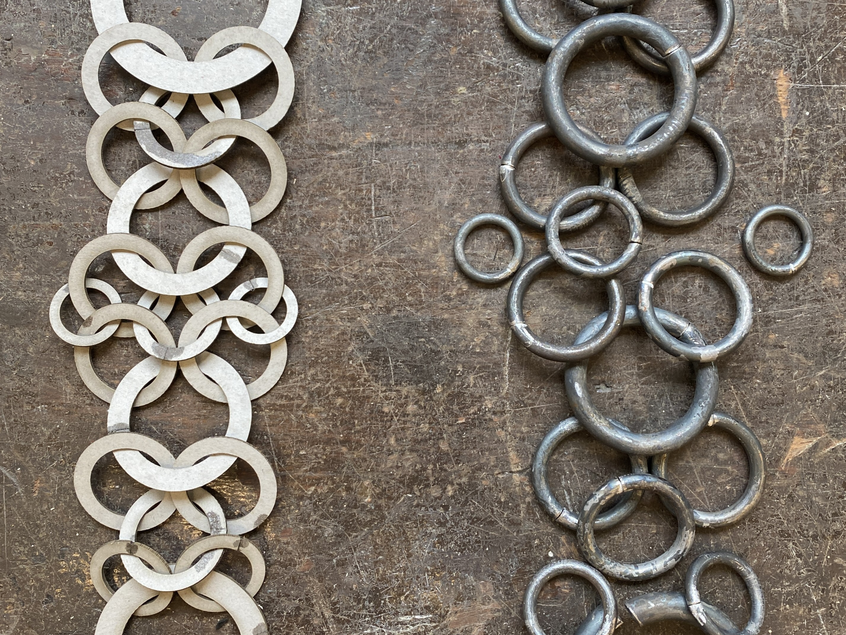
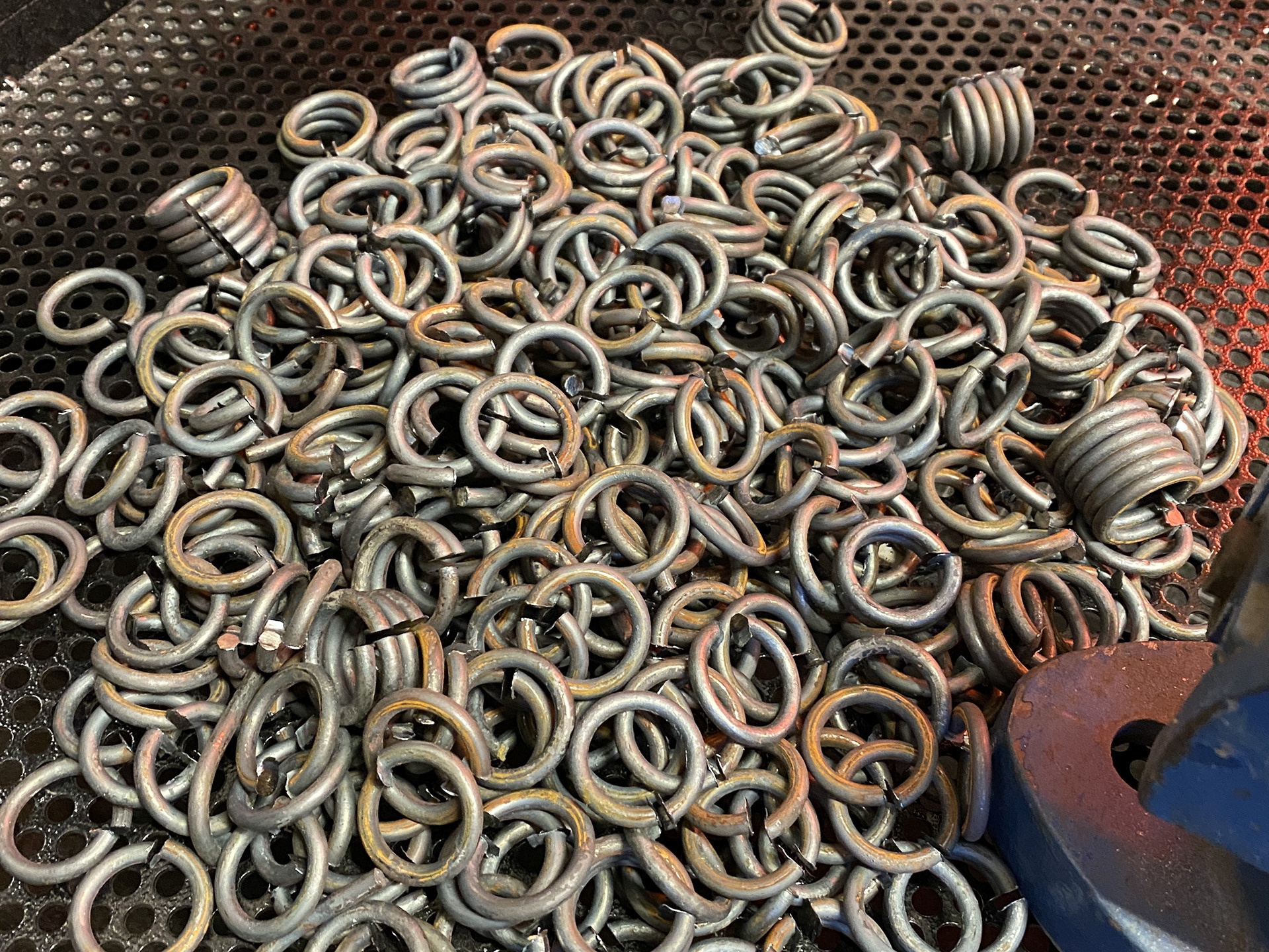
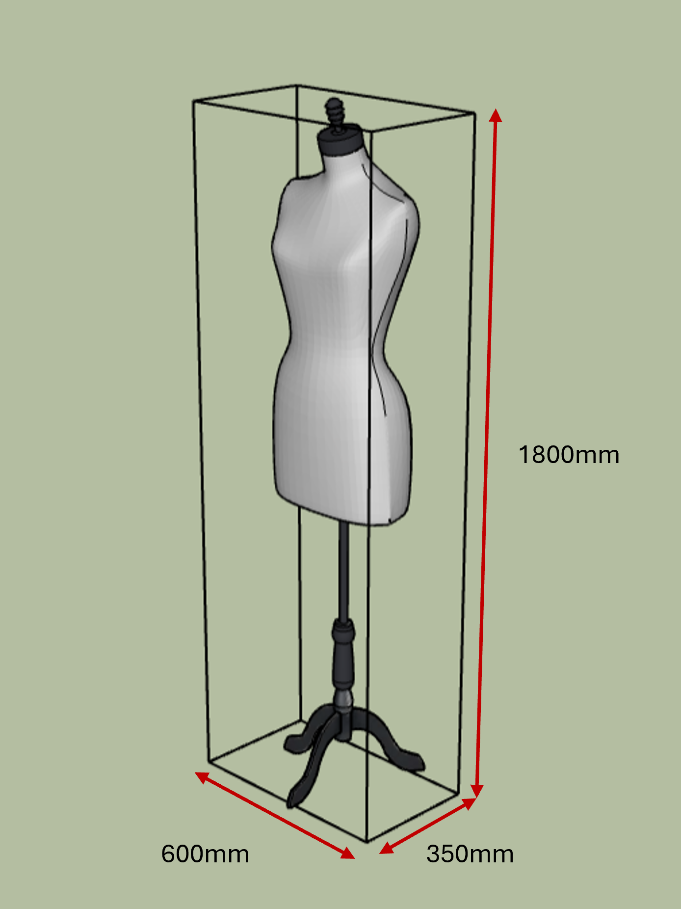
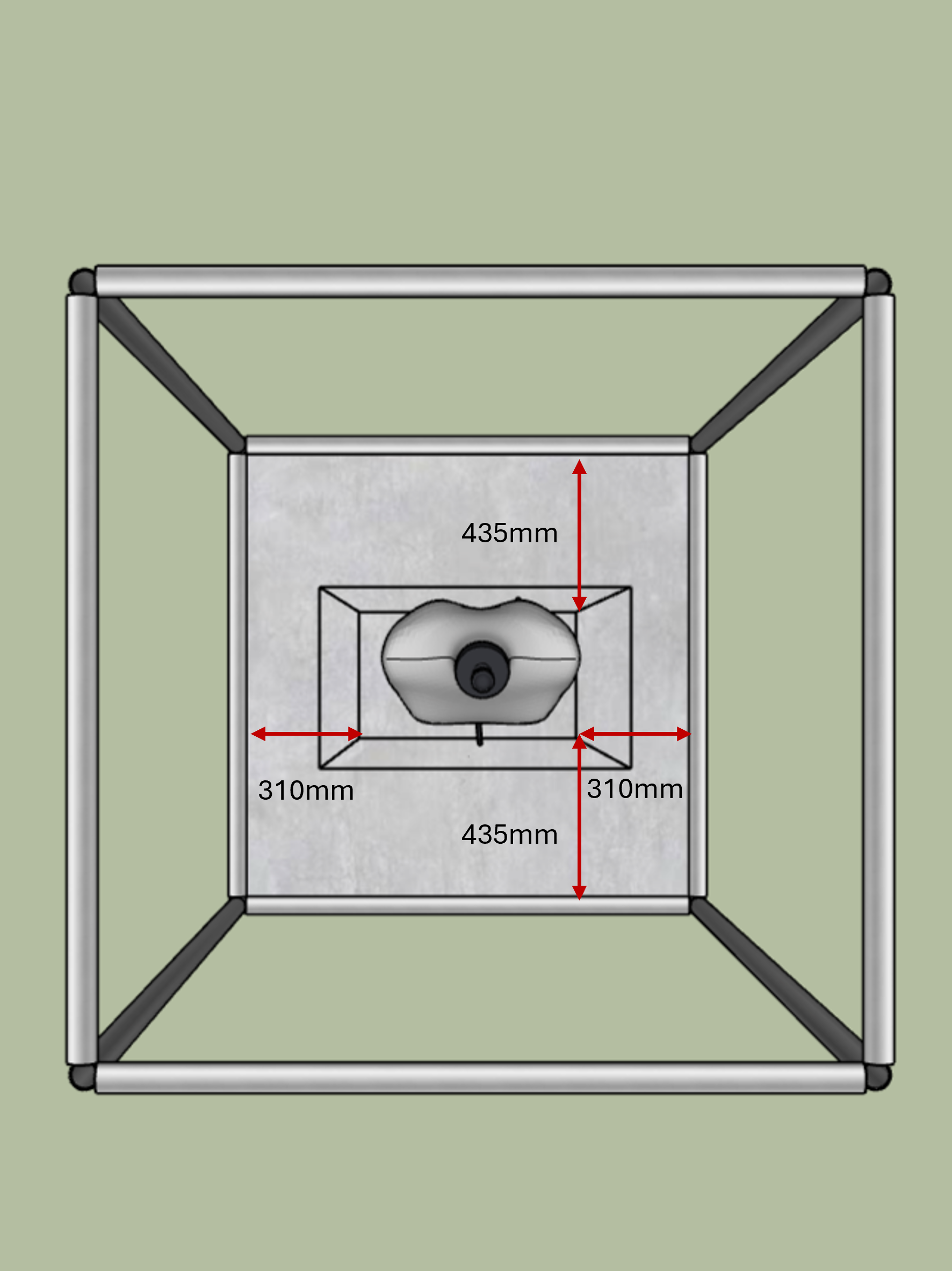
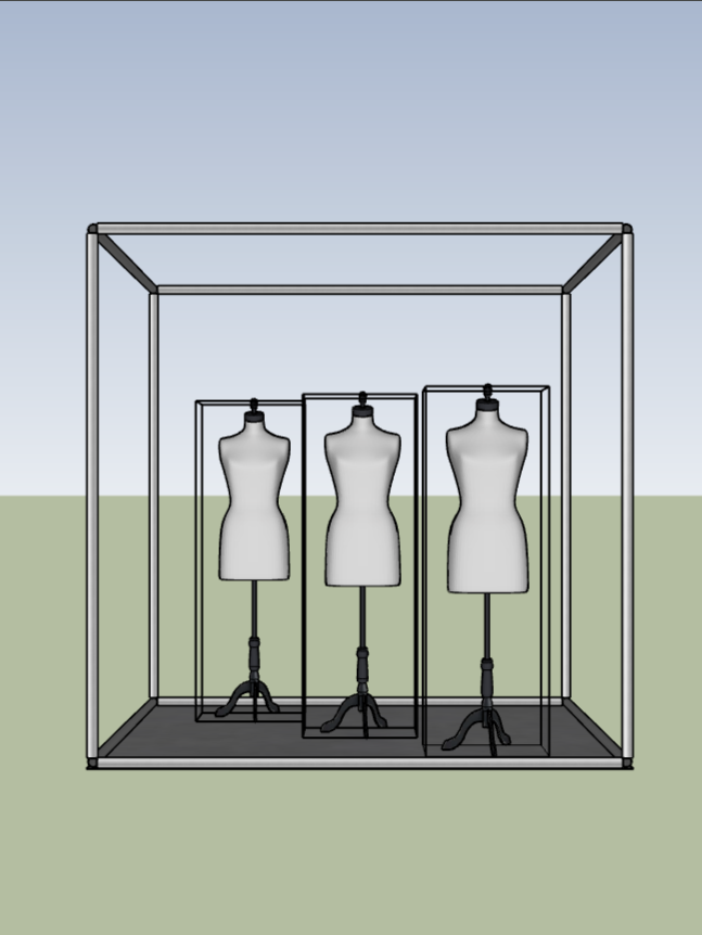
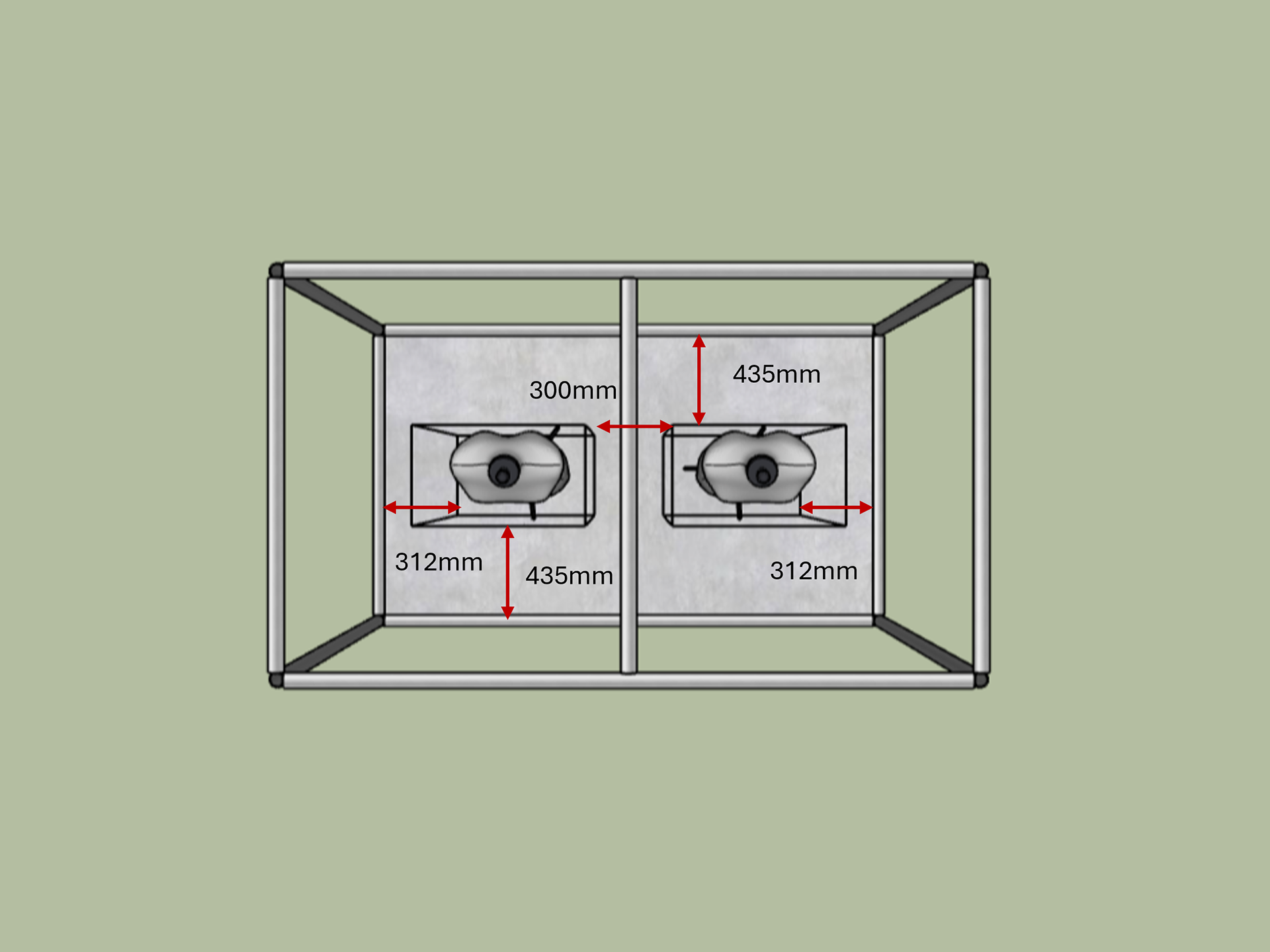
Testing spacing of work for scaffolding
Following our discussions during the Box exhibition we decided to explore the use of a scaffold box to suspend pieces of the collection inside. The scaffolding is used throughout the exhibition for the degree show to create the bases to tables and individual standalone structures.


300mm spacing 400mm spacing 500mm spacing
To determine the necessary size of the scaffolding structure, I considered the space required between and around each piece. I used mannequins to help test and visualize this arrangement. One concern I had was the overall size of the structure and how much space it would occupy in the exhibition compared to other students' work. Keeping this in mind, I believe that a 300mm spacing between each piece is sufficient.
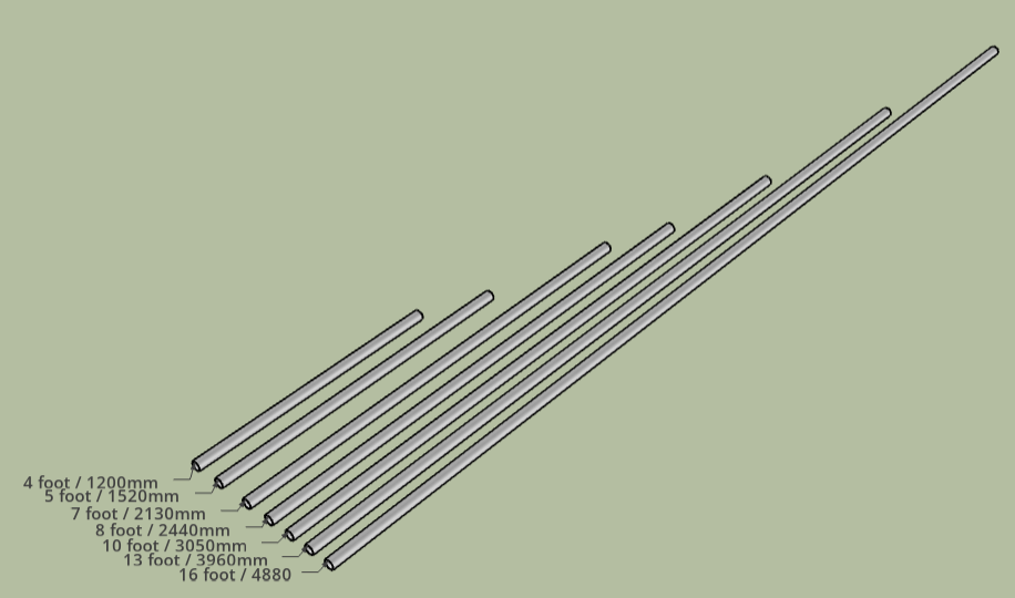
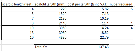
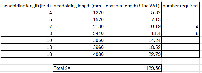
To visualize and determine the different spacings, I began modelling in CAD. I created models based on the various scaffolding lengths available from the supplier. To reduce cost and time, we will only use the provided lengths rather than cutting them into shorter sections, so I will need to design within these parameters.
I took a round measurement of my body to estimate the amount of space the pieces will require. My intention is to hang the pieces at the heights they would naturally sit on the body, ensuring as much contextual accuracy as possible. To illustrate this in CAD, I used a mannequin as a neutral yet proportional representation.
4x4x8 foot cube
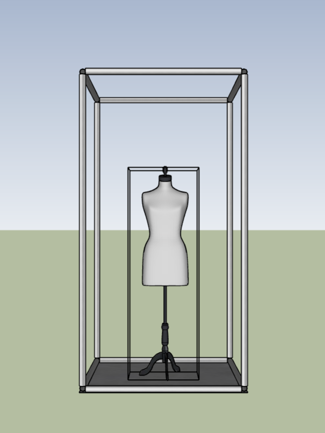
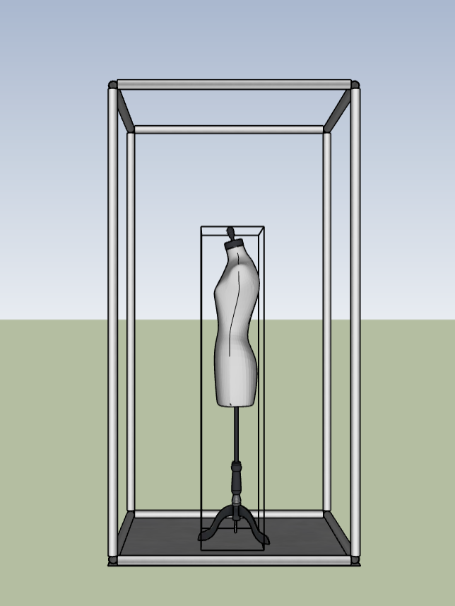
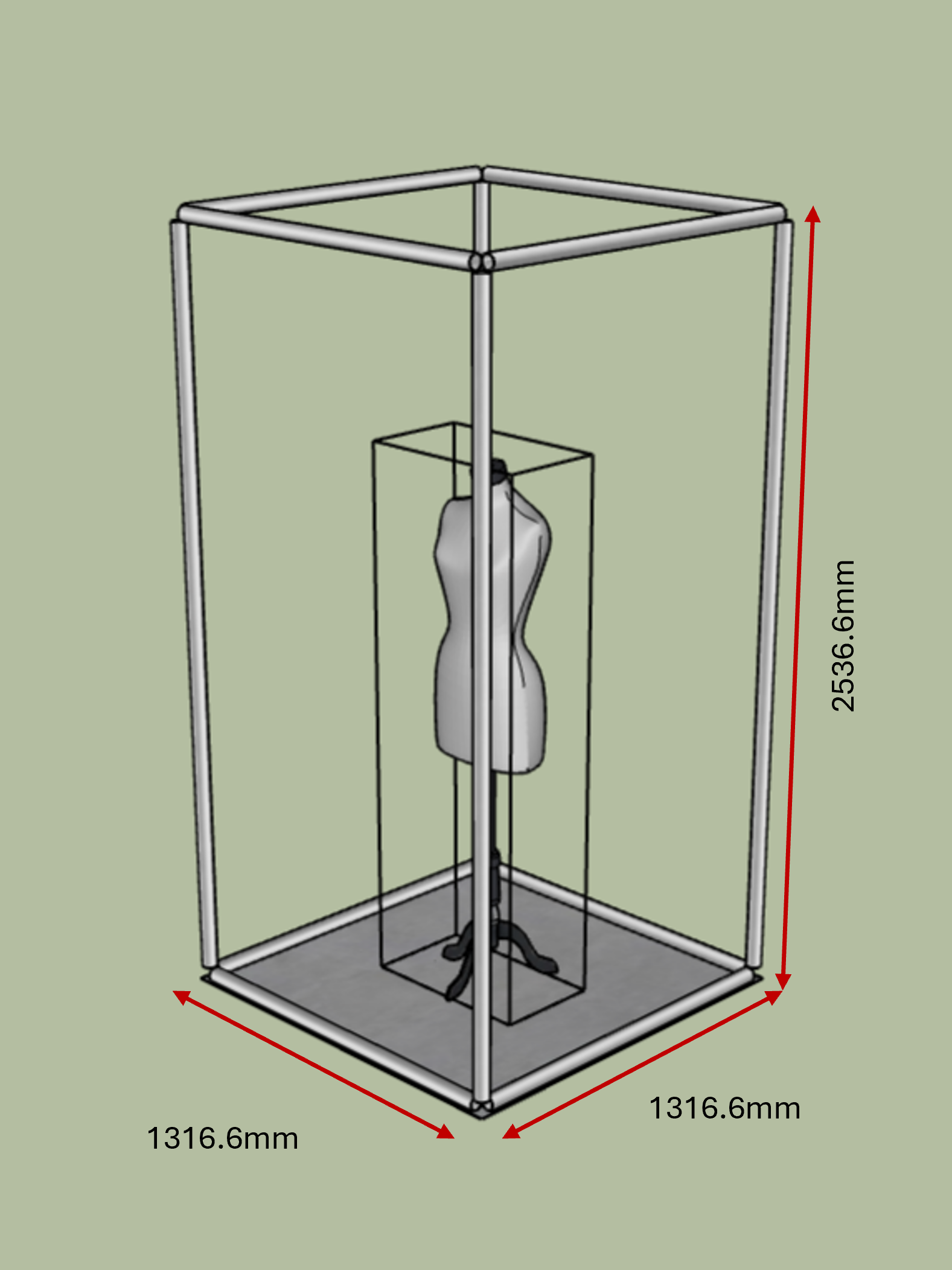
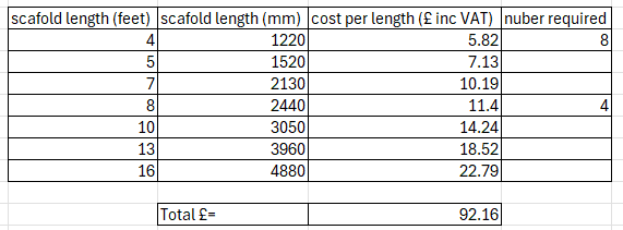
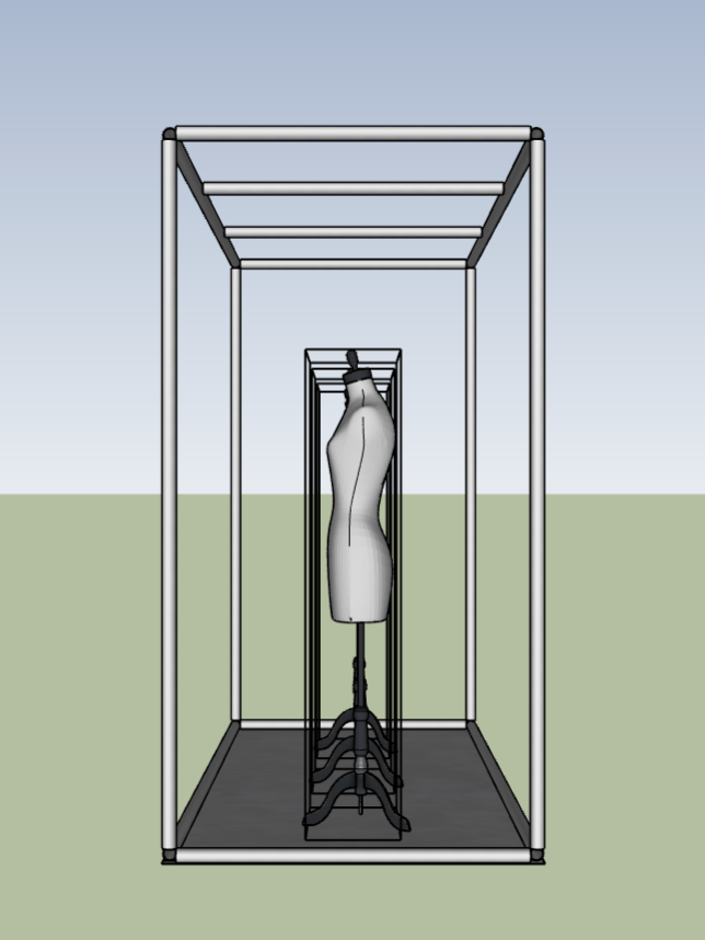
I wanted to explore the smallest possible footprint using the stock from the scaffolding supplier. This setup used eight pieces of 4-foot (1220mm) scaffolding and four pieces of 8-foot (2440mm) scaffolding. Only one piece could be displayed within this system, which could work for a larger scale exhibition by placing multiple structures around a room. However, I feel that showcasing only one of my pieces limits the depth and variety of narratives I have explored throughout the collection.
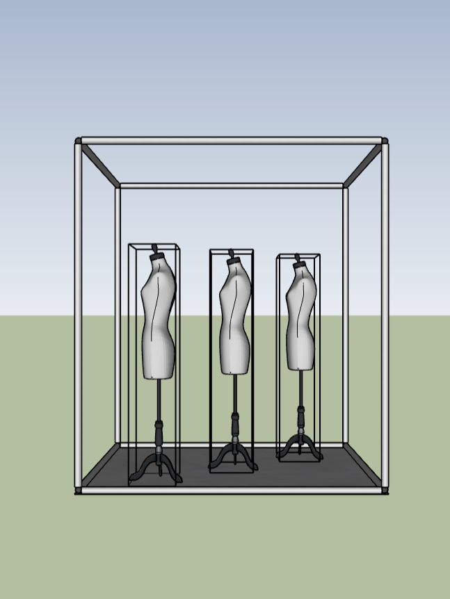
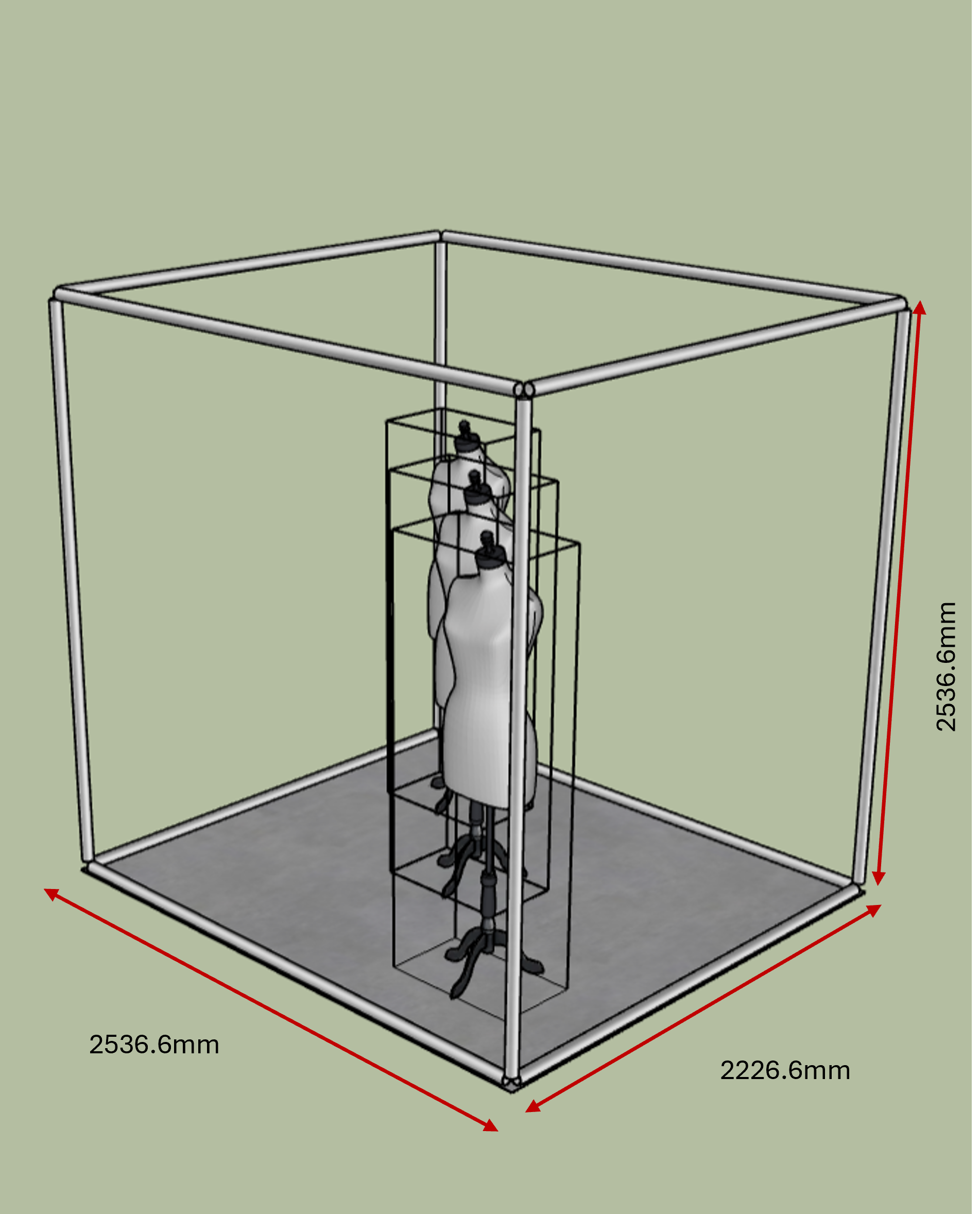
10x4x8 foot cube

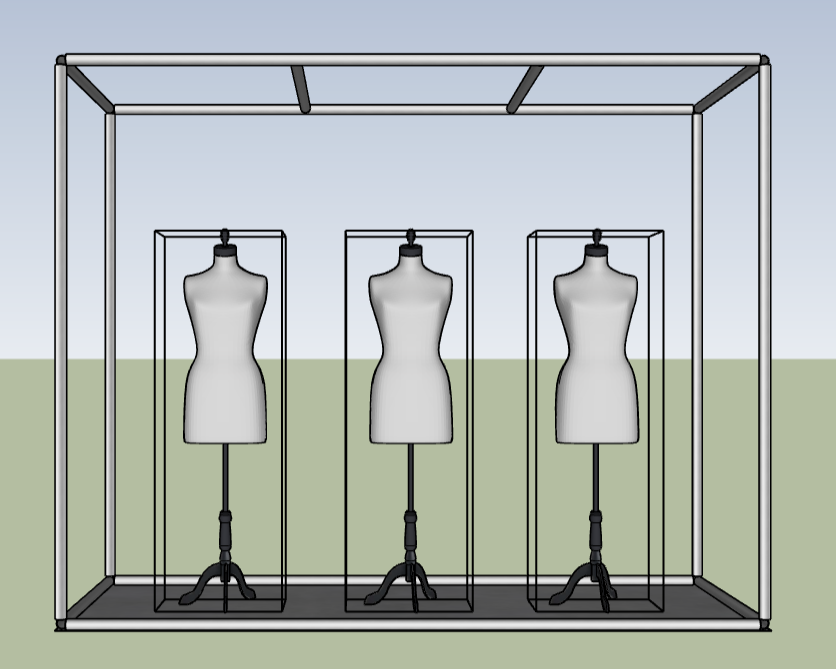

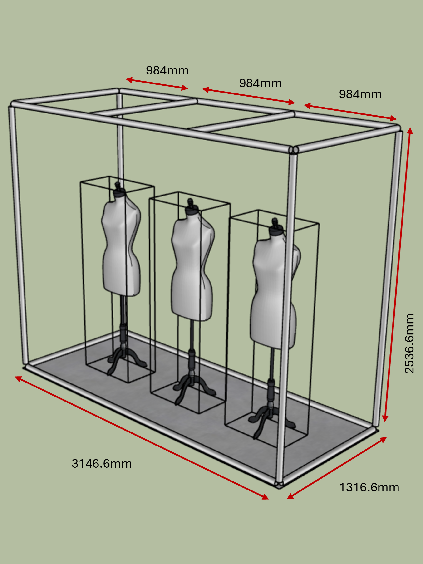
The next system I considered involved placing three pieces in a row. This setup used six pieces of 4-foot (1220mm) scaffolding, four pieces of 8-foot (2440mm) scaffolding, and four pieces of 10-foot (3050mm) scaffolding. I felt that this arrangement was much more effective in showcasing the range of work produced for the collection.
Since this structure was significantly larger, I incorporated additional scaffolding in the top area to provide more mounting points for suspending the work. While I believe this is a highly successful design, it would occupy considerable space in the exhibition. To ensure a fair distribution of space, I needed to collaborate with the curation team to determine the maximum structure size that would allow others adequate room to exhibit their work.
8x7x8 foot cube

I also tested a staggered design, placing the three pieces in a diagonal row. This setup used four pieces of 7-foot (2130mm) scaffolding and eight pieces of 8-foot (2440mm) scaffolding. The system aimed to reduce the overall width required to fit three pieces. However, I found that not only did it occupy a larger footprint, but the pieces were also more obstructed, both by each other and the vertical scaffolding. Overall, I believe this system is less effective than the three pieces arranged in a row.
4x7x8 foot cube
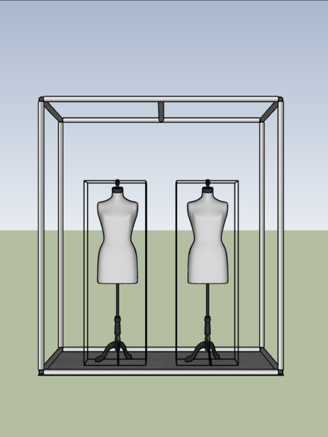
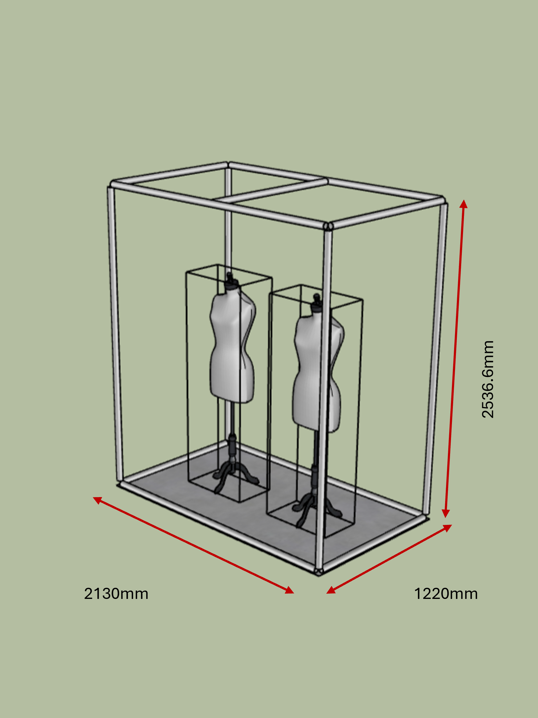
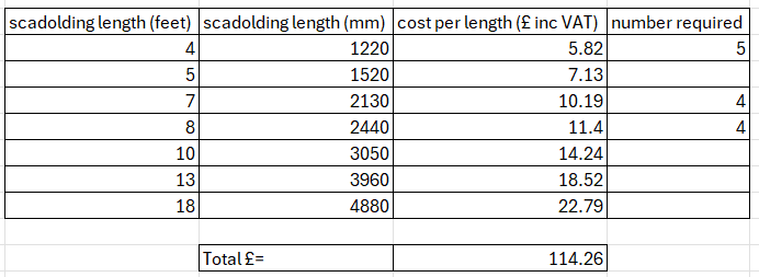
Reviewing my previous designs, I was concerned that these structures might take up too much space in the exhibition. Therefore, I tested displaying only two pieces next to each other while referencing the three-in-a-row design. This setup used five pieces of 4-foot (1220mm) scaffolding, four pieces of 7-foot (2130mm) scaffolding, and four pieces of 8-foot (2440mm) scaffolding. I feel that this is a good compromise given the space constraints. However, I do find that the even pair competes for attention, directing the viewer's eye between the works rather than toward a focal point. An odd number naturally creates a clear centre.
Ultimately, the decision between displaying two or three pieces is determined by the curation team, as they dictate how the space is divided.