Proposal:
For Synthesis and Resolution, I want to continue my exploration of armour as a modern form of protection against society. I will create a collection of pieces that cover differing locations on the body. Focusing on one body part at a time, I can address specific issues and insecurities by increasing the coverage or redirecting the viewer’s eye. I will continue to work with the transfeminine body to communicate personal struggles and how I can find a way through my work to address and overcome them. I feel that connecting with other transfeminine individuals may help to guide my narrative under a closer, shared experience. Also, I think that engaging with my community may bring out ideas that I hadn’t focused on or overlooked.
I want to continue to develop the different forms of mail, both plate and chain. I wish to focus on transparency of the armour, covering areas of the body to hide or disguise areas of the individuals’ vulnerabilities. For example, using a looser and more transparent weave which can easily be seen through will provide lighter protection from the judgement of others. Whereas using a very dense weave or stacked plate, which fully encompasses the body beneath will provide the wearer with full protection and shield them from others.
Also, I think that testing the limits of the forged steel links by scaling up even further could expand and broaden my approaches to design. I am currently only just pushing the traditional scale and want to explore different routes.
I still wish to work in a fashion / couture environment to communicate my work. I would like to explore having a more direct role in a larger photoshoot where I can curate the elements to strengthen the narrative. Connecting and collaborating with other fashion designers who align with my narratives may set me up for work of a similar type when leaving university.
Planning:
As stated in my proposal I want to work with a series of differing locations on the body to tackle personal insecurities and vulnerabilities, specifically cantered around gender dysphoria. I have highlighted 4 main locations that I would like to explore:
The face
The throat/neck
The shoulders
The chest
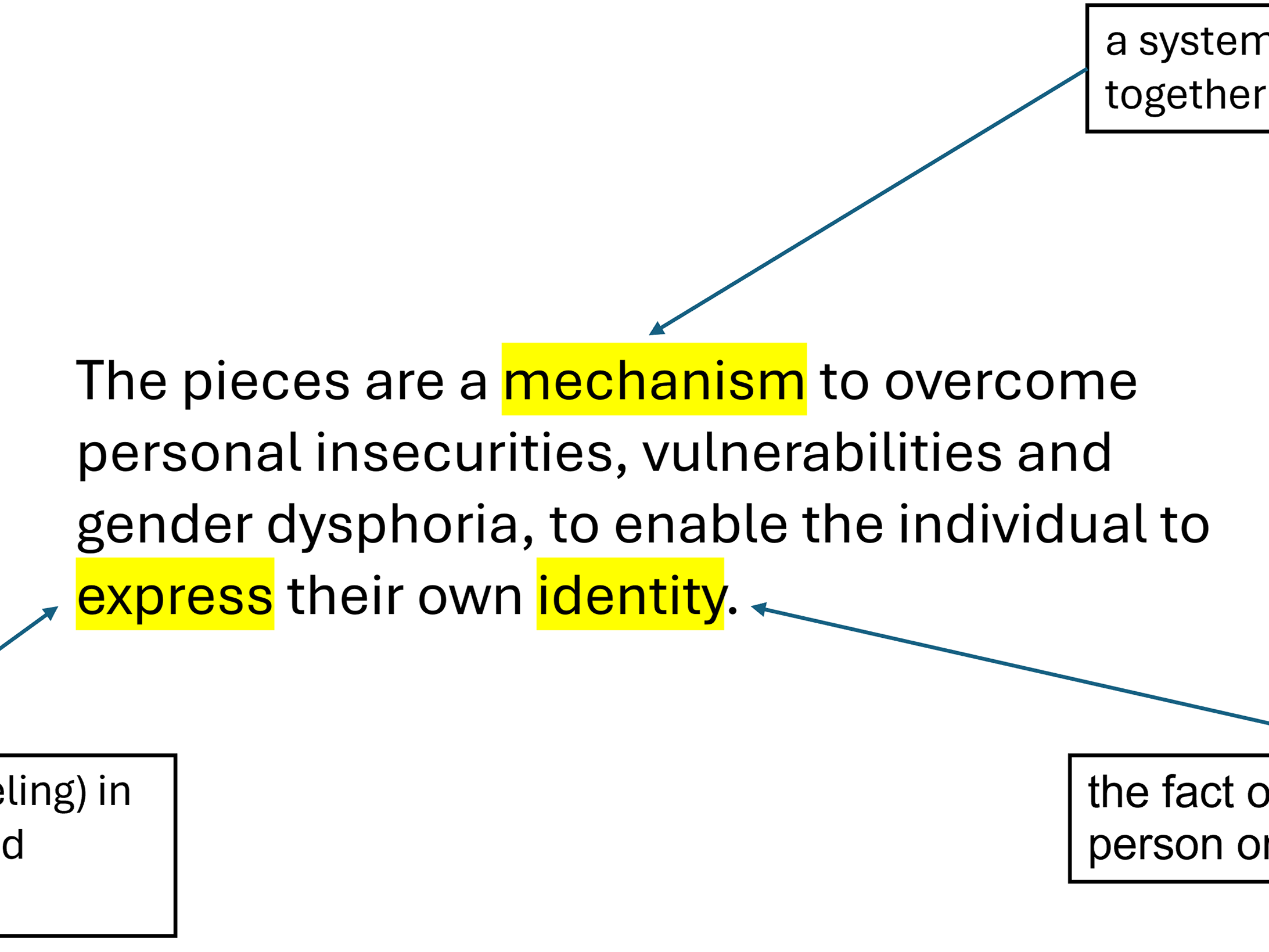
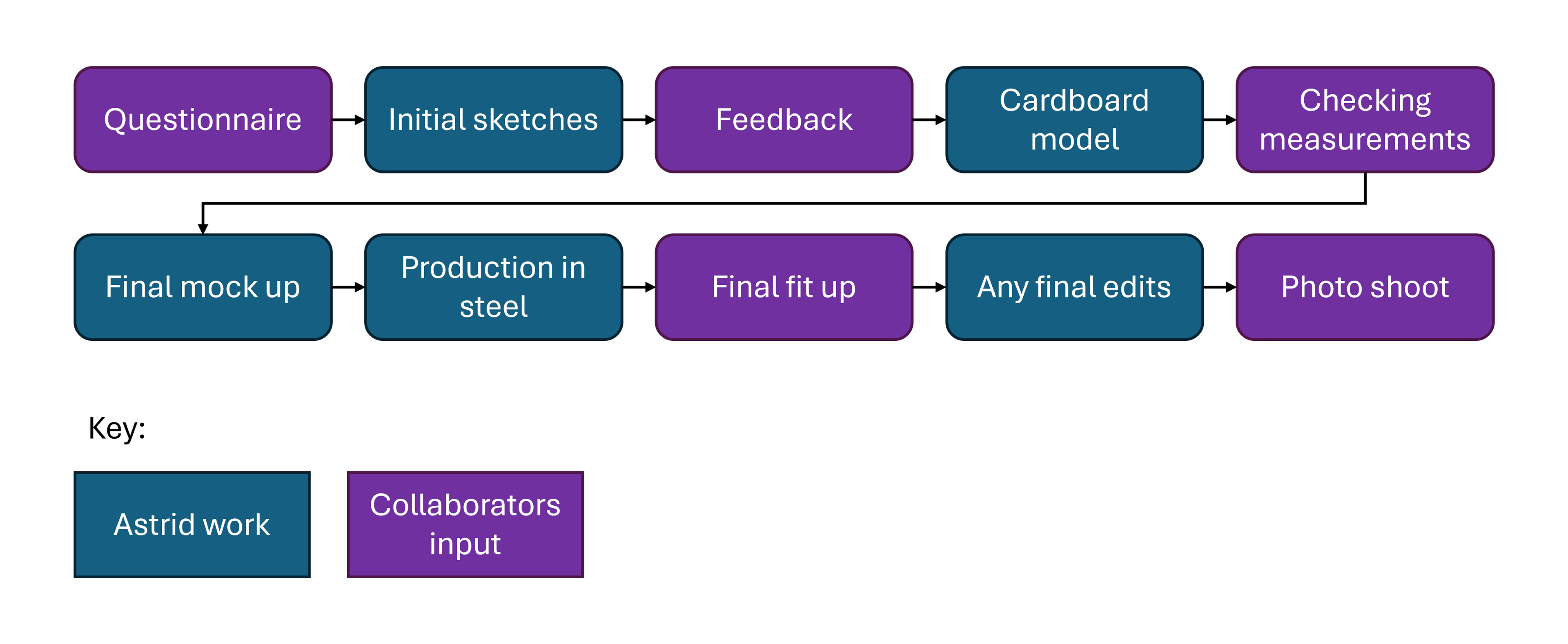
I have also reached out to two trans Drag Queens for their collaboration. I will work alongside them to produce a piece each that tackles their personal experience with gender dysphoria. I have put together an initial questionnaire for them to complete to give me an outline of the issues and locations of the body to address. Additionally, I have laid out the different stages that we will need to complete, showing where I will need to progress the work and when their input is required.
I have chosen to follow this questionnaire and timeline to produce the pieces for myself so that there is a consistent workflow. Also, this will allow me to show what I have been doing for myself and potentially help guide the conversation and help address any questions the Drag Queens may have.
The Questionnaire
What personal insecurities, vulnerabilities or gender dysphoria do you attribute to this area? Describe in a few sentences or bullet points.
How do you usually manage these insecurities, vulnerabilities or gender dysphoria in your day-to-day life? For example, using baggy clothing or makeup.
Can you provide some measurements of the location. For example, clothing size or circumference around the body part.
How does the art from of drag help you to express yourself and your gender identity?
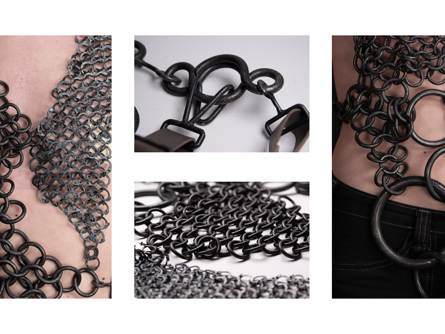
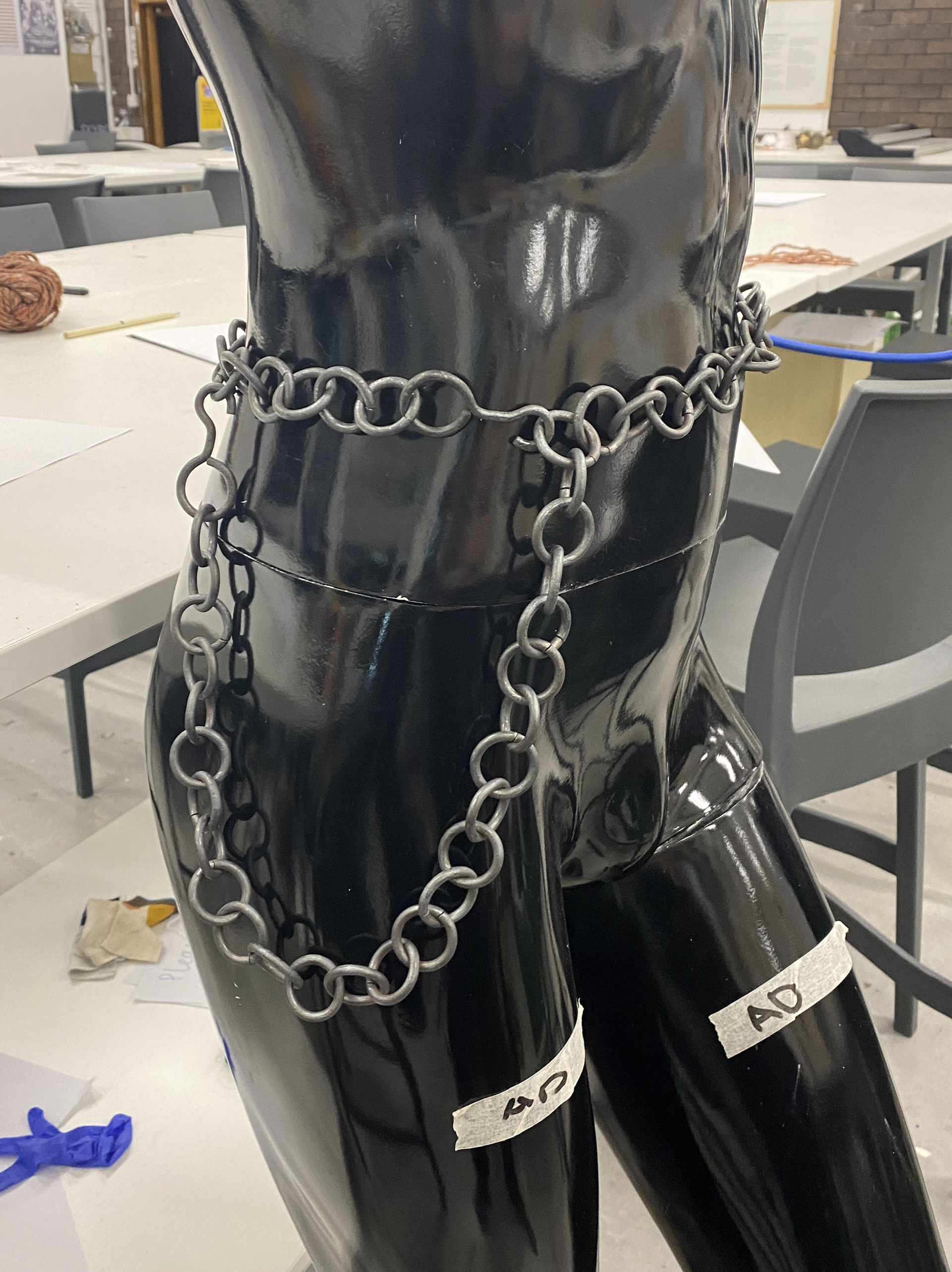
Experimenting with belt designs for a further collaboration with Todd Green Fashion
Reflecting on my last photoshoot with Laren Broxton I found that my work was being styled with additional chain for belts and extra details. I found this to clash with my work and was an opportunity to explore an additional range of purely fashion pieces. Whilst I still want these pieces to utilize the same weave and aesthetic as the rest of my work these pieces wouldn't have as deep a narrative or connection to a specific location of the body.
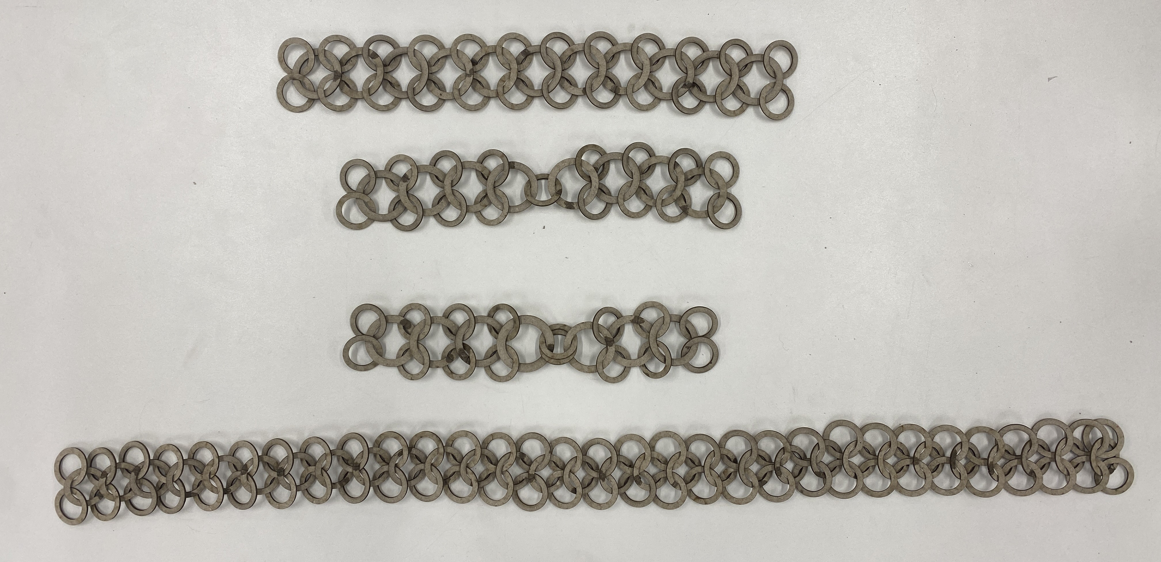
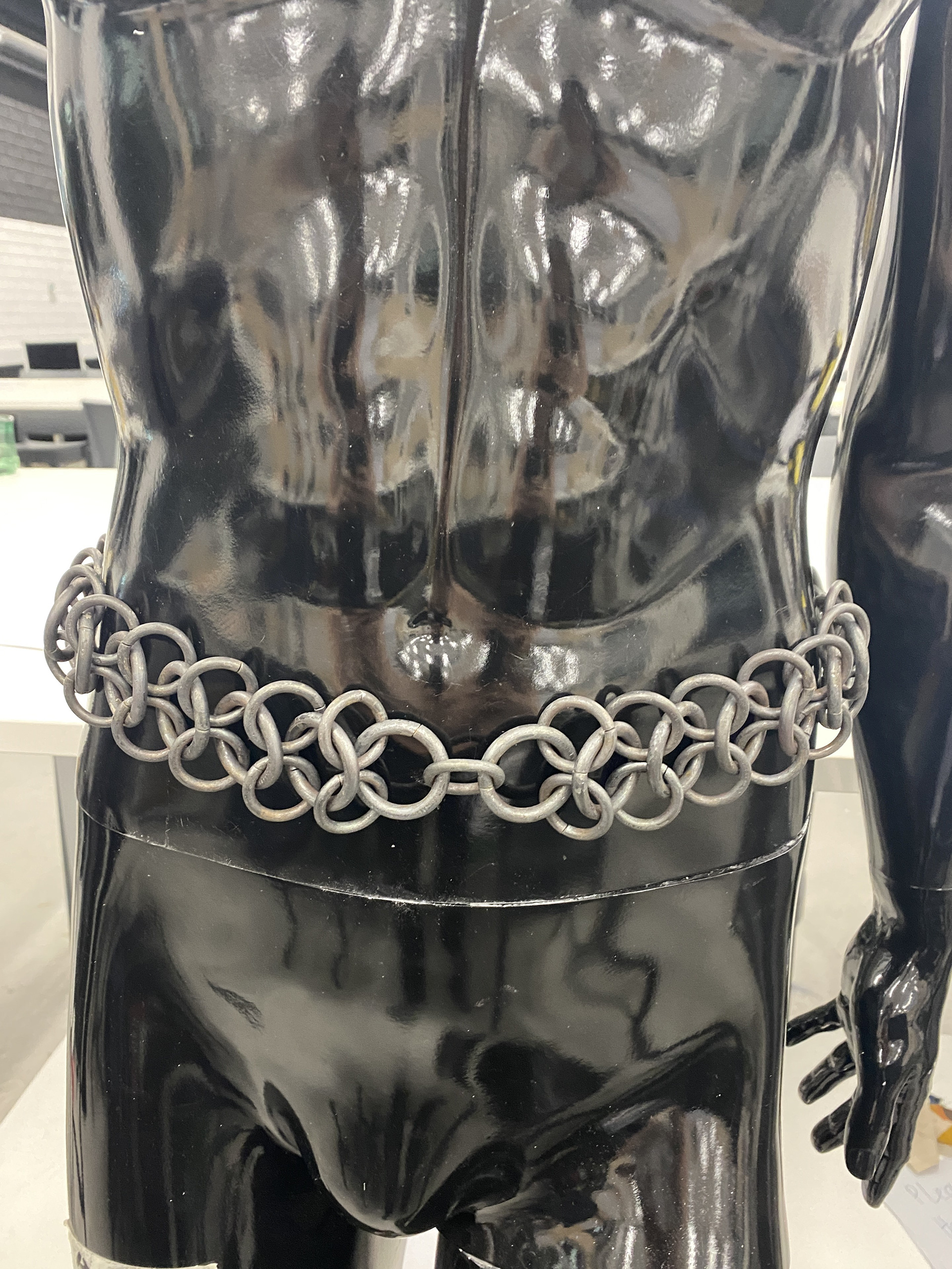
I began by modelling some lengths of chain keeping the 4 in 1 weave but altering the link sizes. I found that to make a belt or piece that wraps around the body and joins at one point, it is best to have a symmetrical design with the pattern facing in opposite directions.
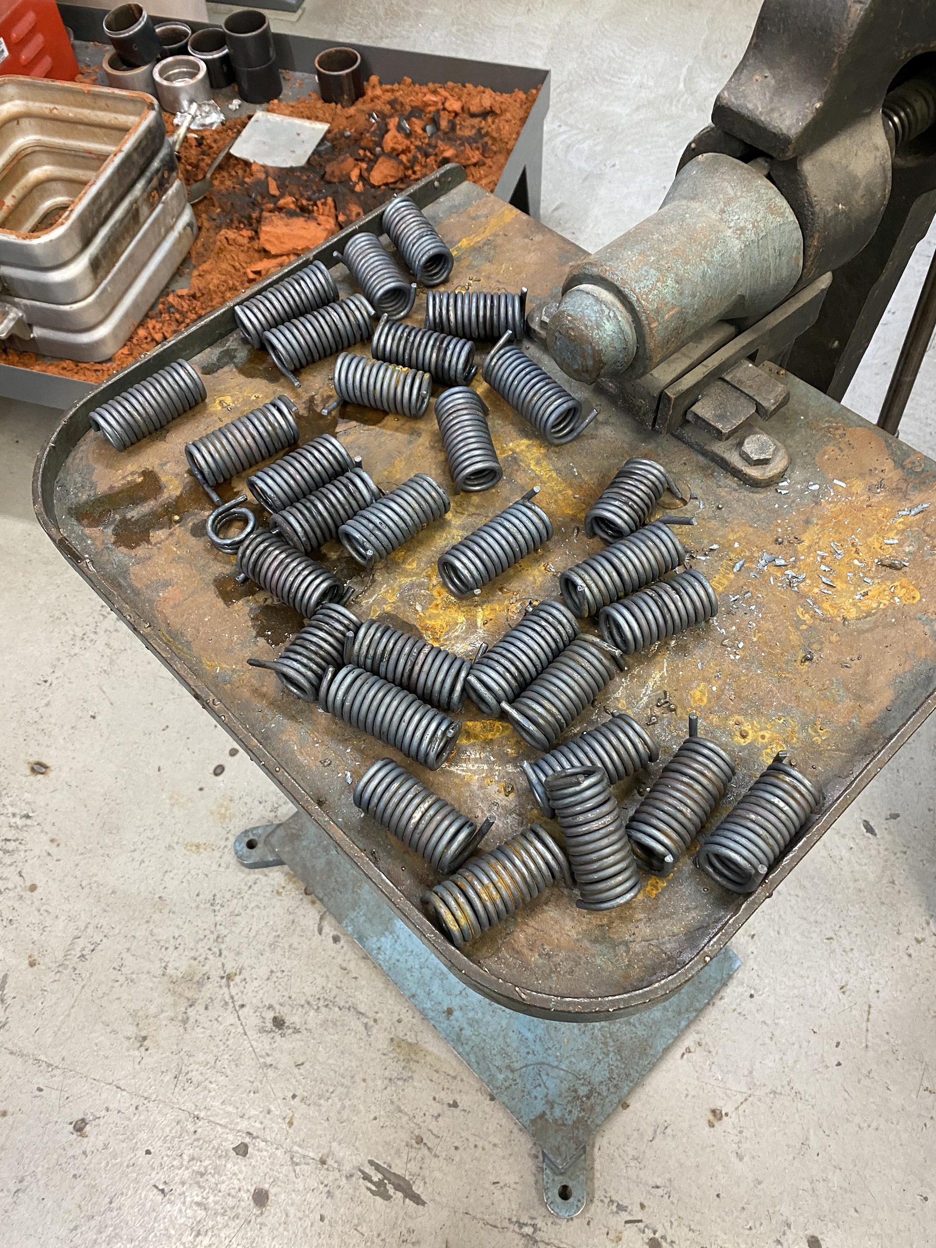
I moved into steel to test how the material would react and bend around the body. I used the same techniques as last unit; forging steel rod around a stake, cutting the coils into links, cleaning them up using a pendant drill and the hammering them together.
I made two types of chain as a test: one was a single length of trace chain with two hooks as the end and the other my mail pattern with one hook.


To make the hooks I modelled the eyelet from the smaller 4mm sized link and the hook with an 8mm radius so that it could easily clip onto the 5mm steel rod. I went through a series of trials to forge such a small and symmetrical piece. I initial forged out the eyelet ensuring that the central line of symmetry ran down the length for the hook and through the eyelet. I then had some difficulties forming the straight section and hook, when I went to bend round the hook it would distort the eyelet and the lines of symmetry. Through testing I found that hammering the start of the second 3/4 eyelet that forms the hook at a 90-degree angle rather than the typical 45-degree, enabled me to control the symmetry better.
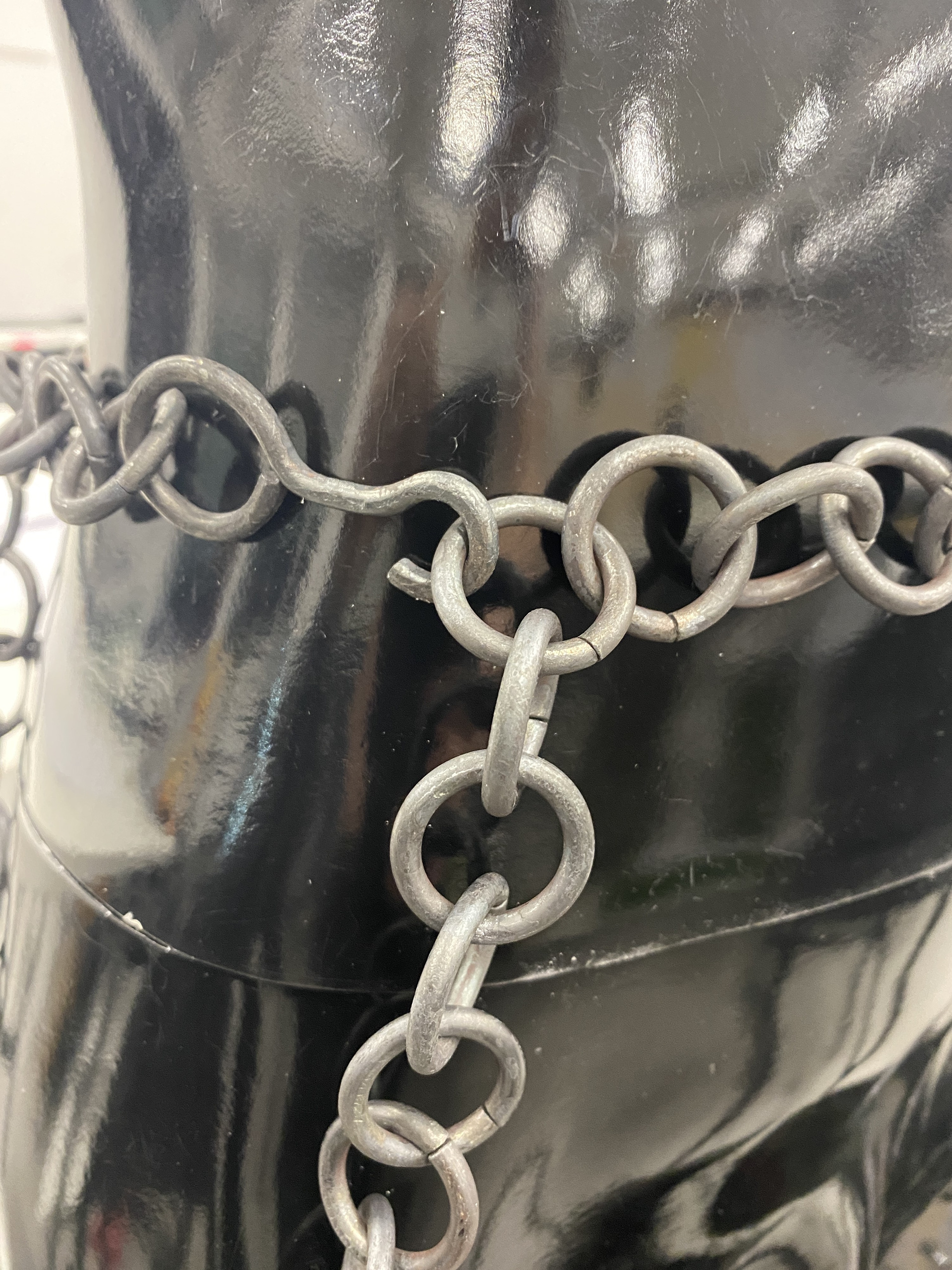
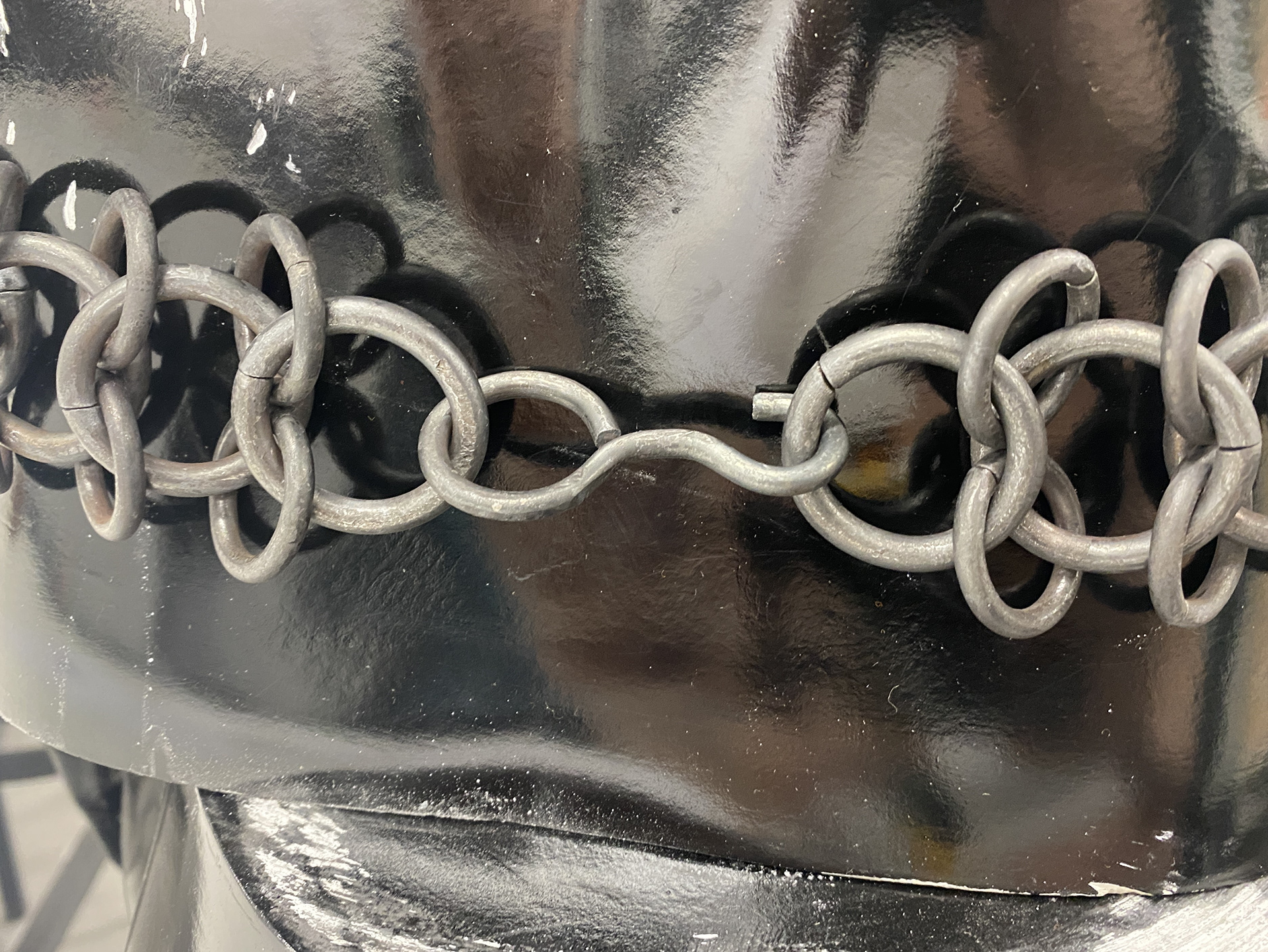
Having completed these I took them to the photoshoot alongside my Unit X piece 'Armoured Femininity'. I found that despite designing these as belts the applications were far greater. Both the model and stylist were placing them across different parts of the body and attaching them to various other cloths and accessories. One restriction I found during this was the length of the pieces didn't always stretch far enough, and I had to use a carabiner to extend it. To address this, I think I need to make a series of hooks and smaller sections of chain so that there is increased versatility.
Overall, I think these pieces were a success for the photoshoot but also serve as a test to make more commercialised batch produced items to be sold.
This experimental series helped me to develop my design style. Looking back at the construction of my unit X piece, I relied upon large sections of the same sized links. This created blocks of texture with different levels of penetration and translucency. However, I think that moving forwards incorporating different sizes of links in the same section will provide greater levels of concealment and visual interest.
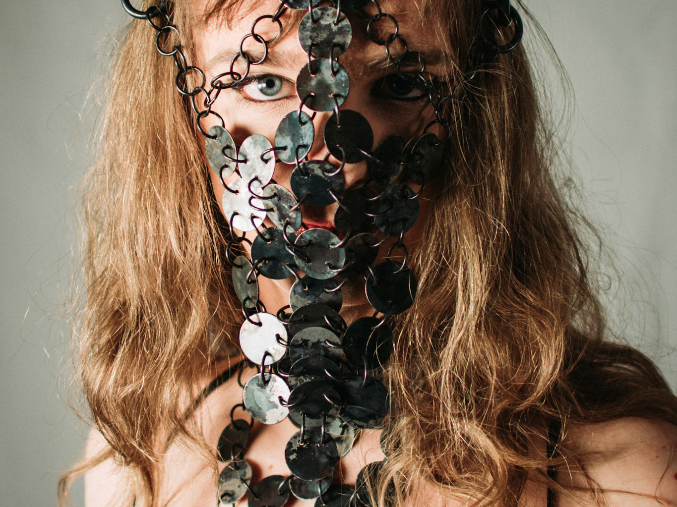
The Face
What personal insecurities, vulnerabilities or gender dysphoria do you attribute to this area? Describe in a few sentences or bullet points.
Facial Hair
Square face shape
How do you usually manage these insecurities, vulnerabilities or gender dysphoria in your day-to-day life? For example, using baggy clothing or makeup.
Makeup
Haircut framing the face
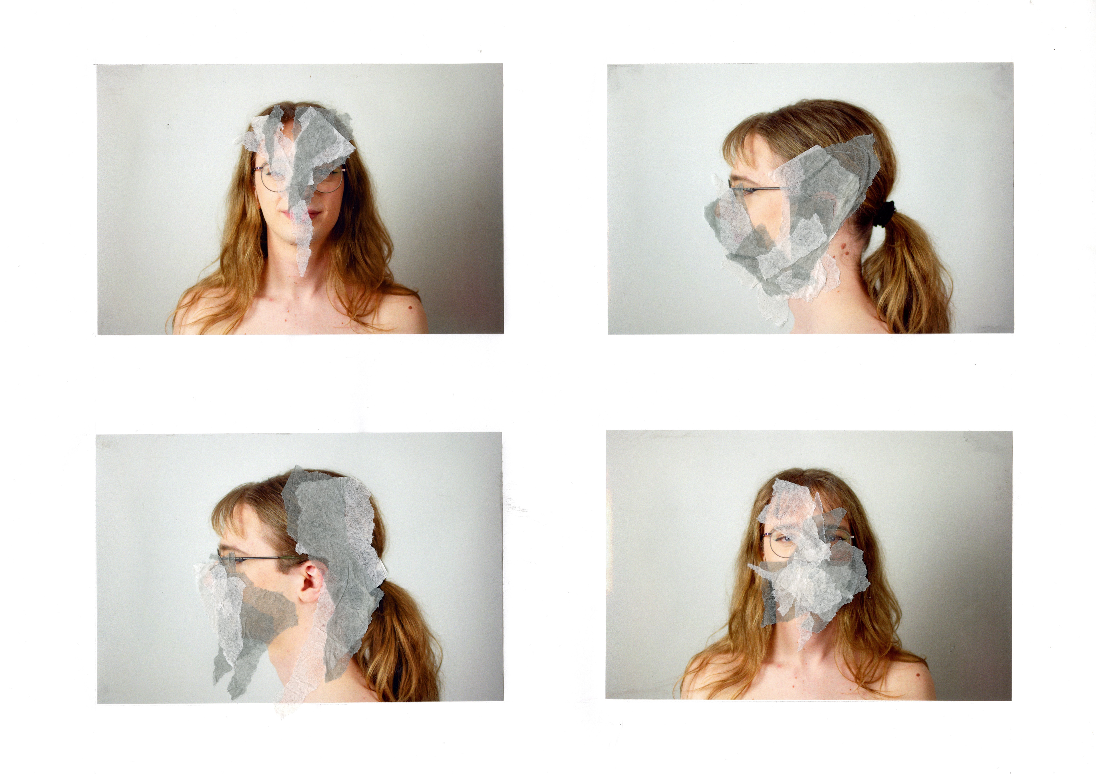
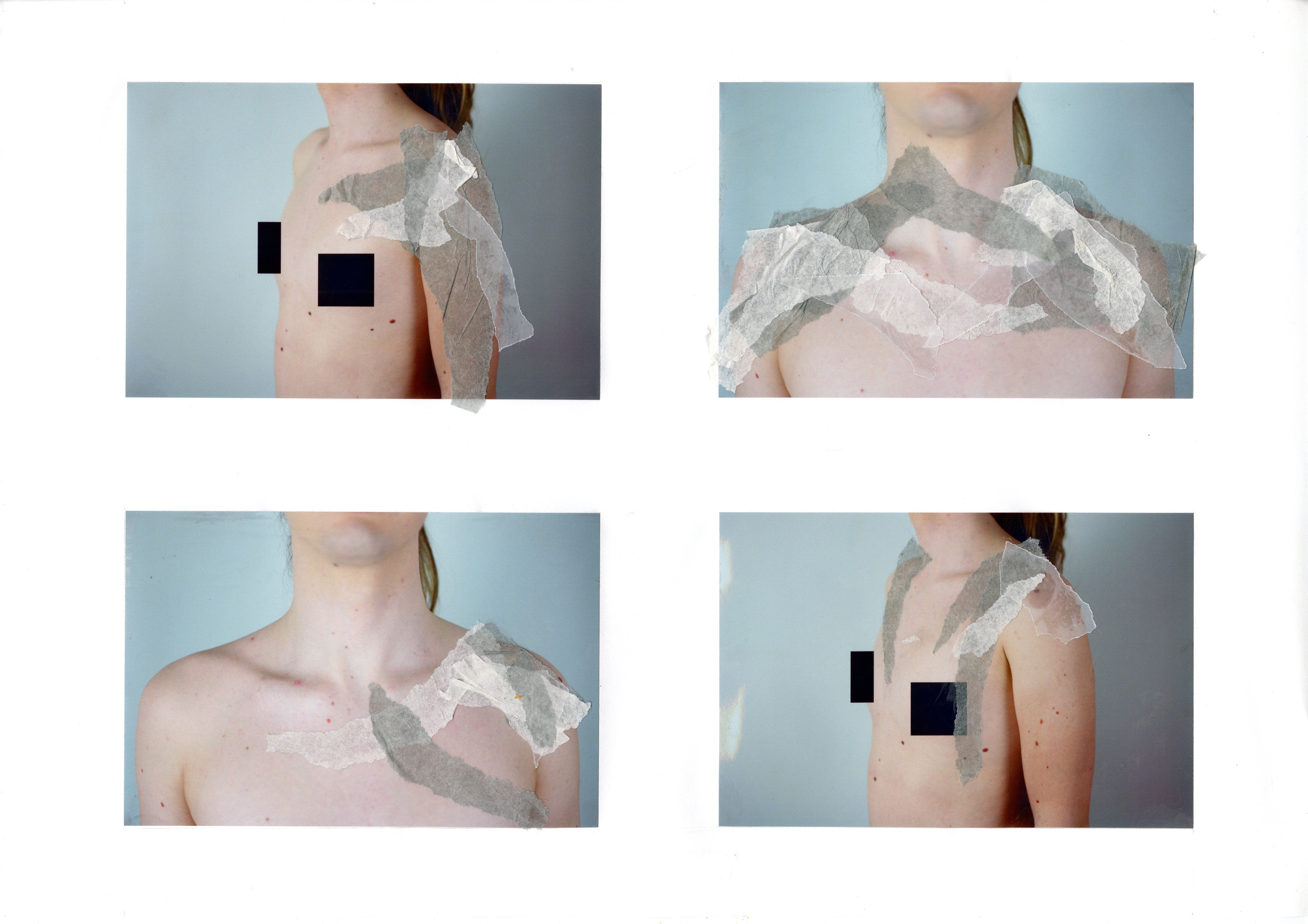
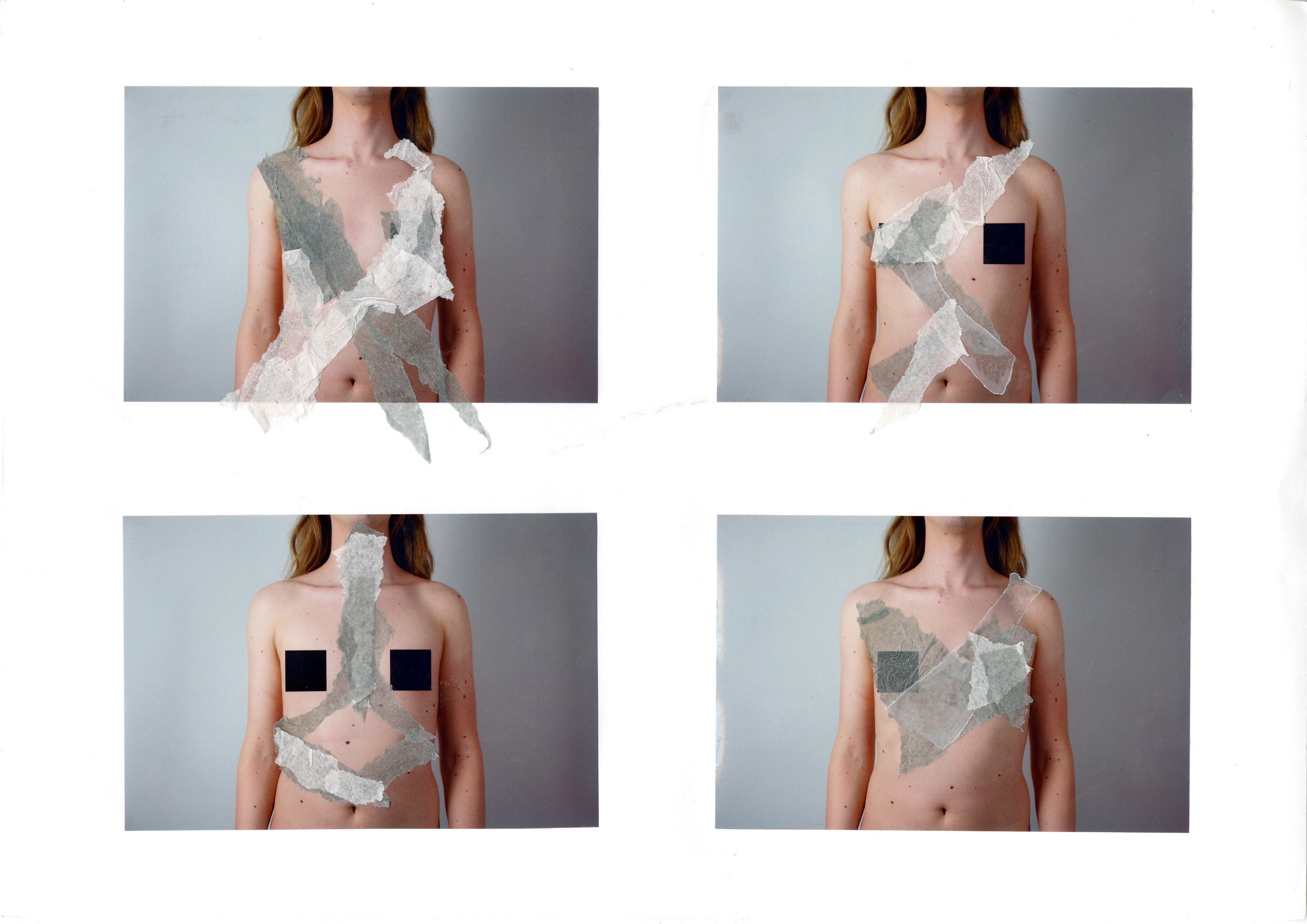
In these collages I sought to shroud and disrupt the view of the facial features. I initially focused on obscuring the view of the addressed issues and then branched this out to remove other key identifying features. I still wanted there to be a glimpse through to the wearer to keep the humanity.
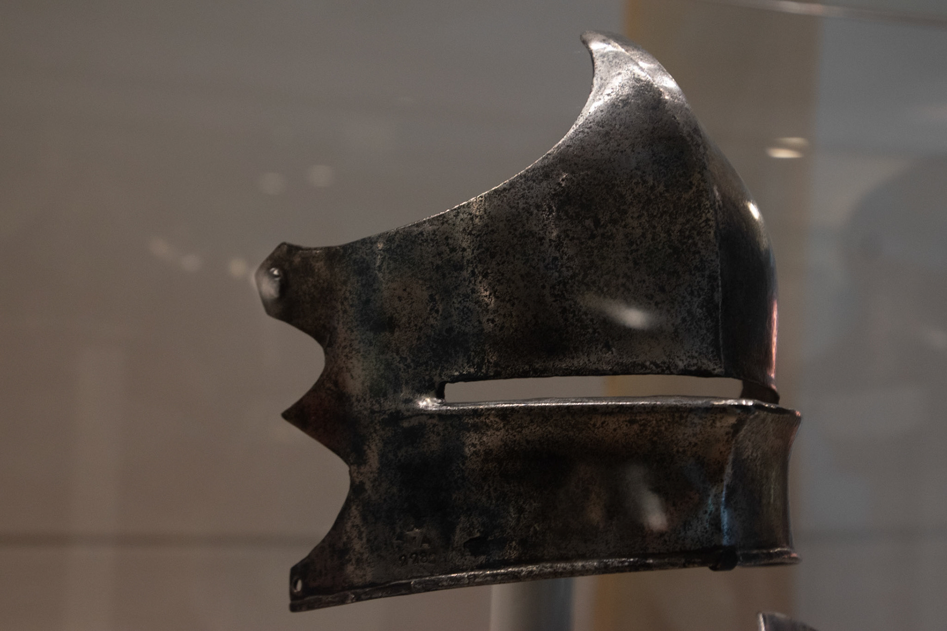
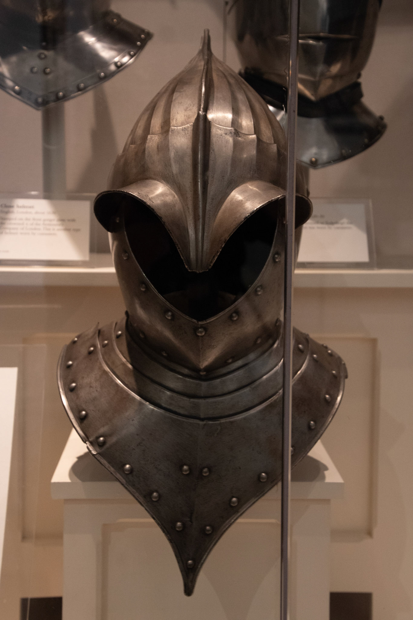
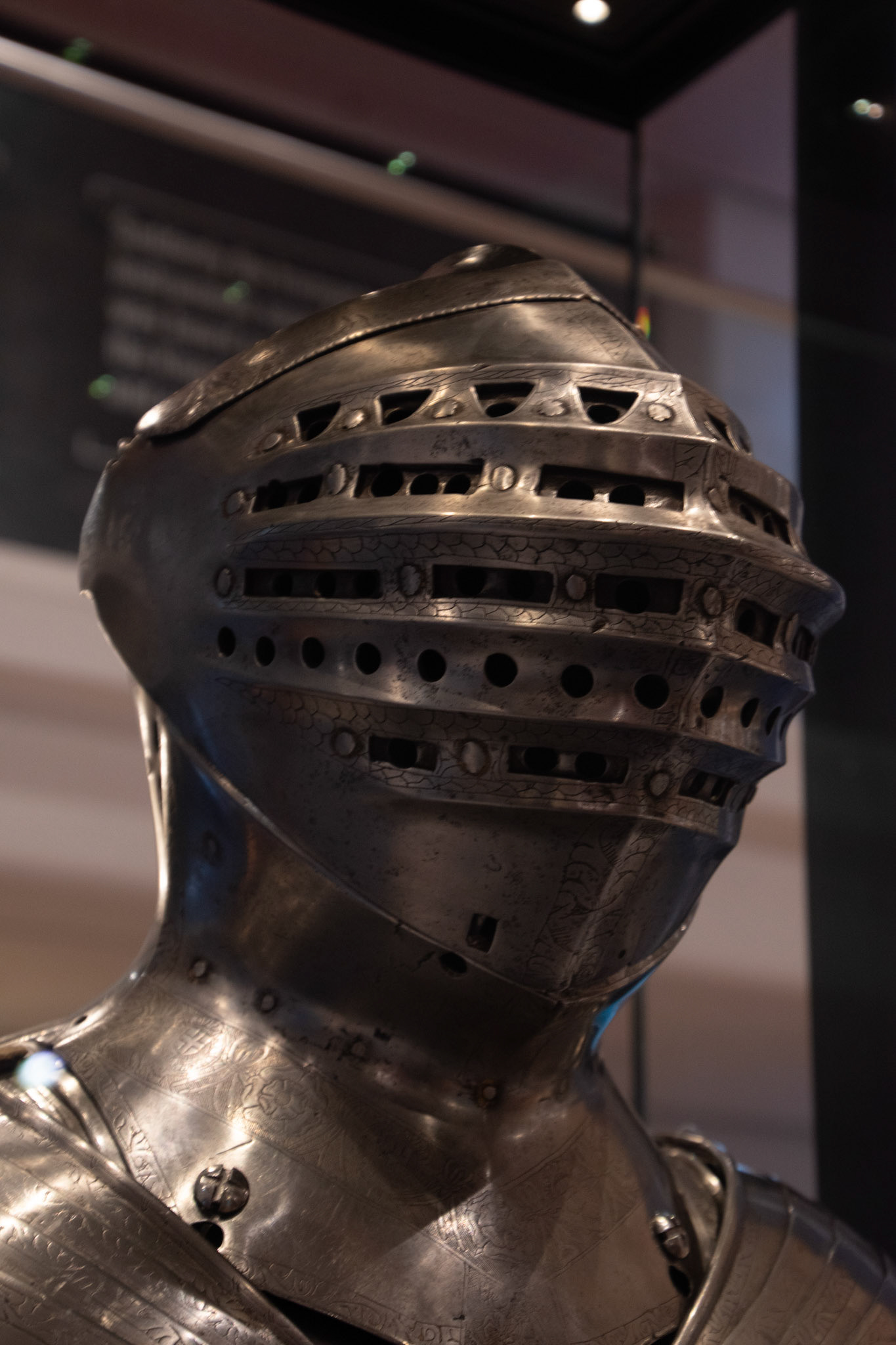
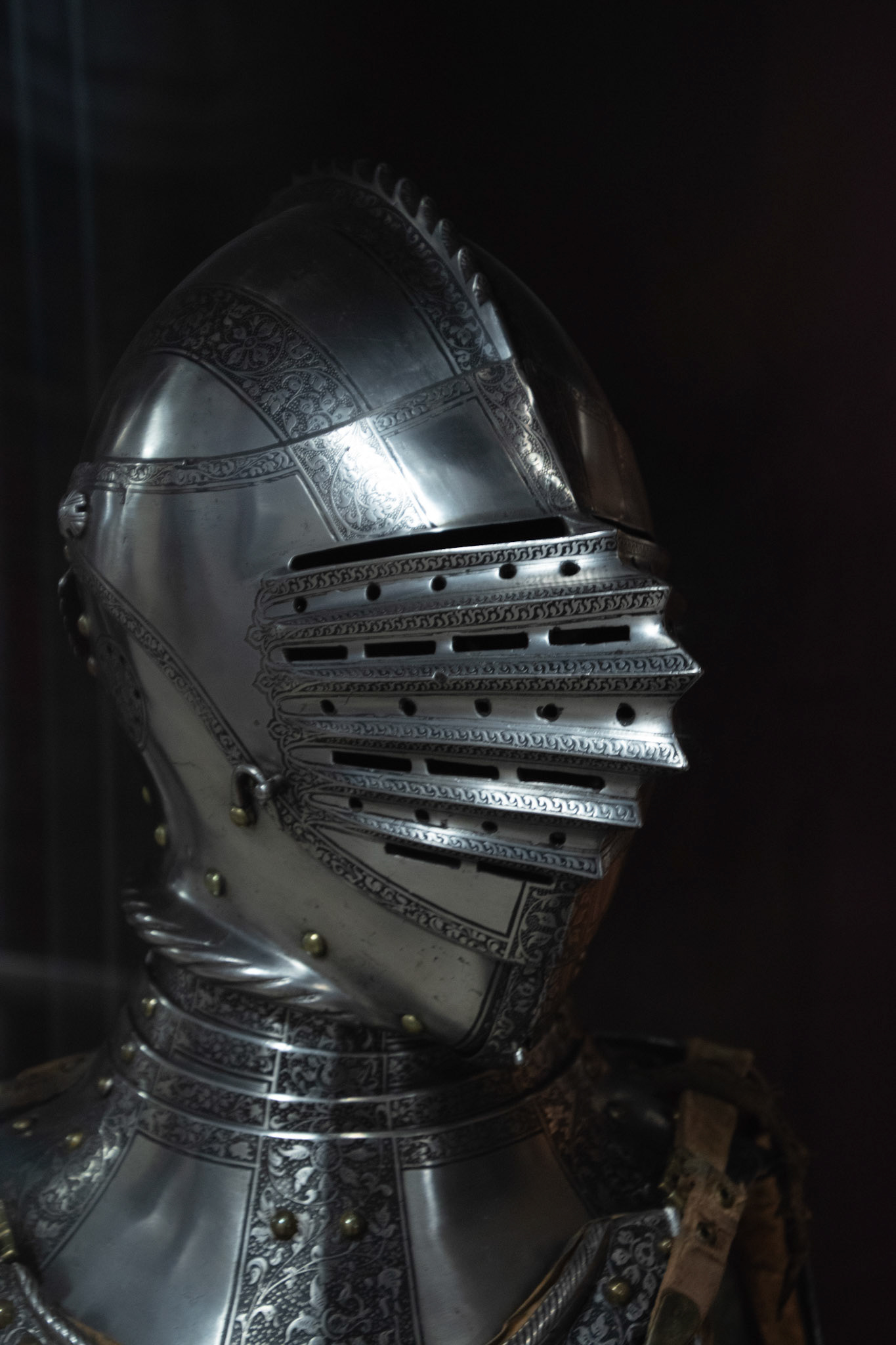
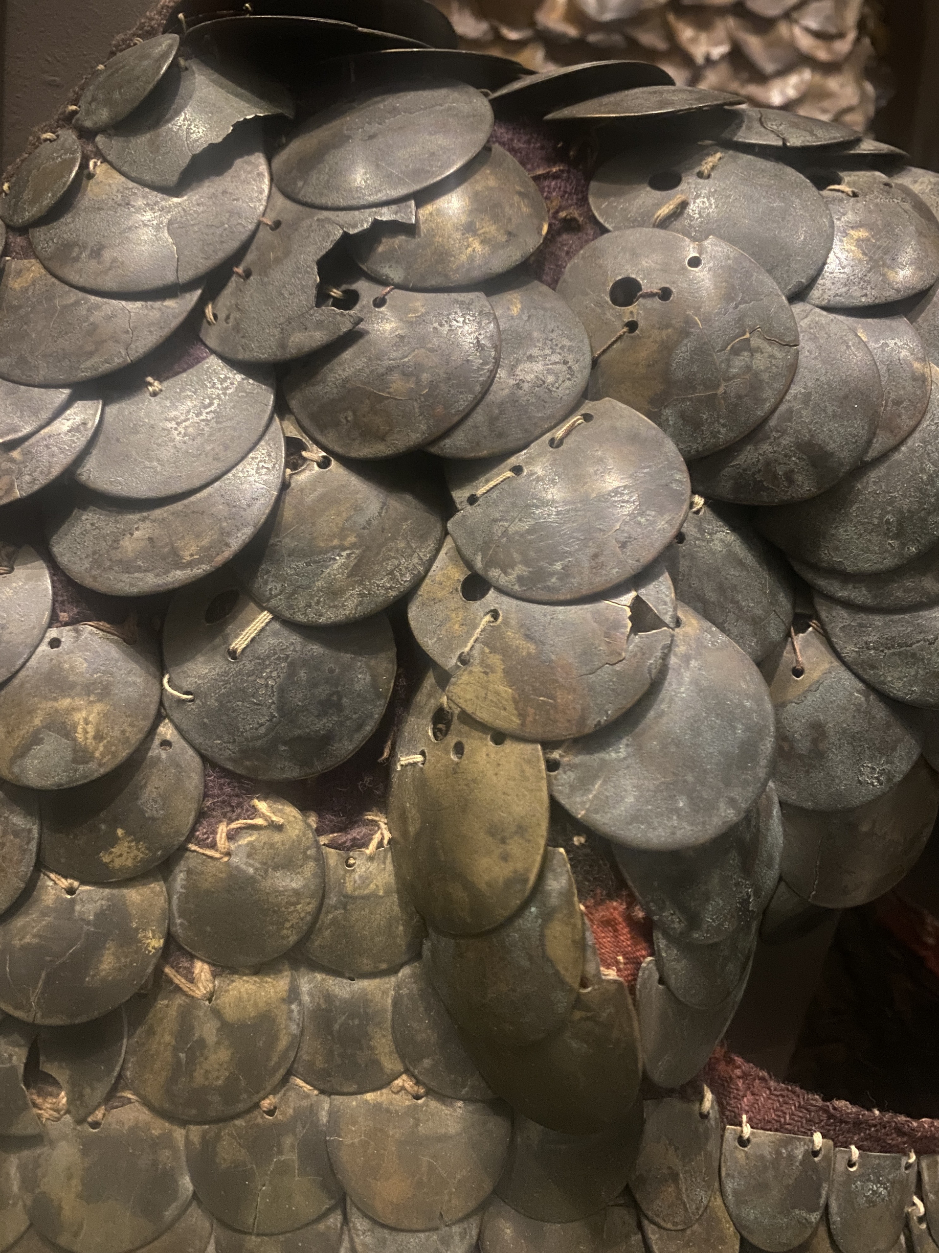
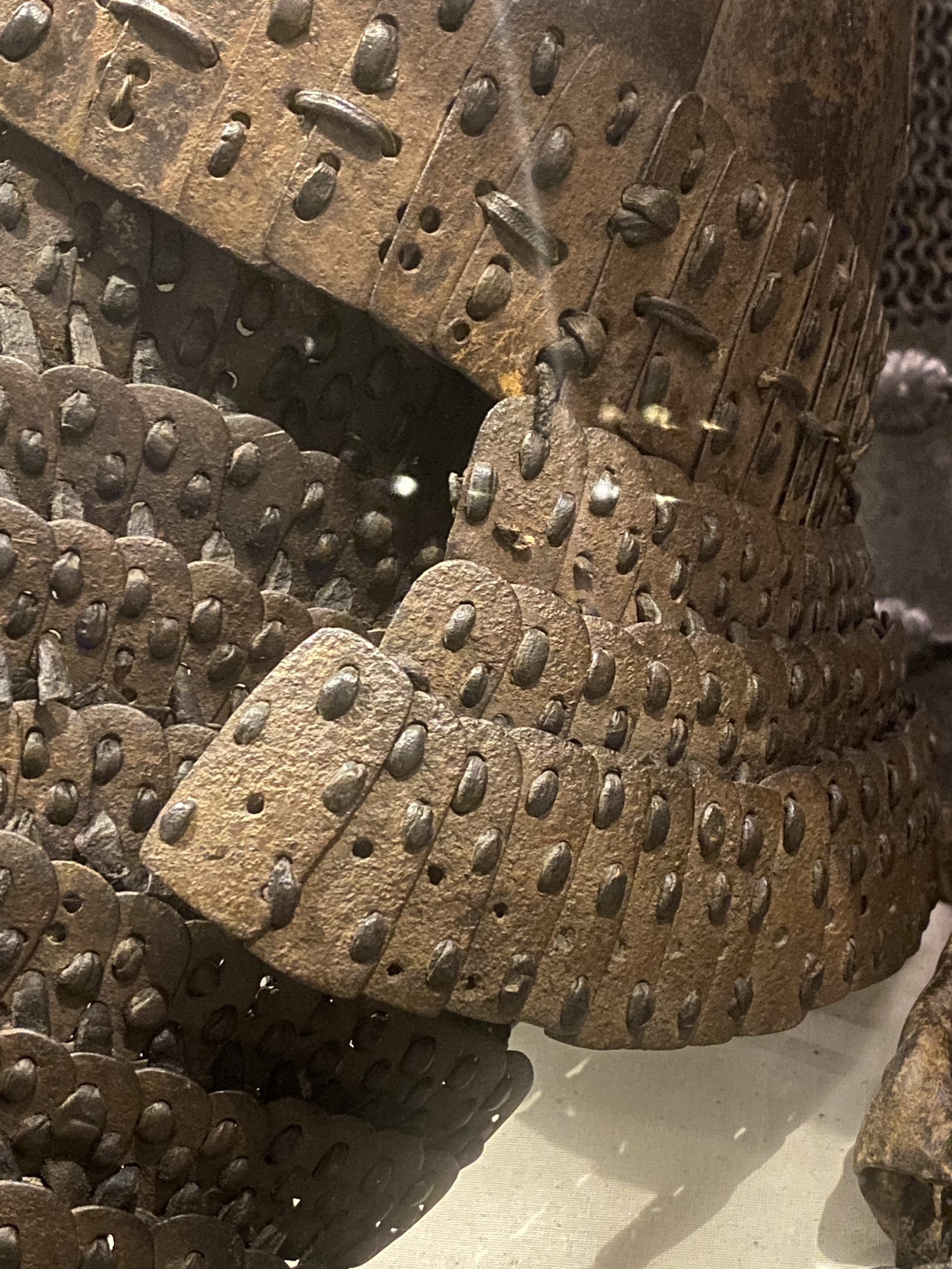
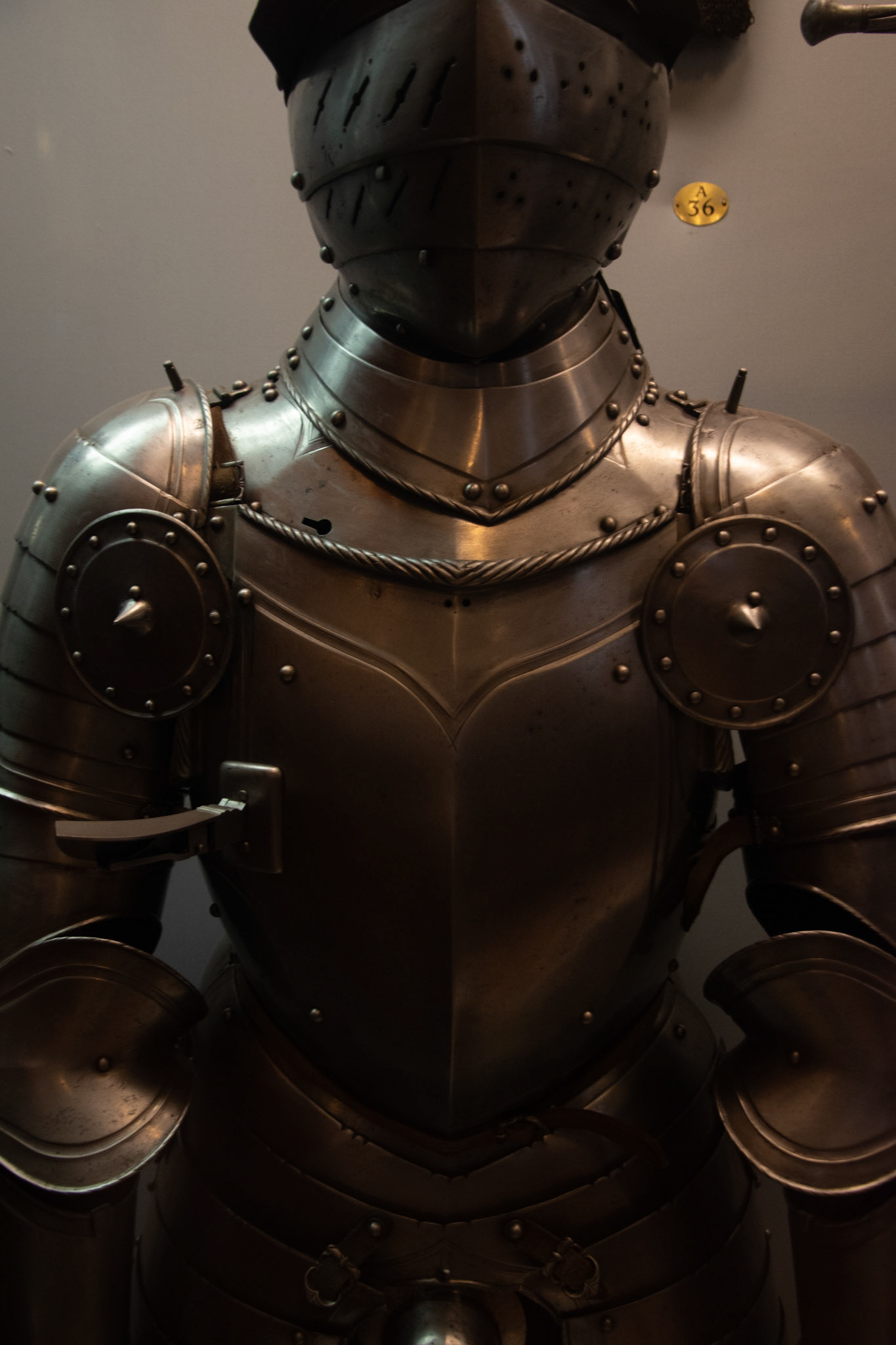
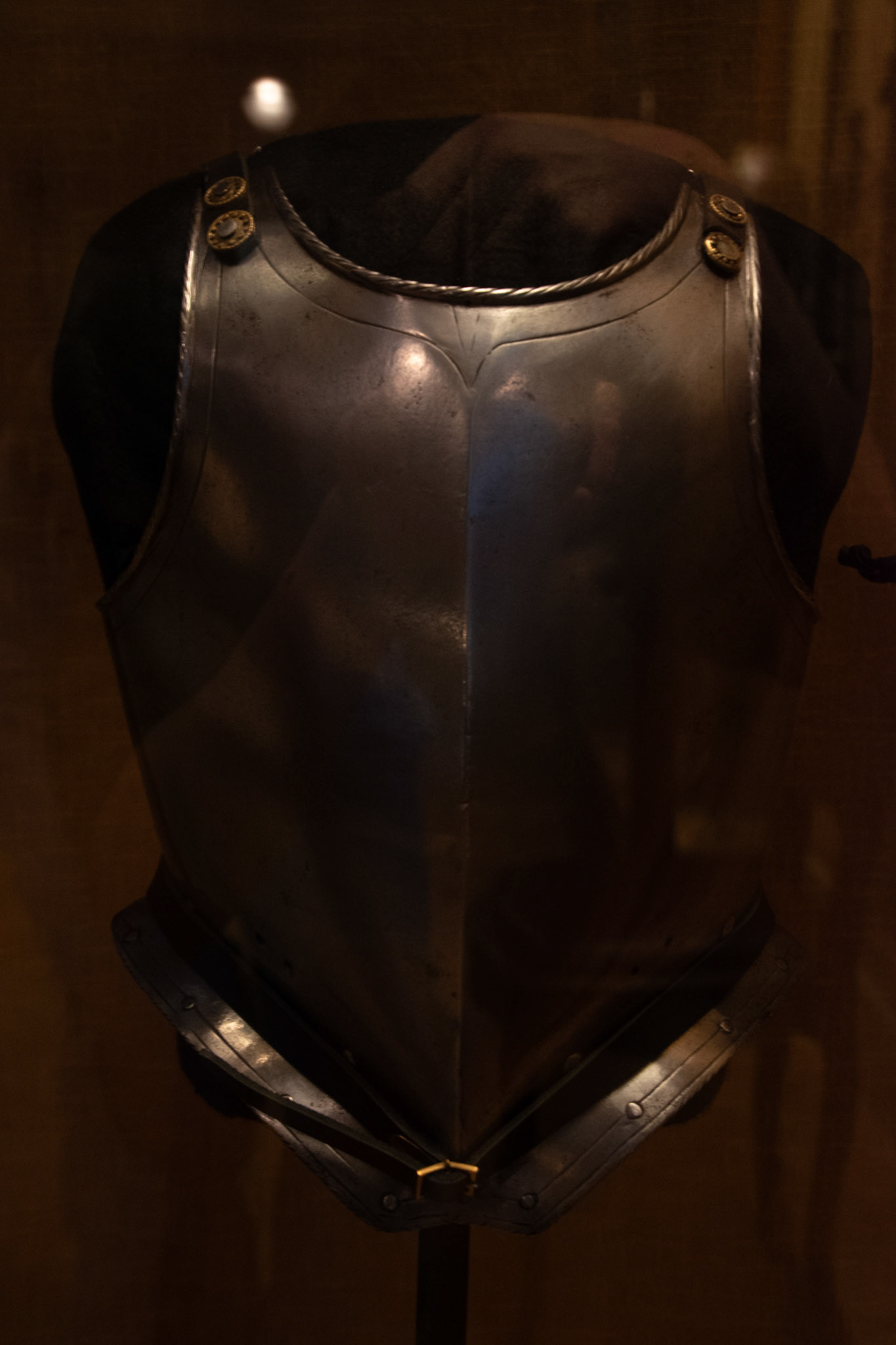
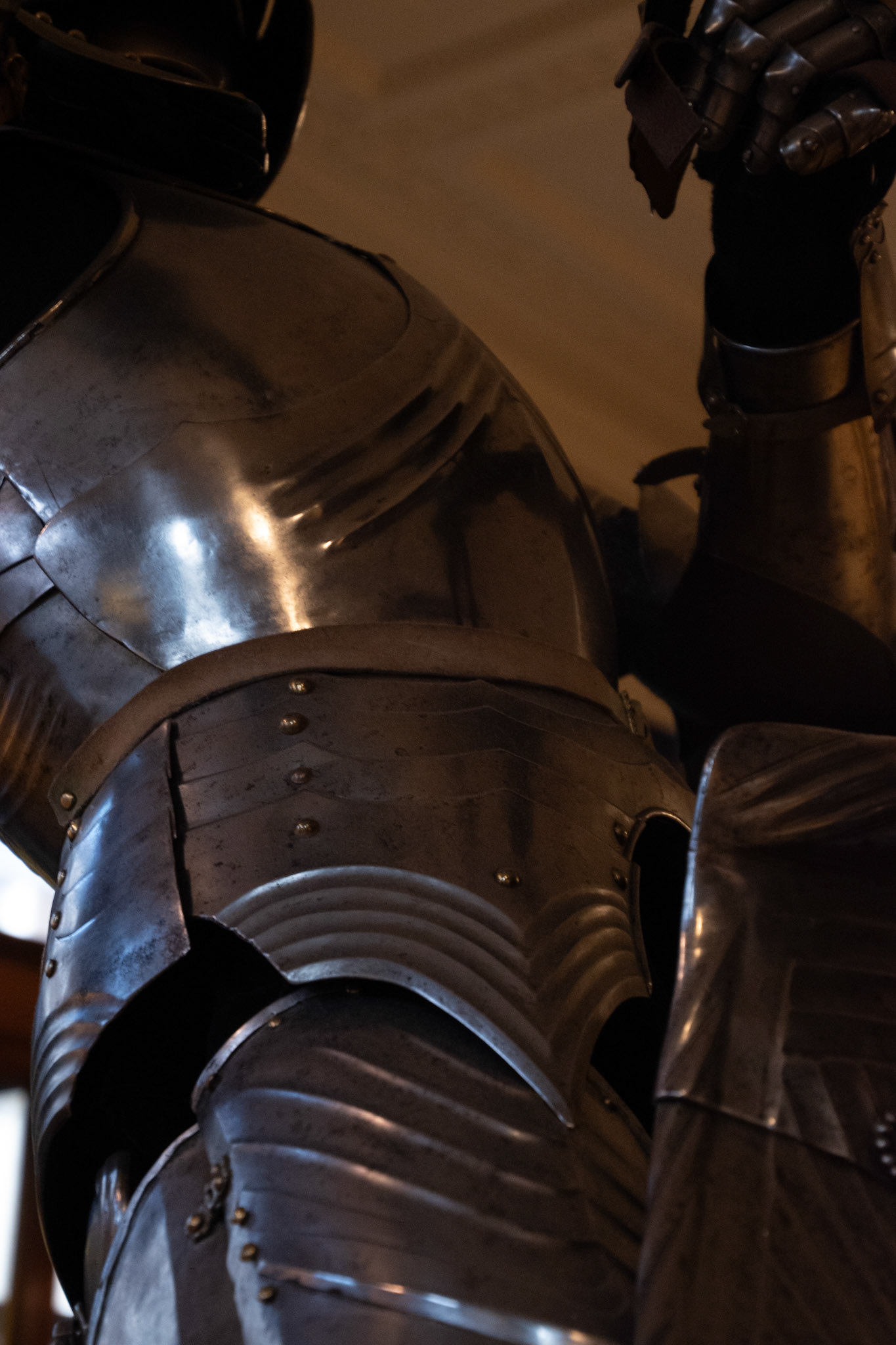
Inspiration imagery from Gallery visits
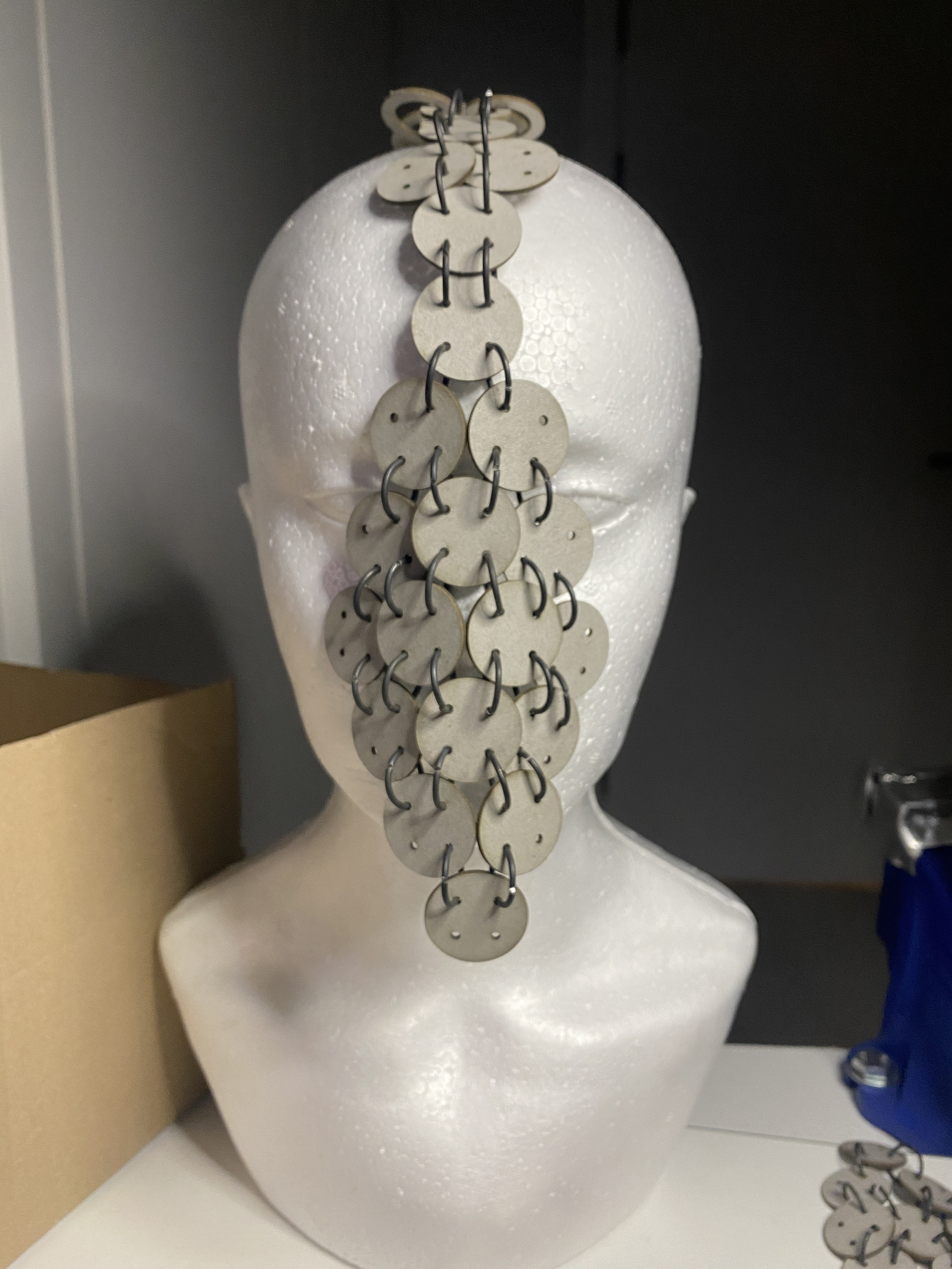
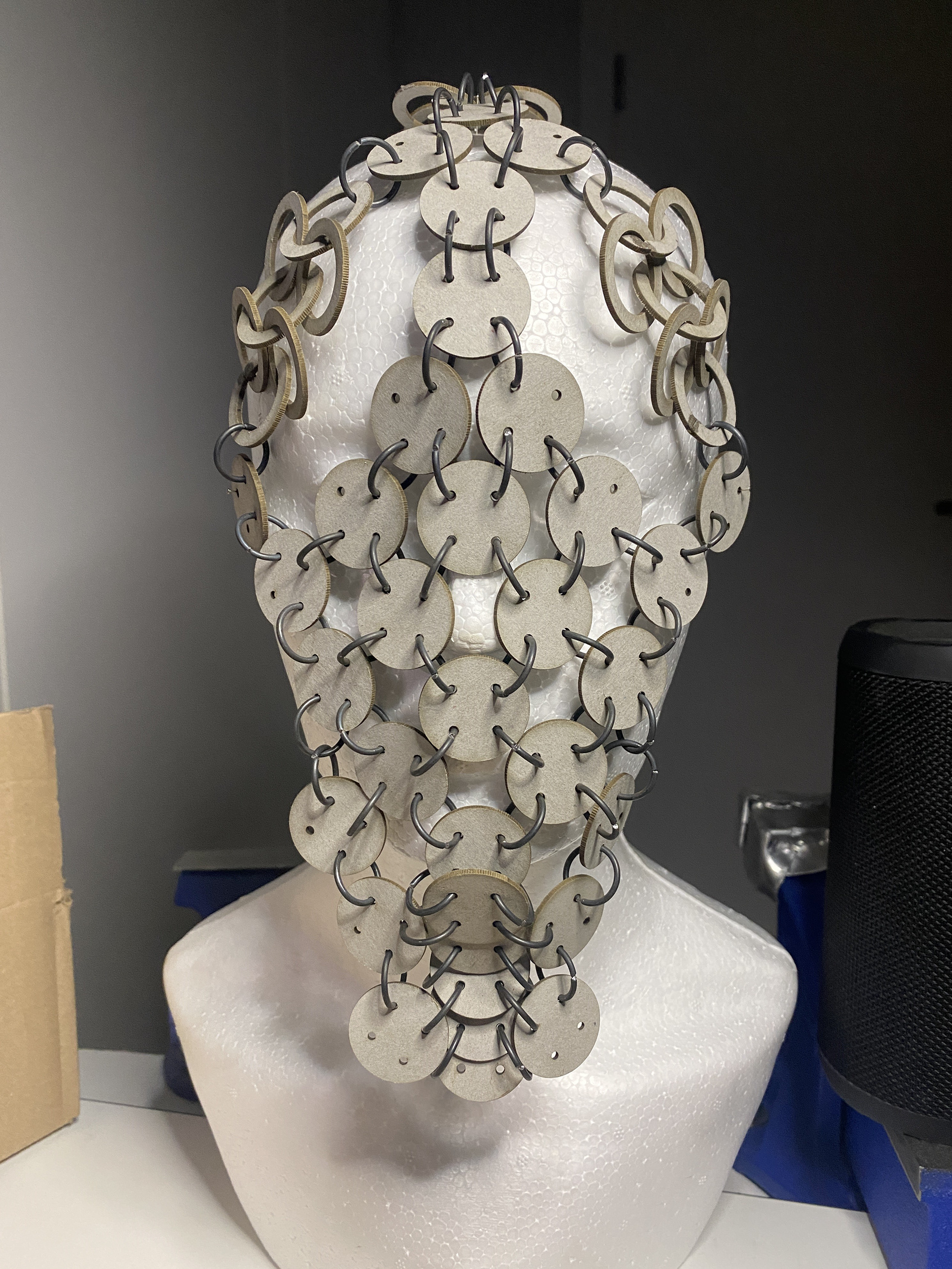
Working from the collages as inspiration, I began modelling using the laser cut links. For the face, I wanted to increase the coverage without making the piece too heavy, so I explored using the linked sheet mail as the starting point. I found that the effects of gravity and the surface of the face greatly altered the drape of the piece. Therefore, I continuously placed the work onto the mannequin head to investigate these effects. The reduced surface area of the head, compared to other locations I had worked with before, proved to be a challenge. Consequently, I focused on small components to cover the key facial features first before fleshing out the rest of the design. One consideration while designing was the weight of the piece and its balance, ensuring it didn’t force the head into one fixed position. I placed most of the larger links directly on top of the head, allowing them to drape down the back with chains to counterbalance the front components.
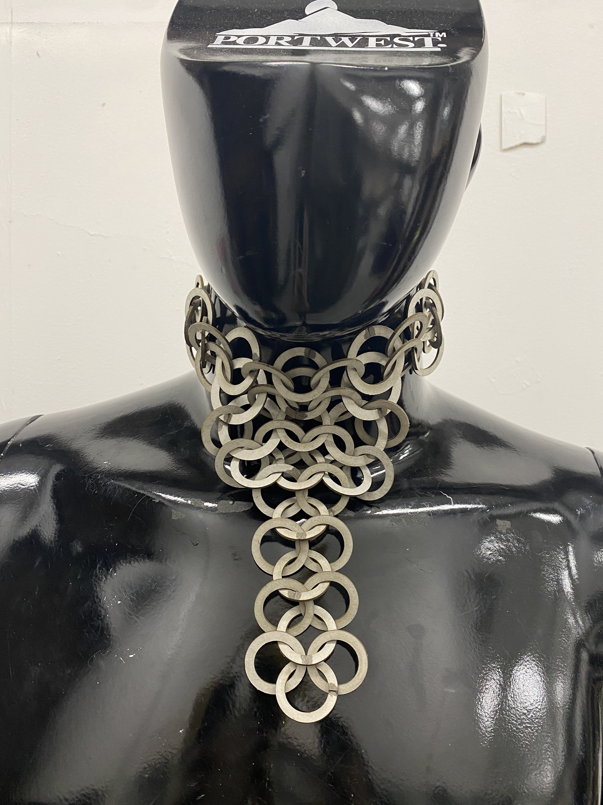
The Throat/Neck
What personal insecurities, vulnerabilities or gender dysphoria do you attribute to this area? Describe in a few sentences or bullet points.
Facial Hair
The Adams apple
Deepness of the voice
Location which displays the feelings of anxiety
How do you usually manage these insecurities, vulnerabilities or gender dysphoria in your day-to-day life? For example, using baggy clothing or makeup.
Makeup
Regular shaving
Reducing talking
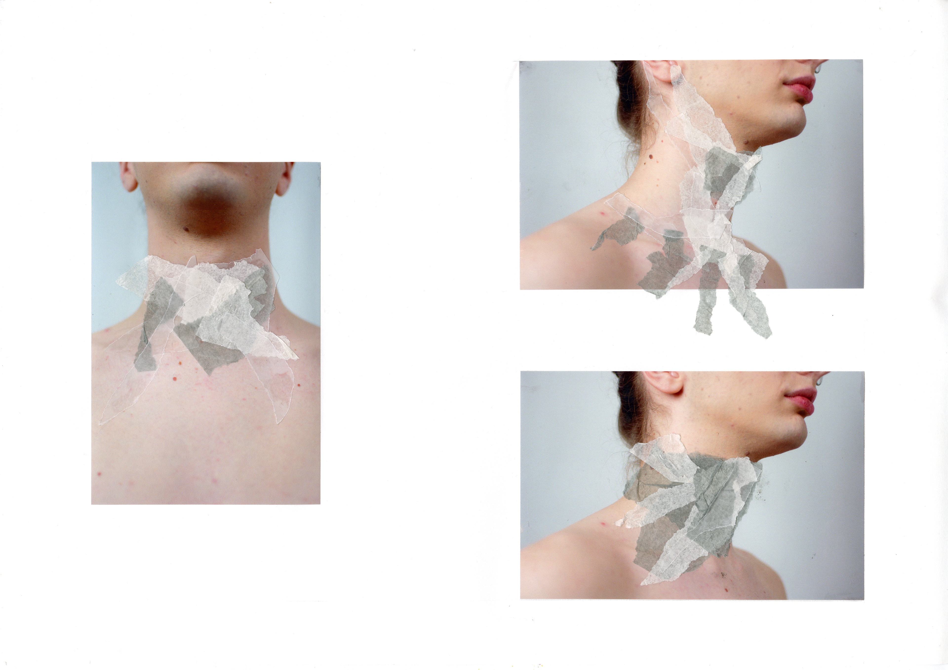
In these collages I focused on completely concealing the throat, leaving no visible signs of the Adams apple. I also experimented with drawing the eye away without stretching sections that spread down and onto the chest. I think that the layering of textures and components is the most effective part of these drawing which I want to experiment with the further with the grey board experiments.
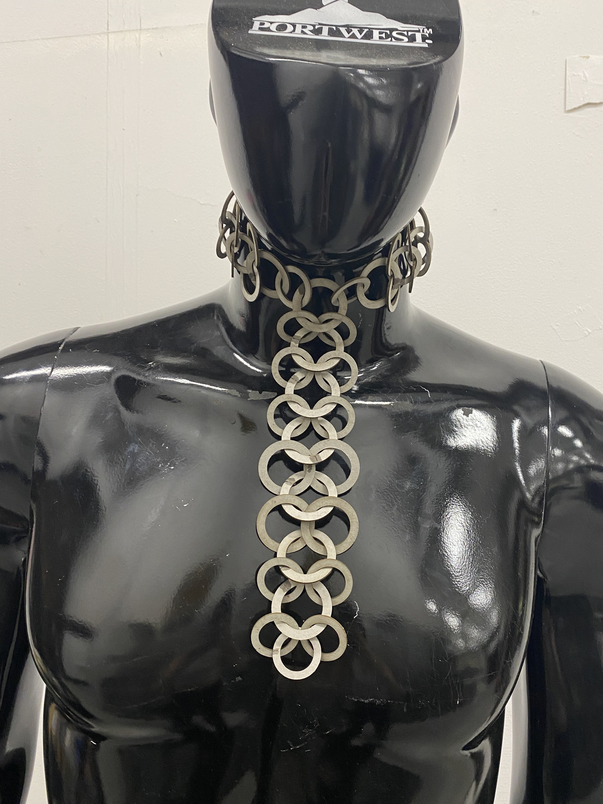
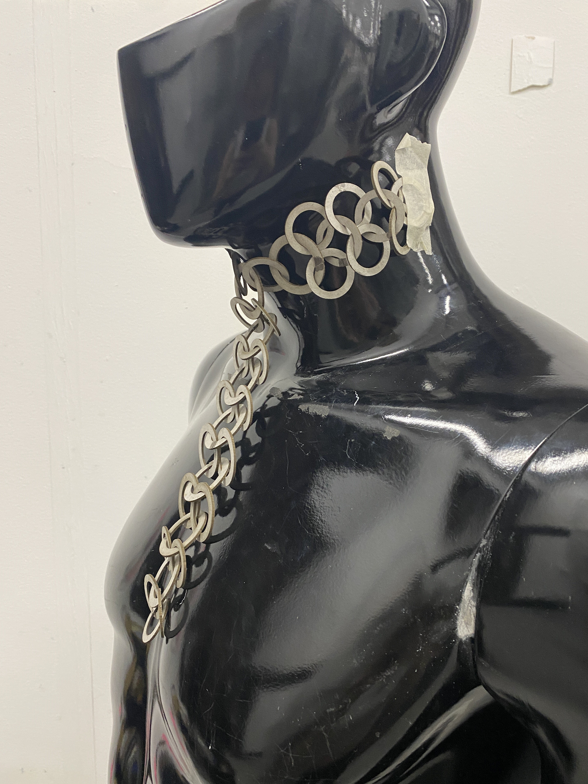
My initial models failed to achieve the desired outcome of concealing and redirecting; instead, they had the opposite effect, drawing all the attention to the neck. The sections that draped down the chest like a necklace acted as an arrow pointing directly at the area of insecurity. Additionally, the size of the chain made it difficult to wrap around the neck, becoming cumbersome. Finally, the bulky aesthetic and the resemblance to a necktie resulted in a masculine appearance, which contradicted the original intentions.
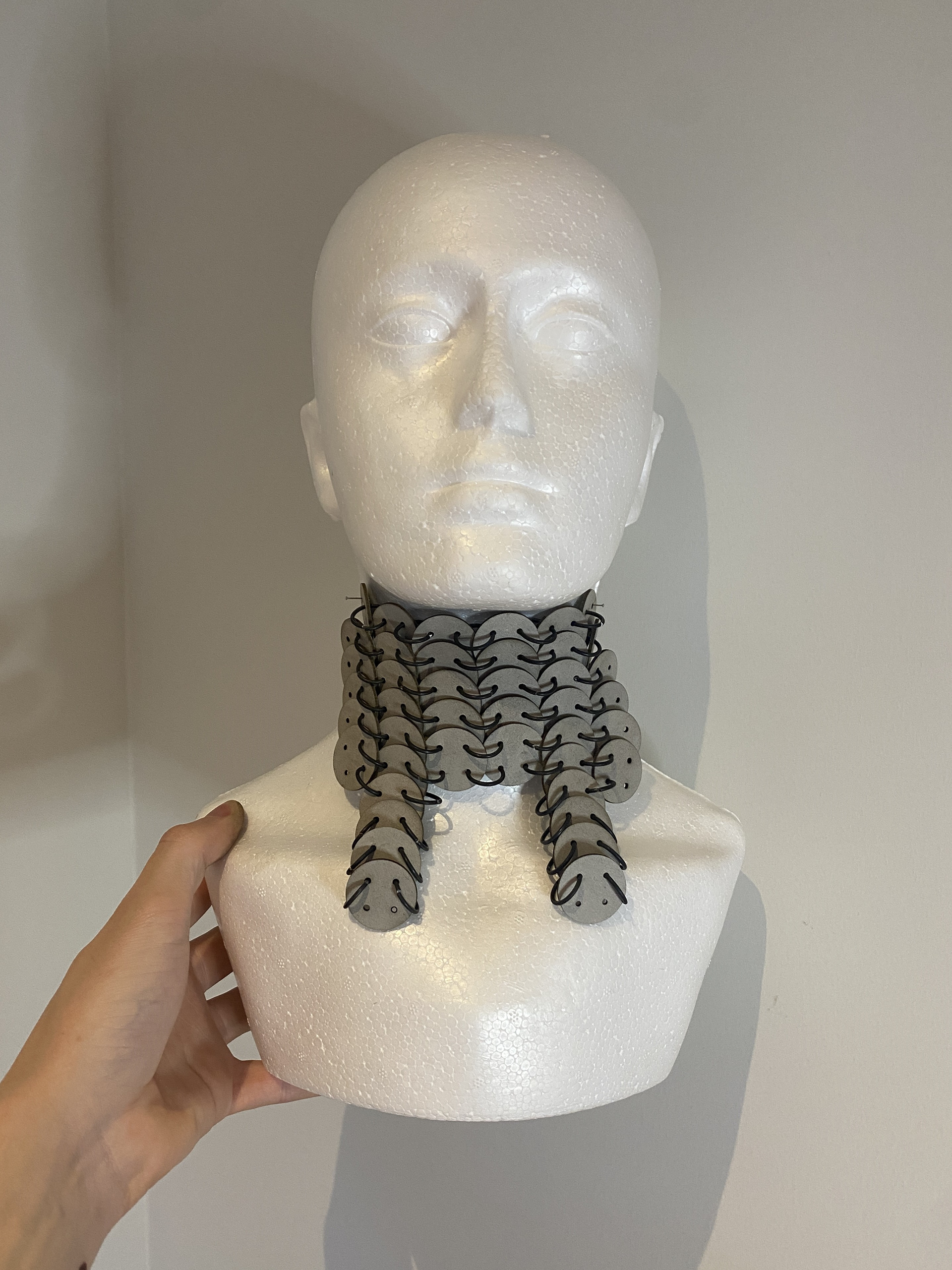
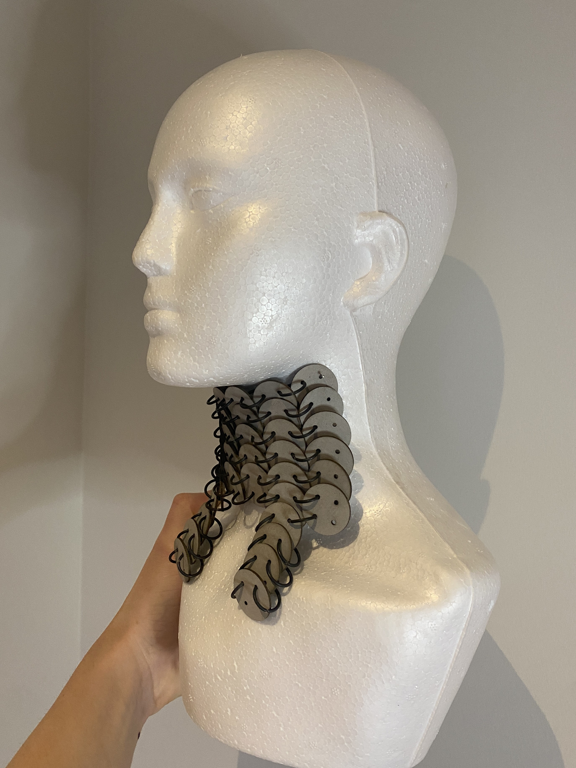
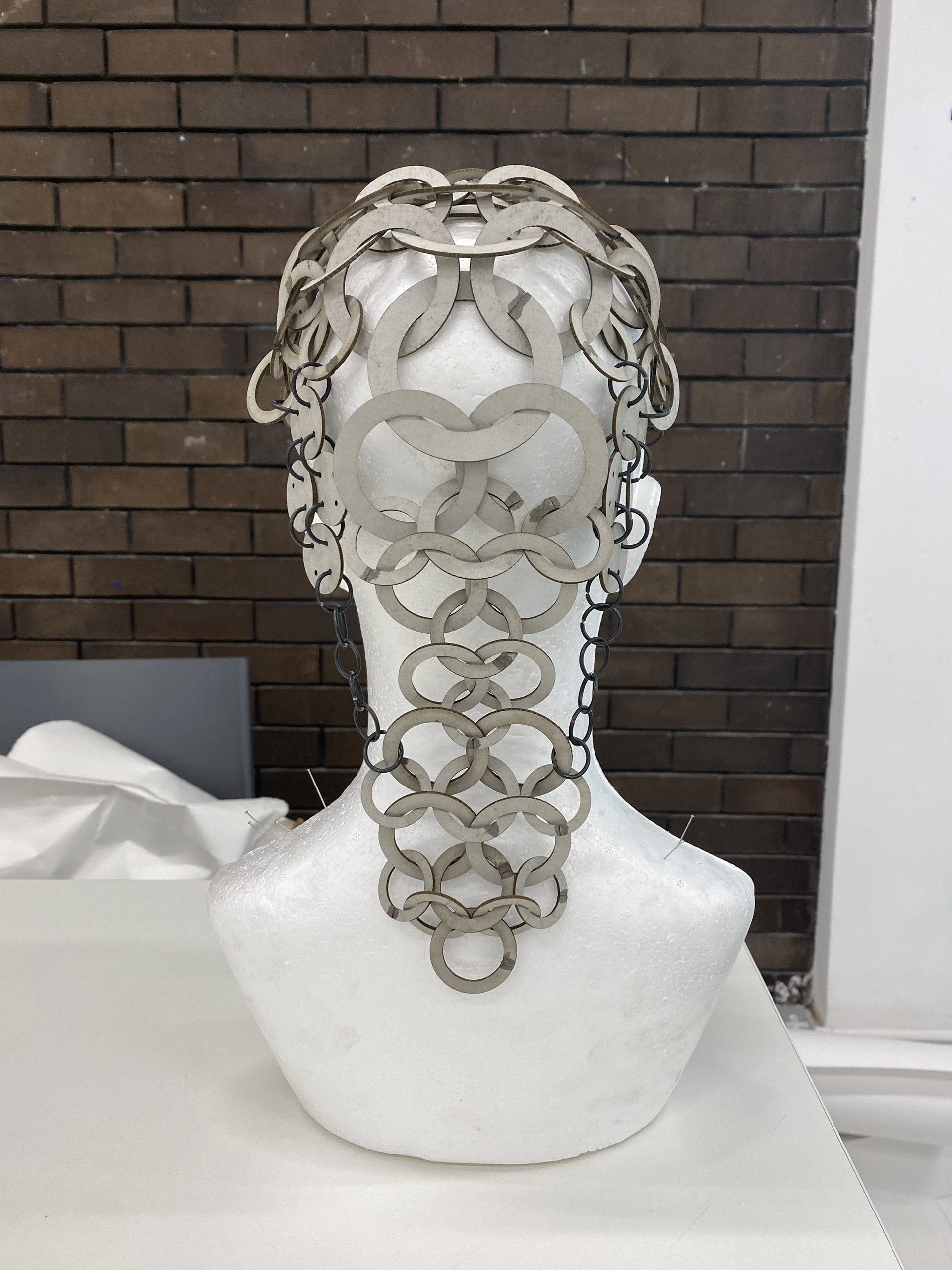
Drawing inspiration from the collages, I aimed to fully conceal the neck and returned to experimenting with plate mail. I used a technique of joining circular sheets together with jump rings and overlapping them to create a continuous, impenetrable structure. While this method worked well on a slightly curved surface, it struggled to conform to the tight bend of the neck. The result was a stiff and bulky design, which I felt lacked potential for this specific body location but could be suitable for others.

Inspiration imagery from Gallery visits
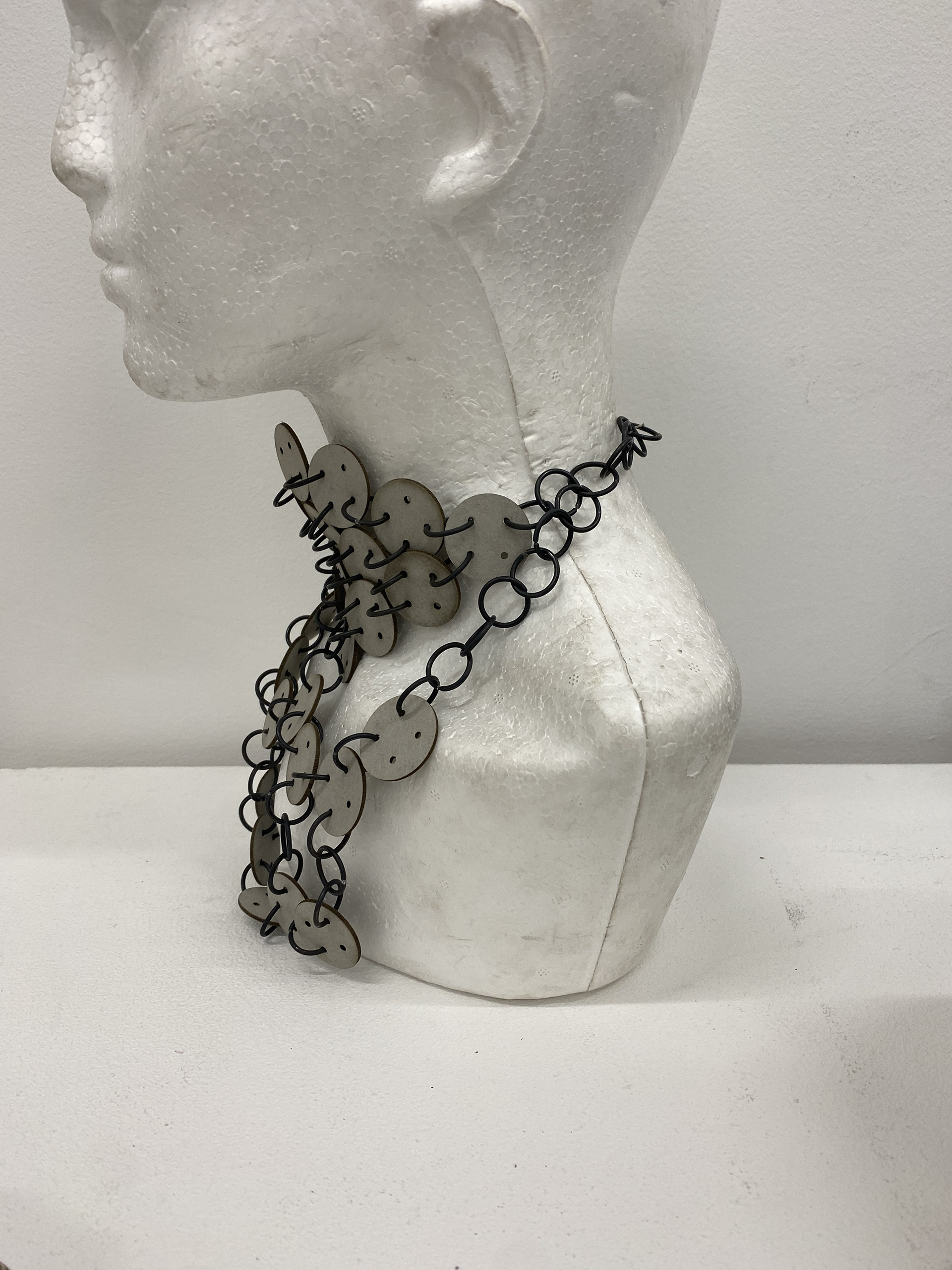
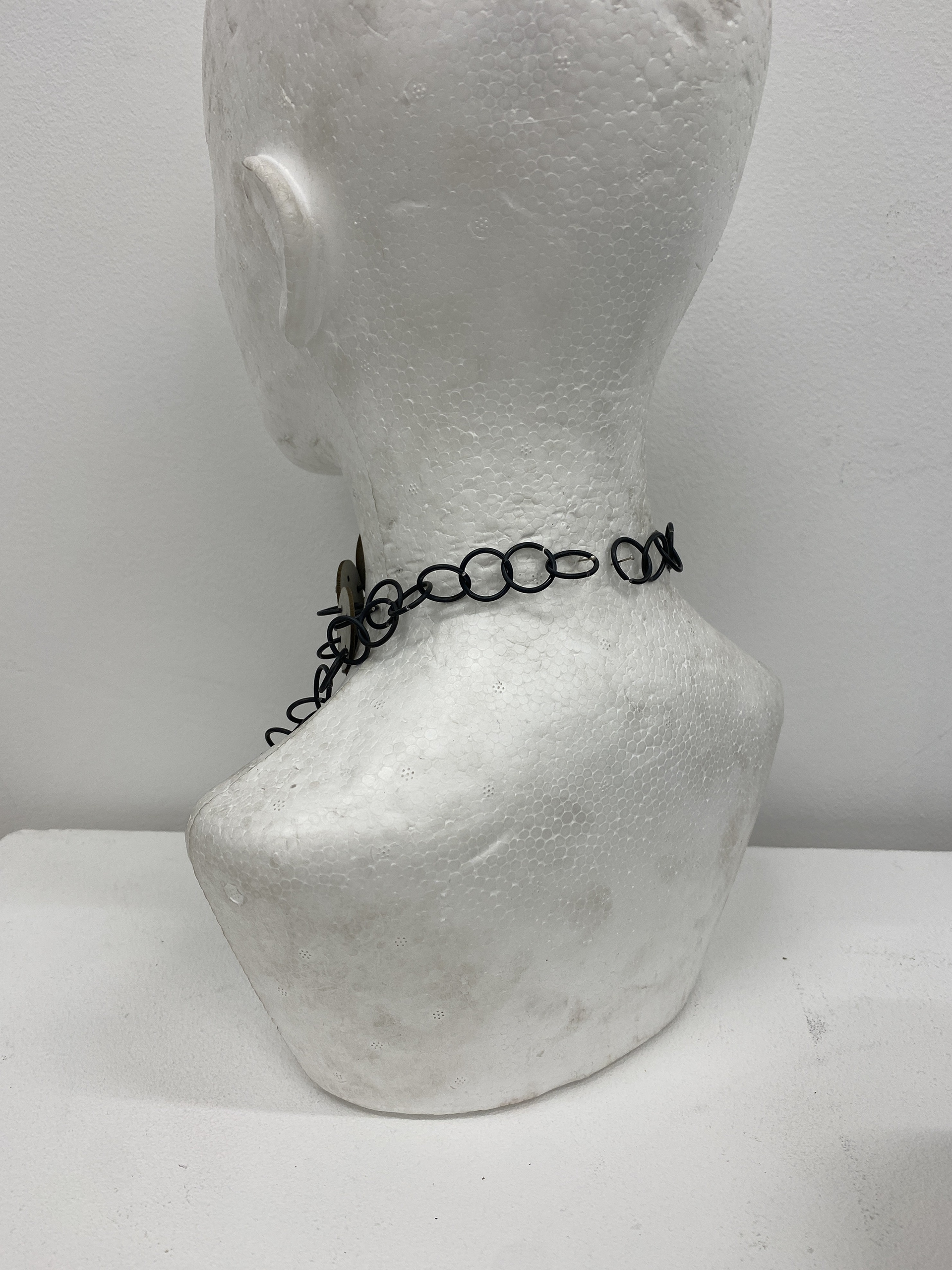
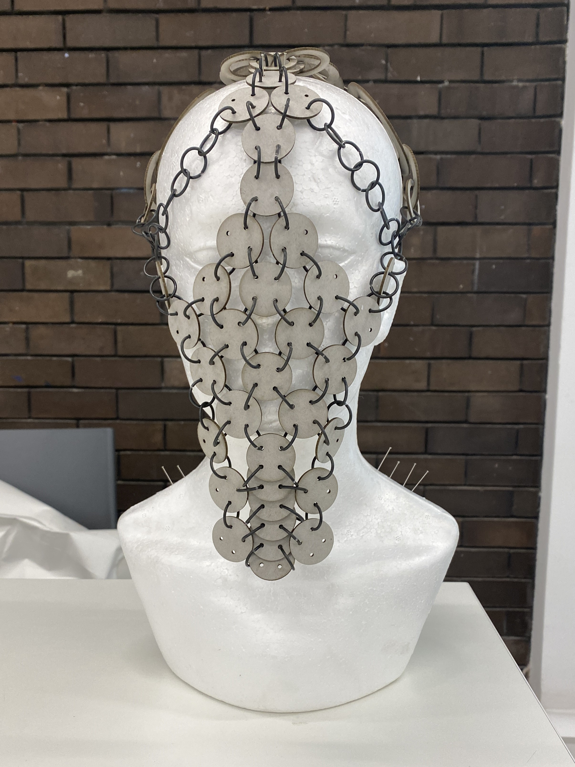
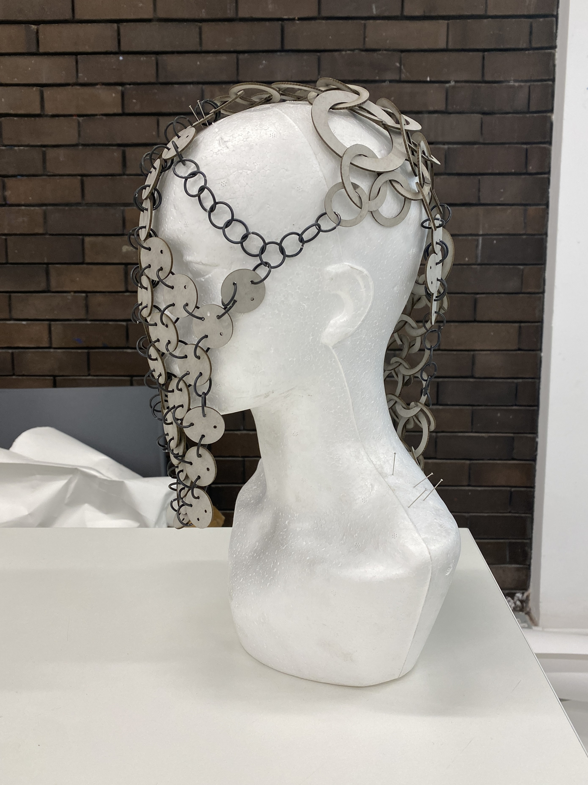
I changed my approach for this piece, focusing on initially creating a flexible structure that could bend comfortably around the neck. This design used the same weave as the face piece, connecting each circle to four others. However, this time I rotated the structure by 45 degrees, forming a diamond shape and placing it under tension to close the gaps, creating an impenetrable layer. I then complemented this with a series of draping chains to redirect attention downward, drawing the eyes away from the insecurities.
The Throat/Neck paired with the Face (Head)
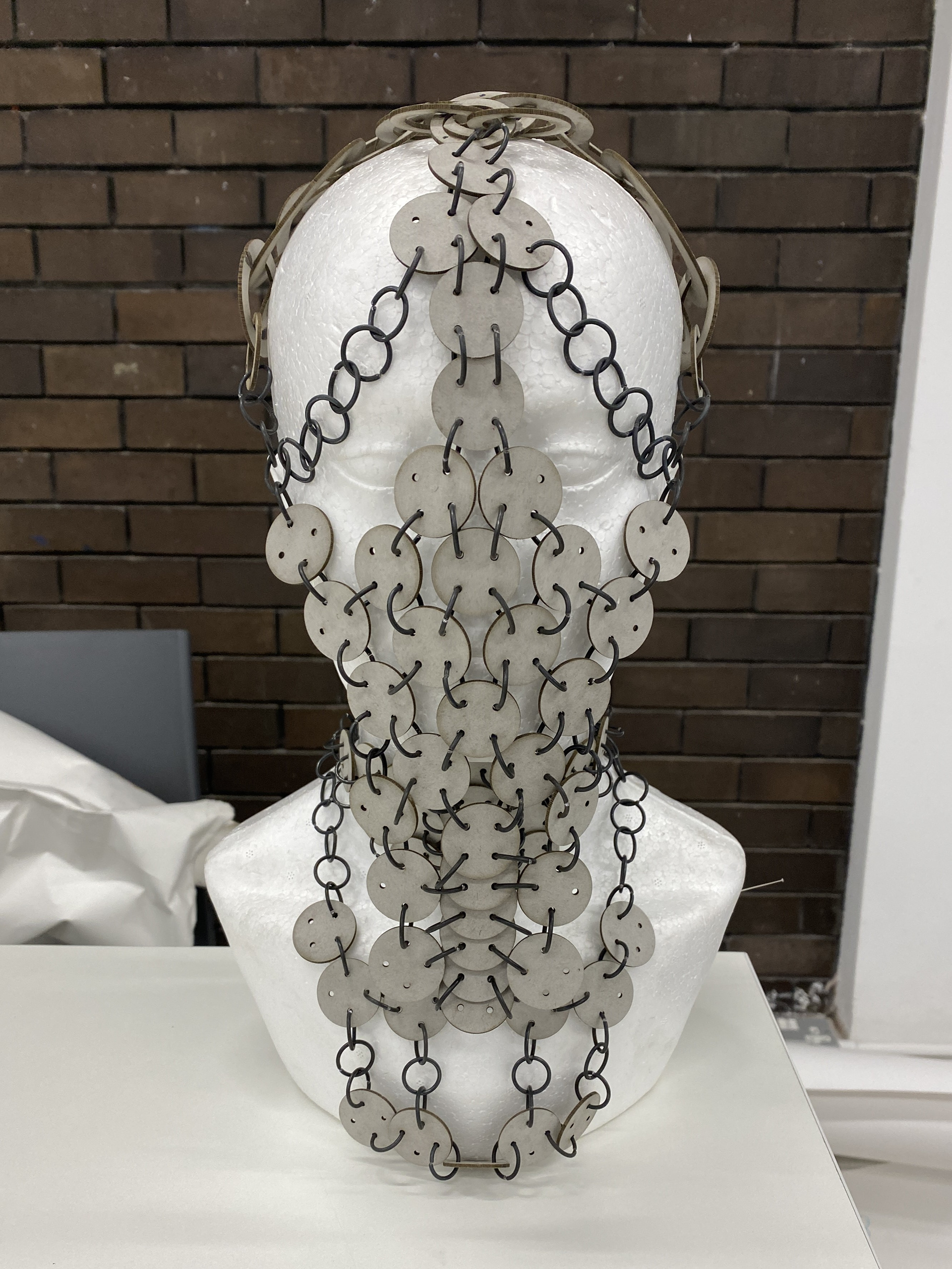
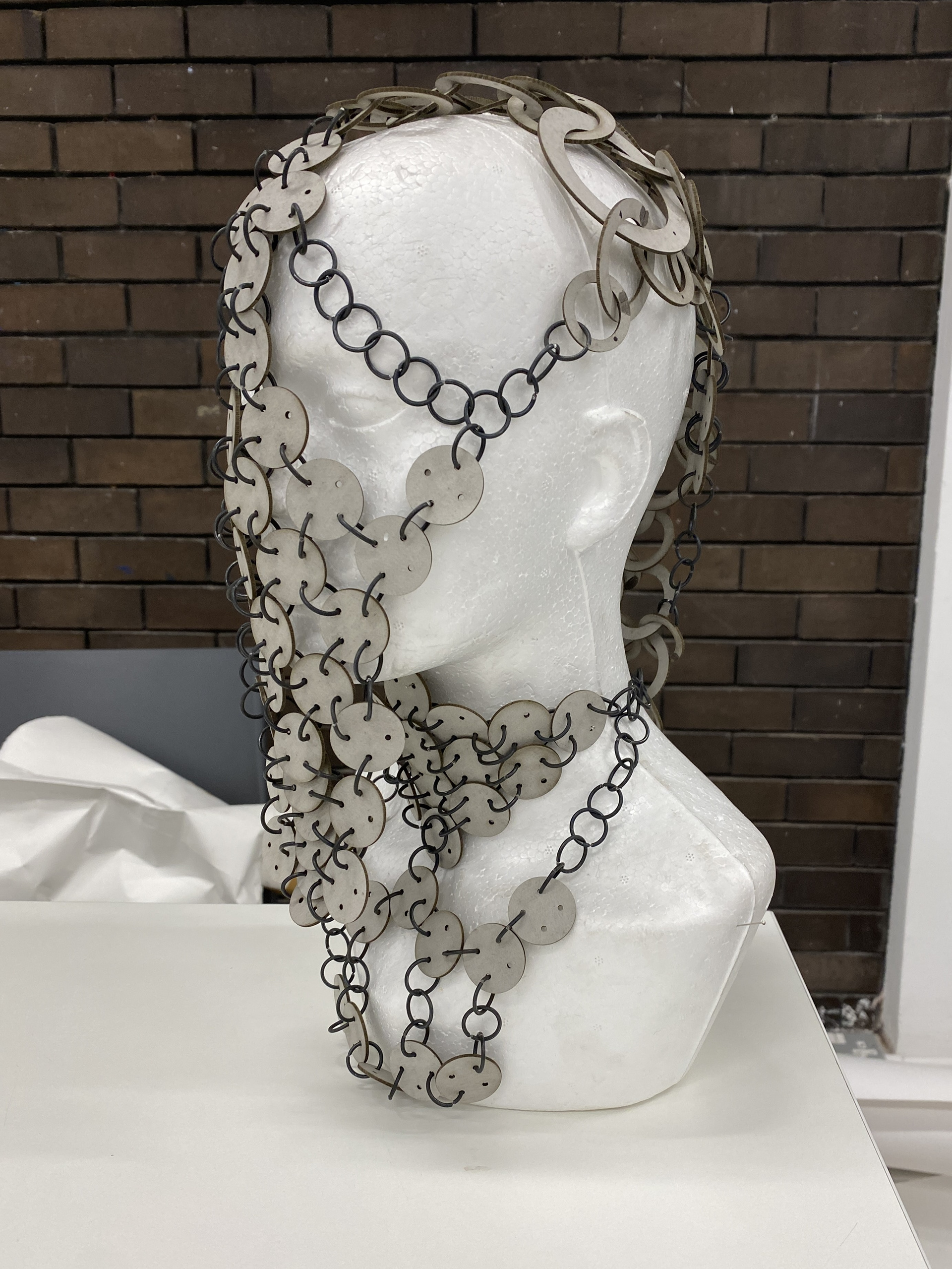
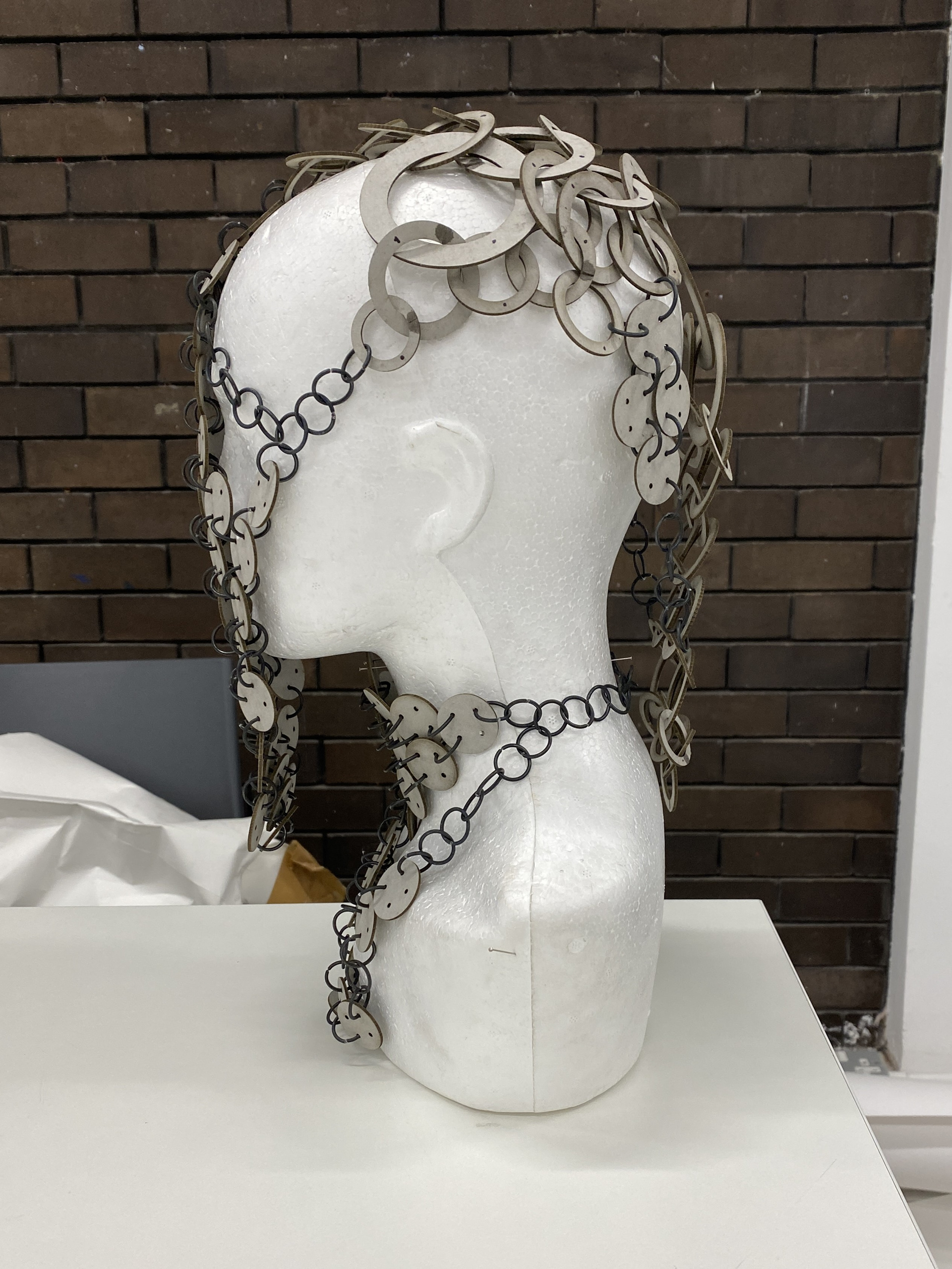
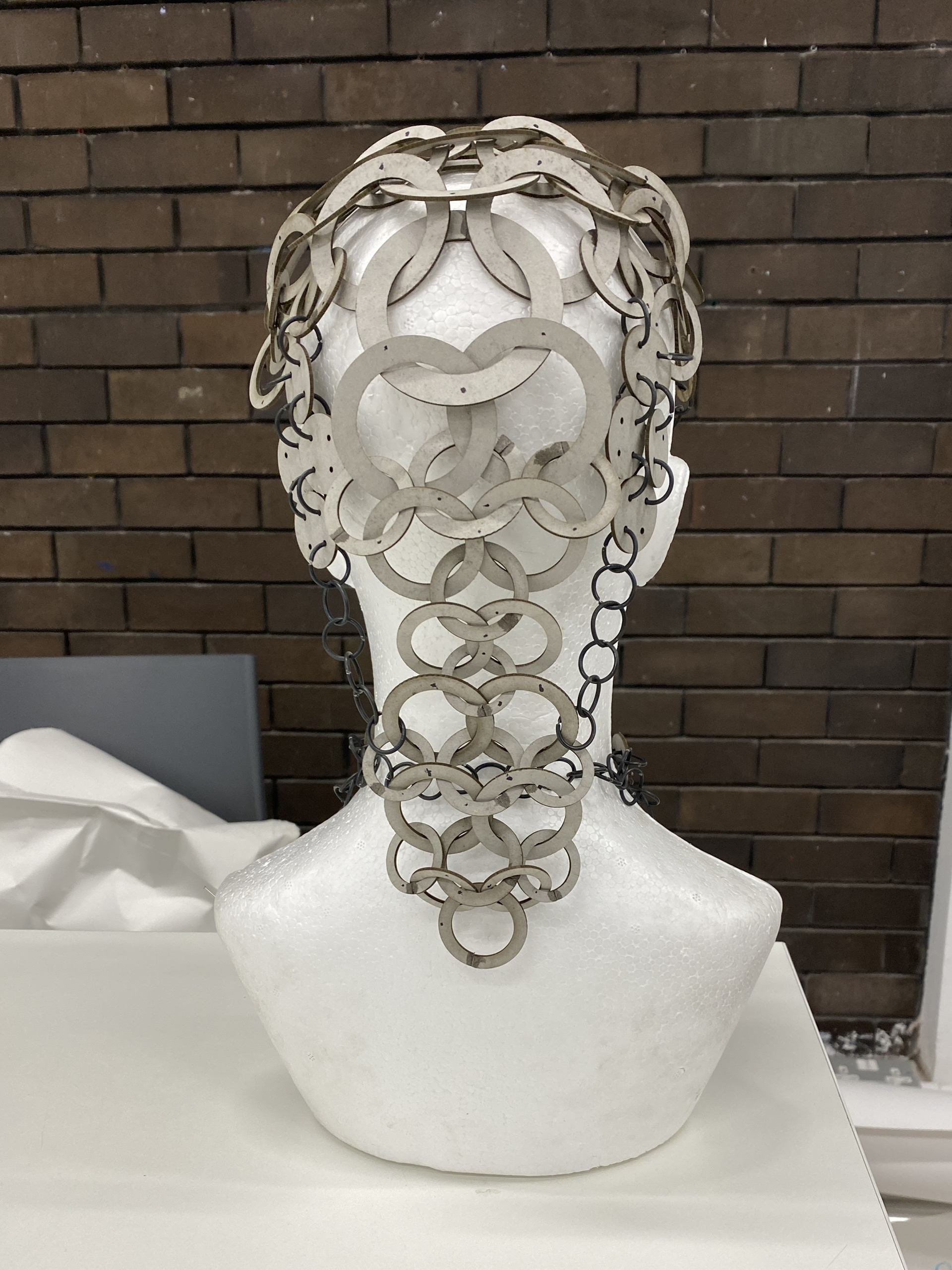
Reviewing the two pieces, I found that they address very similar insecurities. Therefore, I decided to combine them into one, tackling all the insecurities of the head. The material language and designs are highly consistent between the two, meaning that combining them doesn’t require additional work or alterations. One element I wanted to explore further with these pieces was layering. I believe that the overhang of the face piece in front of the neck piece enhances both the concealment and the mystery of the body layers beneath.
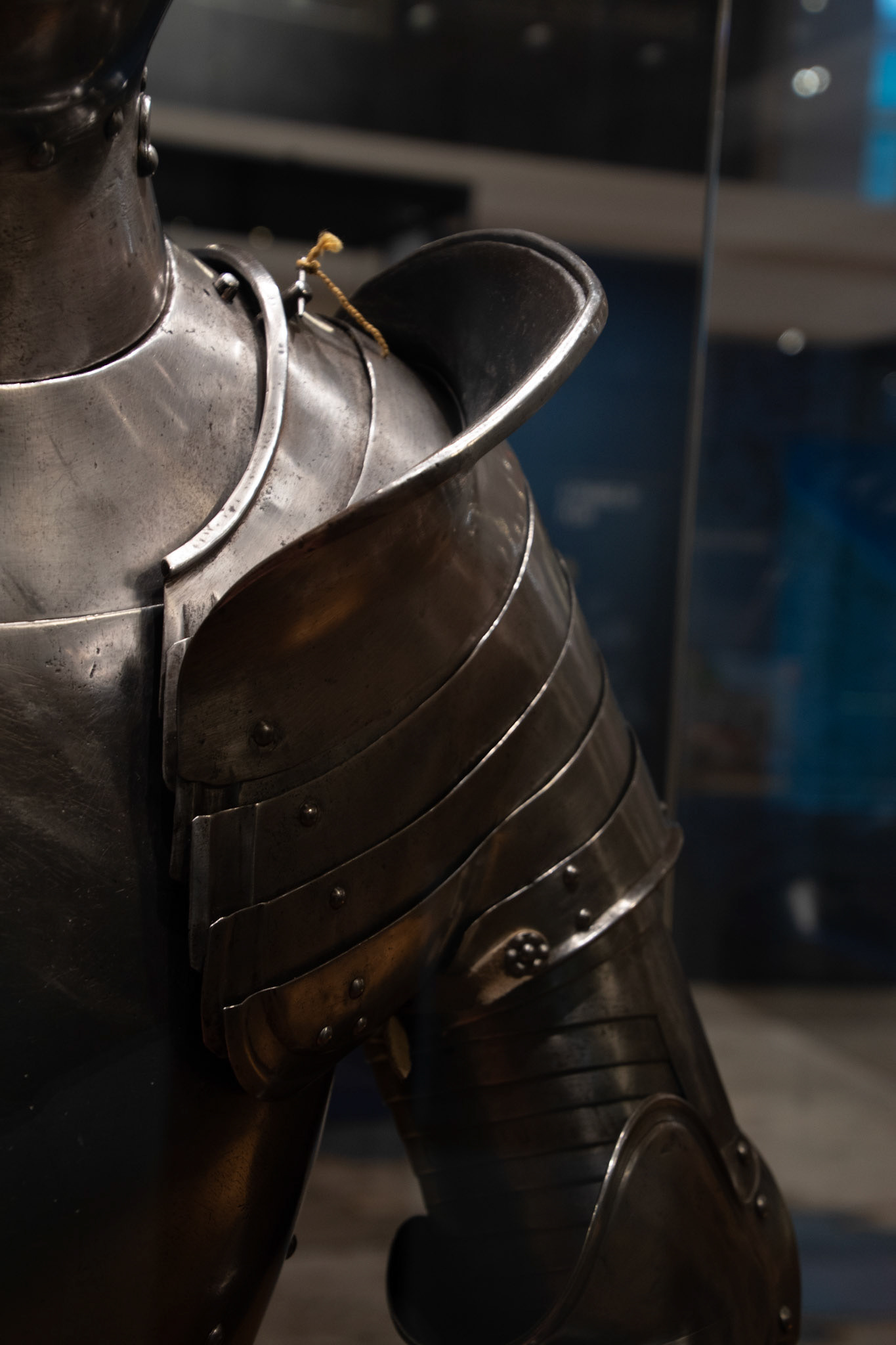
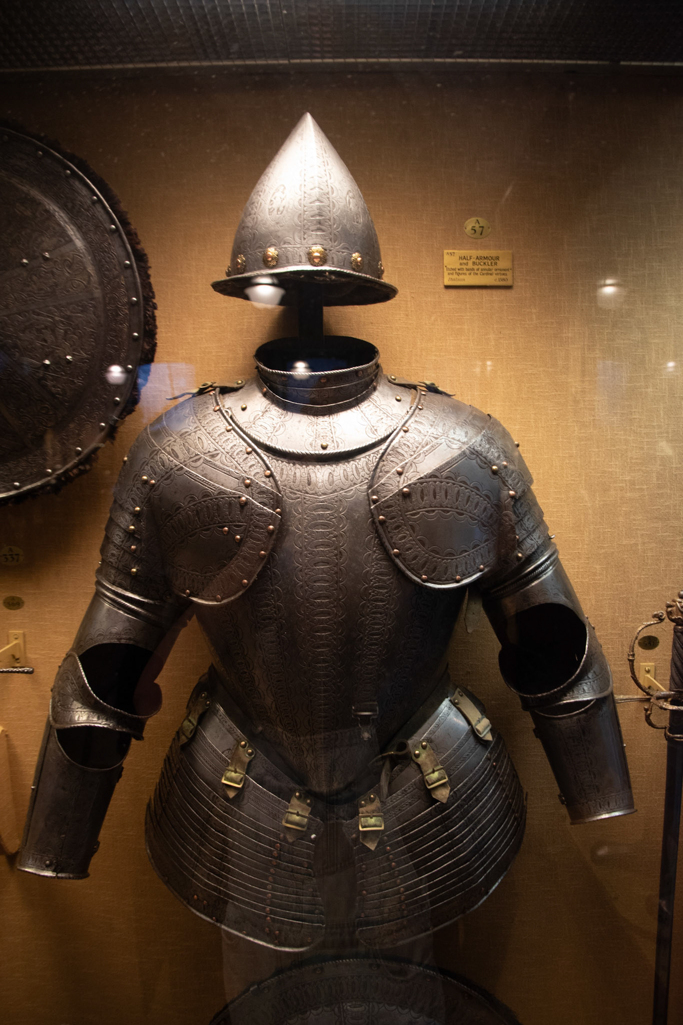
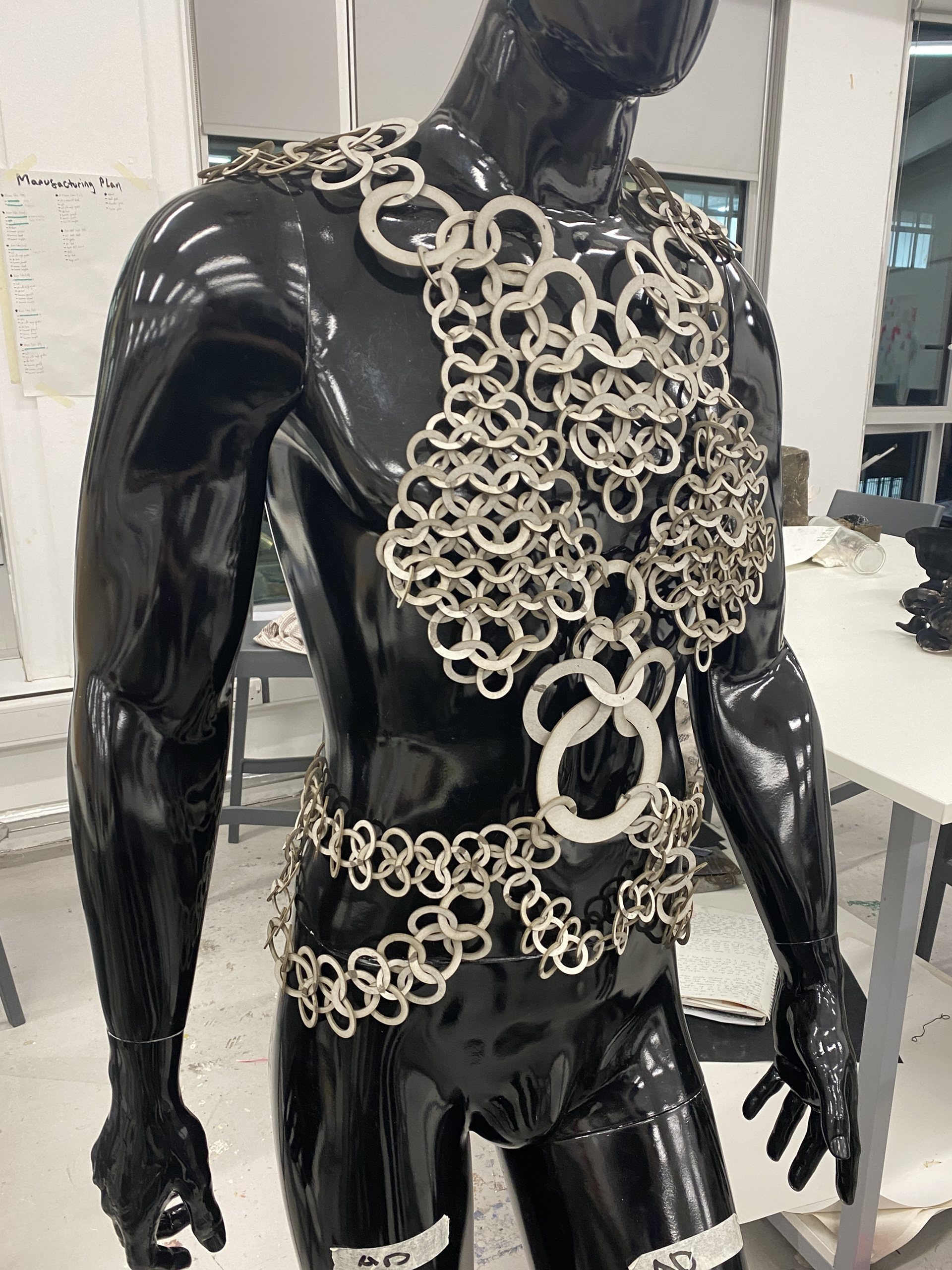
The Shoulders
What personal insecurities, vulnerabilities or gender dysphoria do you attribute to this area? Describe in a few sentences or bullet points.
Width/breadth of shoulders
Prominent collar bone
Muscular/larger proportions than traditional feminine bodies
How do you usually manage these insecurities, vulnerabilities or gender dysphoria in your day-to-day life? For example, using baggy clothing or makeup.
Covering with clothing
Using specific clothing to cover or redirect the viewers attention to less vulnerable areas
In these collages, I explored similar themes of concealment and redirection. I experimented with varying levels of coverage, leaving some designs very open while others provided complete disguise. I found that the exposed designs draw attention to the pieces rather than the body, almost acting as a beacon for the eyes. This helps distract viewers from the insecurities but leaves the wearer exposed. With the asymmetrical designs, this approach only addresses part of the issue and might feel insufficient.
On the other hand, the design with the most coverage (top right) directs the viewer's attention entirely to the area of insecurity. However, the focus remains primarily on the garment itself rather than the body. I believe there is a balance to be found between fully covering and subtly emphasizing the breadth of the shoulders to ensure the piece does not appear overly masculine.
I think both approaches have potential and should be further explored through the modeling process.
Inspiration imagery from Gallery visits
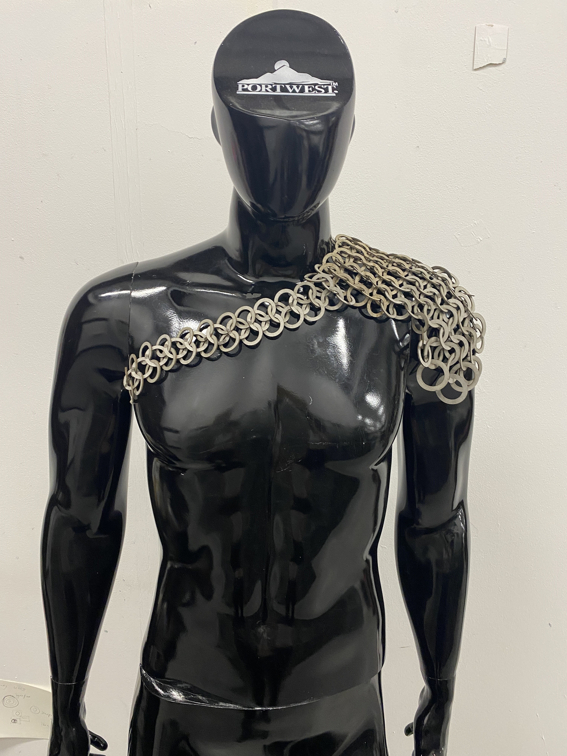
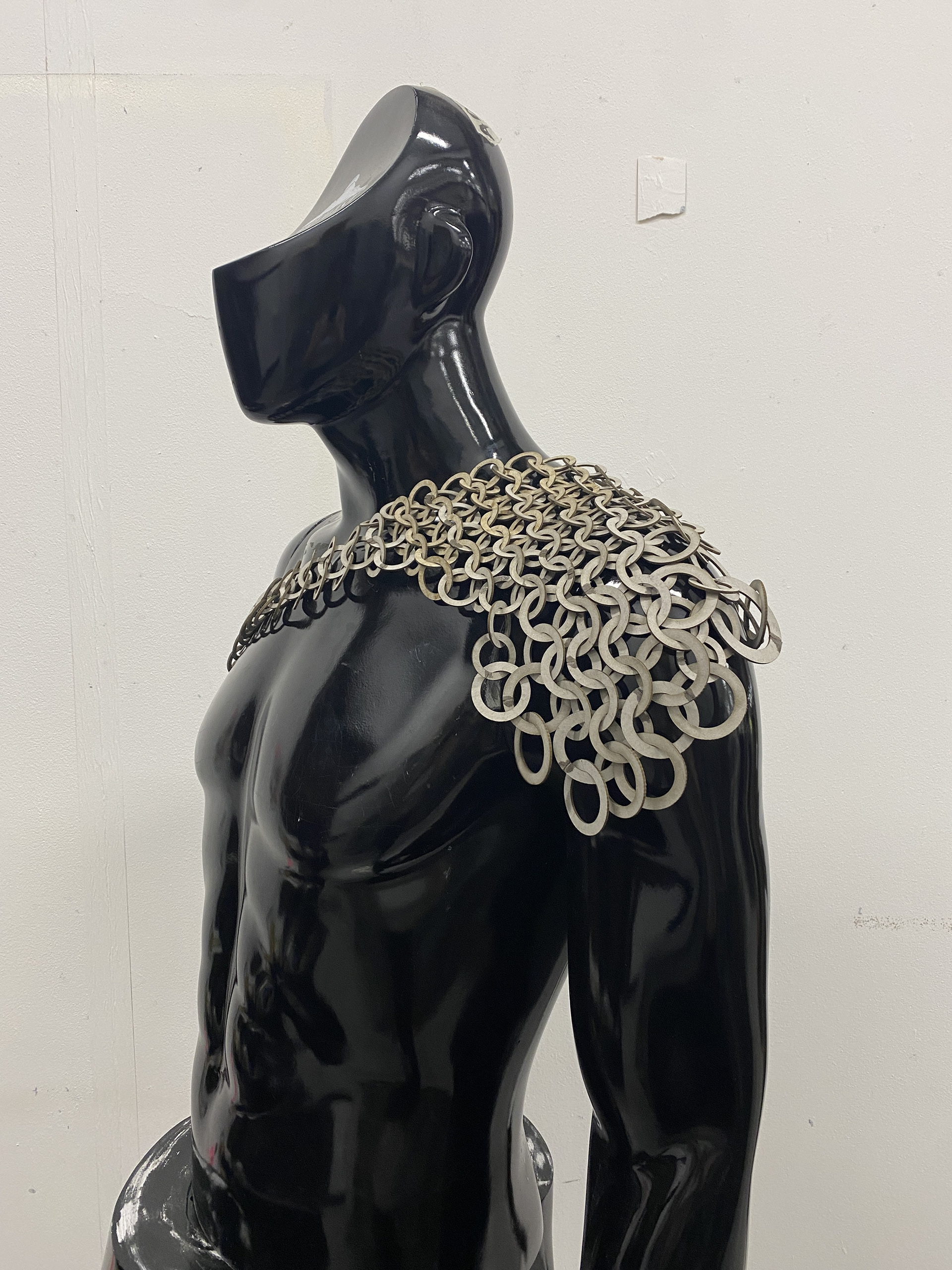
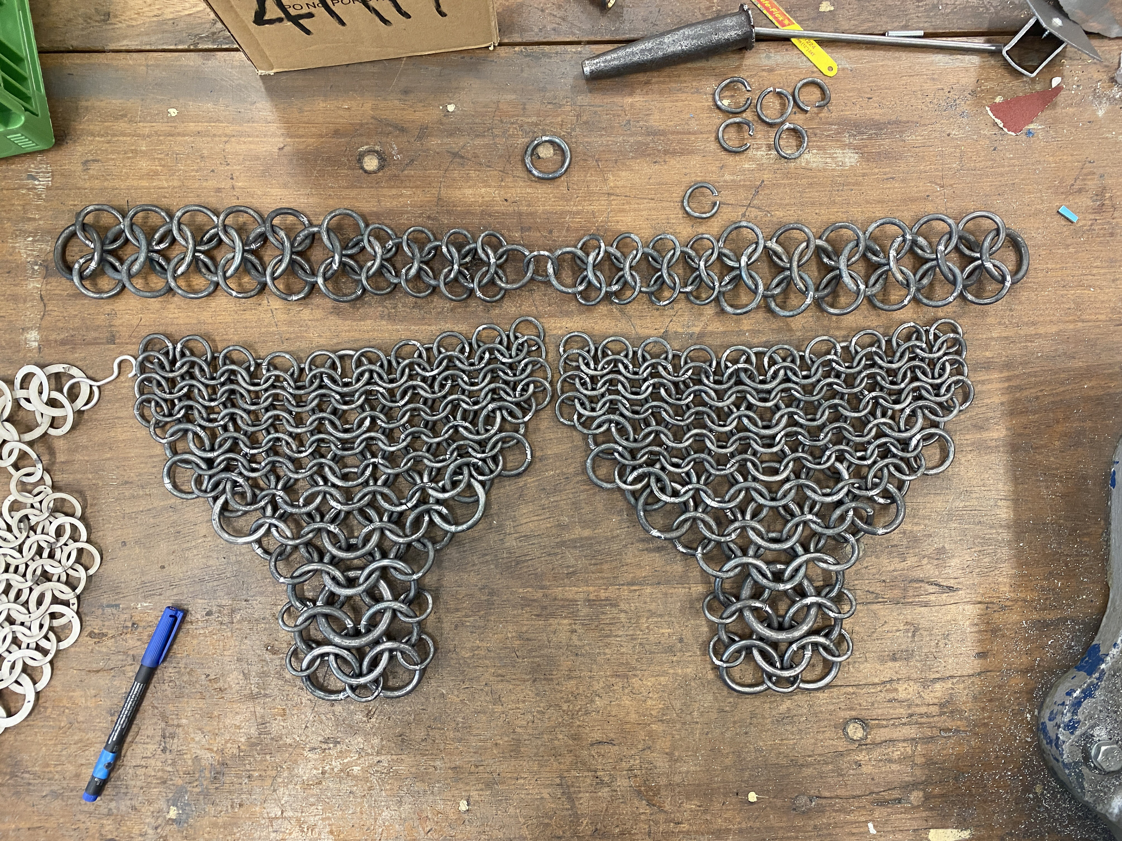
I first tested the asymmetrical design with a large section laying over one shoulder and a chain stretching across the chest. My focus for the shoulder section was to create a gentle, cascading sheet that conformed to the curves of the body. I gradually increased the size of the links as the piece moved away from the neck, concentrating protection over the most vulnerable area. I referred to the belt designs I had previously produced for Todd to span the chest. I felt that a sizable and repetitive design would help draw the viewer’s attention away from the area of insecurity. I mirrored this approach on the back of the piece, creating a triangular shape extending toward the spine, with the largest link at the connecting strap becoming the focal point.


Inspiration imagery from Gallery visits
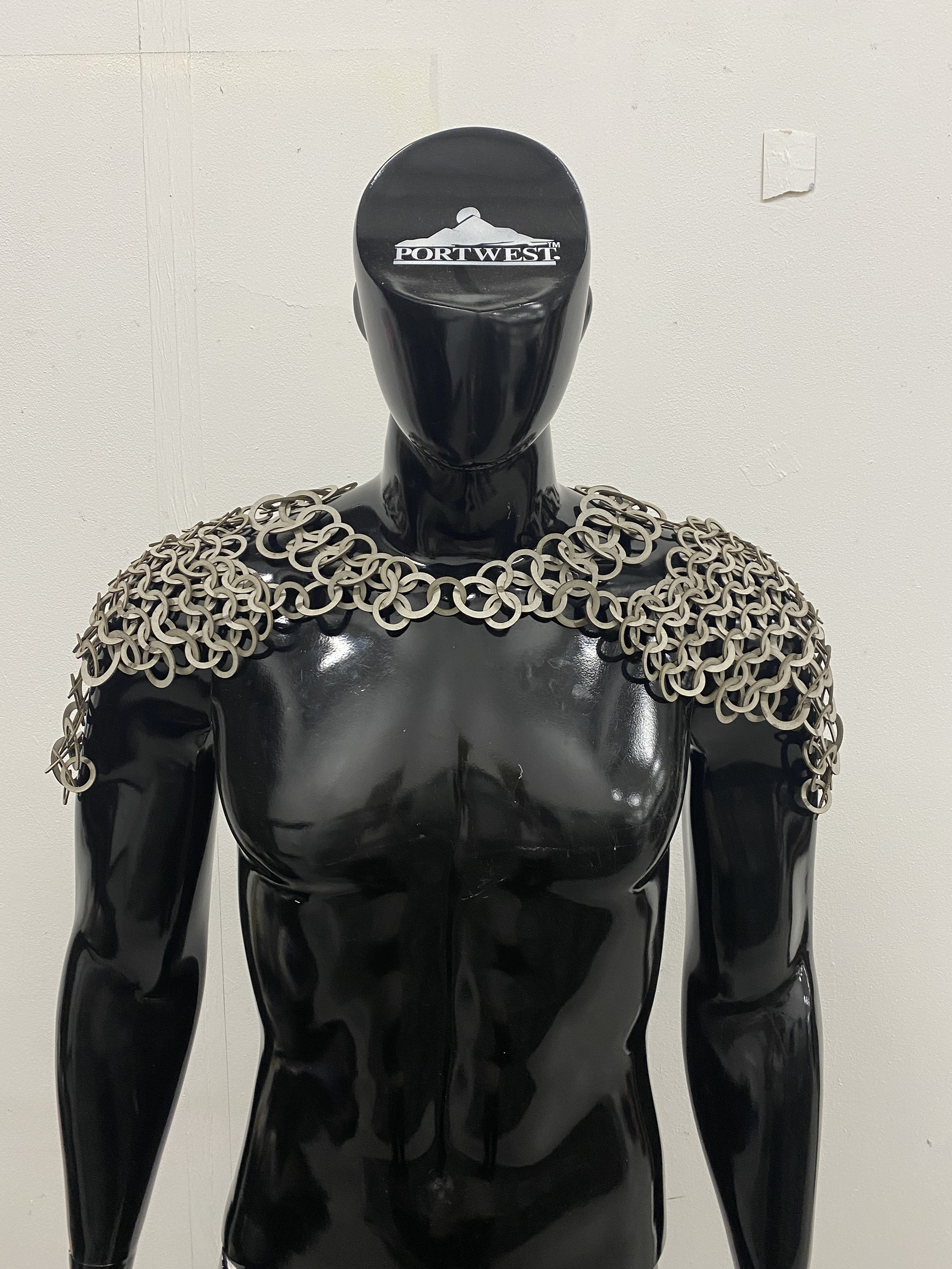
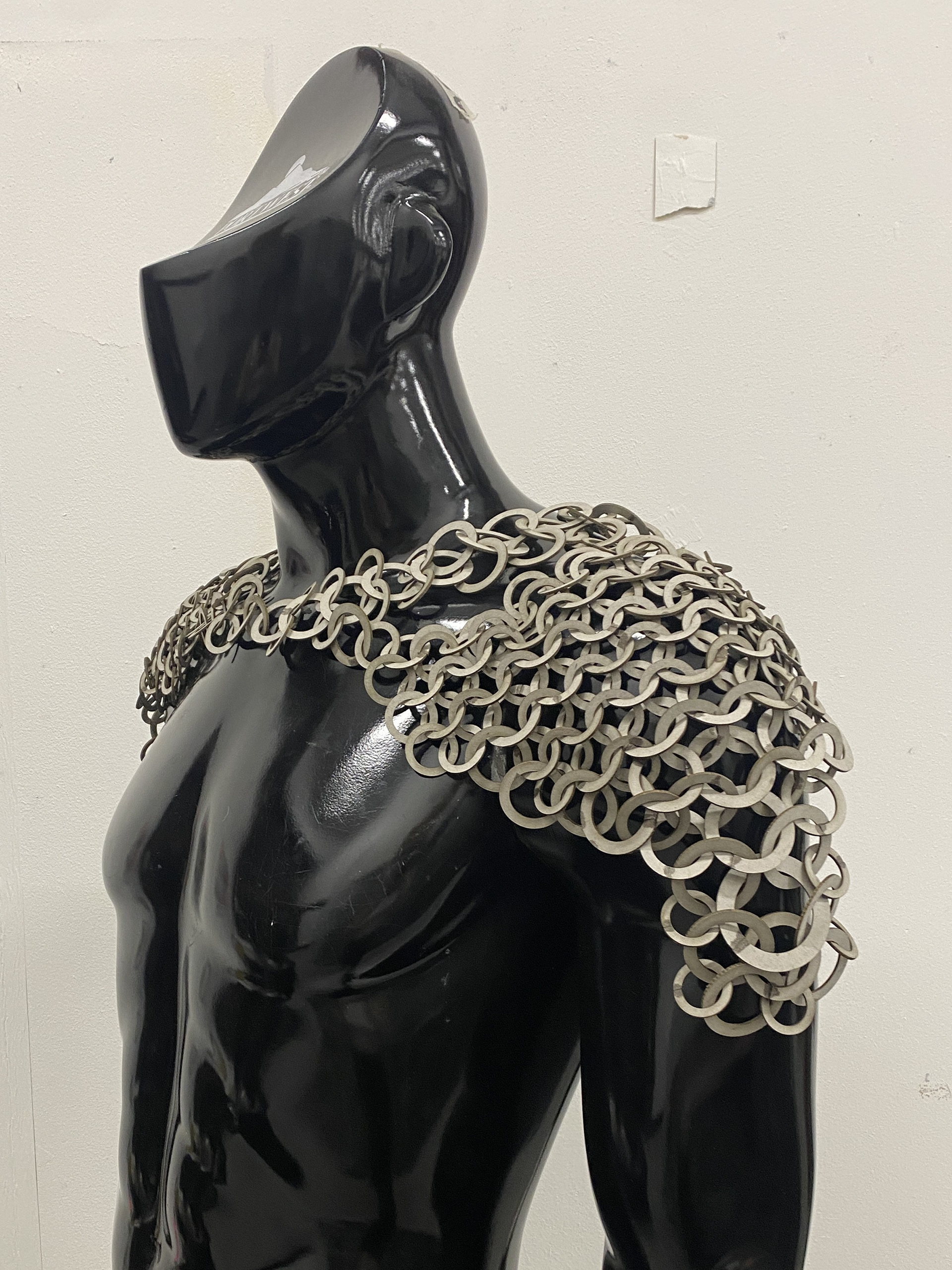
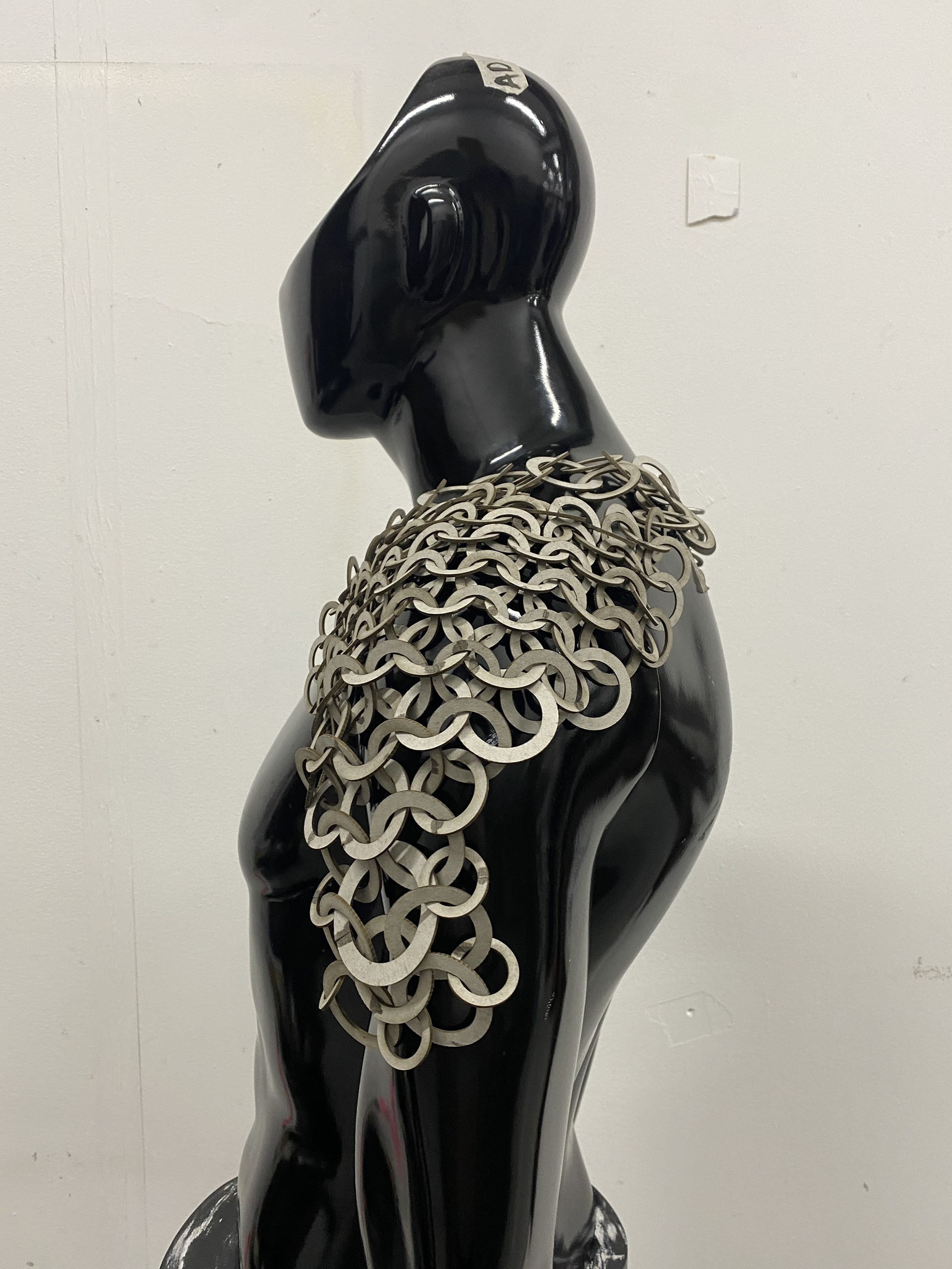
I then tested a fully covered design, aiming to enclose the shoulders in a layer of mail. I created an entirely symmetrical piece designed to convey balance and uniformity, softening the breadth of the shoulders. I utilized several triangles throughout the design to draw the viewer’s eye away from the shoulders: the mail sections over each shoulder drape down the arm, coming to a point, and the piece joins at the center, forming a V-shape around the neck. I disconnected the shoulder sections from the chain loop that encircles the neck, using only a few links to connect them. This provides a subtle glimpse of the body beneath and suggests a narrower placement for the shoulders. Additionally, this breaks up the large sheet into smaller sections, avoiding the appearance of enlarging the body.
I believe that both designs address the issues sufficiently. However, I think providing full coverage of the insecurities will help the wearer feel more comfortable and confident. As a result, I have chosen to proceed with the full coverage design.
The Torso
What personal insecurities, vulnerabilities or gender dysphoria do you attribute to this area? Describe in a few sentences or bullet points.
Rectangular shape
Flat chest
How do you usually manage these insecurities, vulnerabilities or gender dysphoria in your day-to-day life? For example, using baggy clothing or makeup.
Clothing
I continued exploring ways to conceal and redirect the viewer's attention away from insecurities. I worked with two different approaches: fully covering and hiding the area of vulnerability, focusing on the breast area, and placing the piece over areas that don’t cause gender dysphoria to instead draw attention there.
For the first approach, I aimed to stretch the coverage across the body, pulling and guiding the viewer’s attention. Additionally, I used blocks of mail and multiple layers to cover key areas. For this piece, I believe that transparency could enhance concealment where desired while allowing more penetrable sections to provide structure. Adding layers to the breast area would also help to build volume and provide additional definition to the body.
The second approach focused on creating leading lines over the torso to accentuate the curves of a feminine body. I envisioned these elements to be similar to the chain belts I designed for the collaboration with Todd. In this case, I used the structures more as traditional chains encasing the body, rather than constructing a garment with defined panels. This approach could evoke the feeling of being enveloped by a safety blanket while emphasizing the body’s desirable features.
Upon reviewing these two approaches, I concluded that combining them would be most effective. Using greater coverage over the specific areas of insecurity would give the wearer confidence that these parts are hidden from view. Additionally, incorporating leading lines across the body would accentuate and emphasize a more feminine shape.


Inspiration imagery from Gallery visits


For this piece, I incorporated the techniques I explored during my collages. Through testing, I found that a symmetrical design worked best to define the leading lines of the feminine body. I primarily applied these ideas to the lower third of the design, cinching in at the waist and broadening the hips with stacked, flowing belts. Additionally, by concentrating the mass of the structure in the center of the body and broadening it at the chest and hips, the design enhances the hourglass figure.
I focused the thickest and tightest weave on the chest to provide maximum coverage, while utilizing larger links and more open weaves to form the leading lines. Drawing inspiration from the shoulder piece, I left areas of skin exposed around key features. This approach helped to frame these elements and define the body's figure, rather than applying a uniform layer over the entire torso.
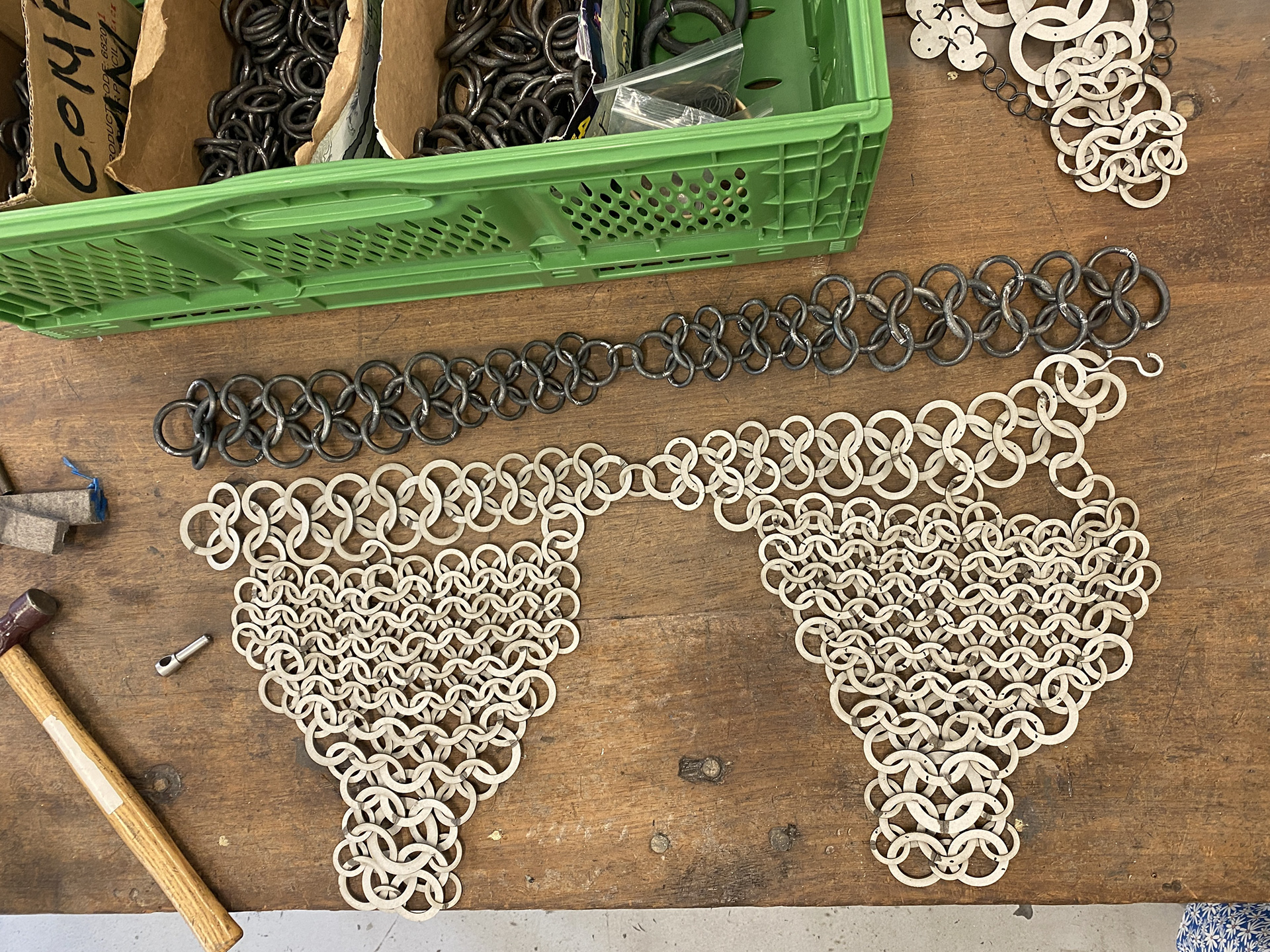
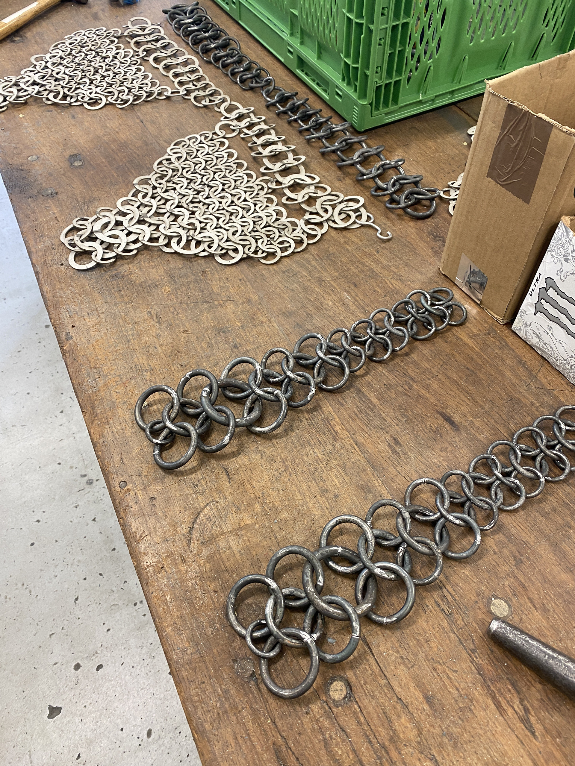
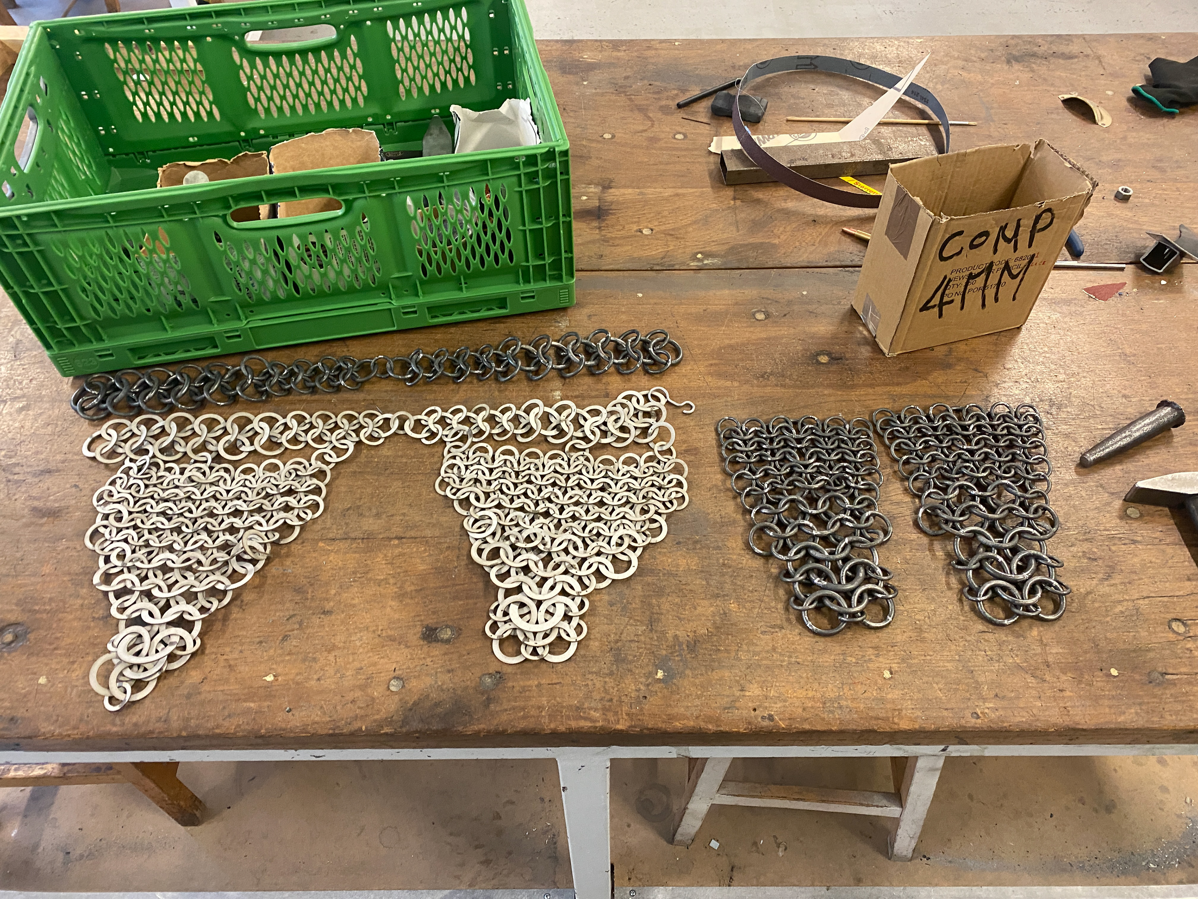
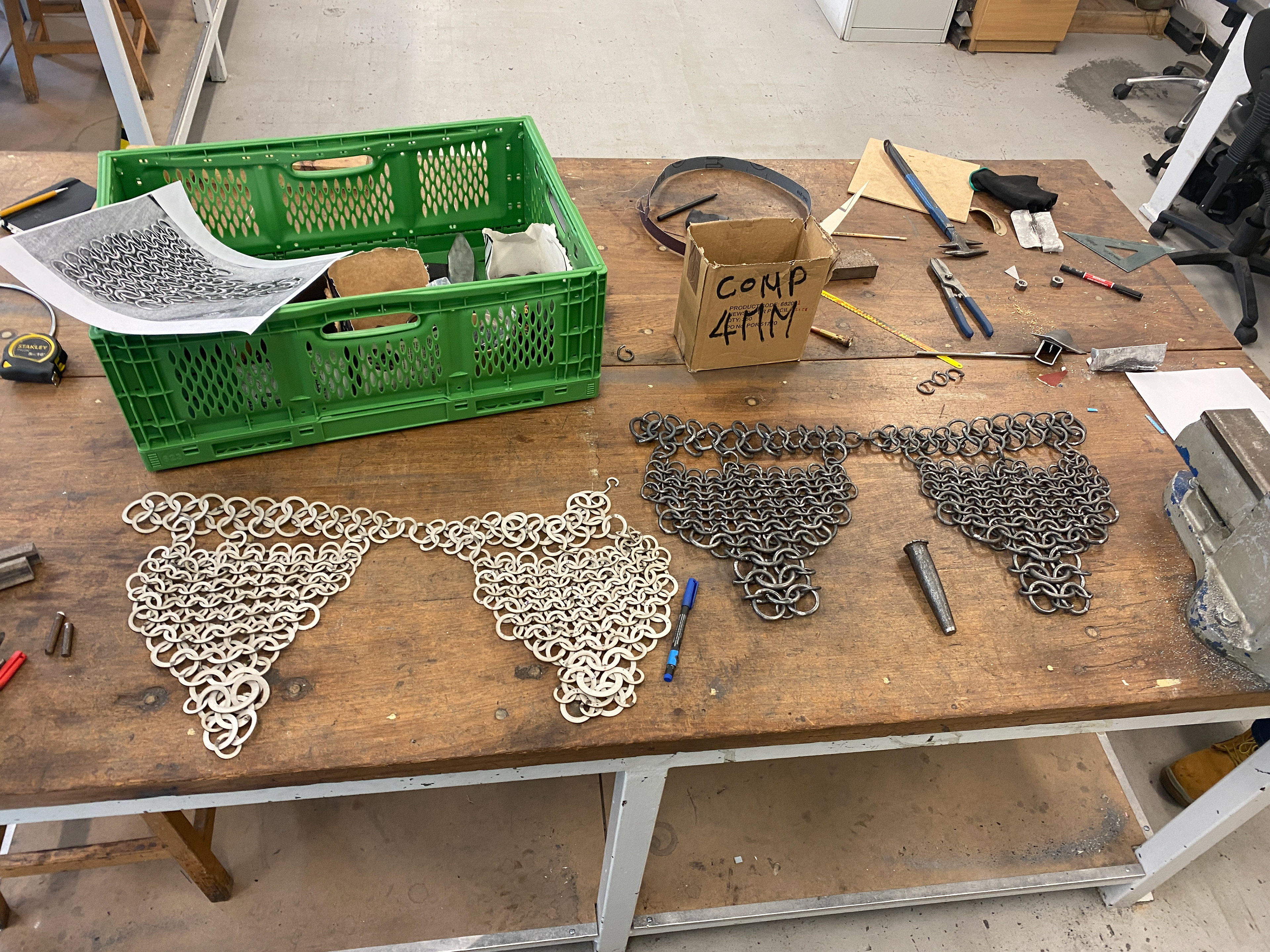
Making the links for all 3 pieces (Head, Shoulders and Torso)
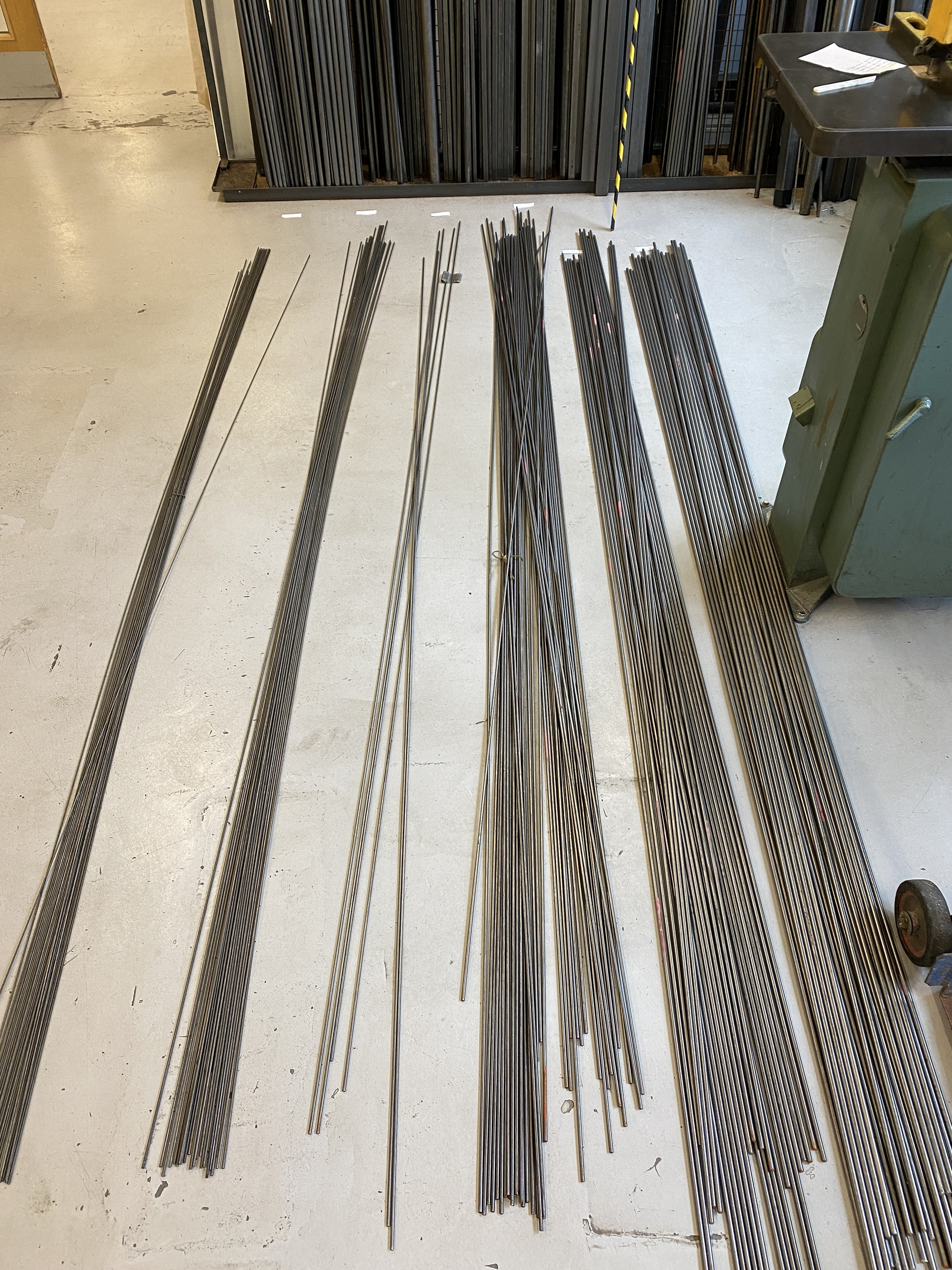
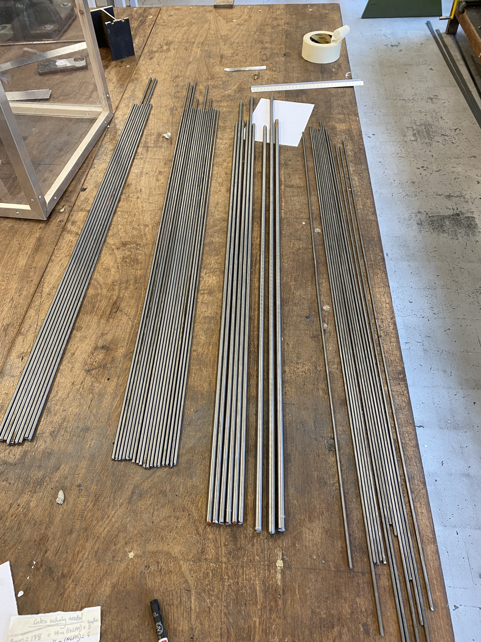

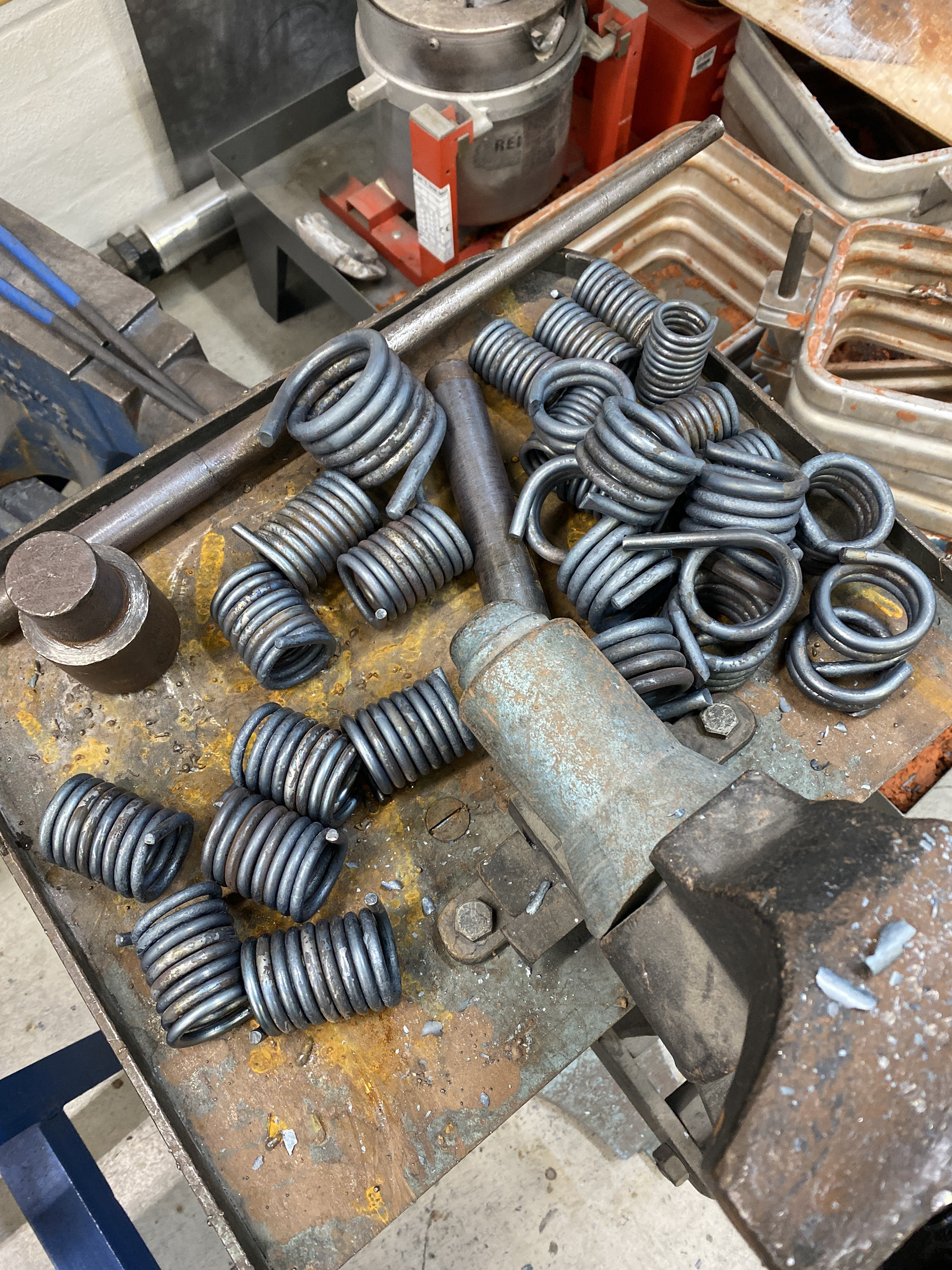
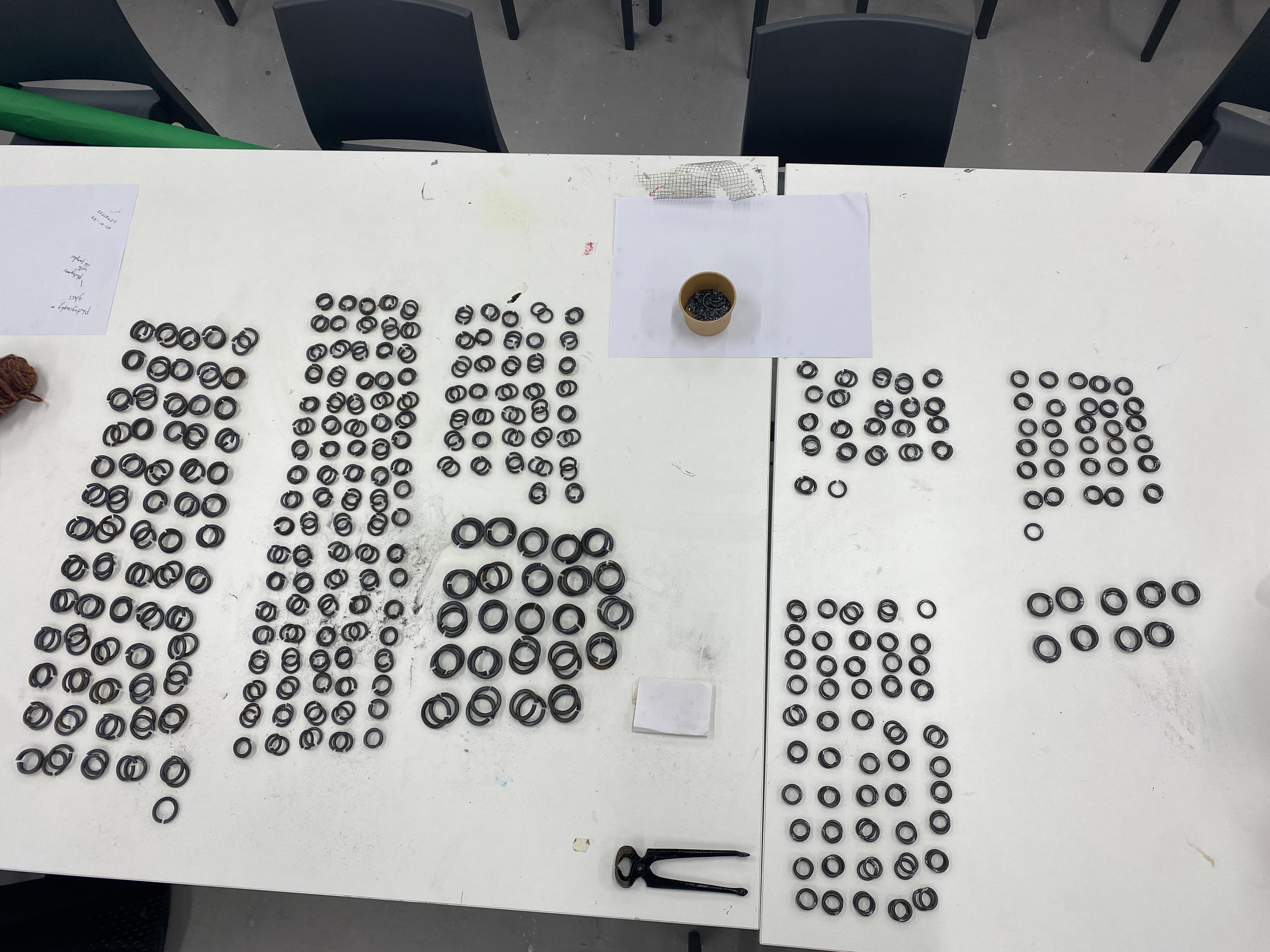
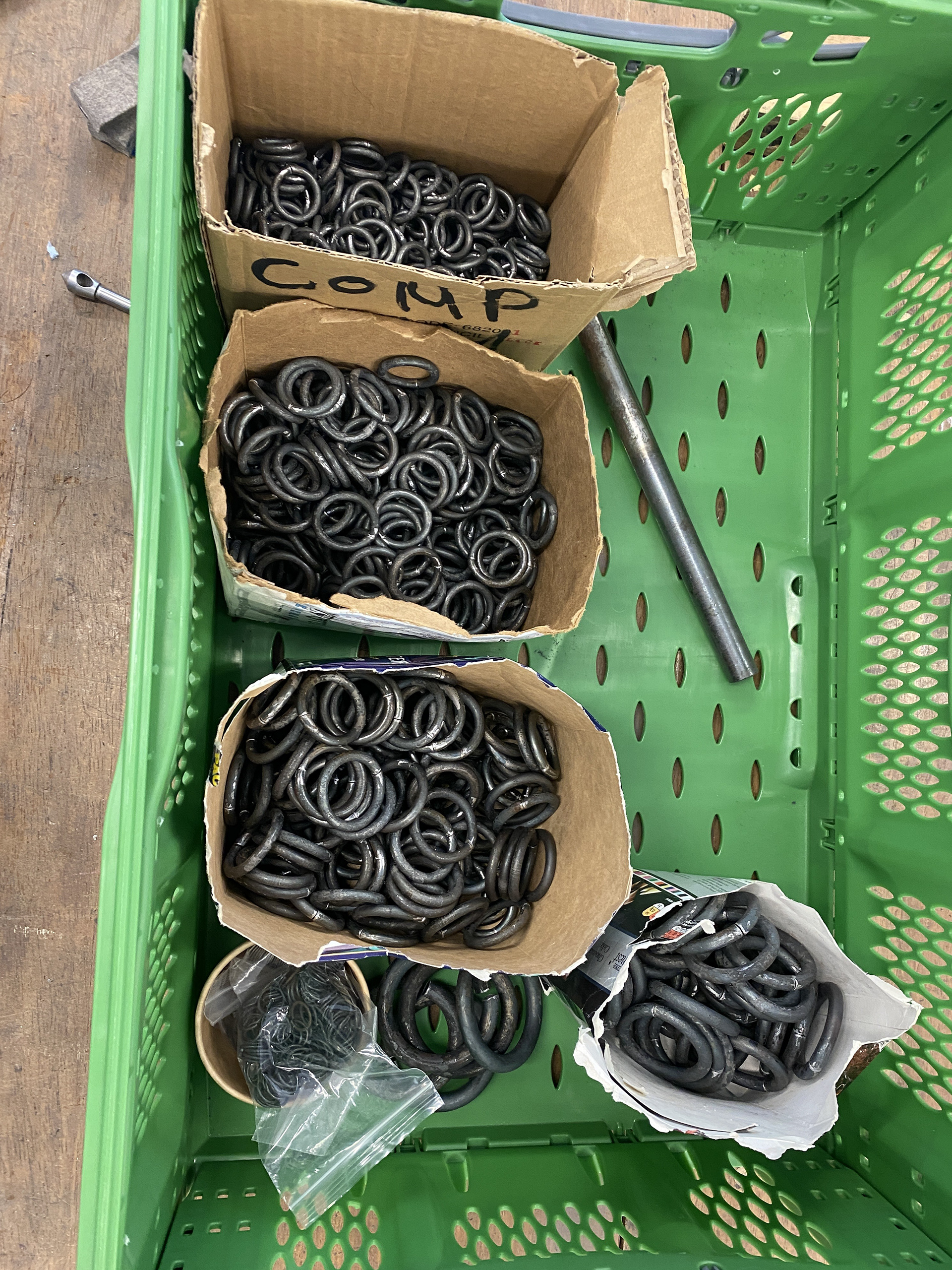
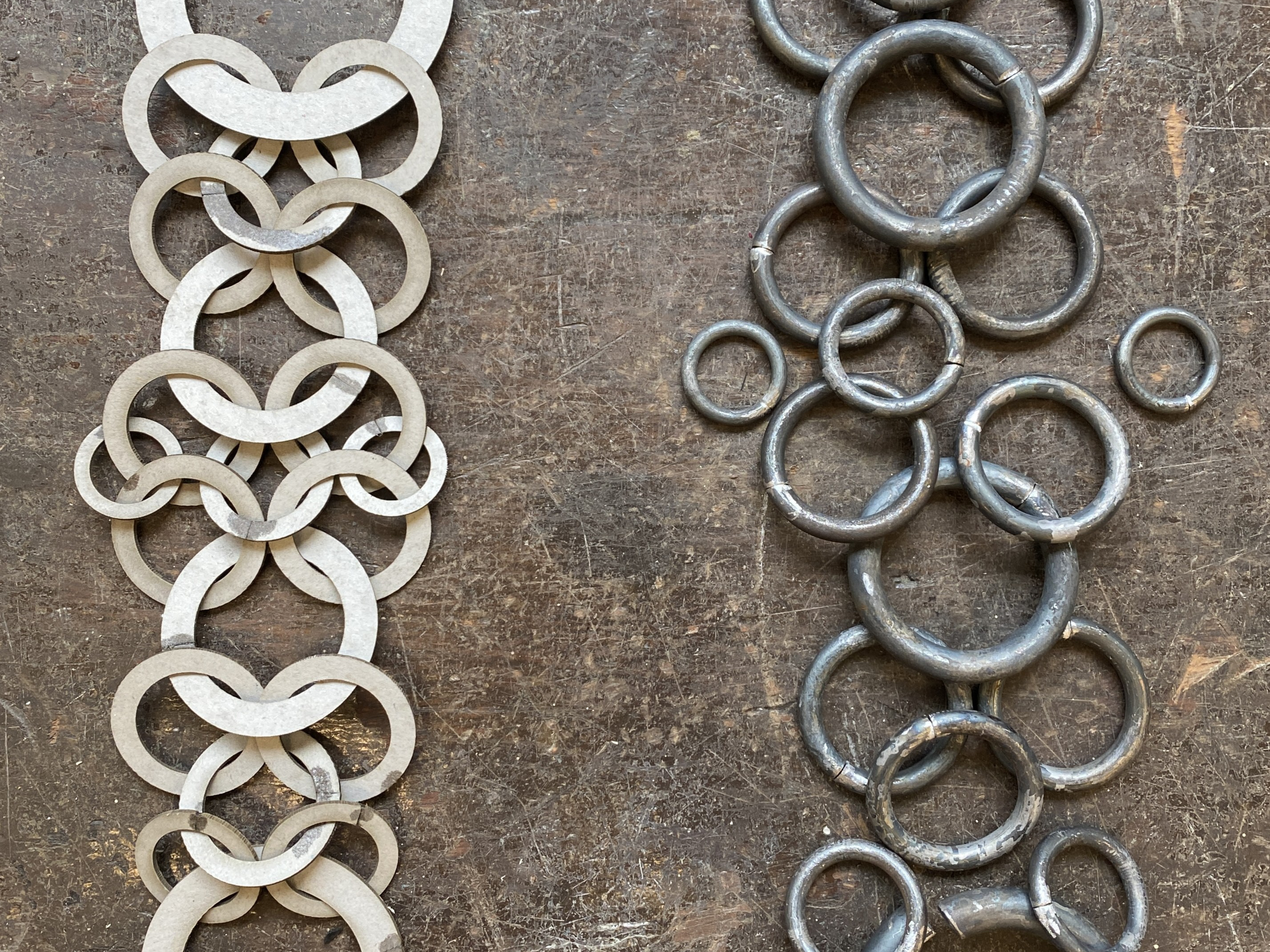
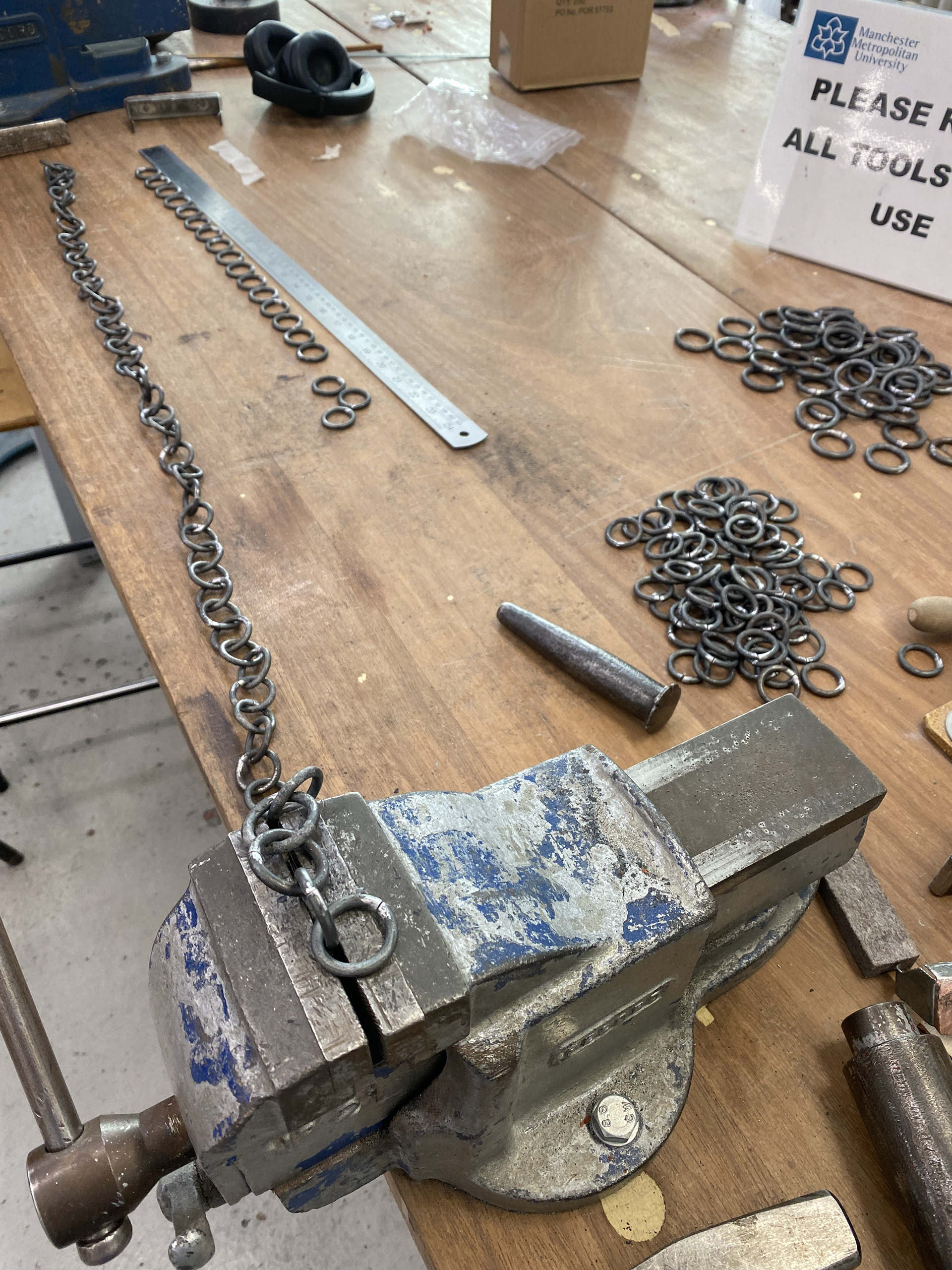
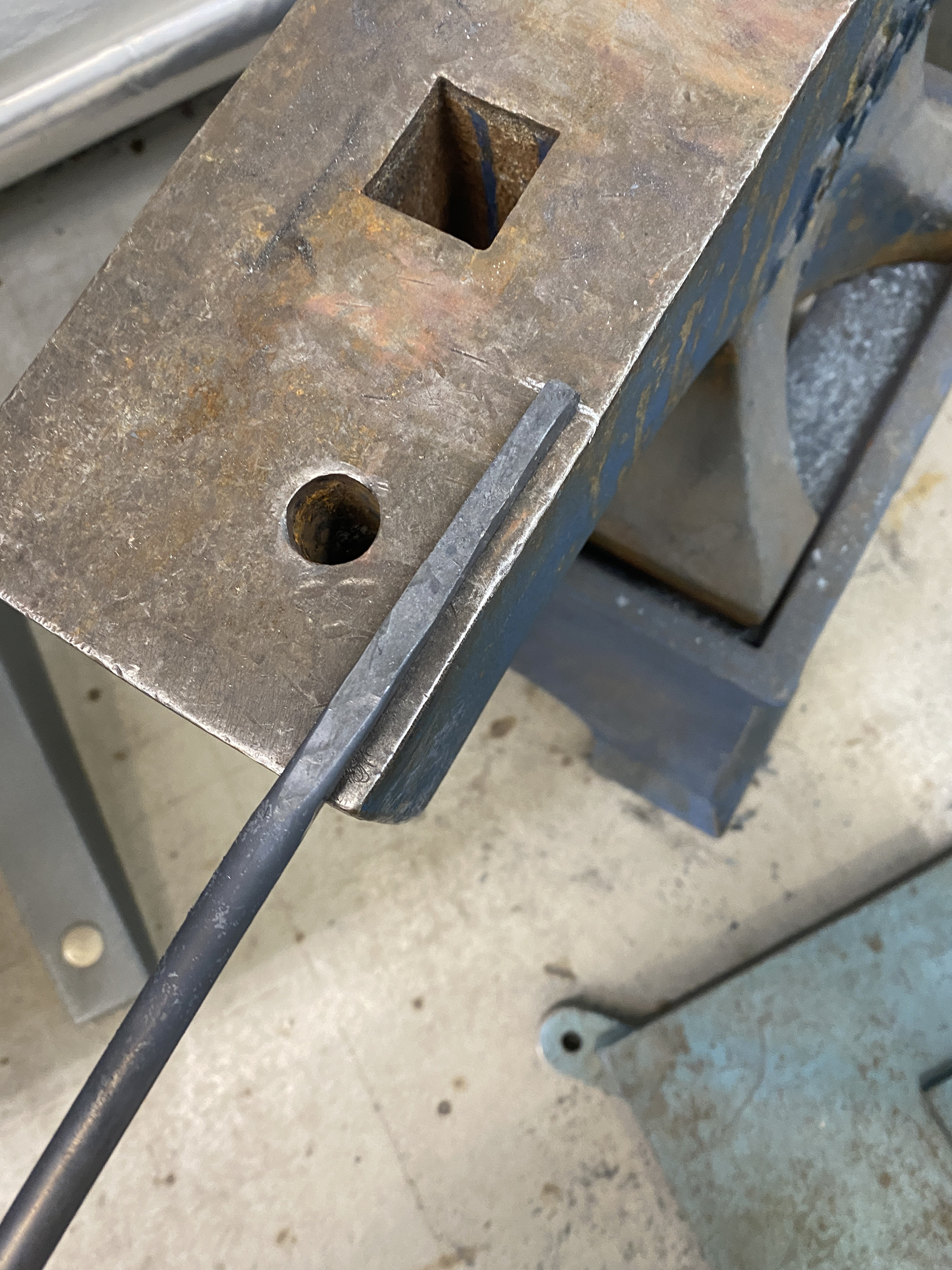
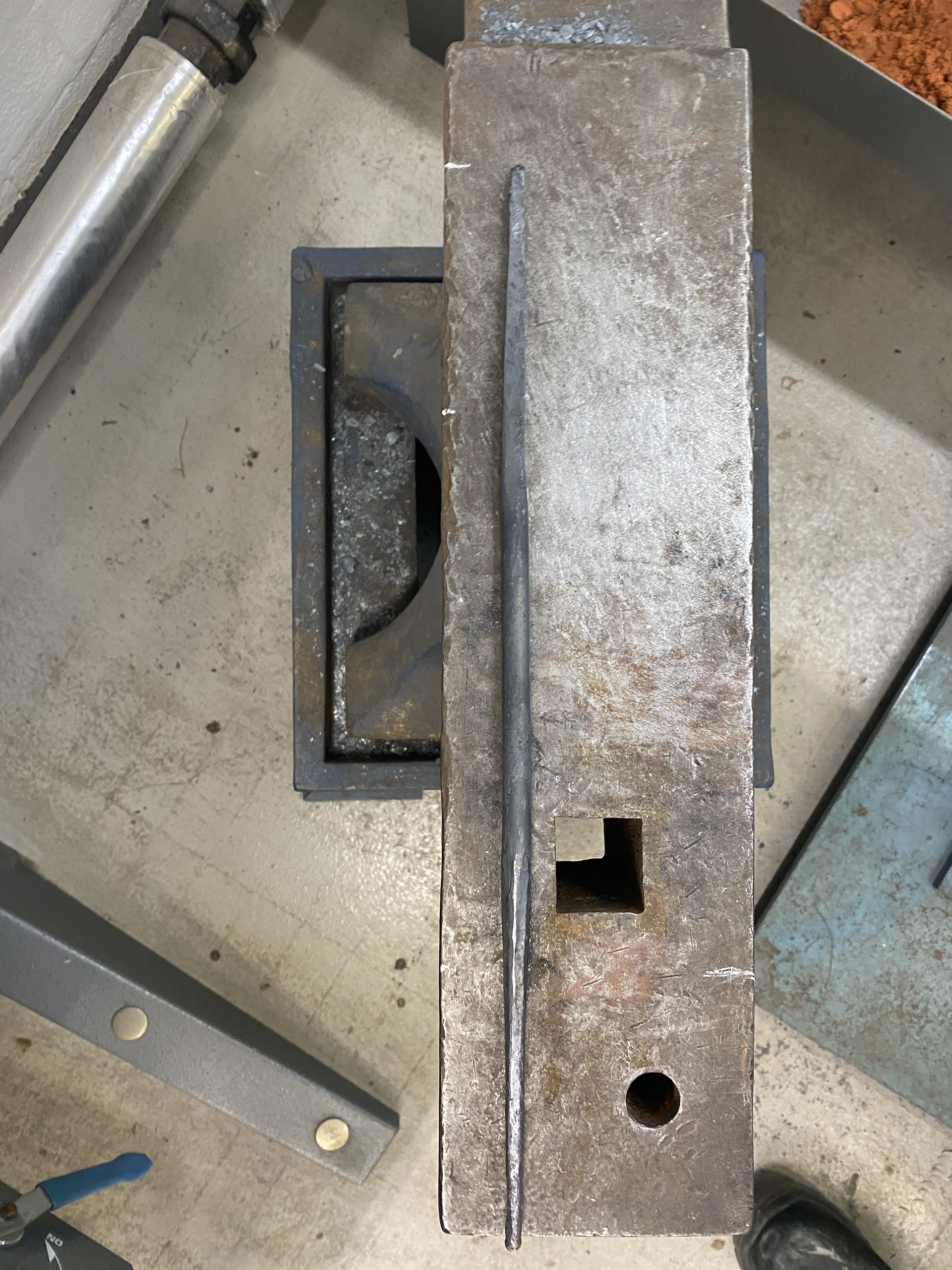
To produce the three pieces for myself, I worked in batch production. This approach allowed me to work more efficiently, as it eliminated the need to repeatedly set up machinery and ensured I had all the necessary components before beginning assembly. I calculated the number of links required for each piece, determined the total link count, and measured the resulting meters of steel needed (details of which can be found on my pricing page). Batch producing allowed me to share the links from 1 coil across several pieces, this reduced the quantity of steel I needed to purchase. I reviewed the steel stock available in the workshop and collaborated with the technicians to ensure there was sufficient material for both myself and others, which led to placing an additional order.
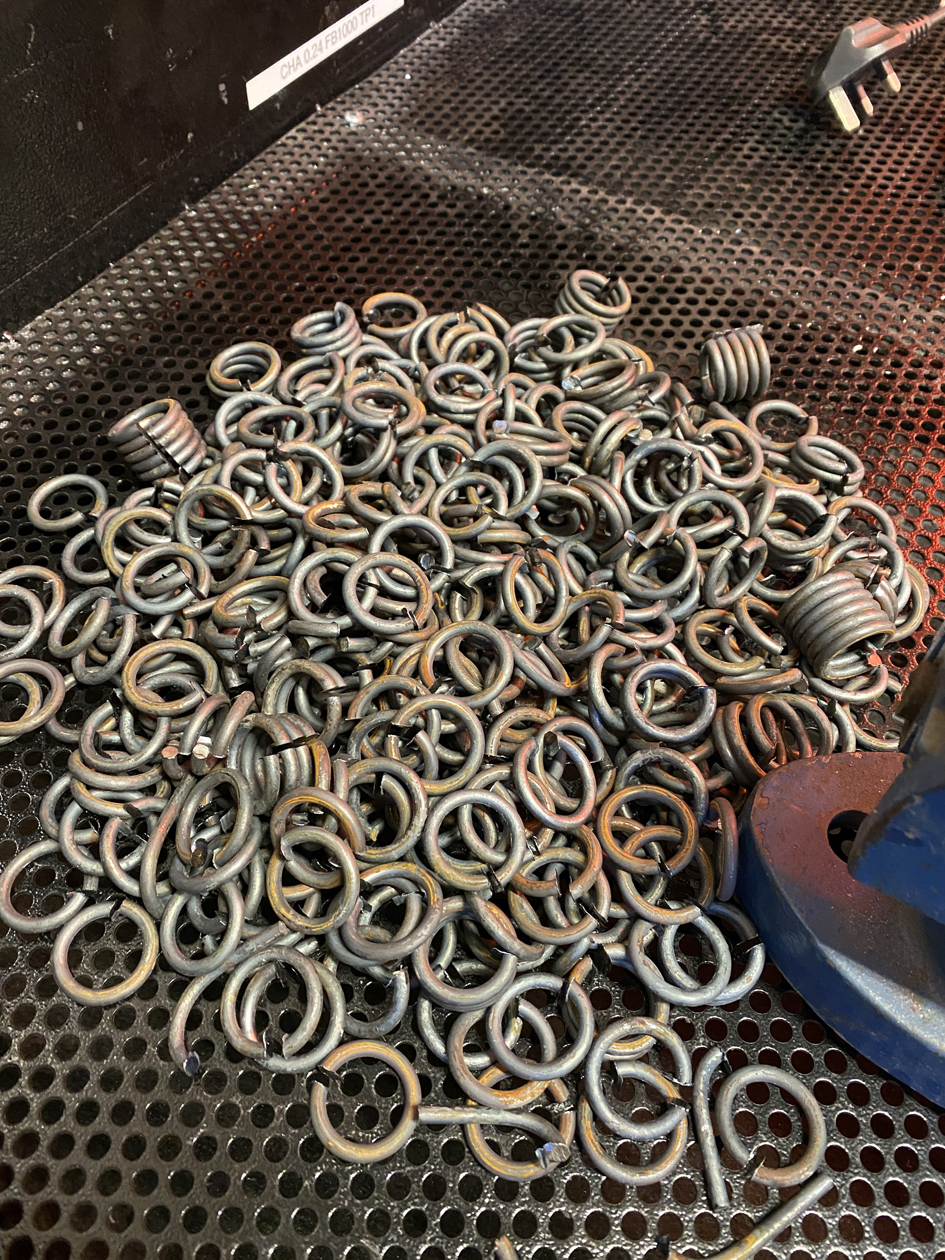
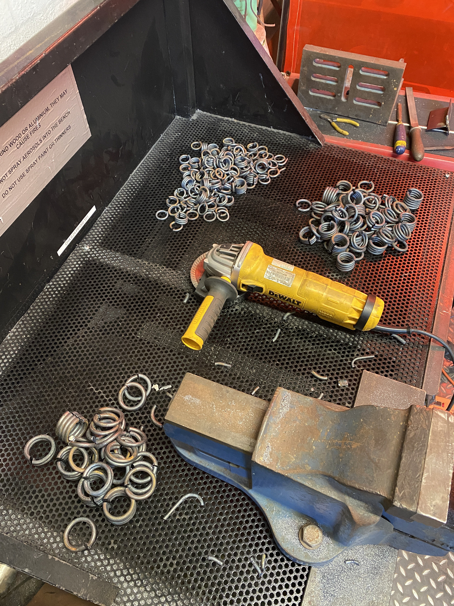
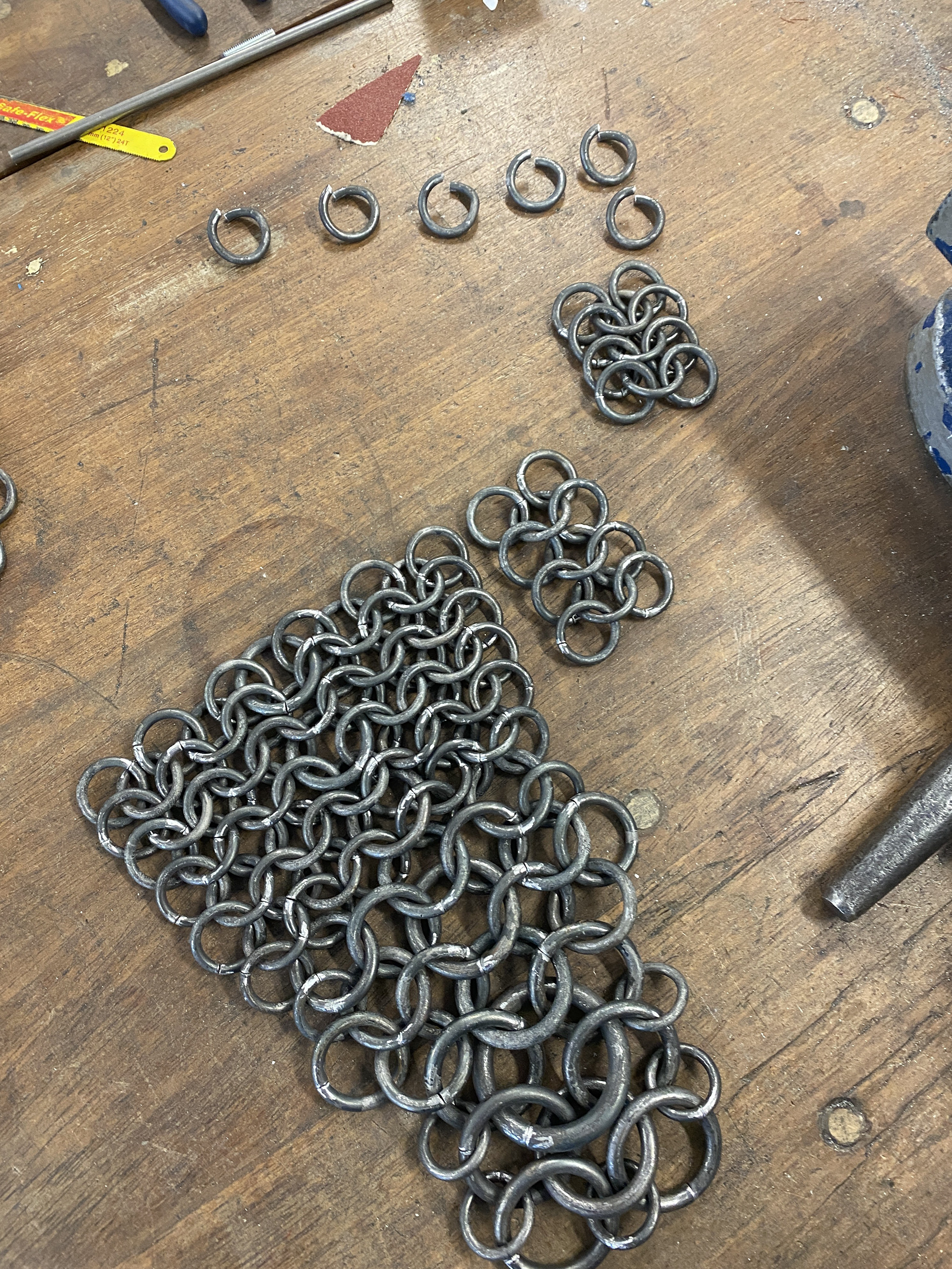
To produce the links, I followed the same methods as my Unit X piece, as this process has been refined and optimized to suit the tools and space available. This involved cutting steel rods into 1-meter lengths and wrapping them around a stake while hot from the forge. I then cut these coils into individual links using an angle grinder and cleaned up the burrs with a pendant drill. Finally, I hammered the links parallel and close together, ready for assembly.
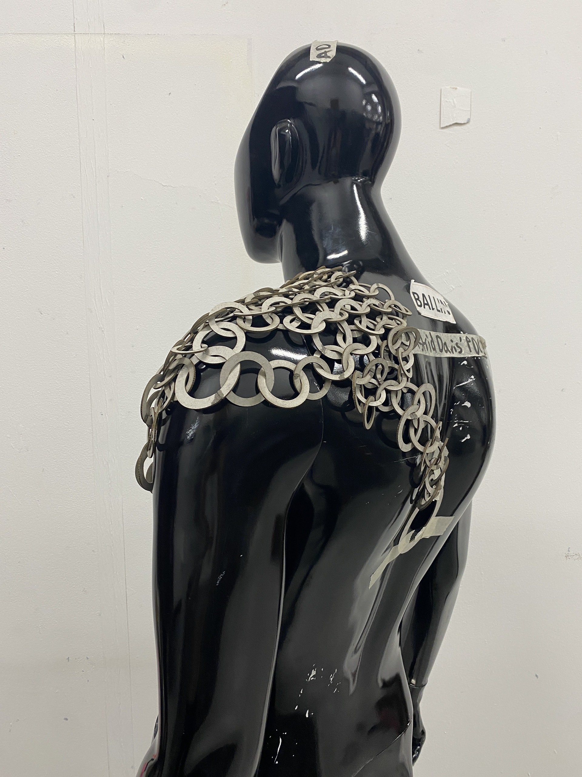
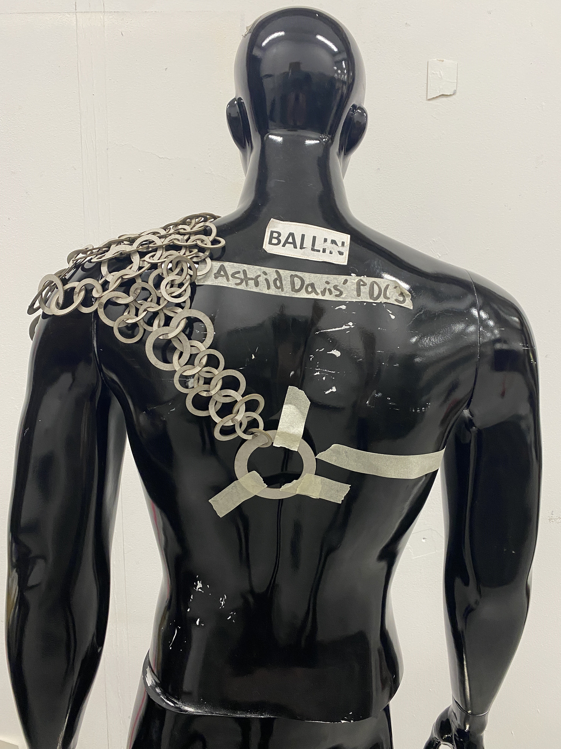
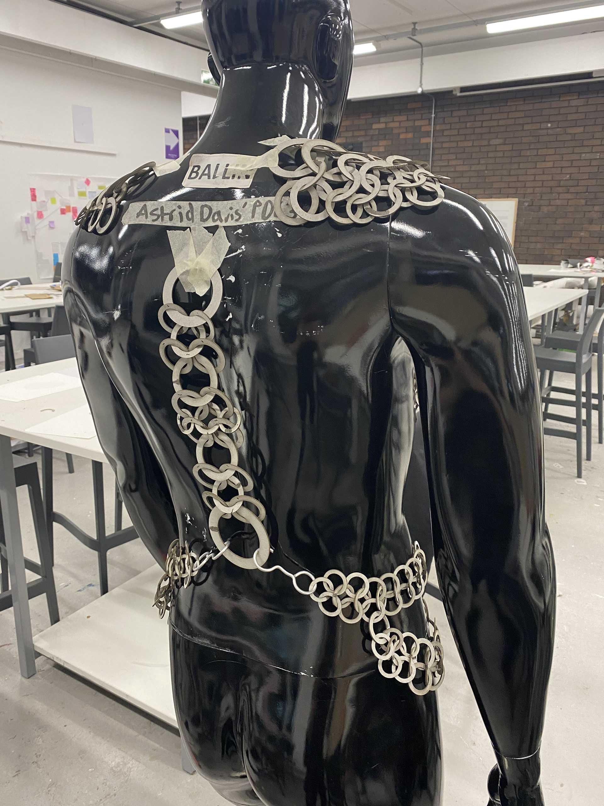
Making the Shoulder piece

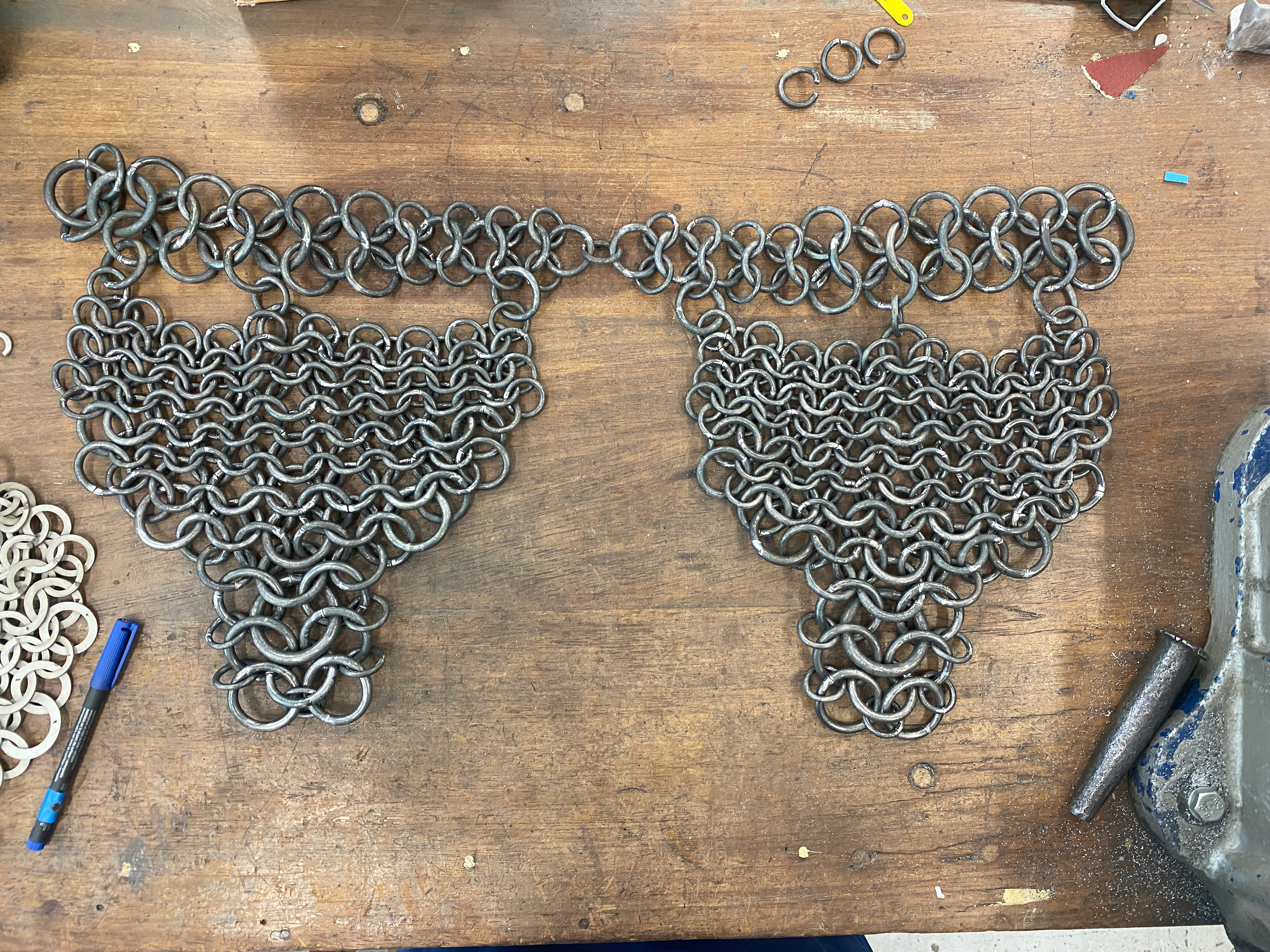
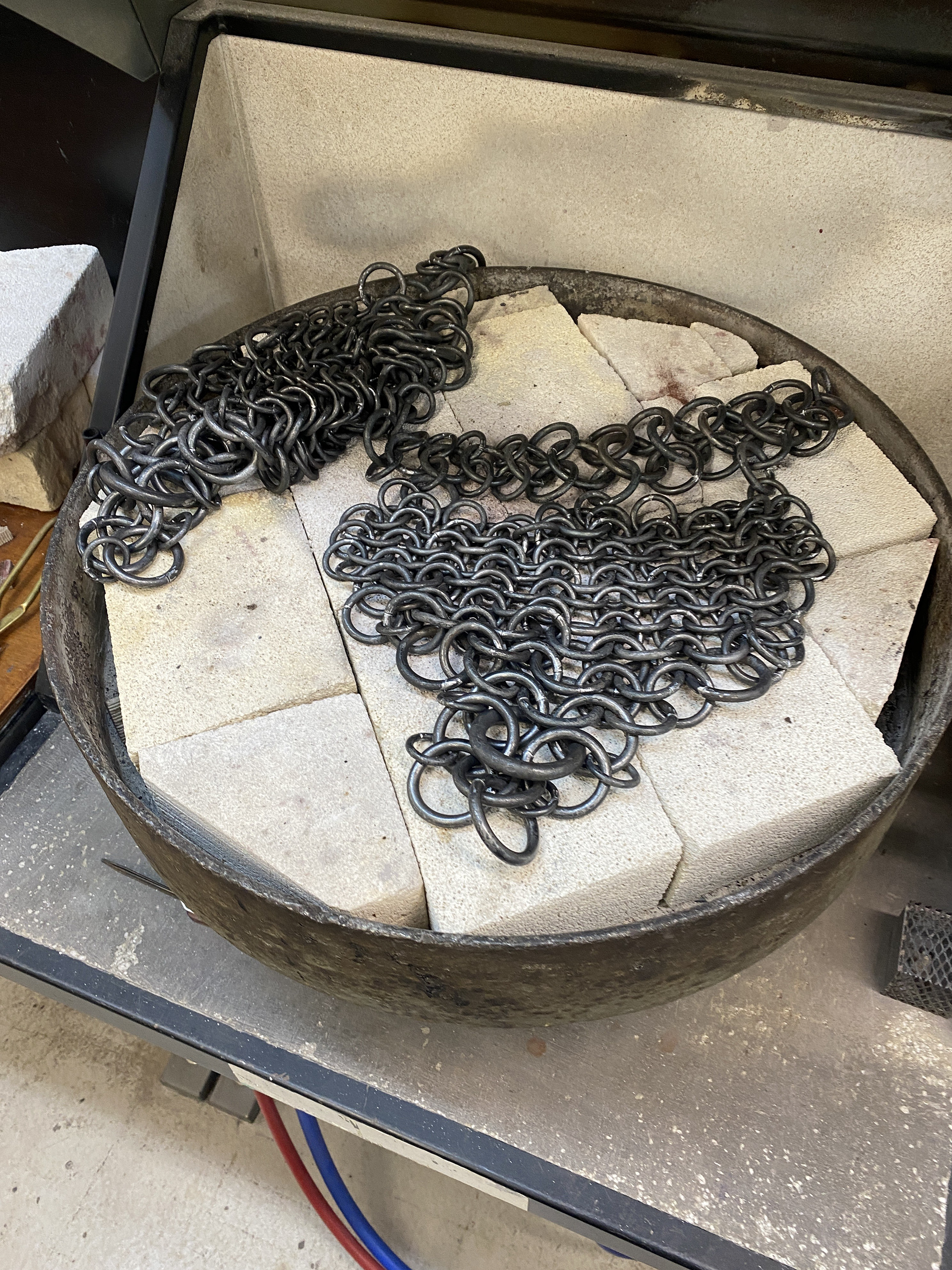
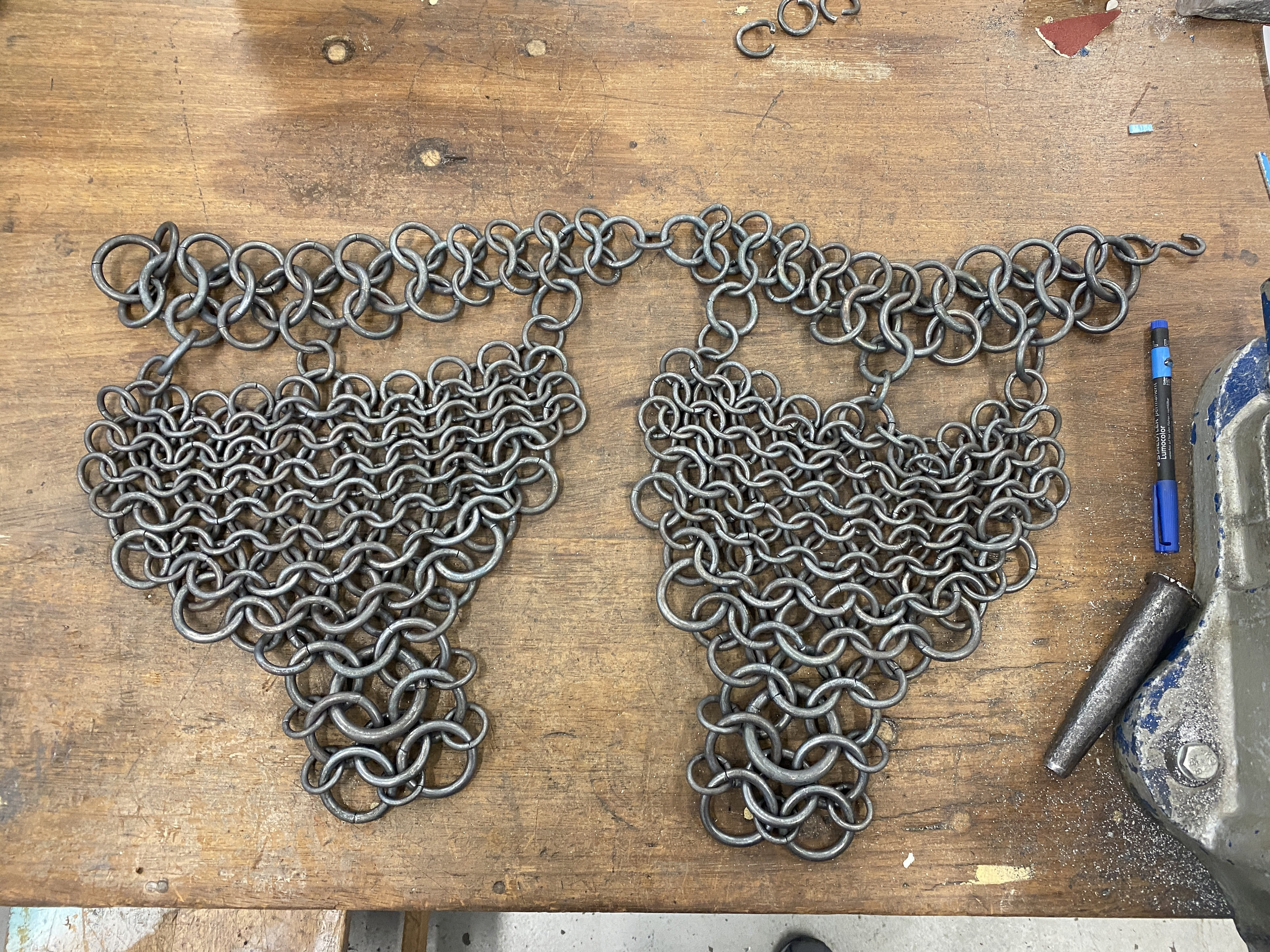
To assemble the Shoulder piece, I used the grey board model as a reference, copying the weave directly. I used the vice to hold each link as I hammered it open using a punch to ensure accuracy. I then weaved the links together on the workbench before placing the open link back in the vice and closing again with the punch. I weaved sections together for subassembly before attaching them all together. Finally, I used a torch to blacken the links where the pendant drill had removed the forge scale and ensure a uniform aesthetic.
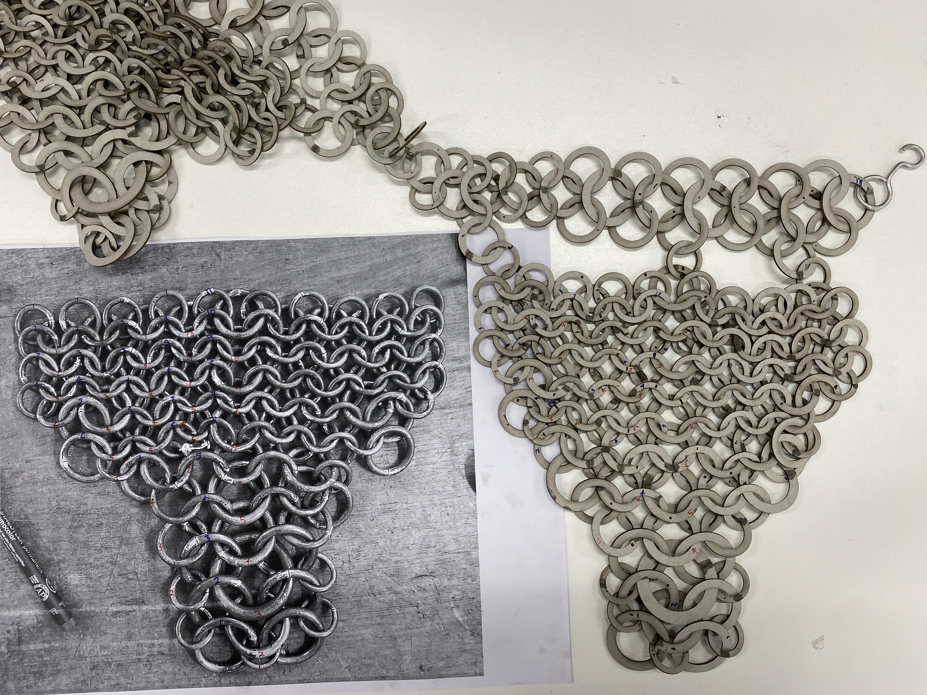
During the weaving process, I made a mistake by linking a section incorrectly. I was unable to identify the error solely by referencing the grey board model. To resolve this, I took a photo of the steel version and used a marker to tick off each link that was in the correct position. This method allowed me to locate where I had woven the wrong links together and fix the mistake.
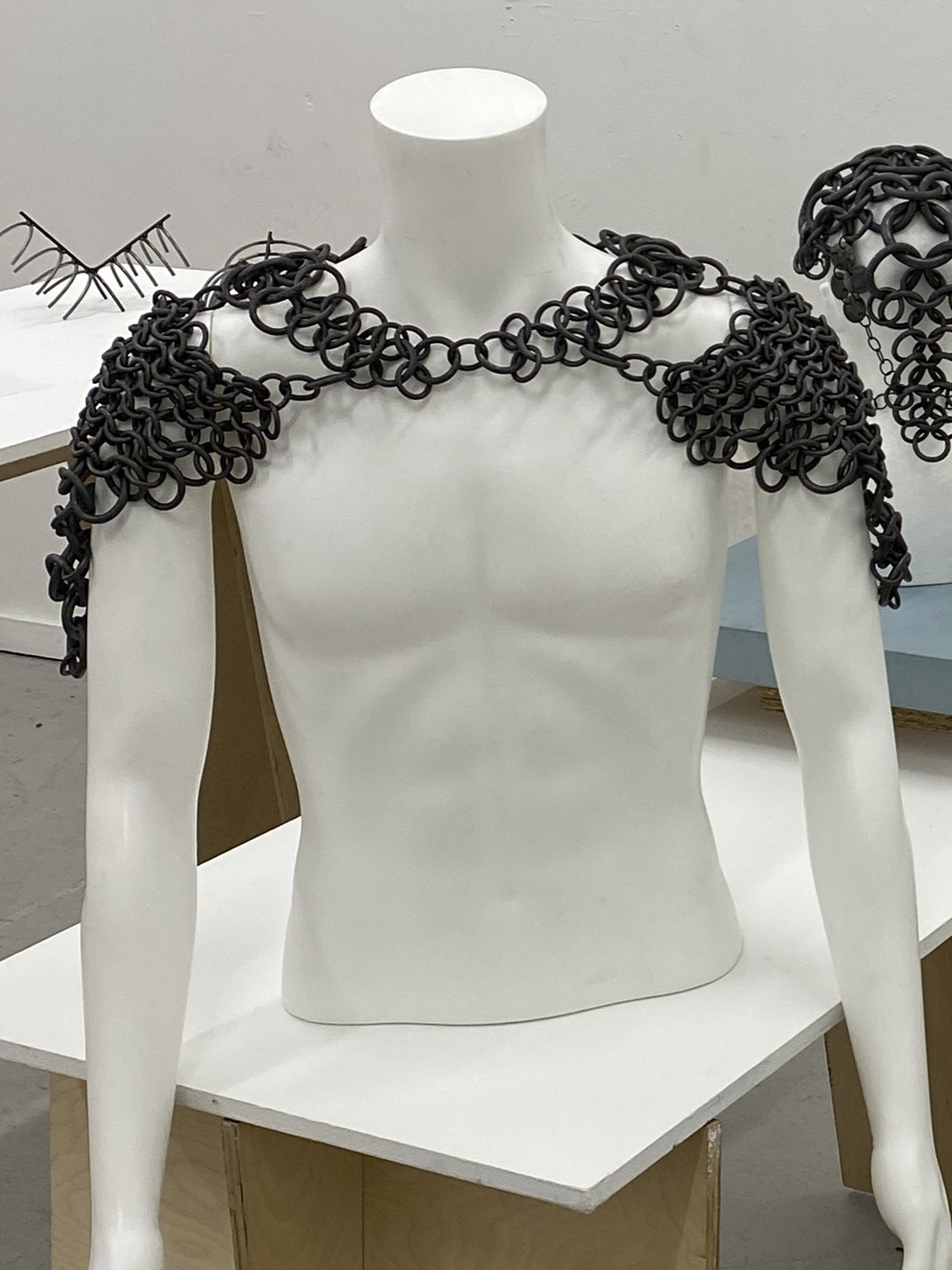
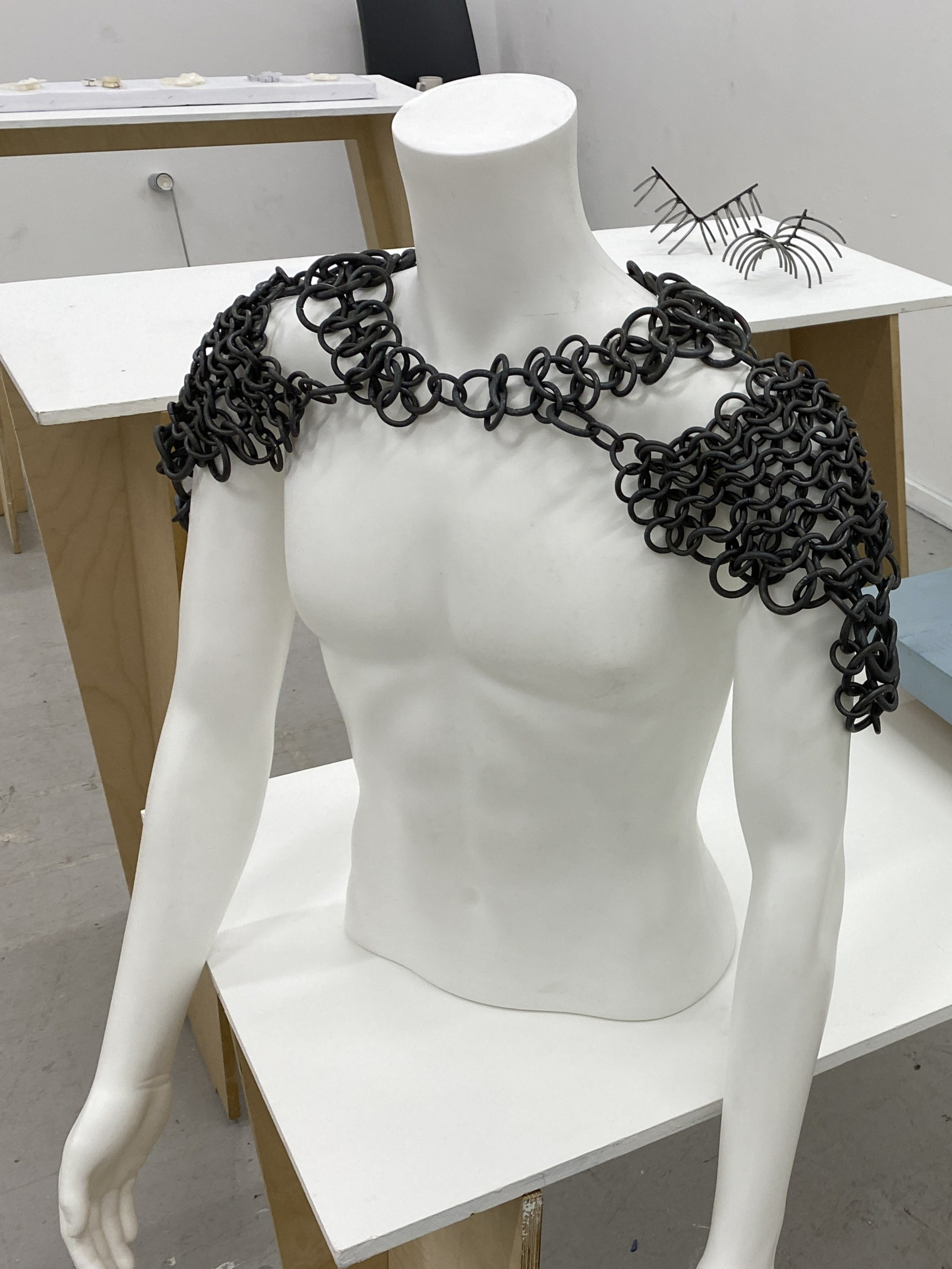
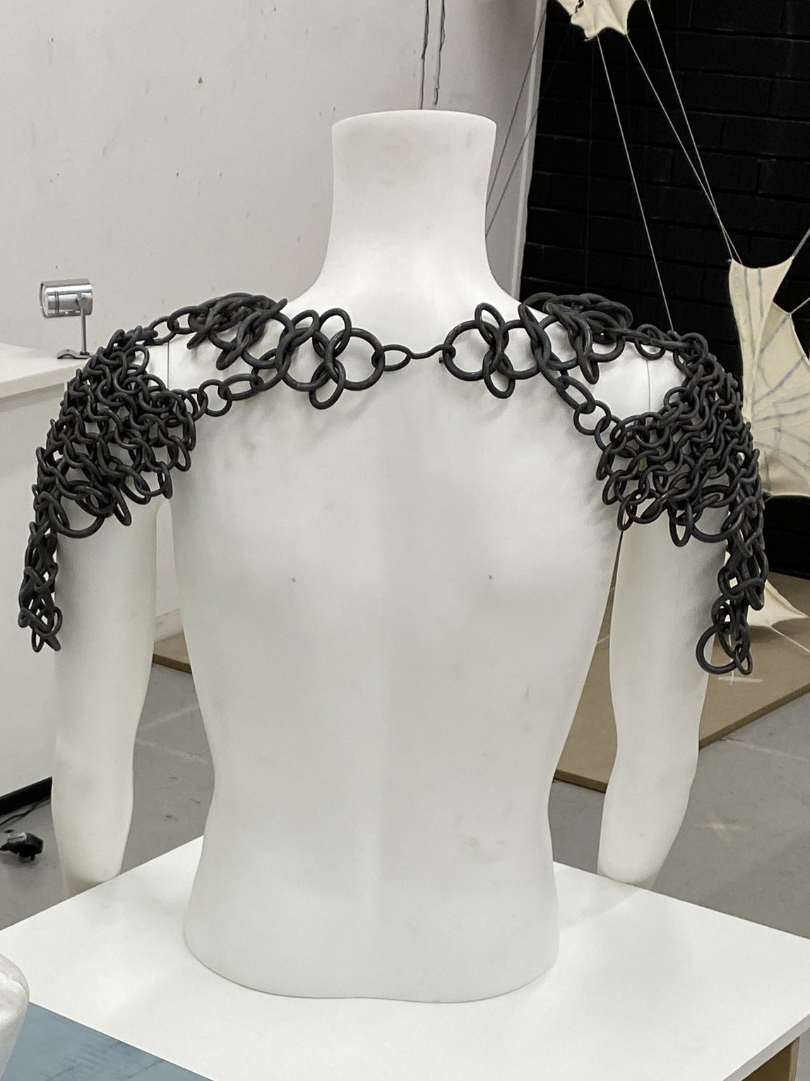
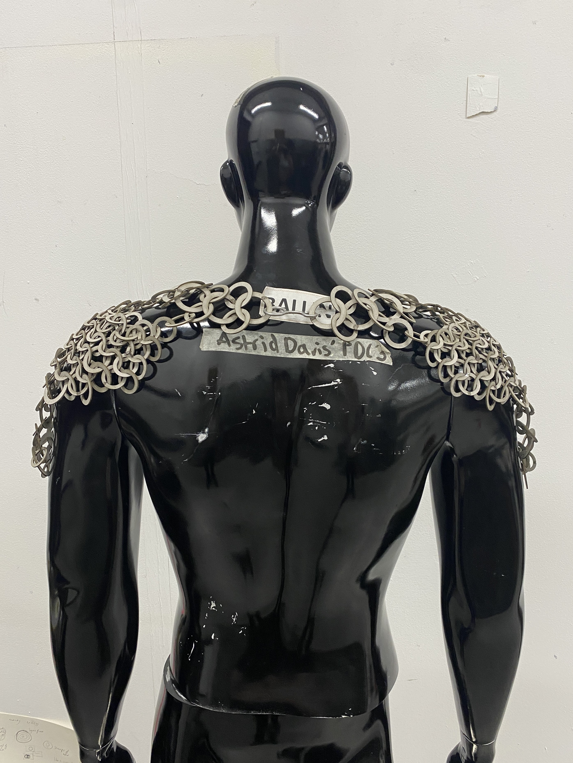
Reviewing the finished piece, I decided I was satisfied with the overall mail section, but the clasp didn’t work. The back of the piece converges at a single point, the only connection for the entire design, so it needed to either blend seamlessly or make a bold statement. I concluded that the clasp should draw attention away from the breadth of the shoulders and direct it toward the centre of the back.
Since the clasp is positioned at the base of the neck, the wearer will have the option to control its visibility. They can choose to showcase the large focal point or conceal it by laying their hair over it or pinning it up. Additionally, I believe that incorporating different materials into the clasp could further enhance its ability to draw attention.
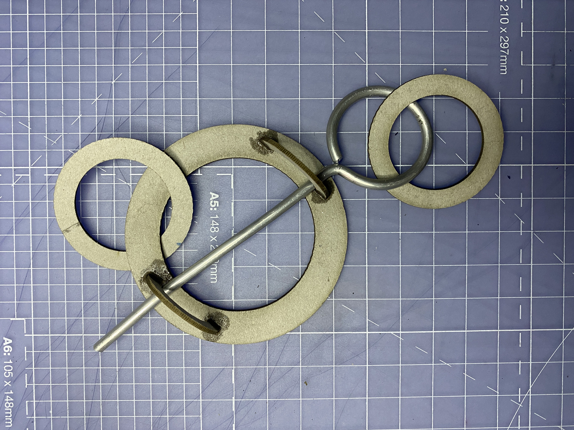
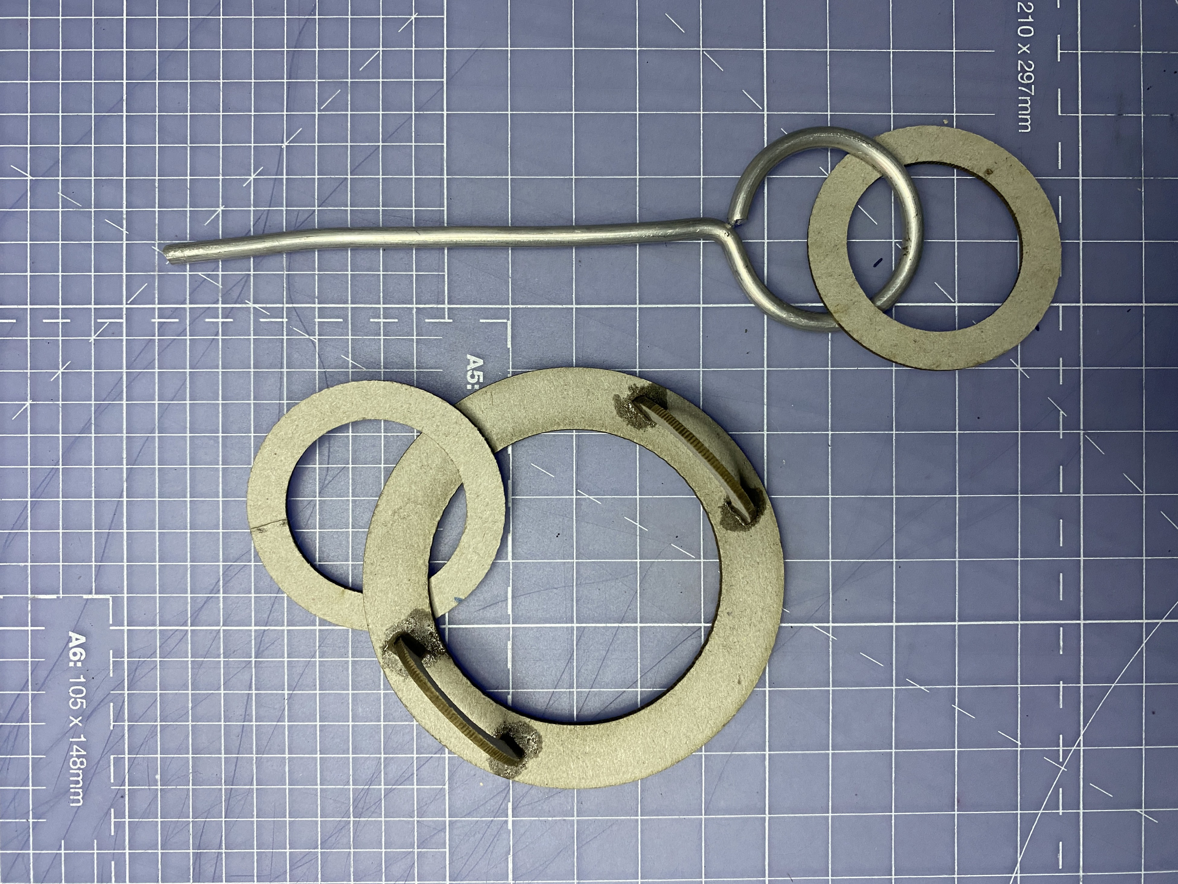
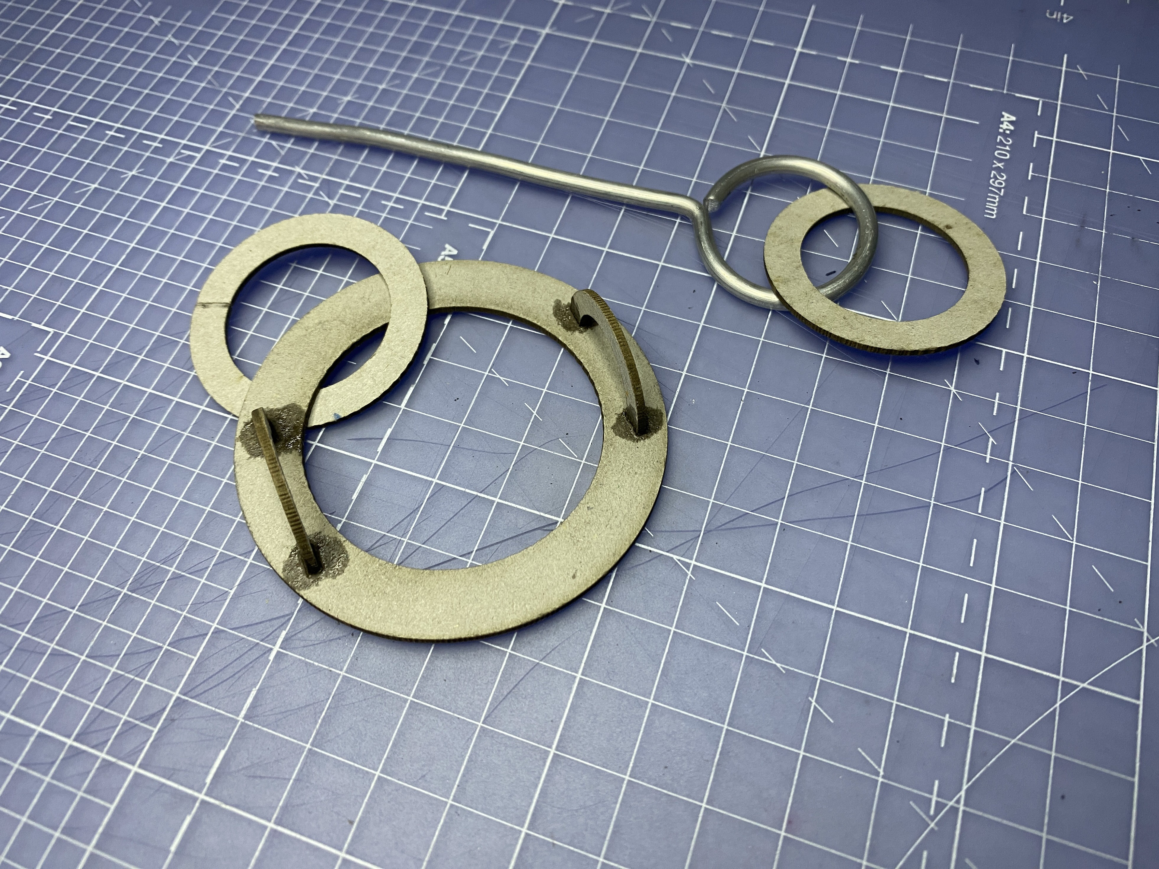
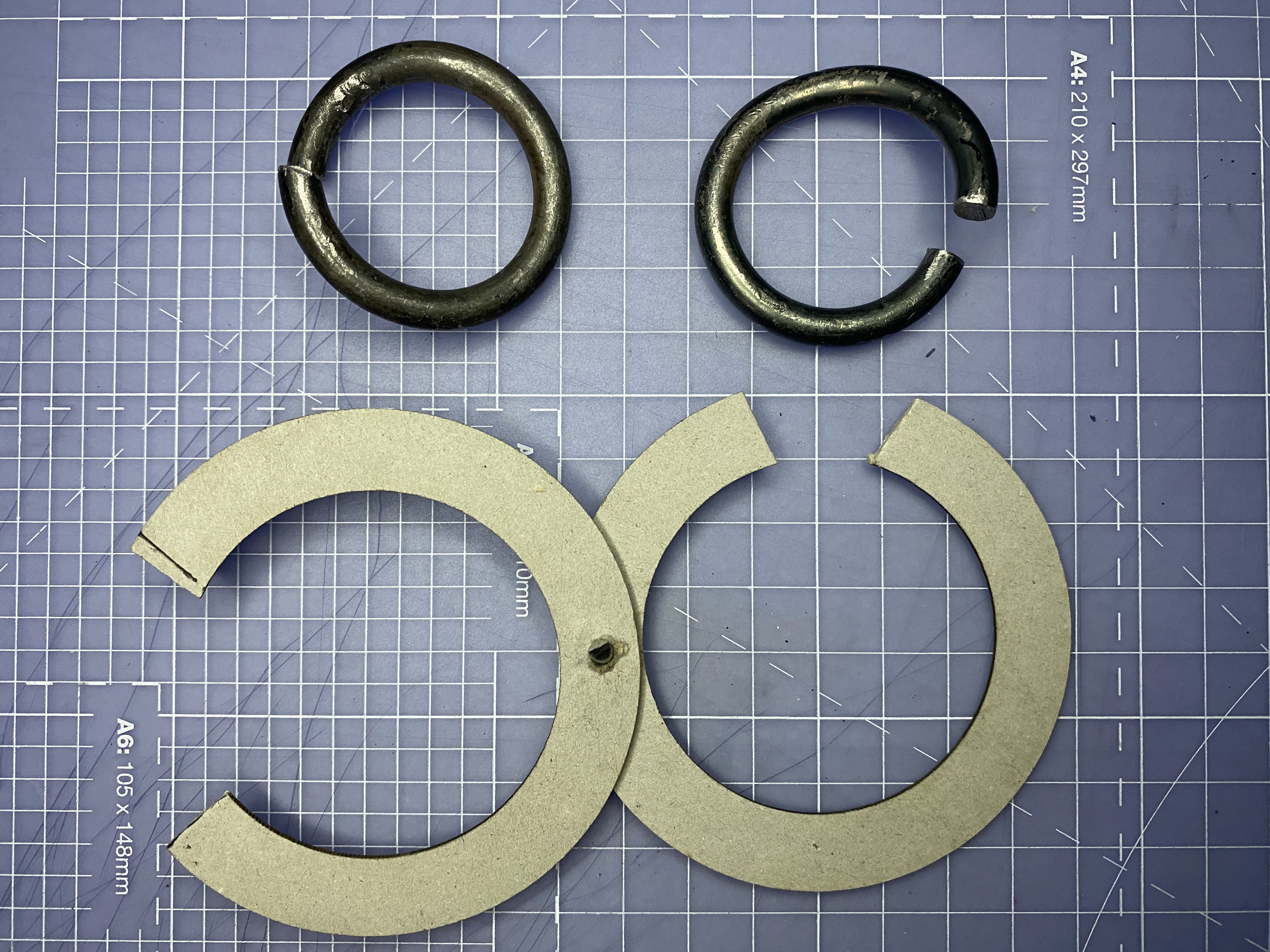
Modeling a new clasp

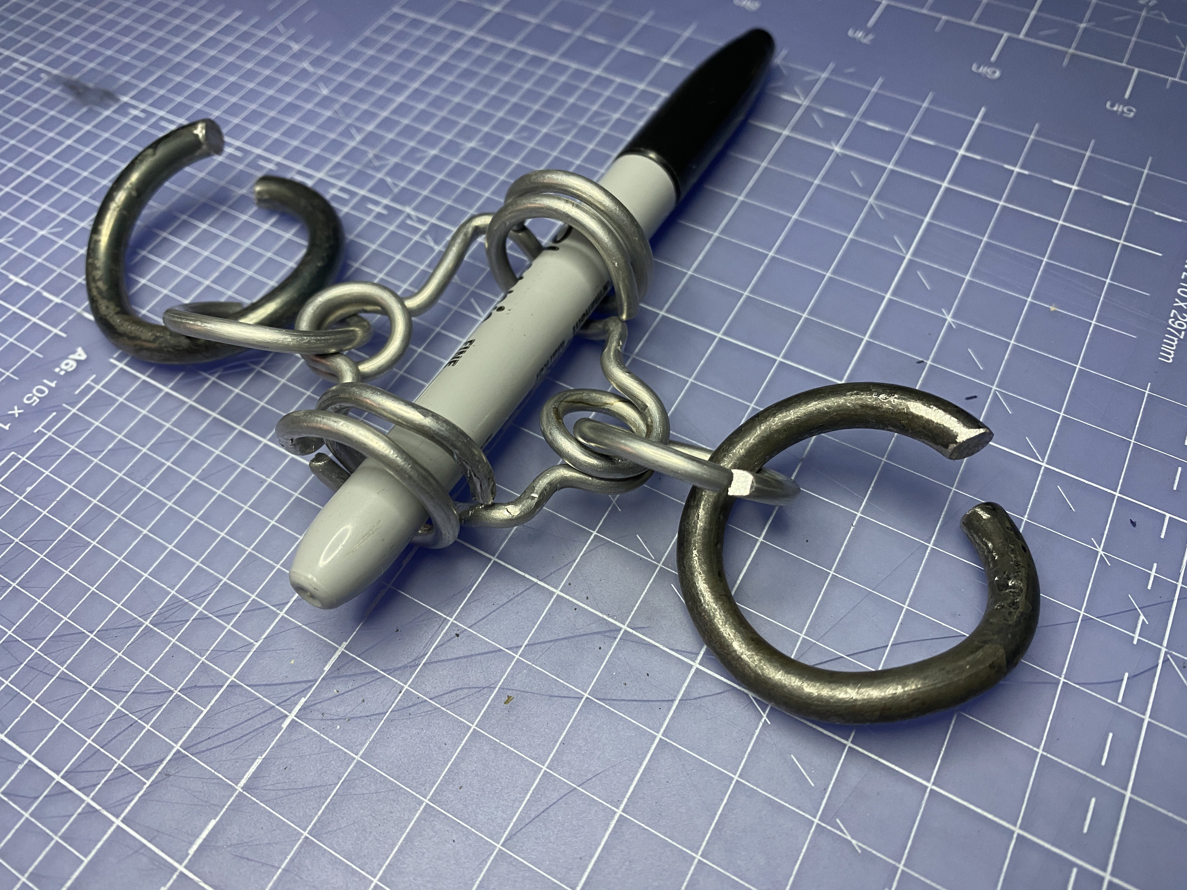
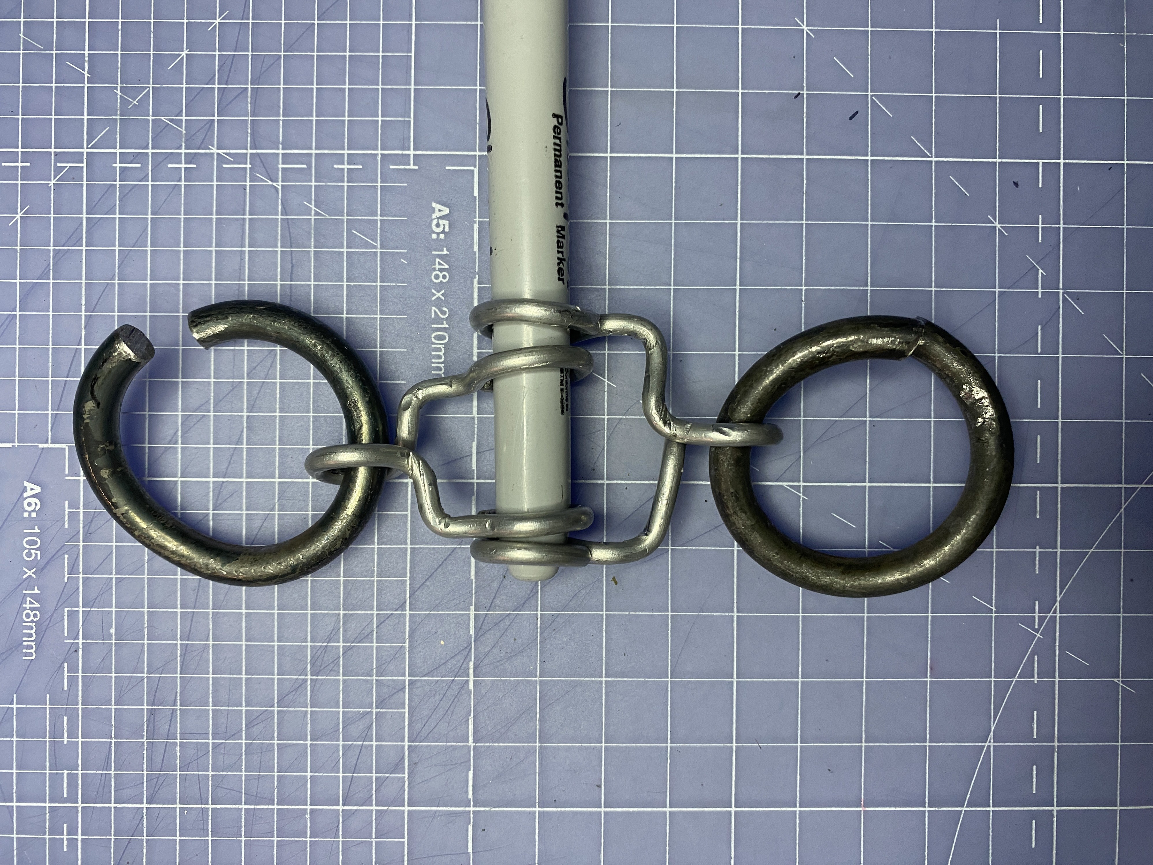

I began by exploring how a tapered, forged copper piece (represented by the pen) could serve as a pin to lock the two sides together. I appreciated the motion of bringing the two sides together and securing them with an additional element, creating the effect of the piece being locked together like a key. Furthermore, the tapered pin would naturally draw the viewer's eye to a singular vertical point, directing attention down the back rather than across the shoulders.
However, during testing, the pin tended to move out of place, raising significant concerns about the piece coming apart. This issue became a problem when the wearer leaning too far forward, as the pin could fall out from the top.
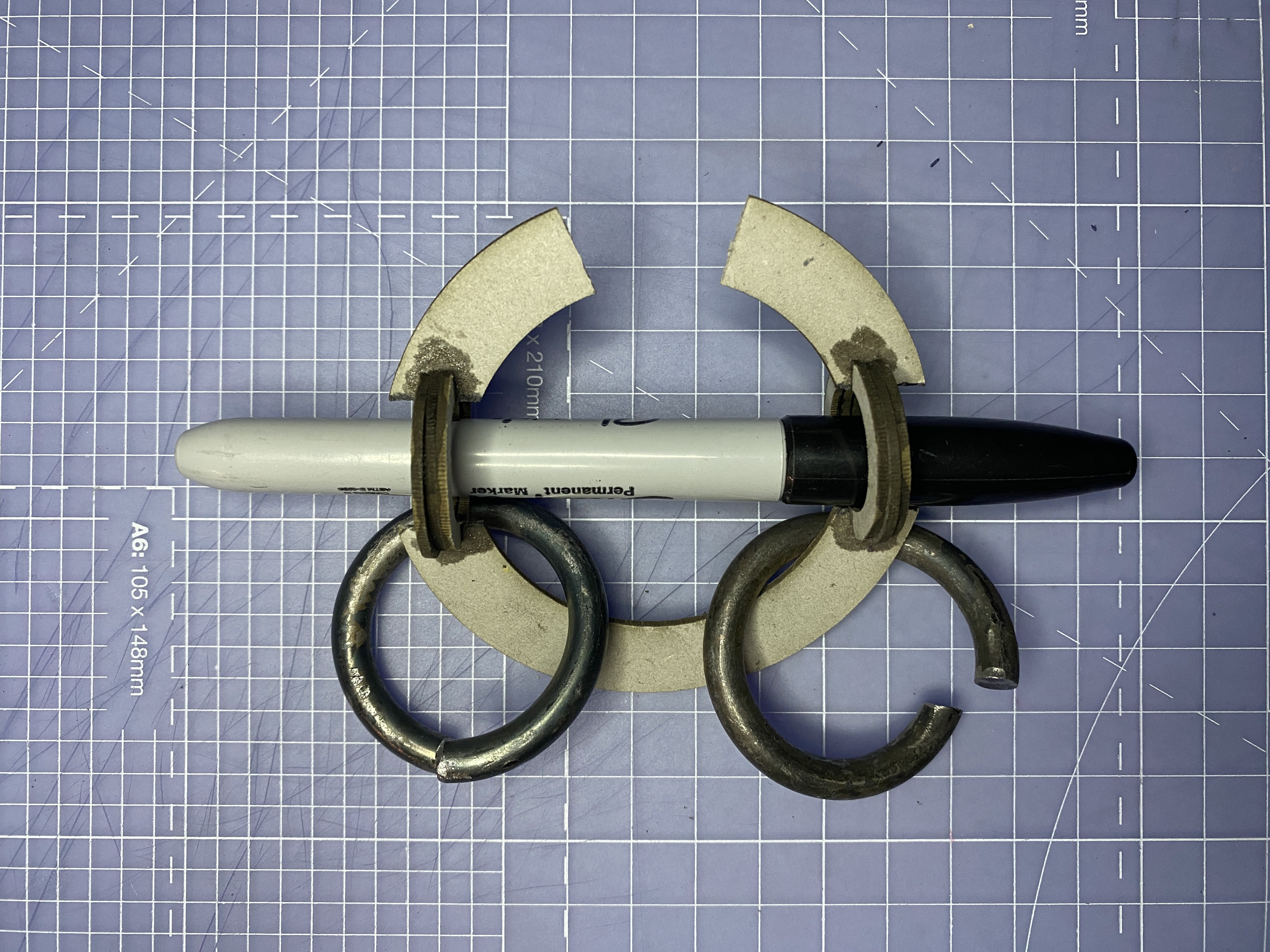
To address the issue of the pin falling out, I experimented further by altering the shape of the clasp. My goal was to create a design that maintained harmony with the rest of the piece, modifying the links into a clasp mechanism rather than introducing a conflicting design language. I explored the idea of manipulating a link by punching a hole for the tapered pin to pass through and lock the two sides together.
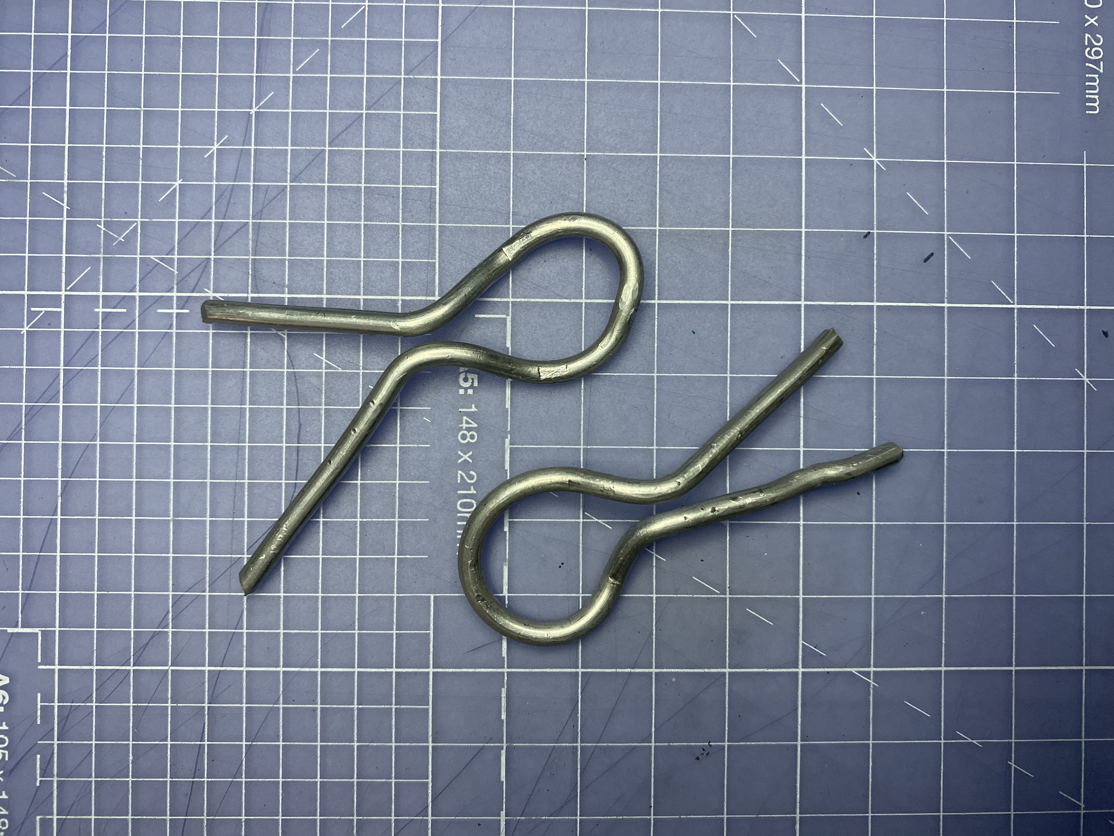
The first design involved creating a gap in the link for the two sides of the piece to hook through, securing them in place with the pin. While this motion was aesthetically pleasing, it had the same issue of the pin falling out when the piece tilted.
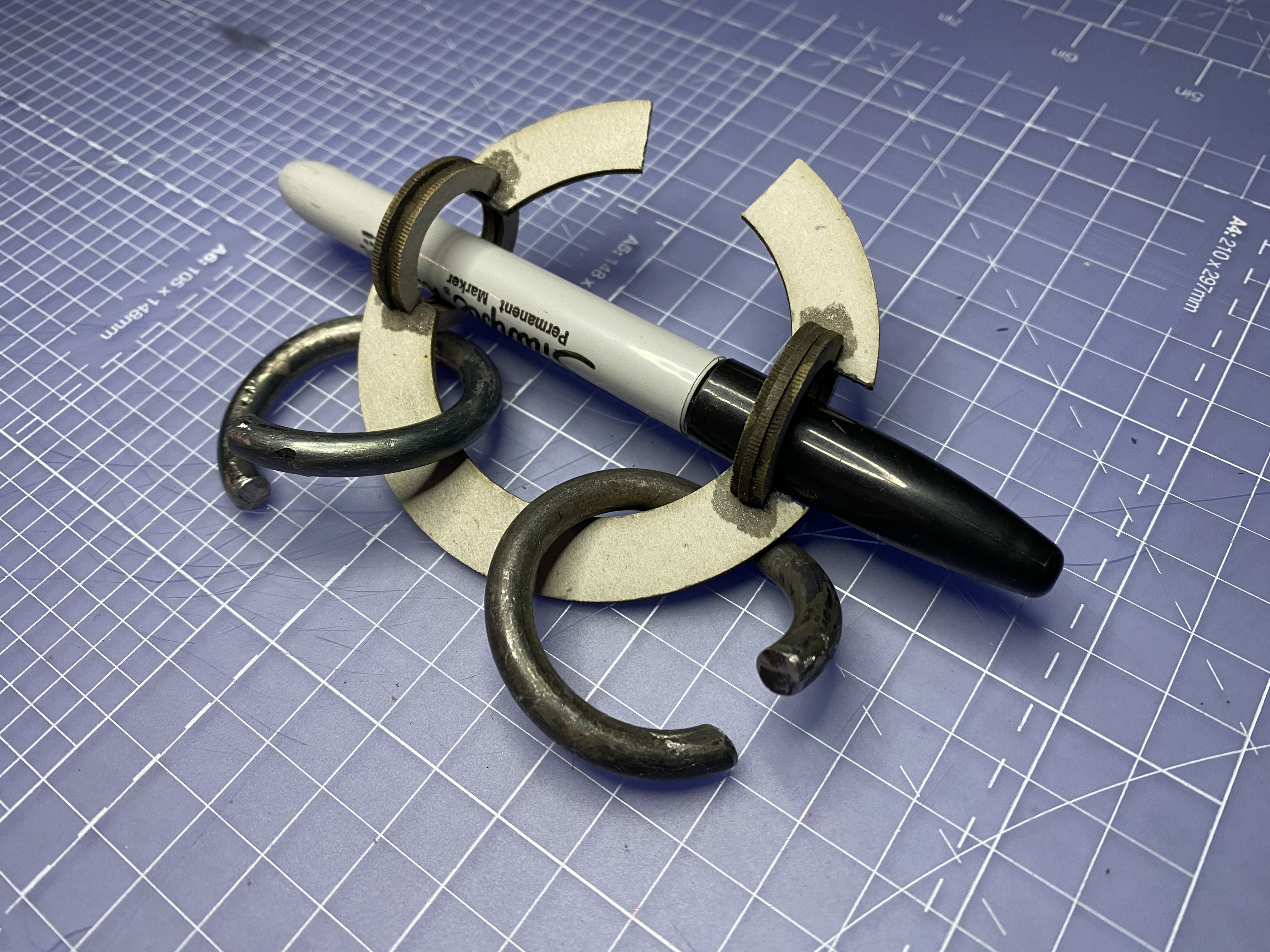
The second design attempted to resolve this by leveraging gravity and incorporating a much larger eyelet. However, the offset design caused a visual imbalance in the symmetrical piece. Additionally, the two sides would not have aligned correctly on the back.
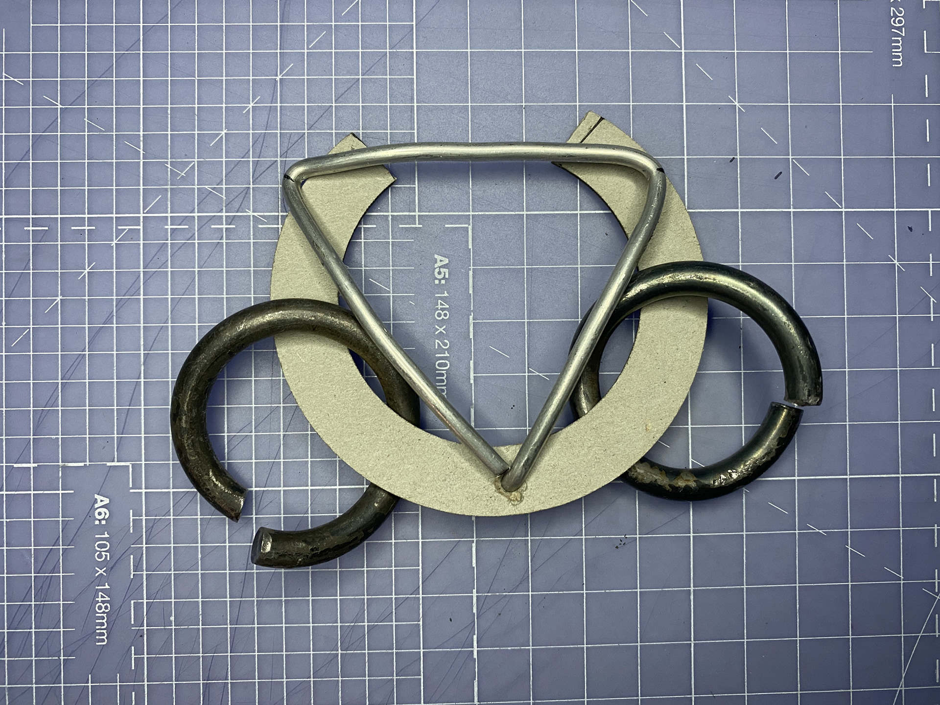
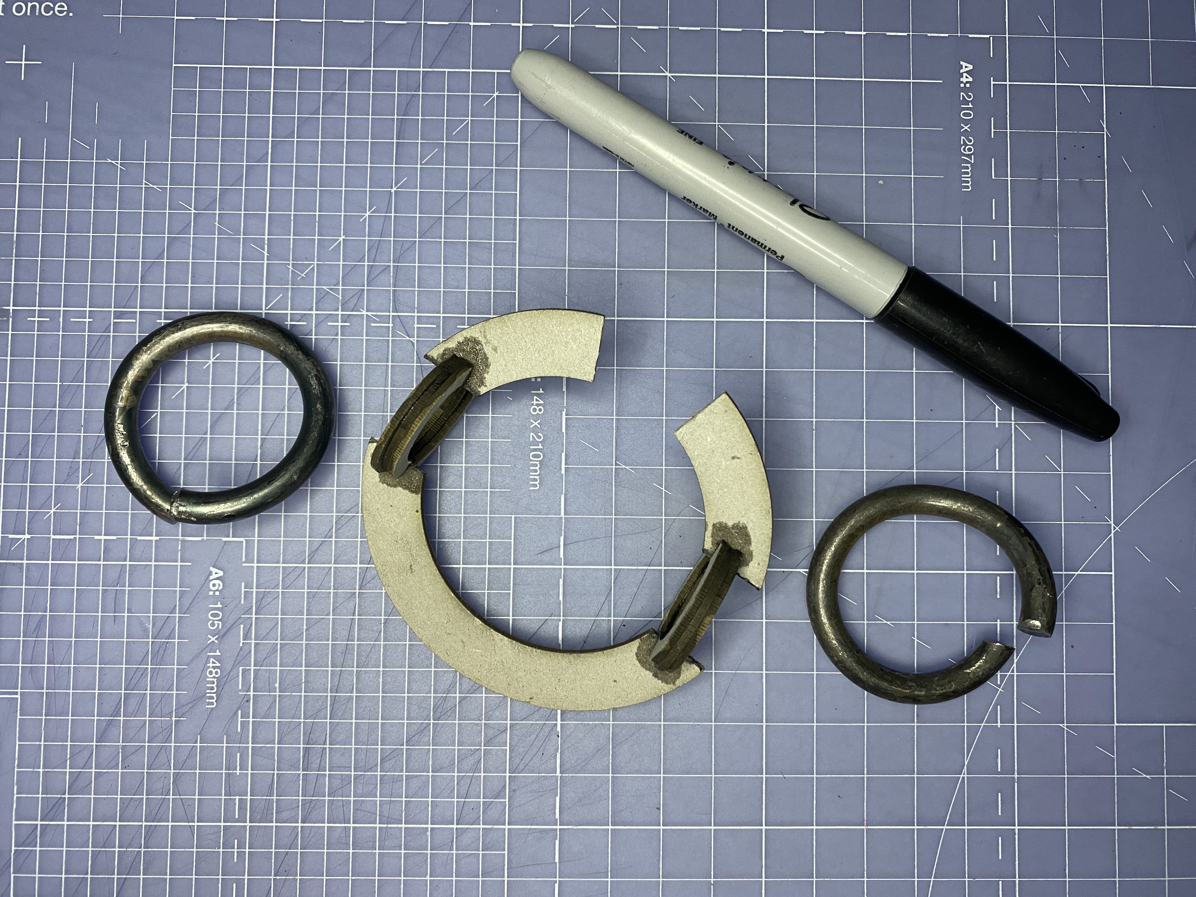
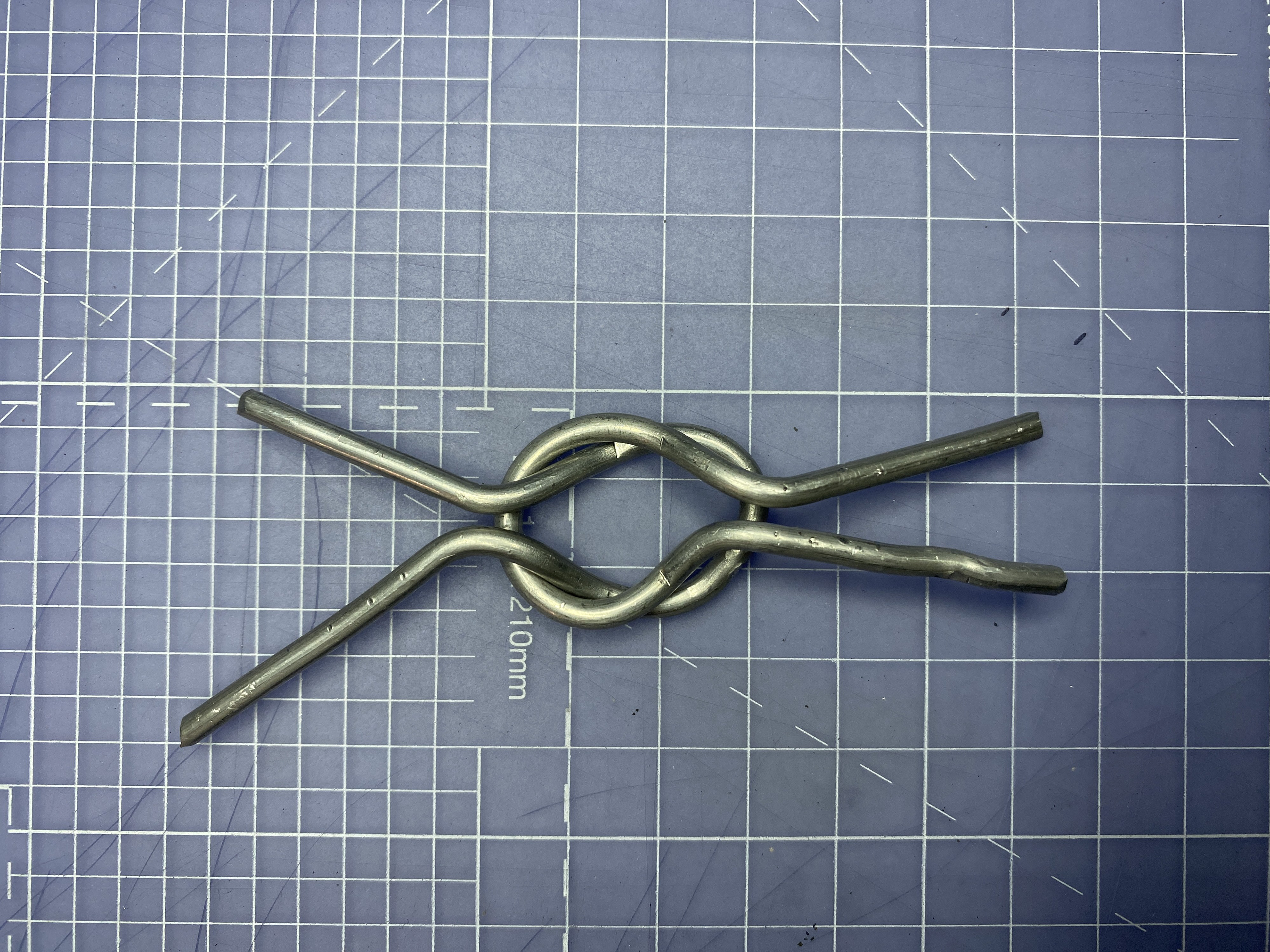
I wanted to further explore the interlocking motion and tested two methods of securing the sides into the modified link. First, I experimented with twisting two overlapping links apart to create a space for the mail to slot into. While this worked, it proved difficult to align and would likely become too challenging to perform once on the body.
Next, I tested a rotating triangular lock, which offered a much smoother motion. However, I found that the triangle frequently collided with the links during rotation. Even after increasing the clearance, there were still positions where the mechanism would catch.
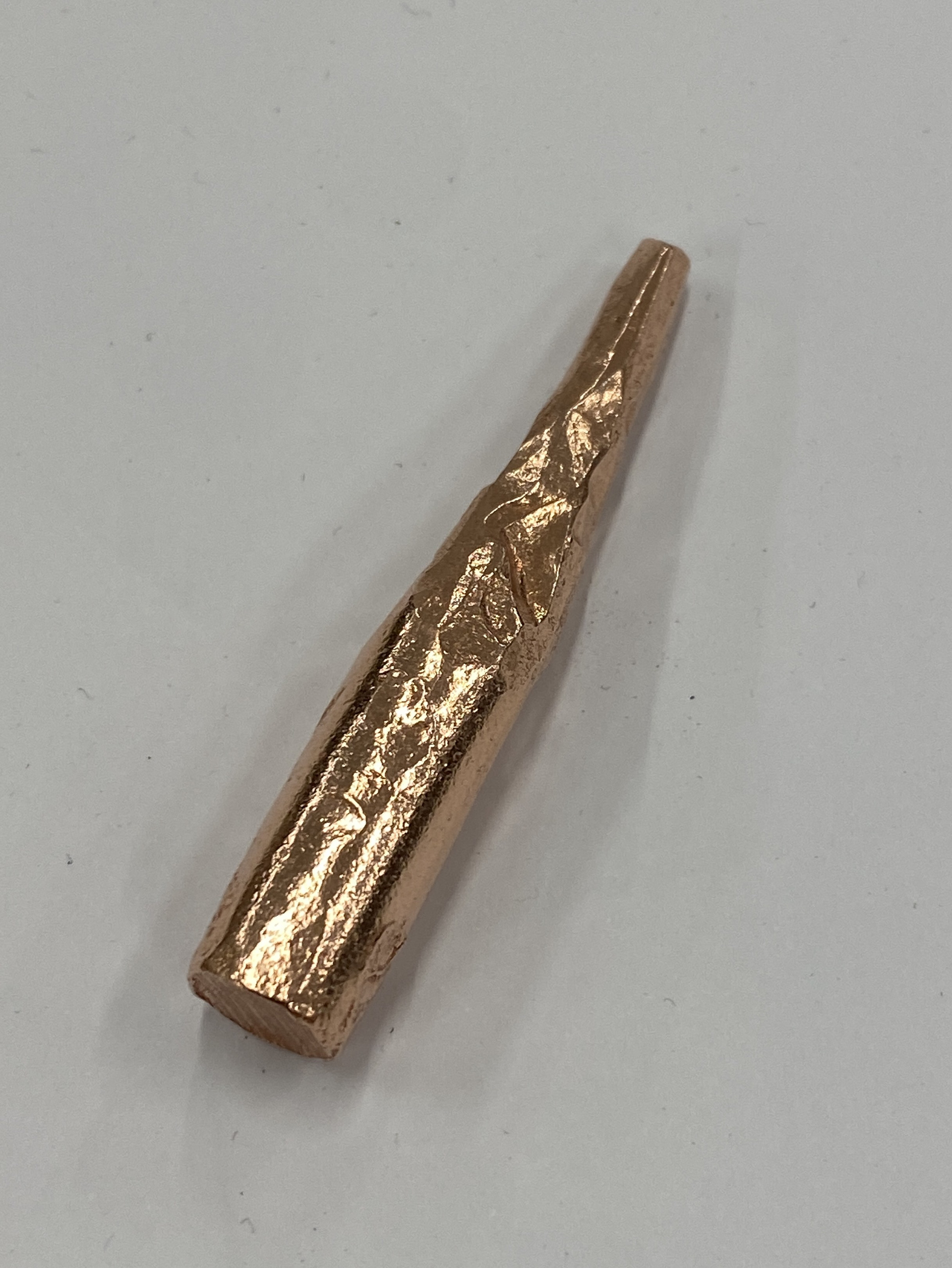
I wanted to use the new claps as an opportunity to explore some new techniques and introduce additional blacksmithing skills into the piece. As stated above, I aimed to investigate different materials and began by forging copper, a material I have some experience working with in the past but have never fully tested for its capabilities. Additionally, the stock we have available in the department is believed to be manufactured for machining rather than forging. Therefore, I experimented with tapering and punching a couple of pieces.
When tapering the copper, the process was very similar to working with steel, as it drew out into a very uniform point. However, one difference was the significantly increased malleability of the material, which required much less force to manipulate. This sped up the process but also resulted in the piece picking up more imperfections from every knock or misplaced hammer blow. Overall, tapering the copper was a success, but it requires greater care compared to working with steel.
I then tested punching holes into the bar. This process spreads the material around the hole, maintaining the structural integrity of the piece rather than removing material through drilling. I found this very challenging with the copper rod. When I placed the piece over the pritchel hole (the circular hole in the anvil) to punch out the hole, the force pushed the workpiece into it and deformed it. I then tried cold working the piece on the face of the anvil instead, which proved much more effective. However, the rod began to deform and flatten even when cold, due to the material's high malleability.
In conclusion, I believe introducing forged copper will suit the claps, adding both colour and a display of technical skill. Tapering and bending the rod seem promising, but punching is too unpredictable and would require too much time to master for this body of work.
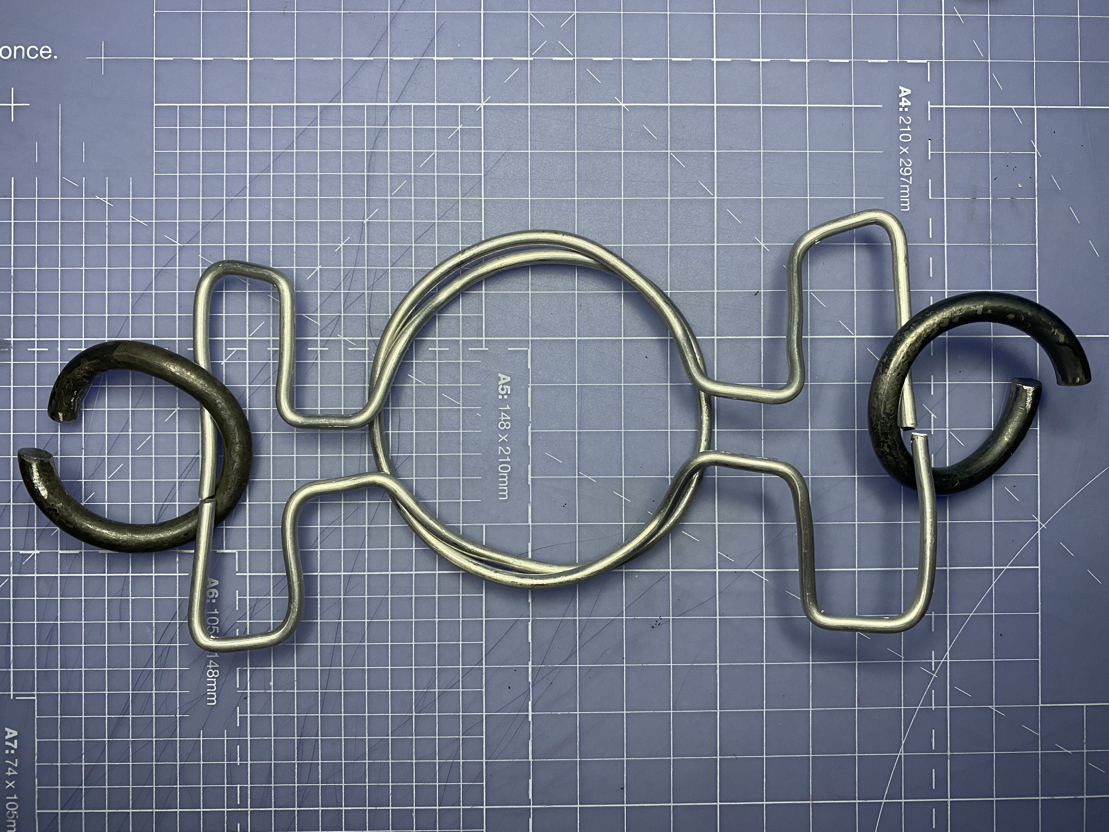
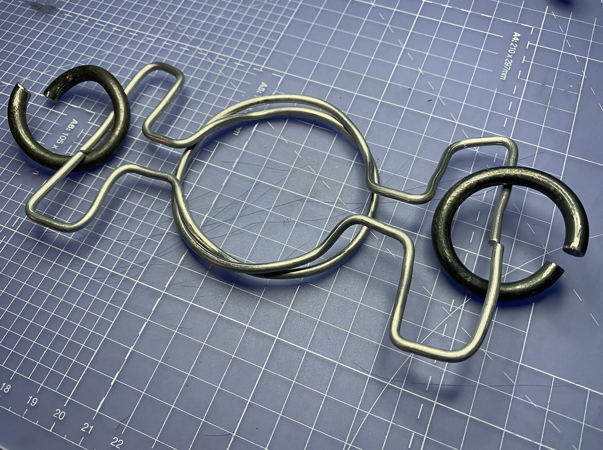


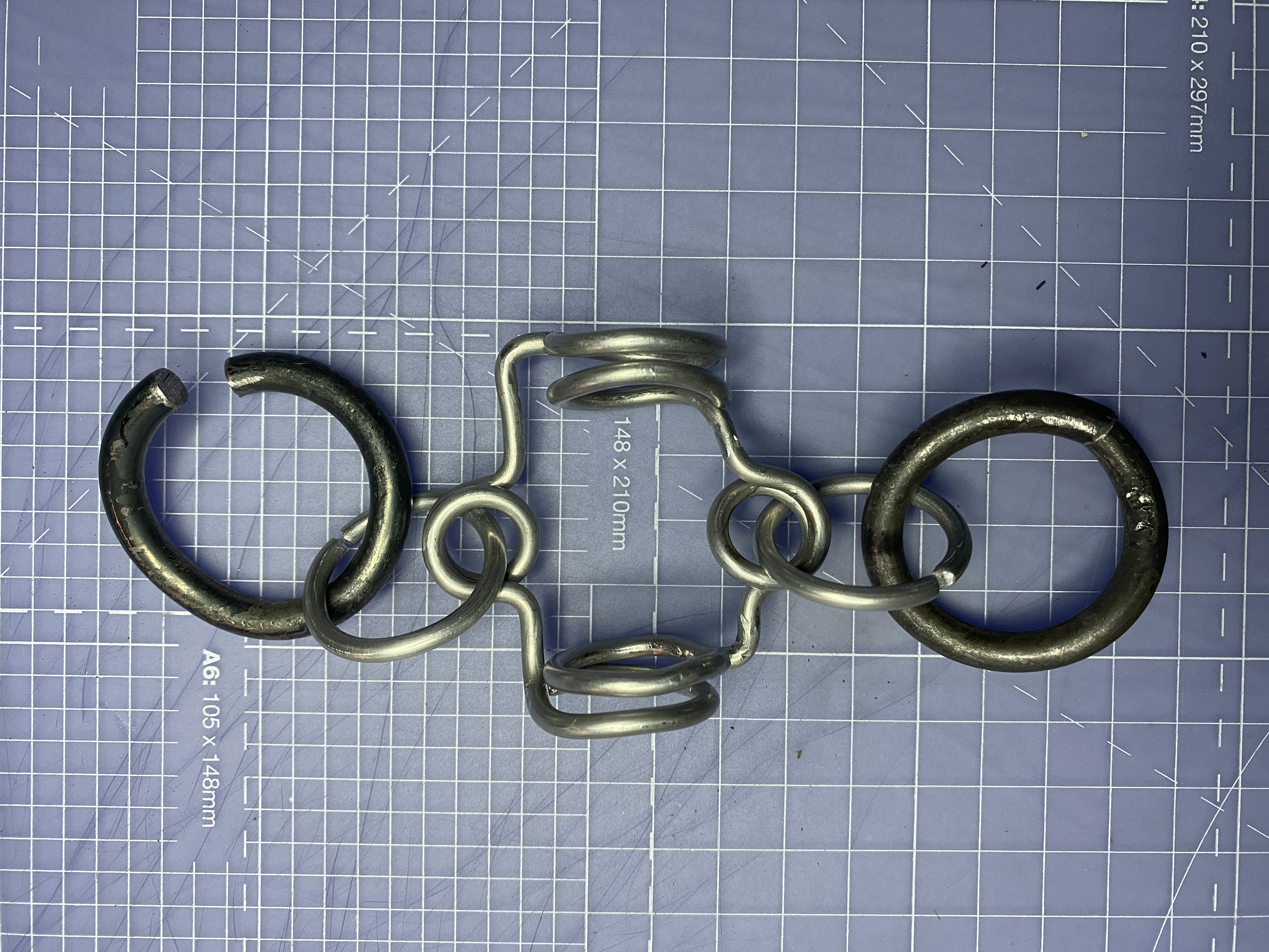
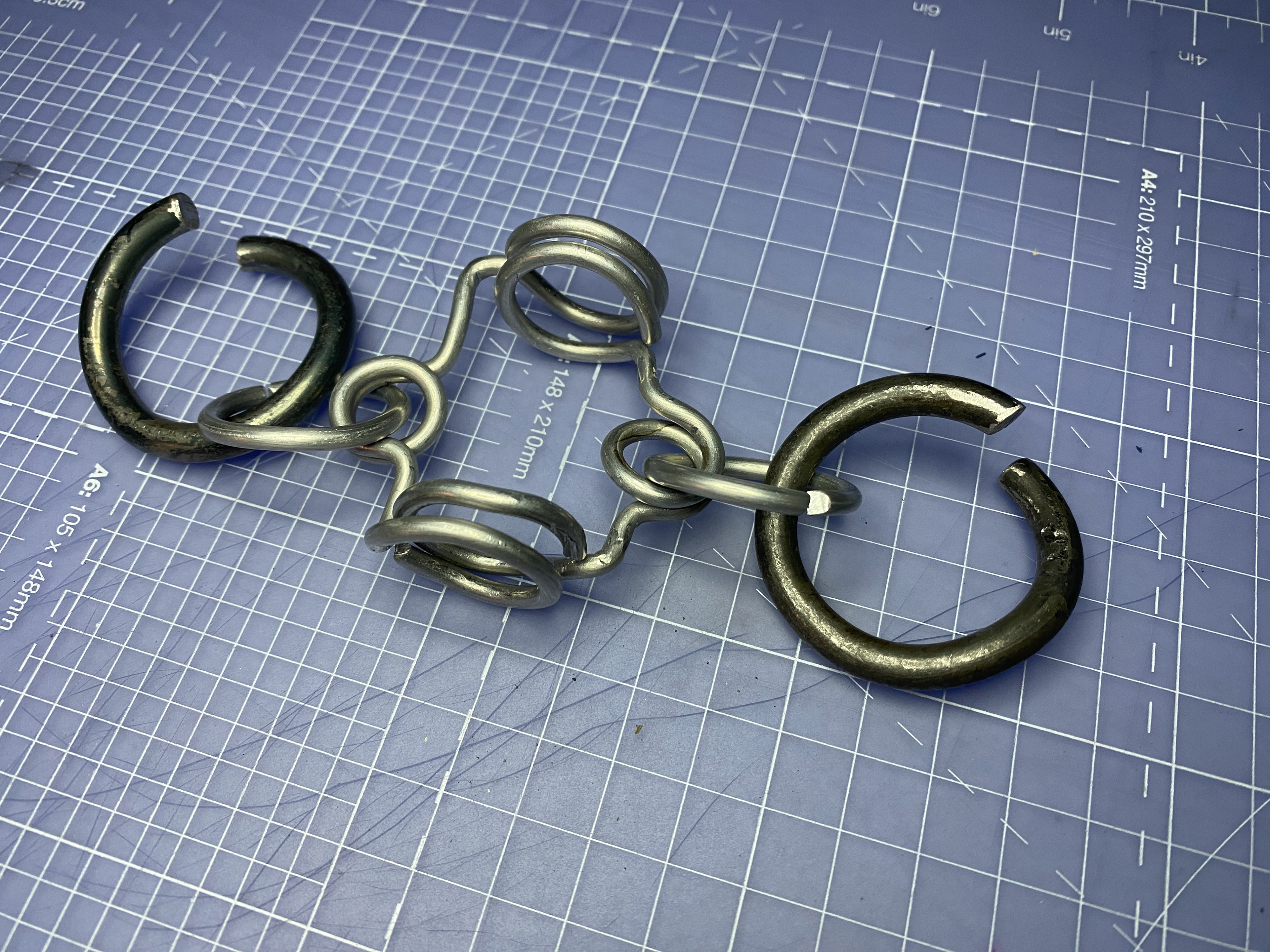
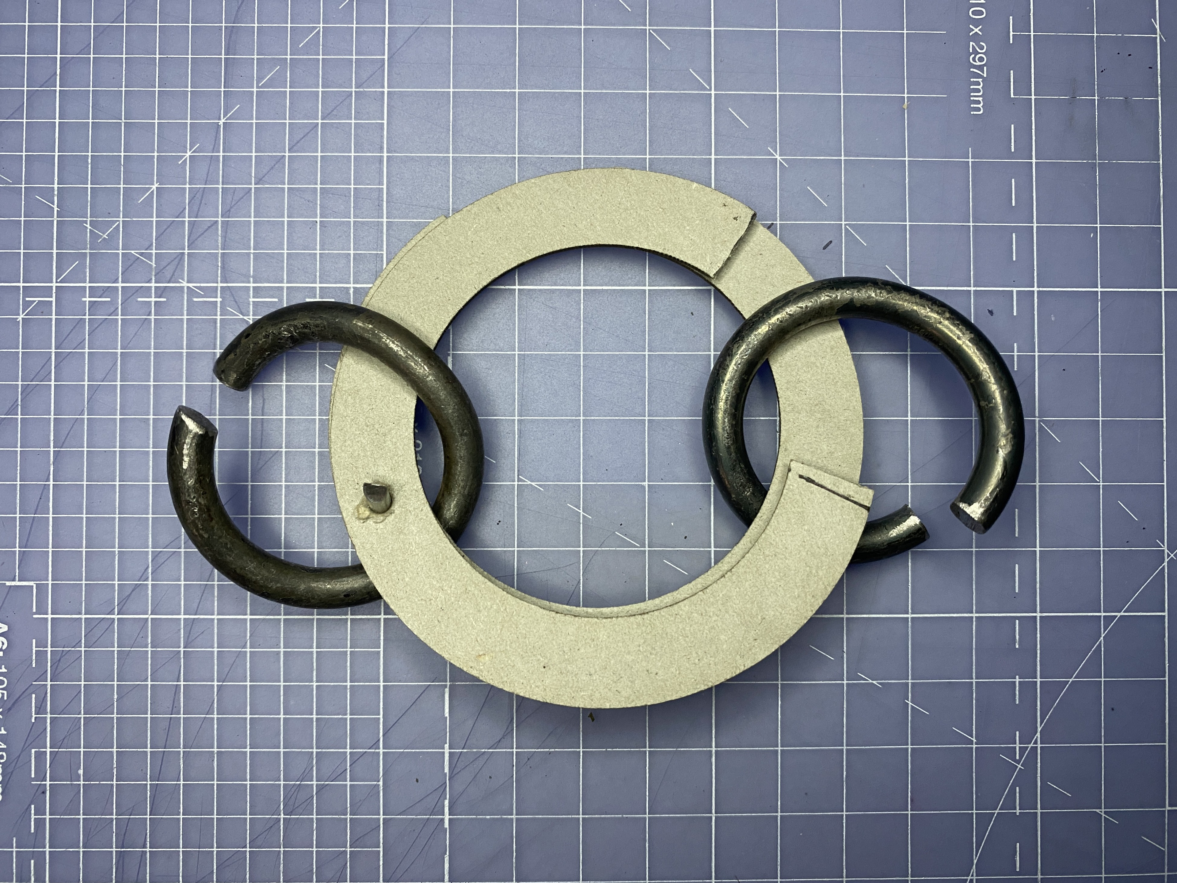
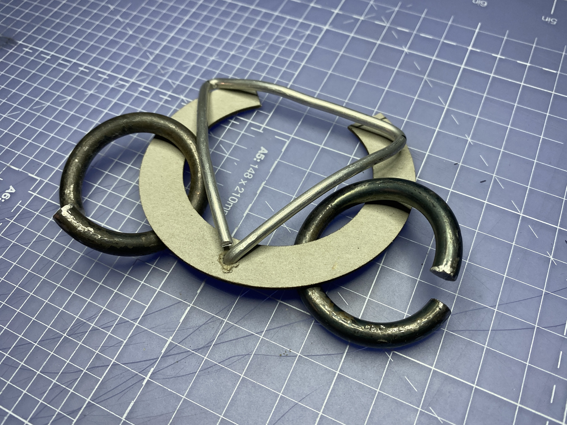
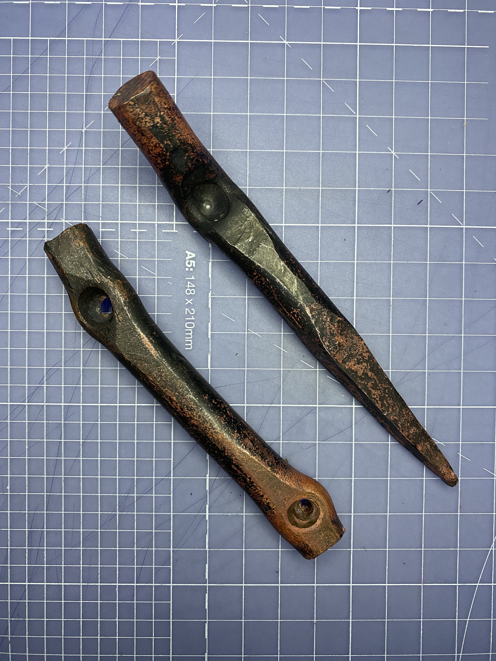
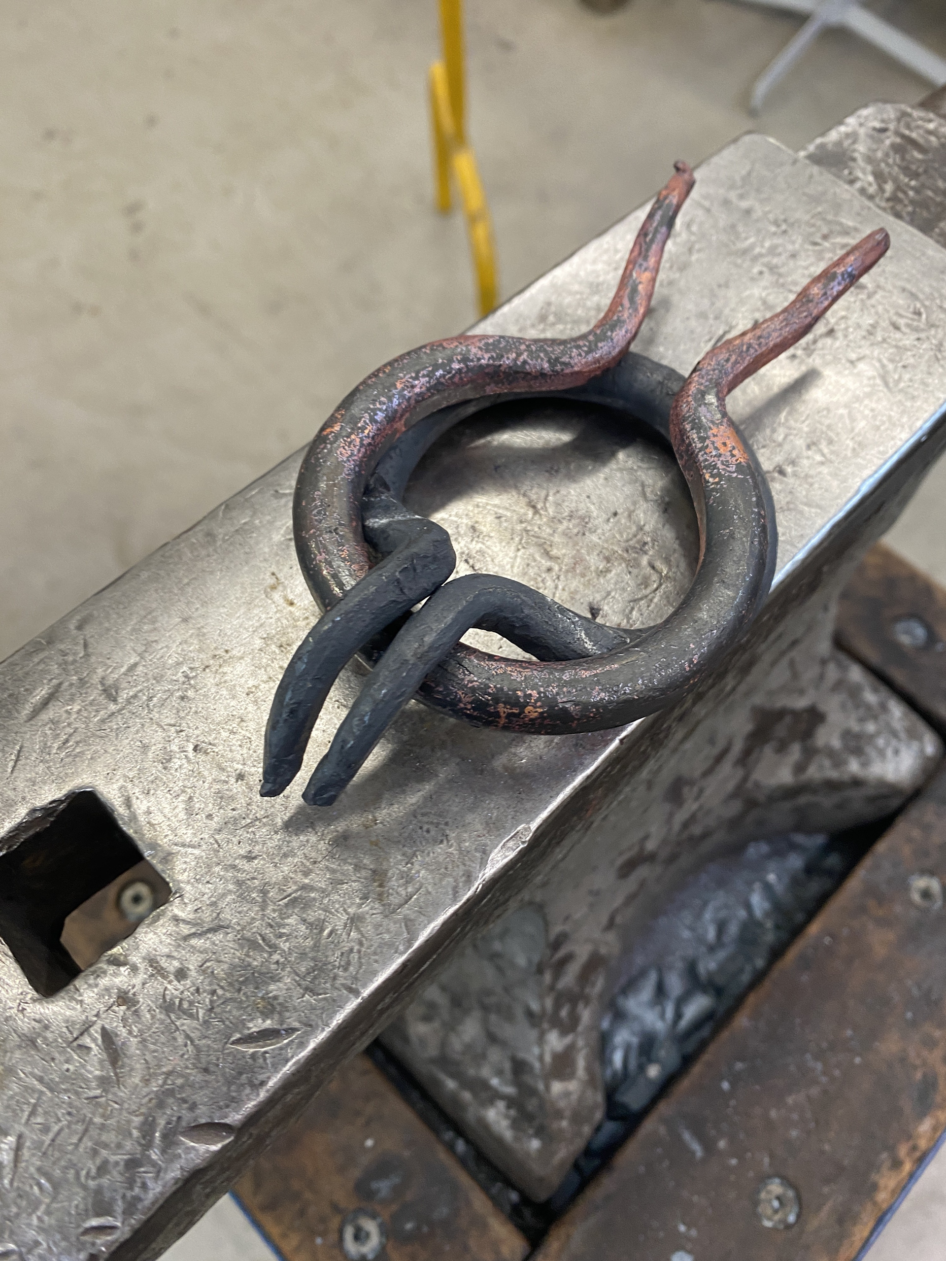
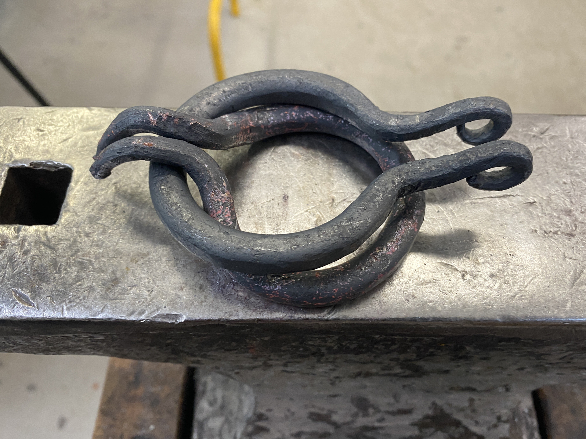
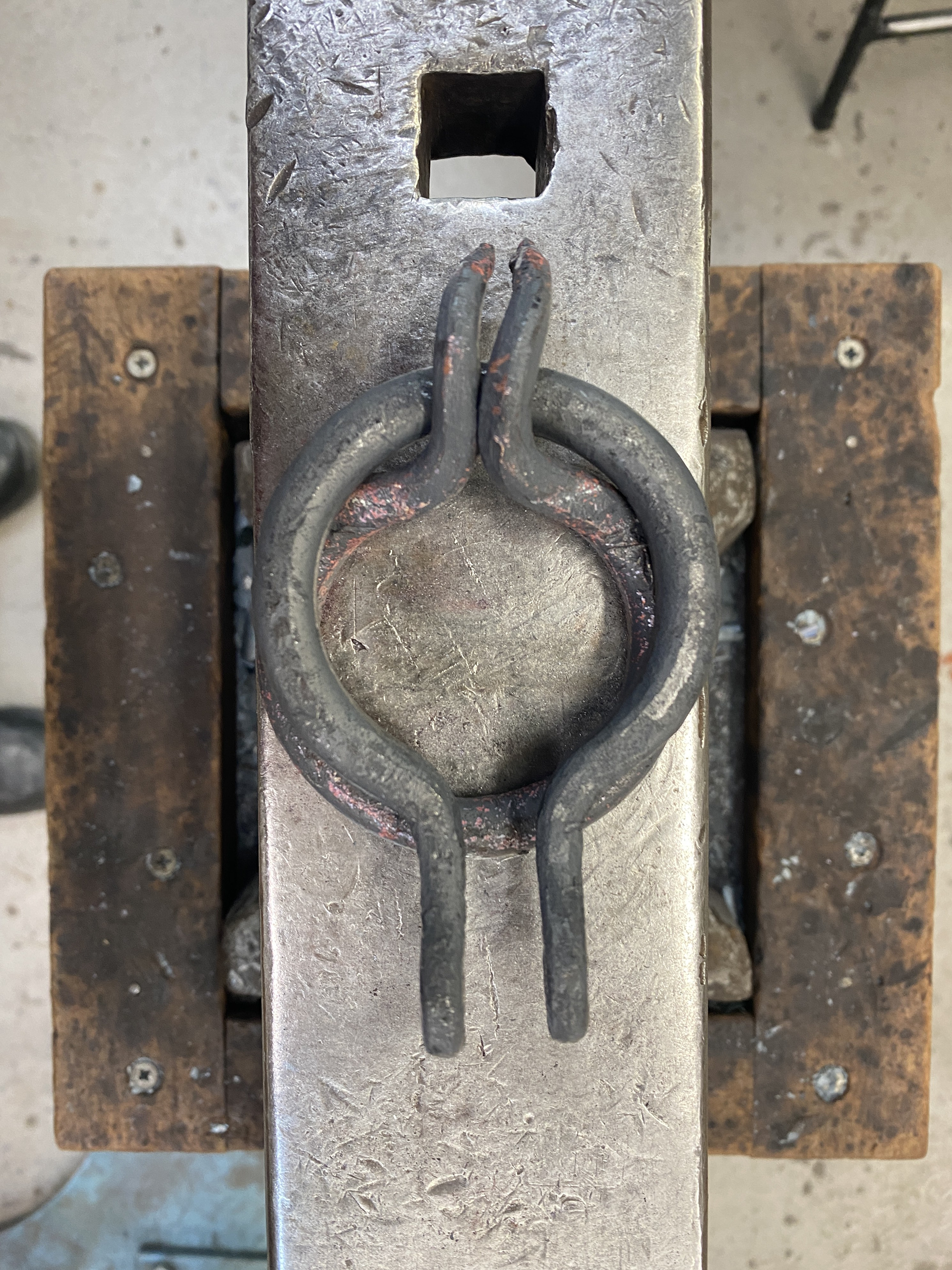
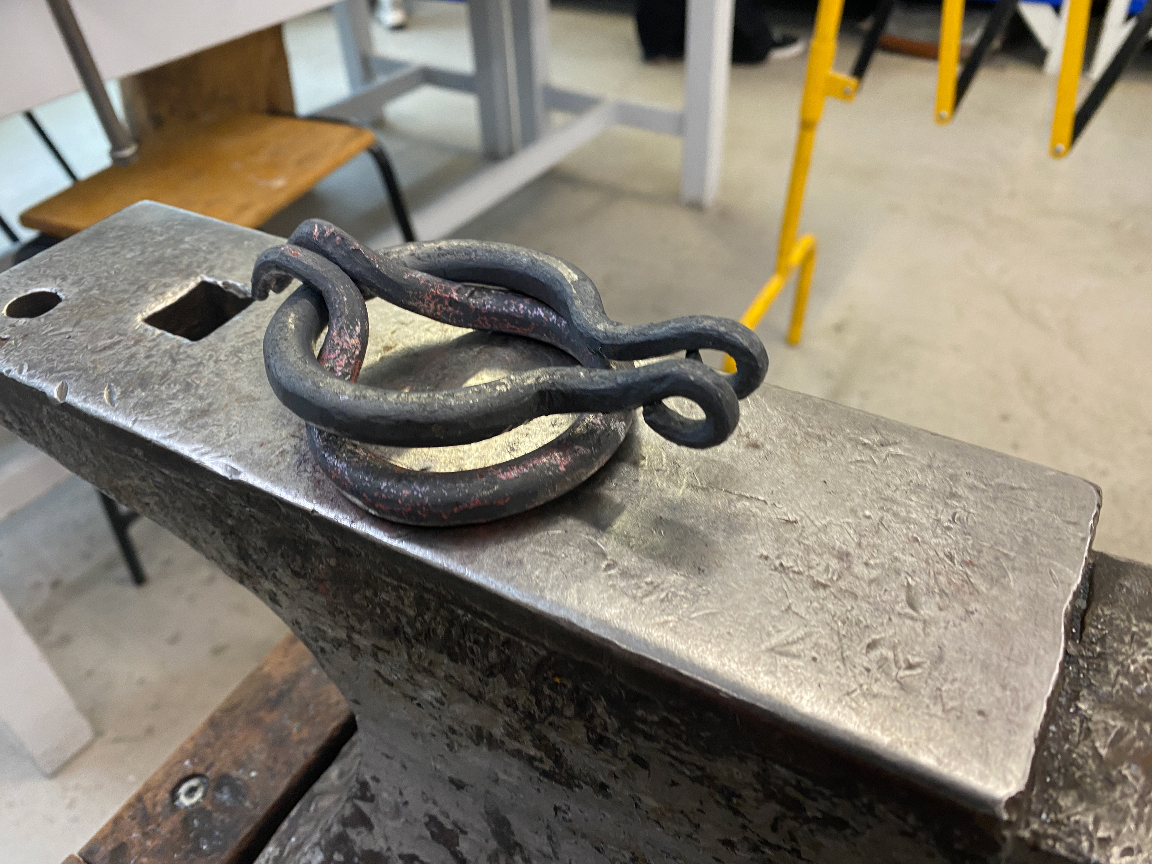
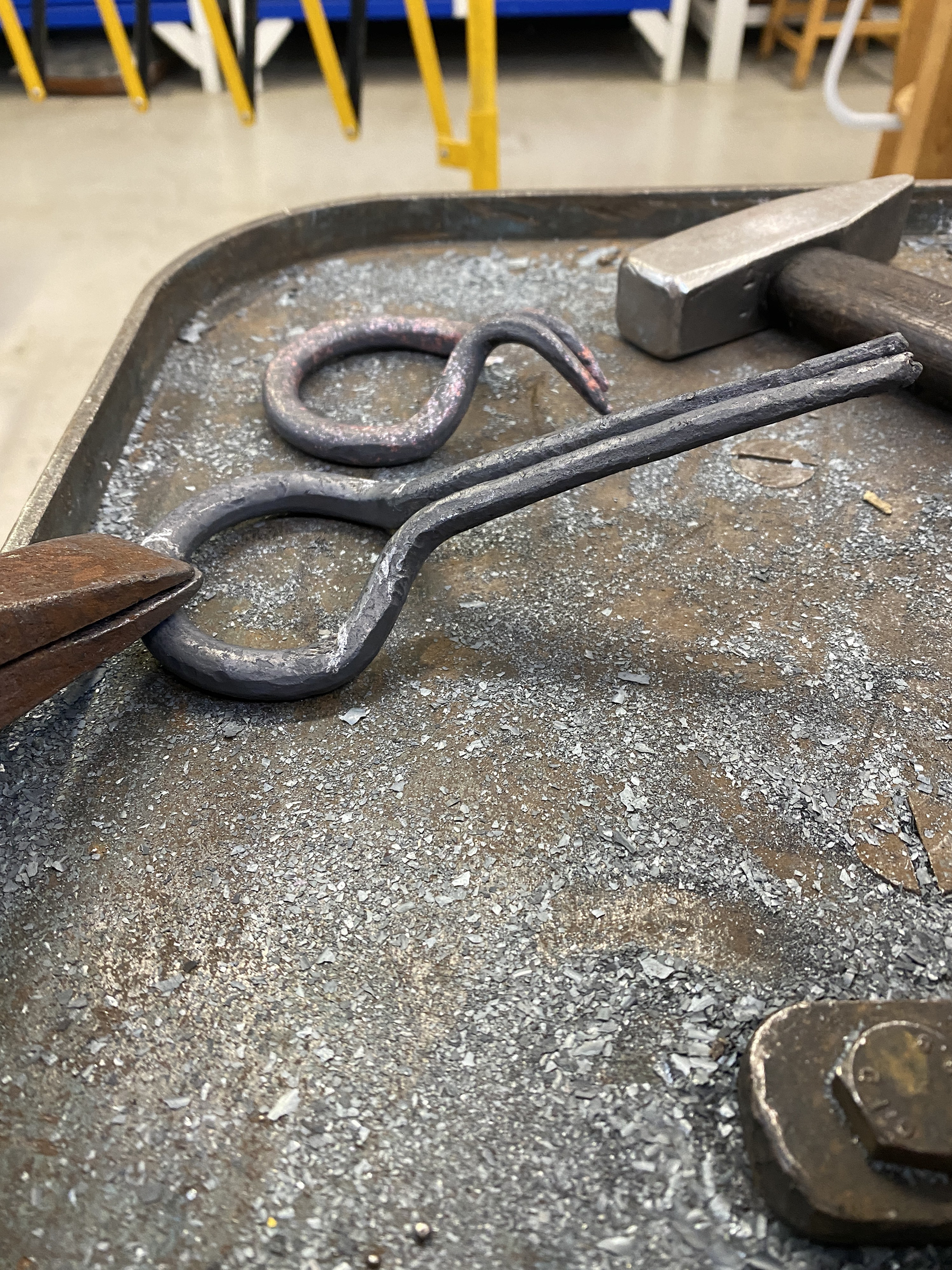
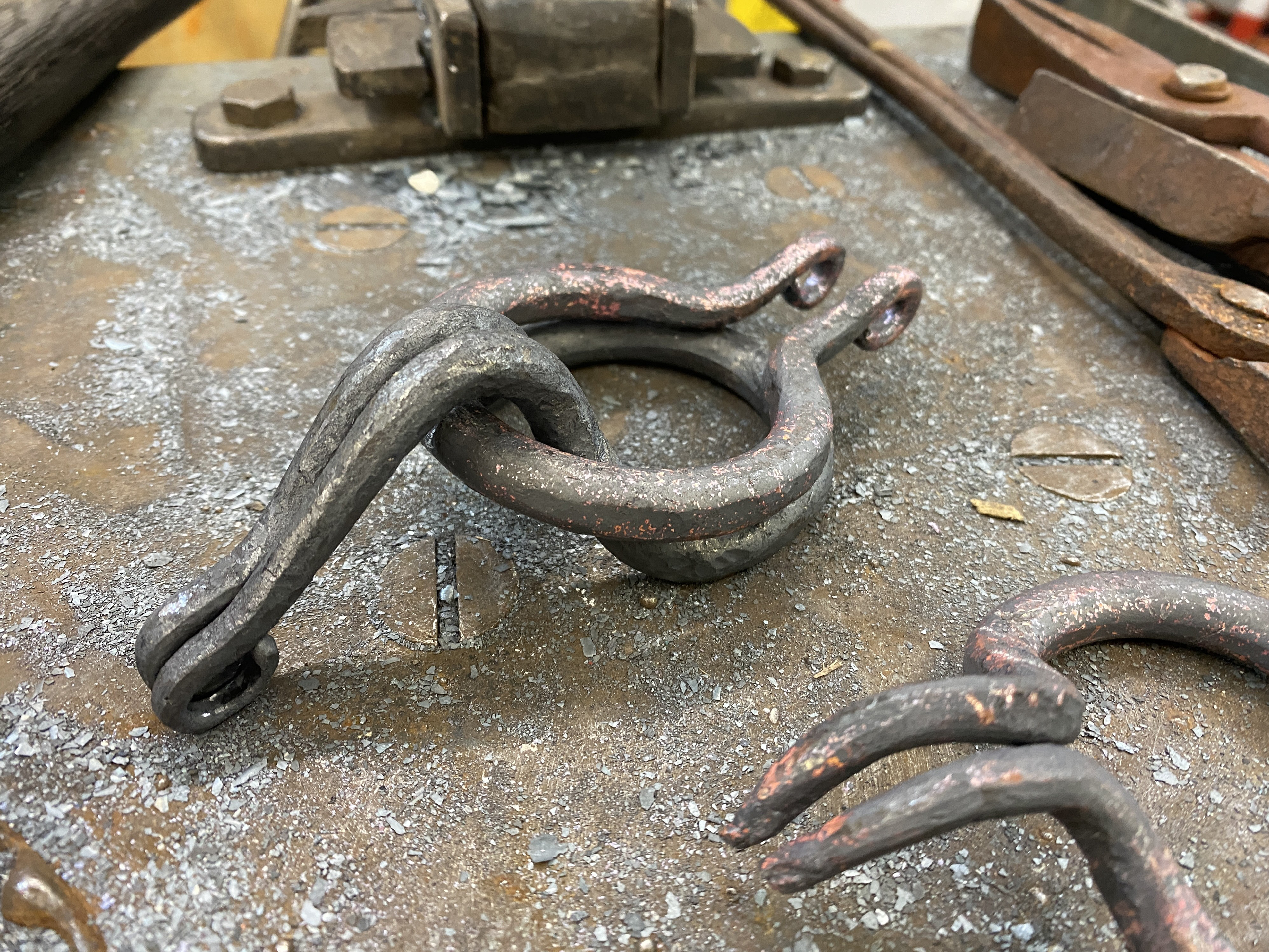
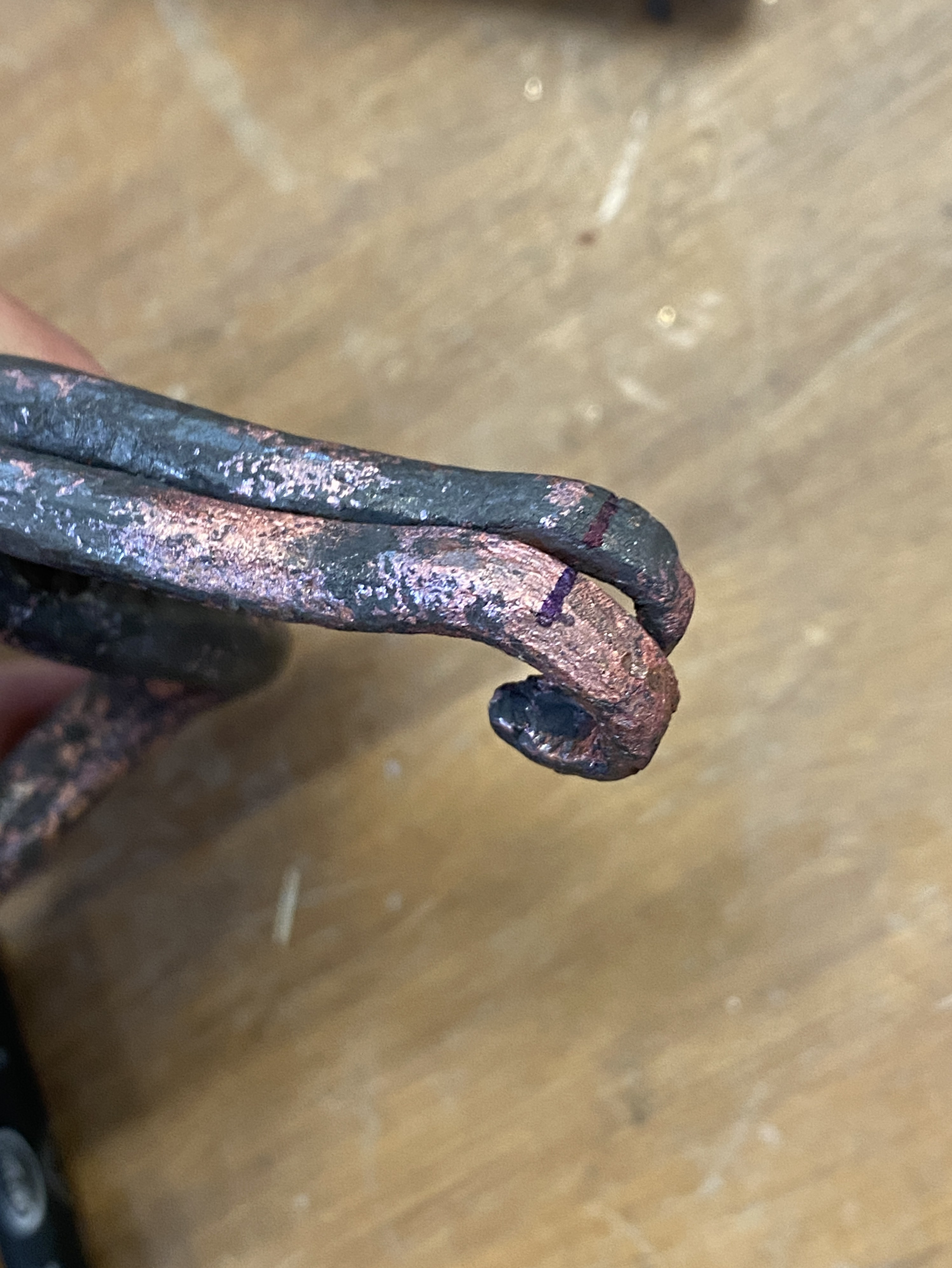
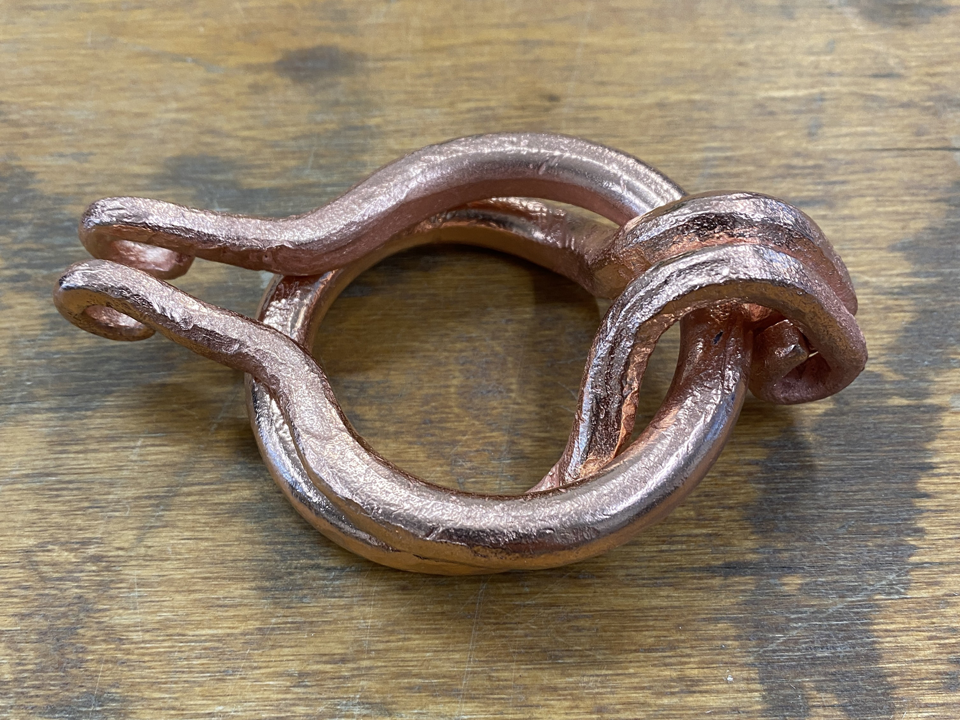
Reviewing my forged copper testing, I determined that using a combination of tapering and bending to create a manipulated link for the clasp was the most efficient method of manufacture. I revisited the interlocking motion of the previous clasps and sought to simplify the design. I found that bending two links so that one could slot through the other (as shown in the top-left images) was highly effective. I then explored scaling up this design and adjusted the arms to ensure a smooth transition between the clasp and the rest of the mail.
One area that needs alterations is the curve of the main 2 circles. I introduced this to the design in the attempt to conform around the neck and back. However, the curve is too tight and protrudes away from the body rather than lying flat against it.
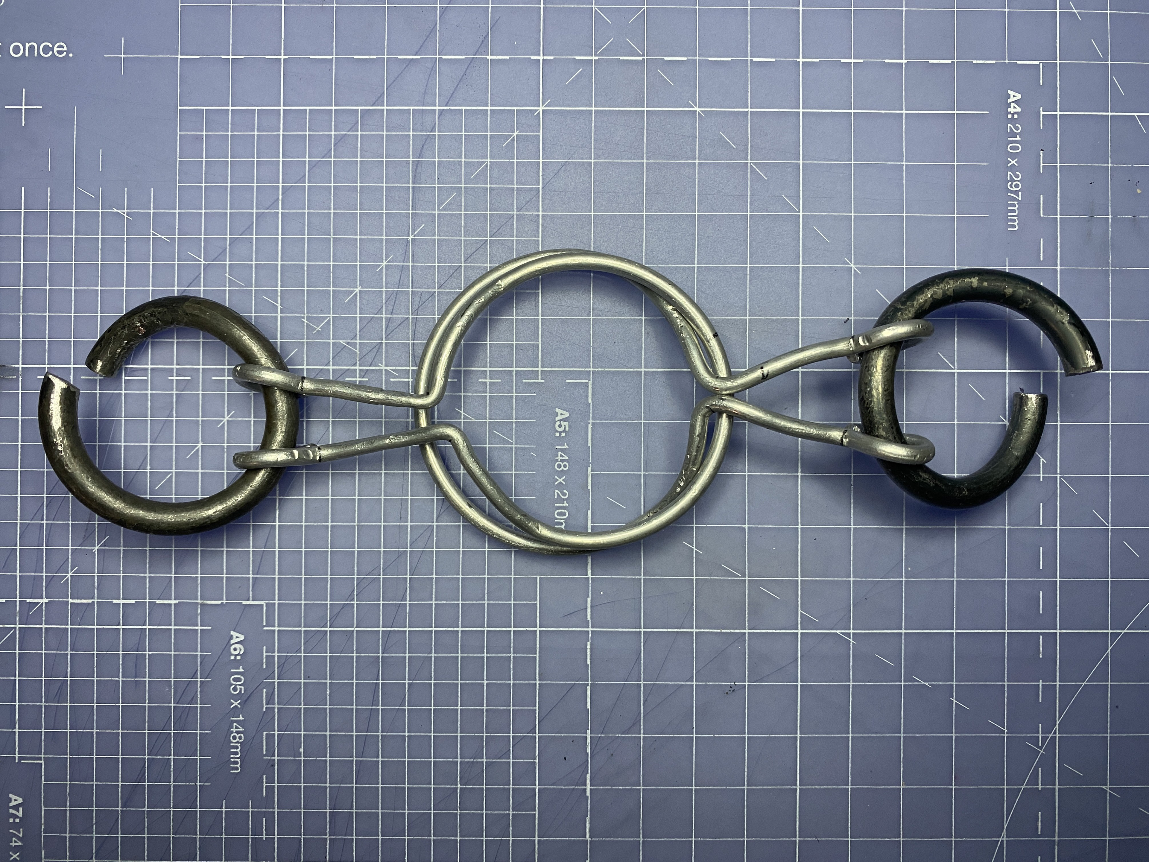


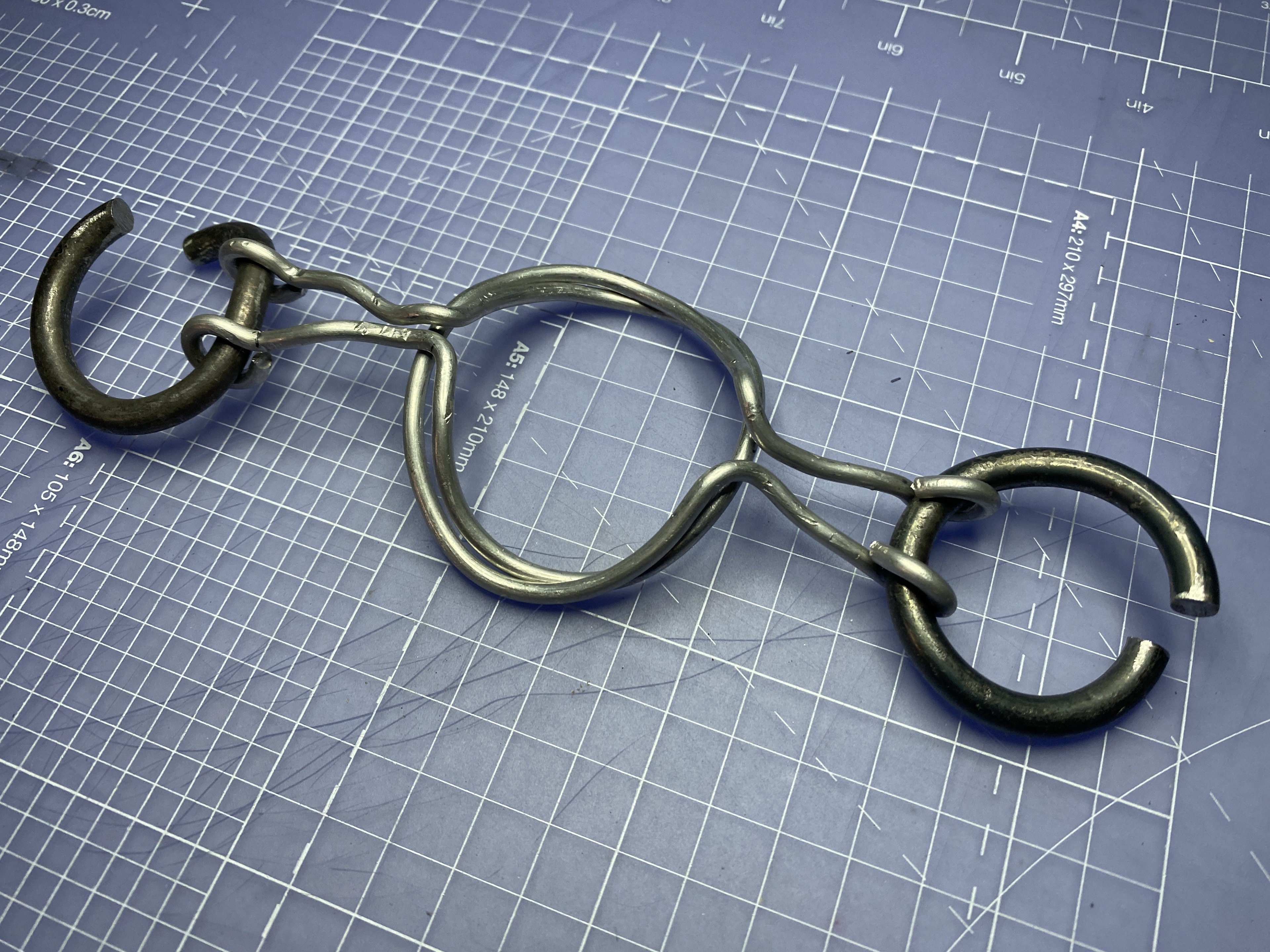
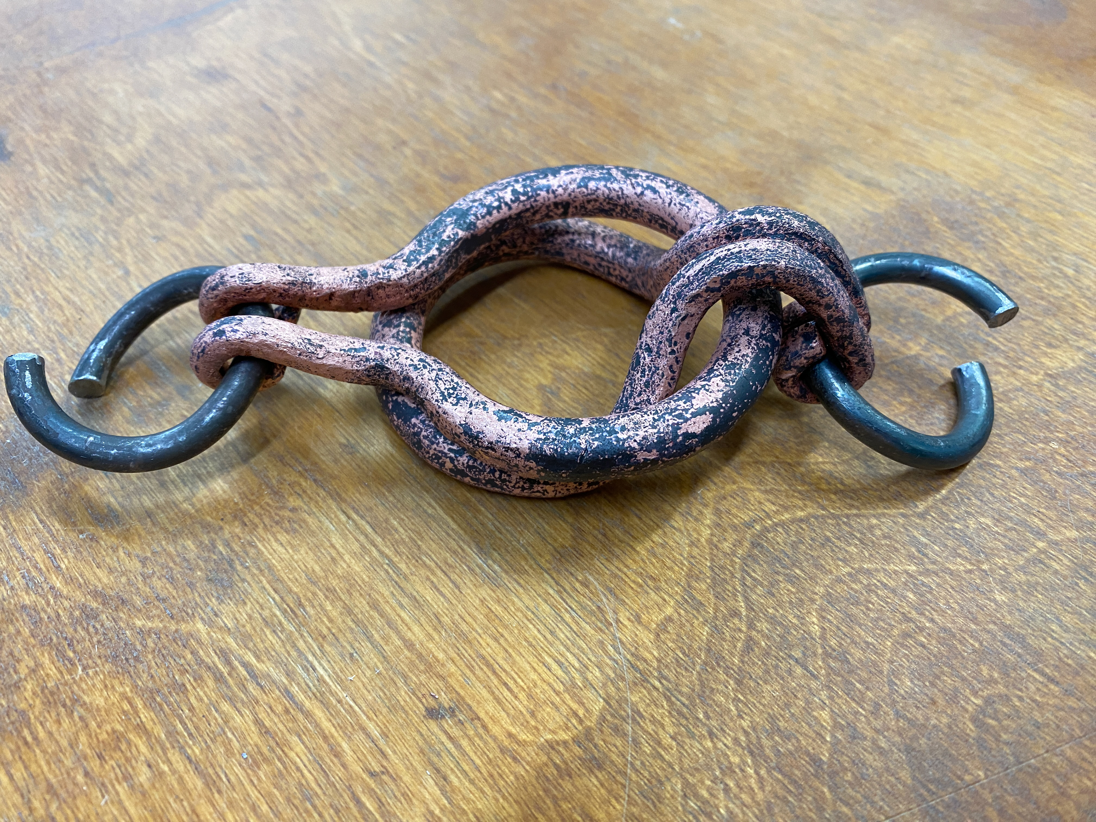
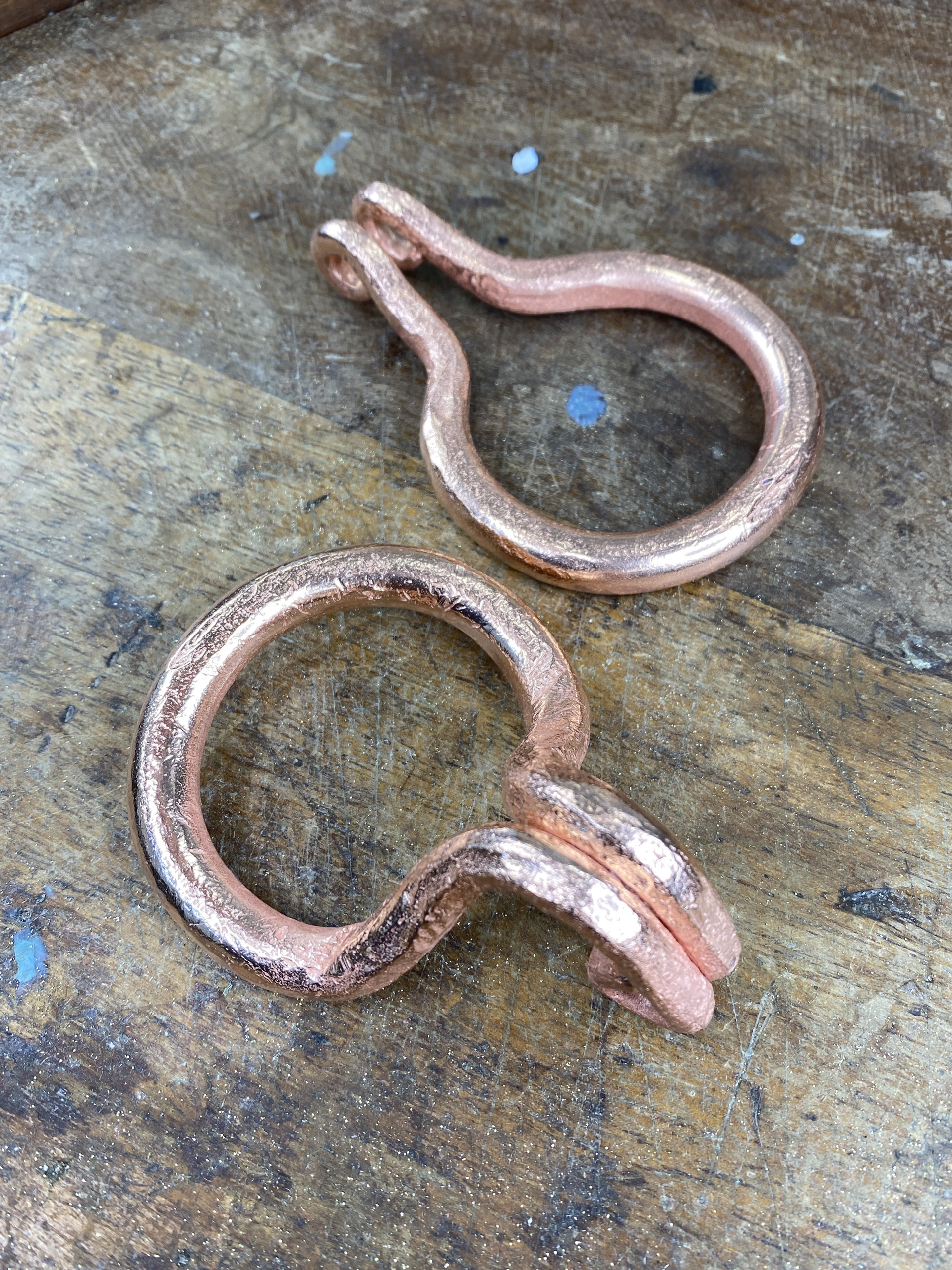
I then refined the clasp further by removing the curves from the main two circles and repositioning the bends that enable the interlocking motion further along the arms. This adjustment brought the design closer in alignment with the overall design language of the piece.
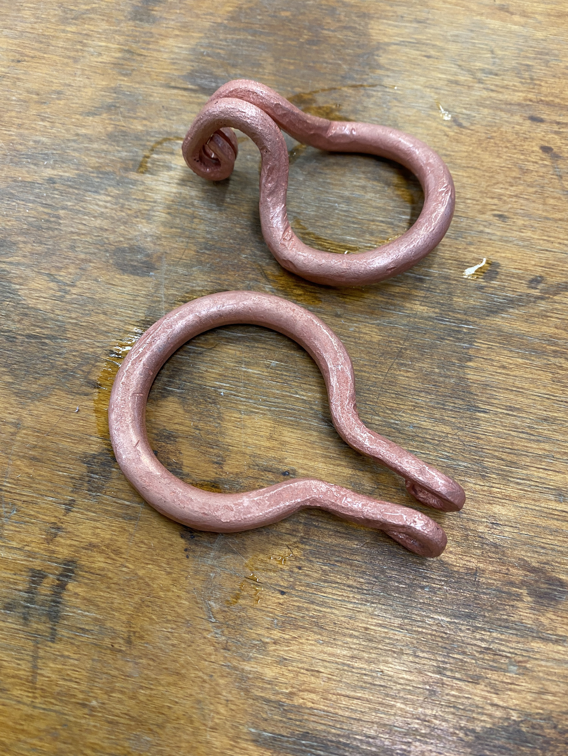
Forging copper clasp
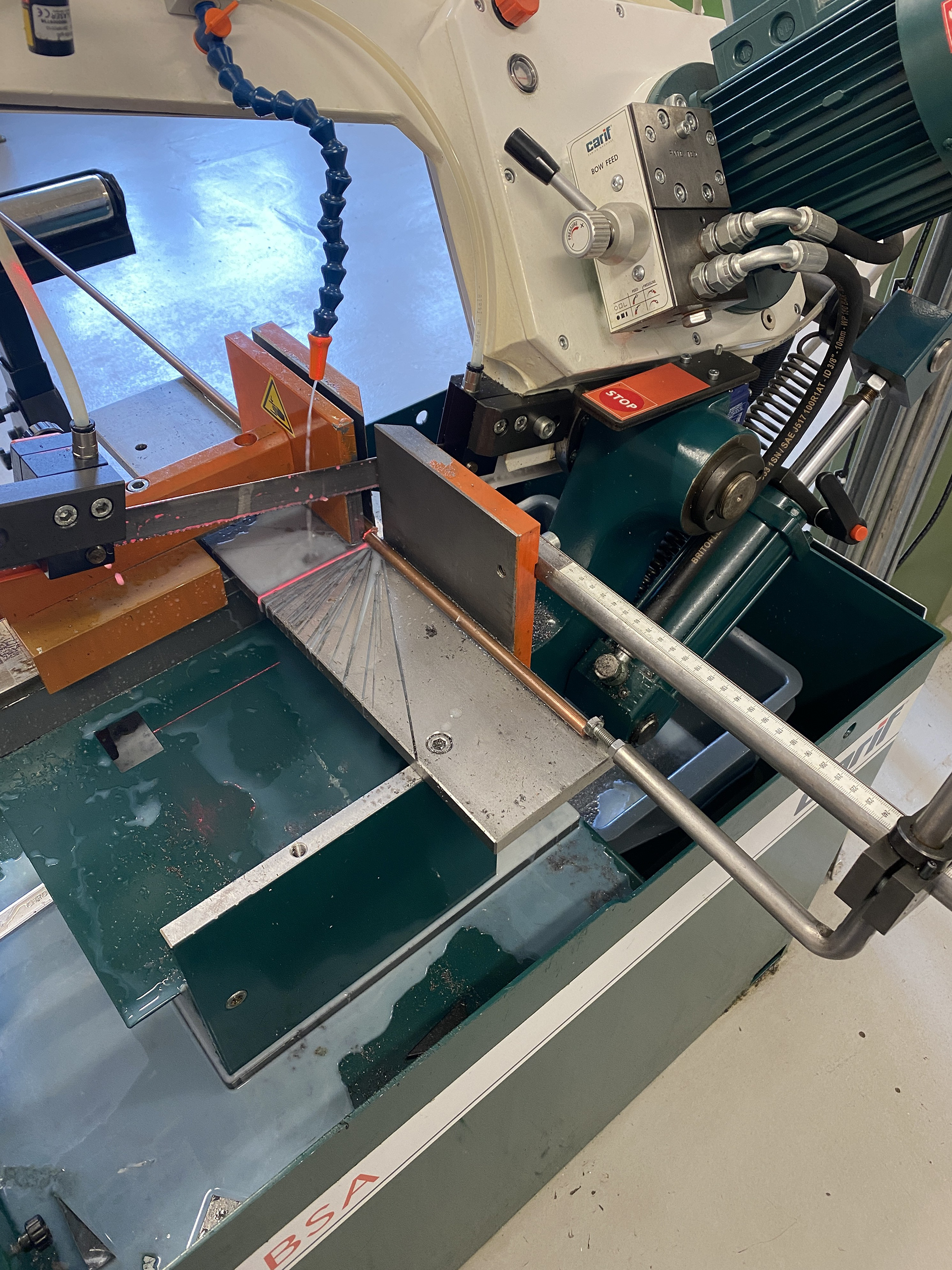
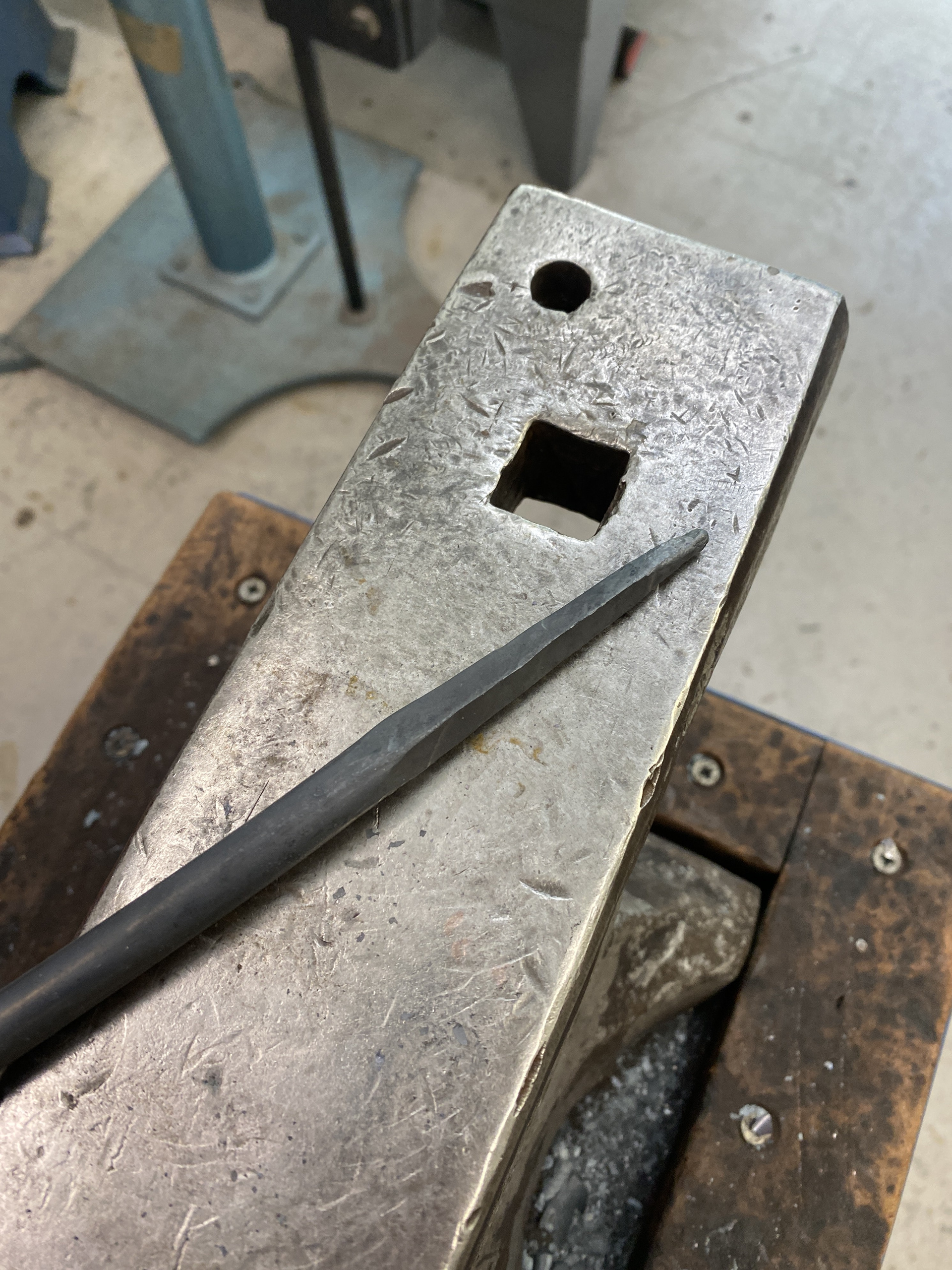
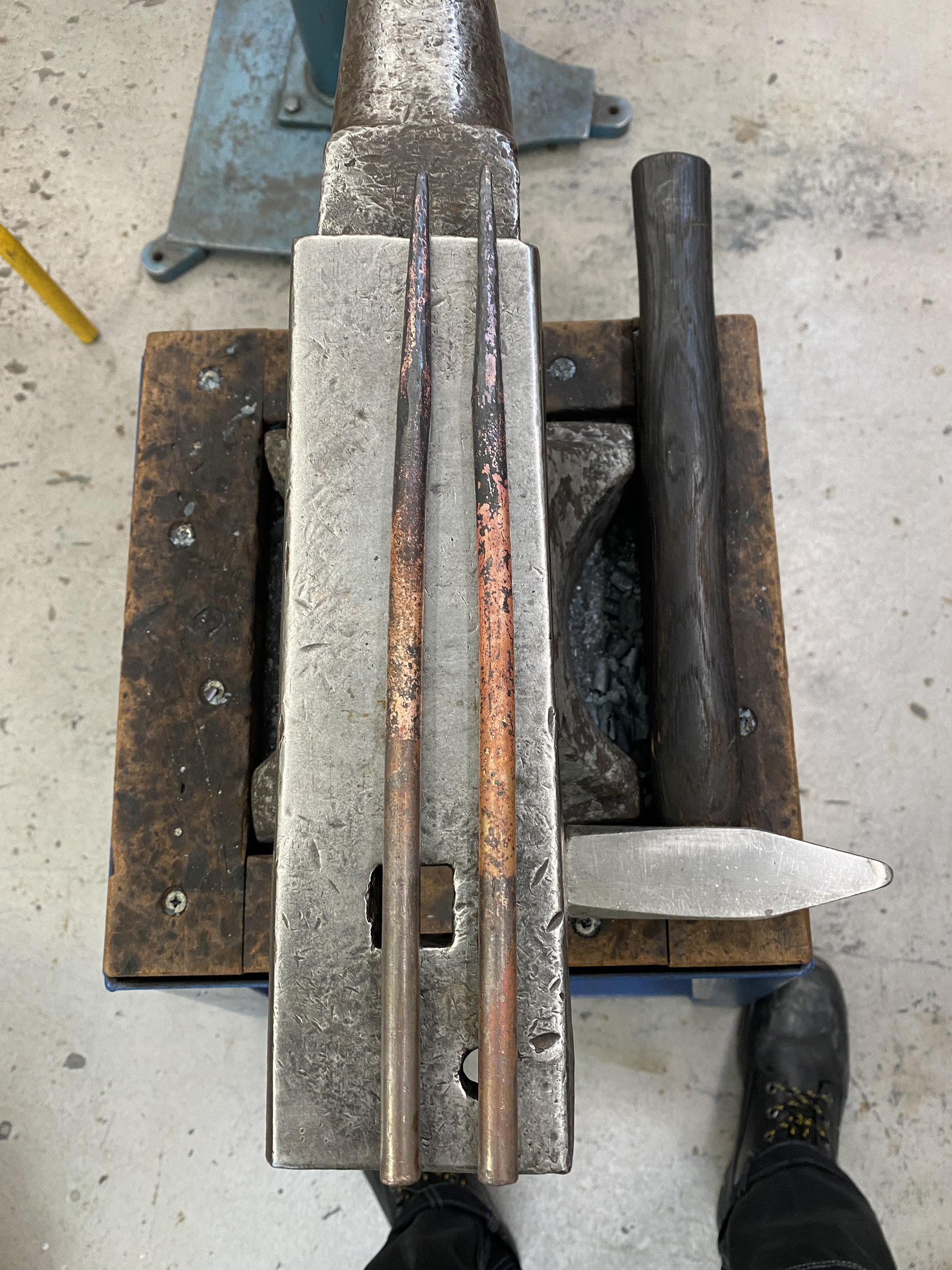
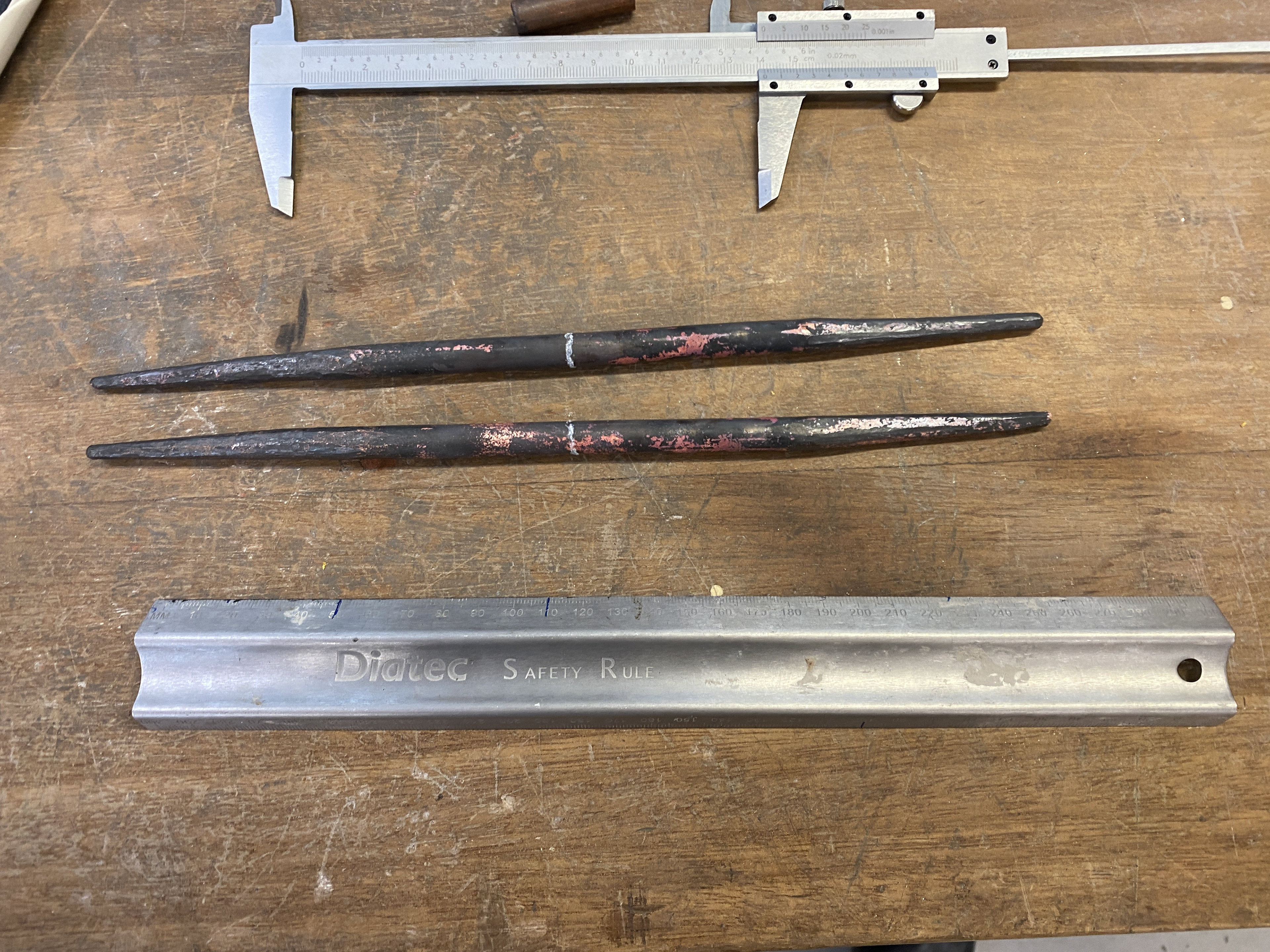
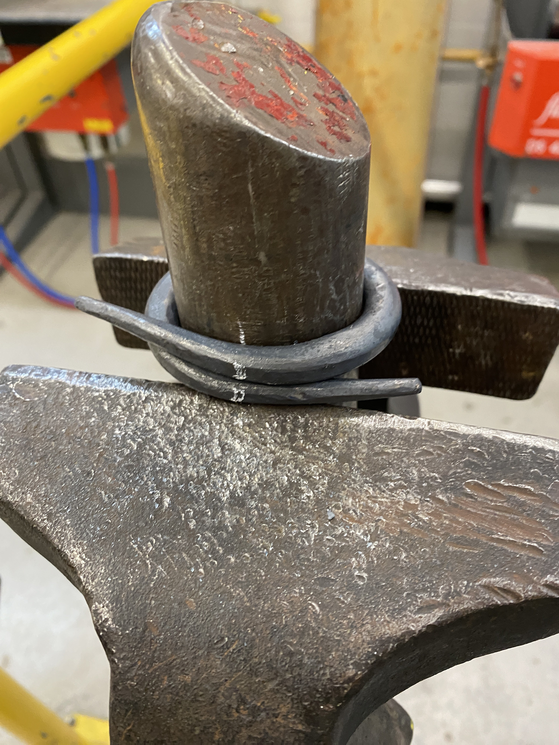
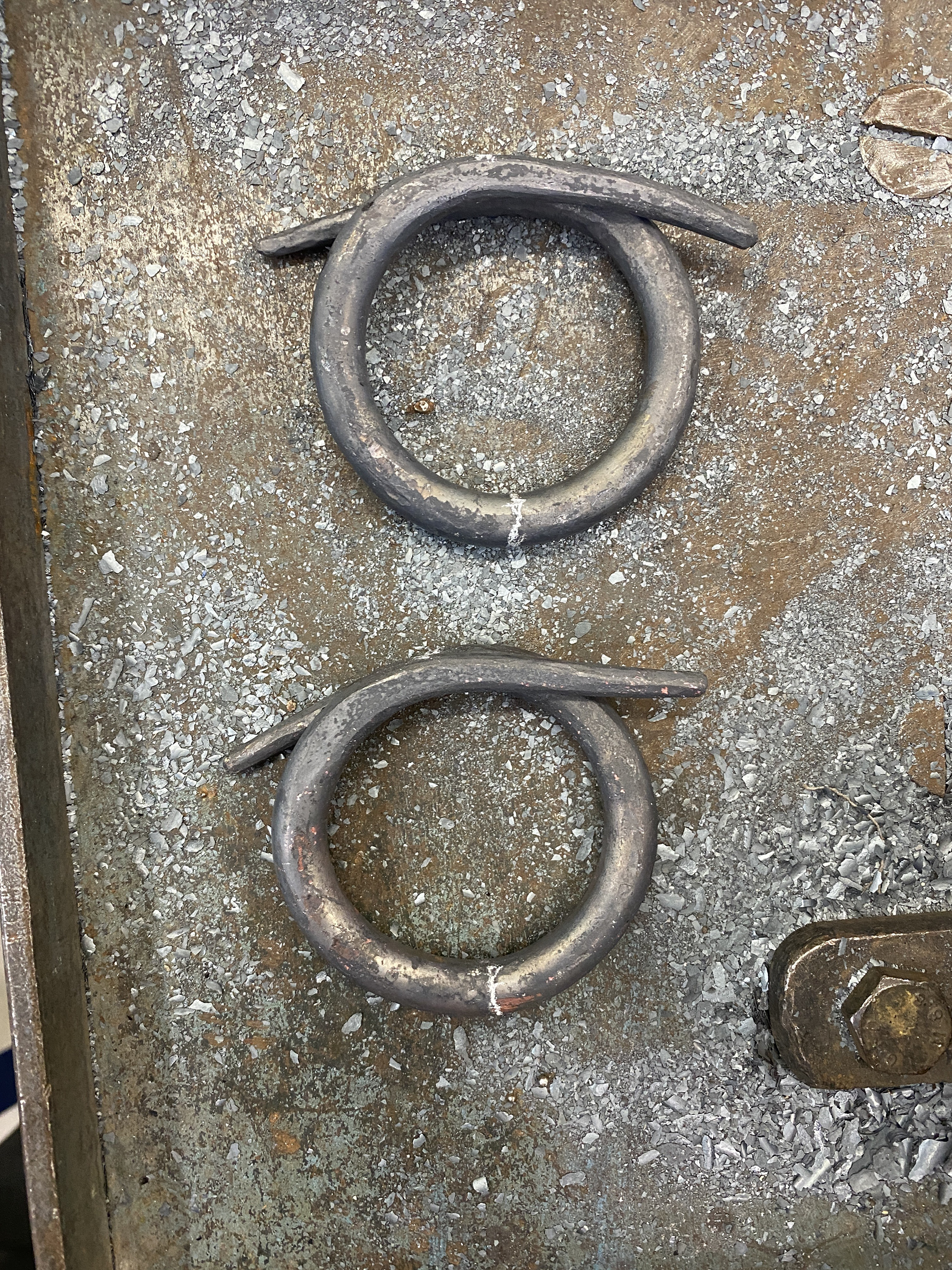
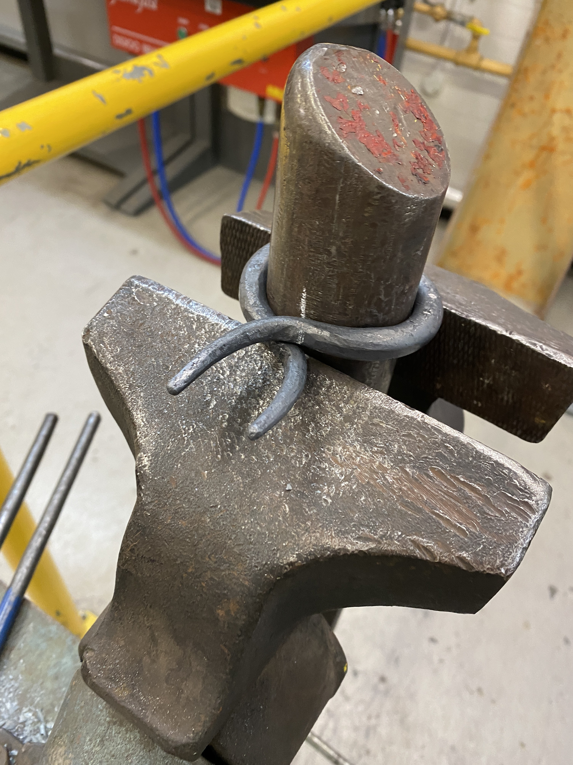
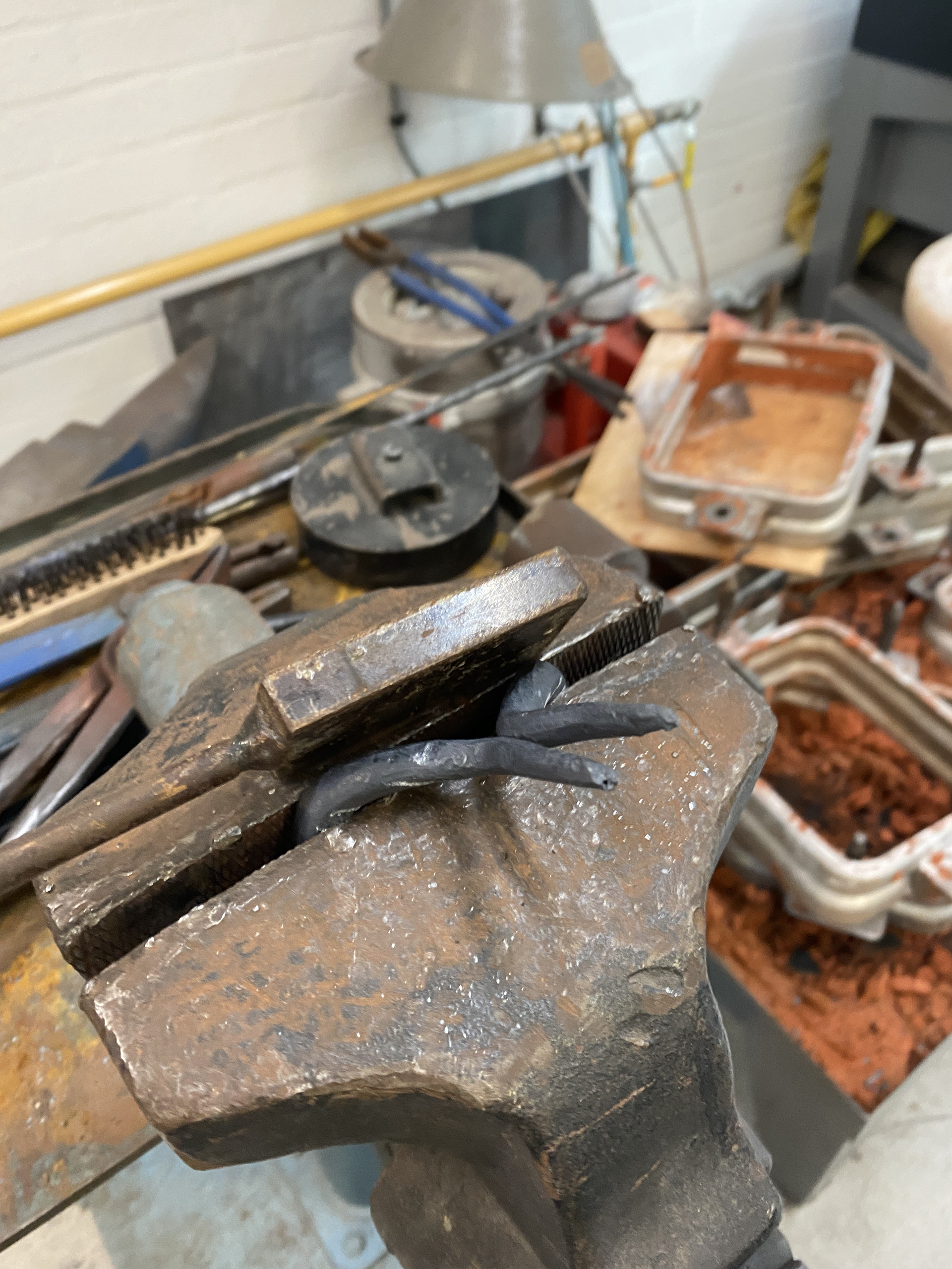
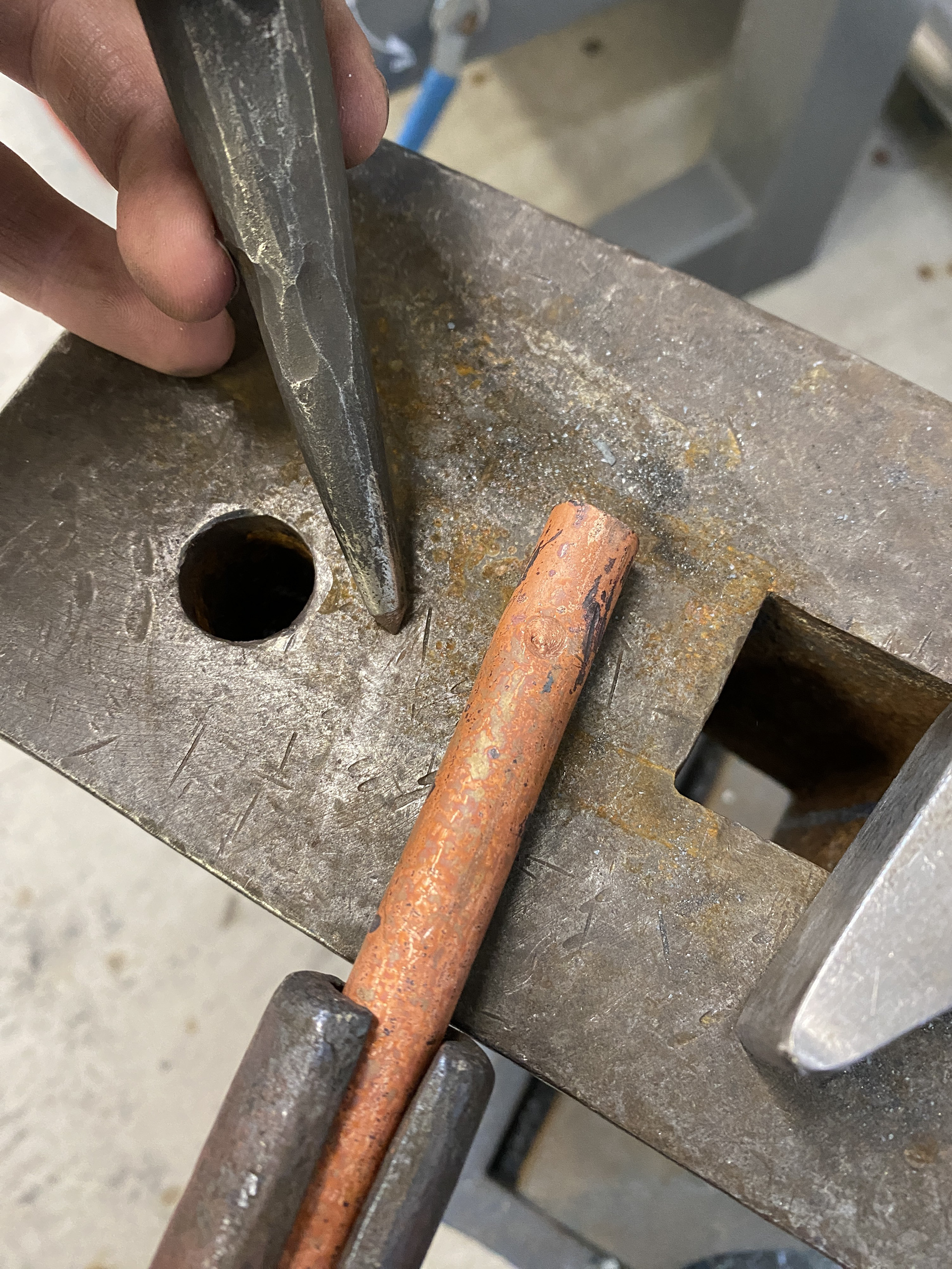
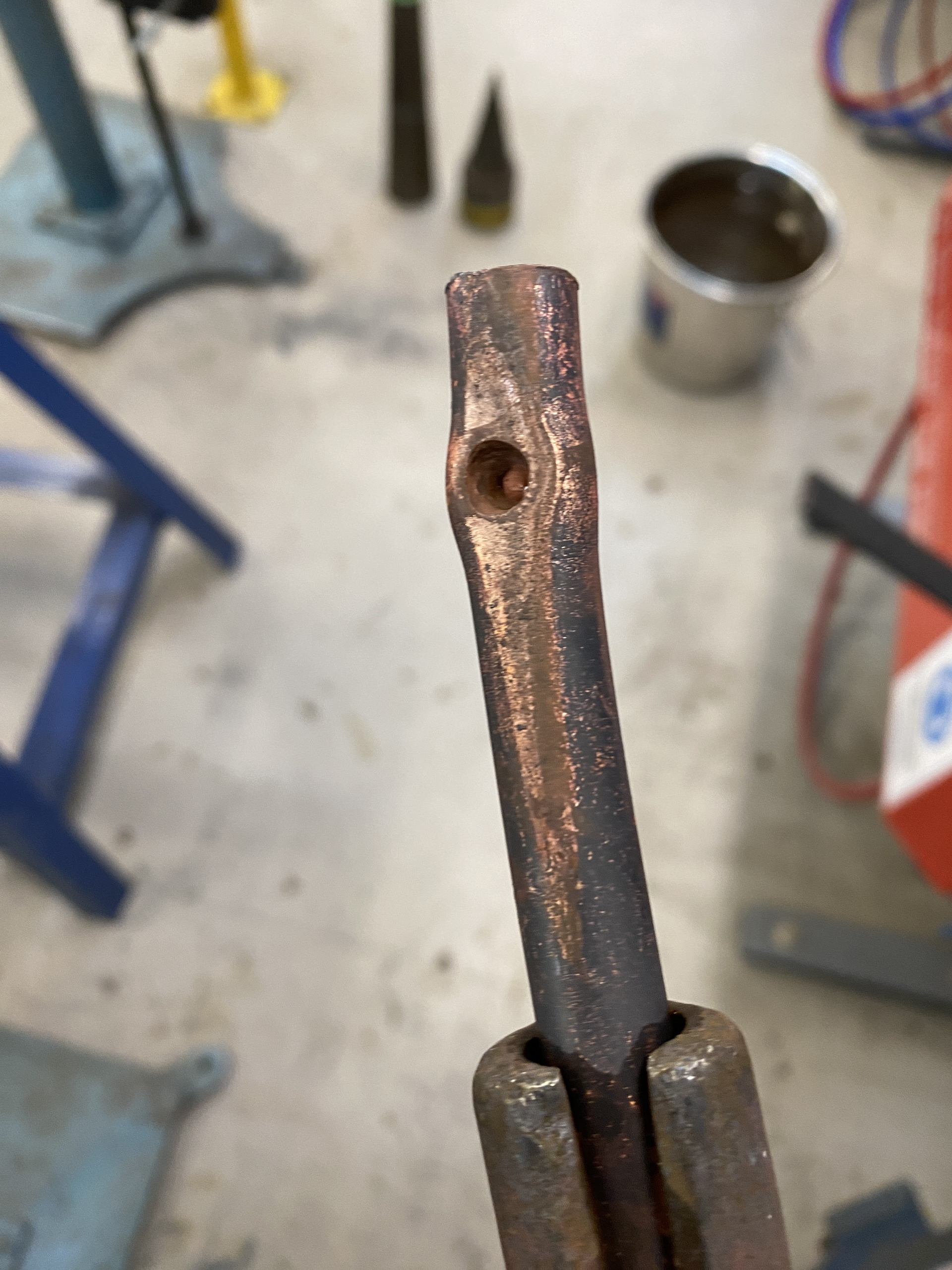
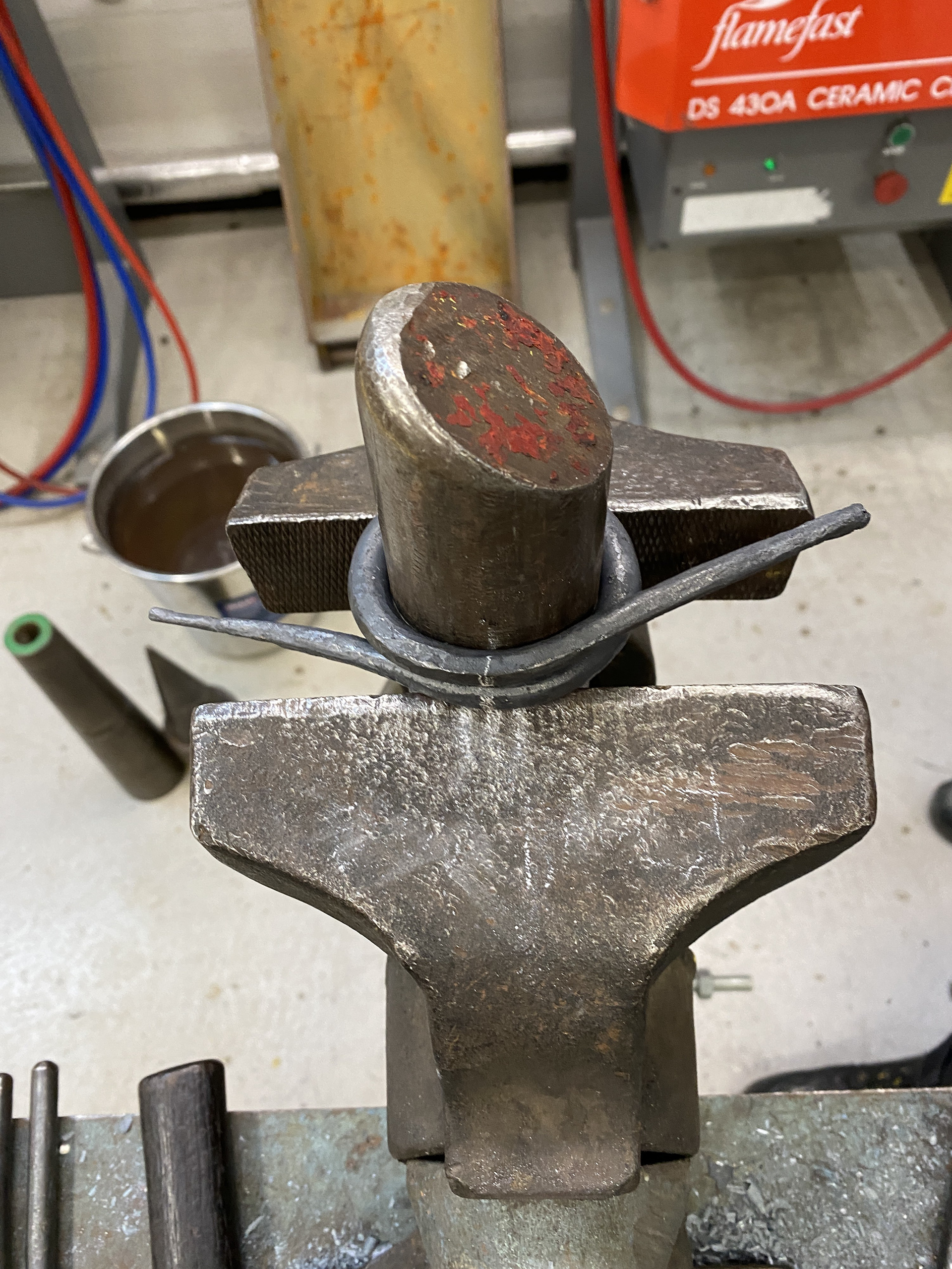
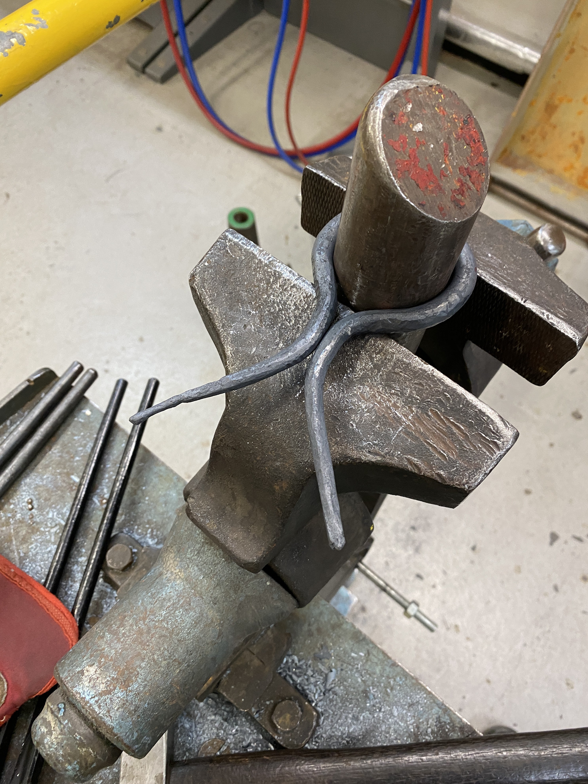
From the aluminium model, I determined that I needed two pieces of 10mm copper rod, each cut to a length of 250mm. I used the horizontal bandsaw to ensure they were parallel and square. I then tapered each end, referencing both callipers and a chalk mark on the anvil. Next, I wrapped the piece around the same-sized stake used for the 10mm links (45mm diameter). To ensure a symmetrical and uniform result, I added reference chalk lines to both the stake and the workpiece.
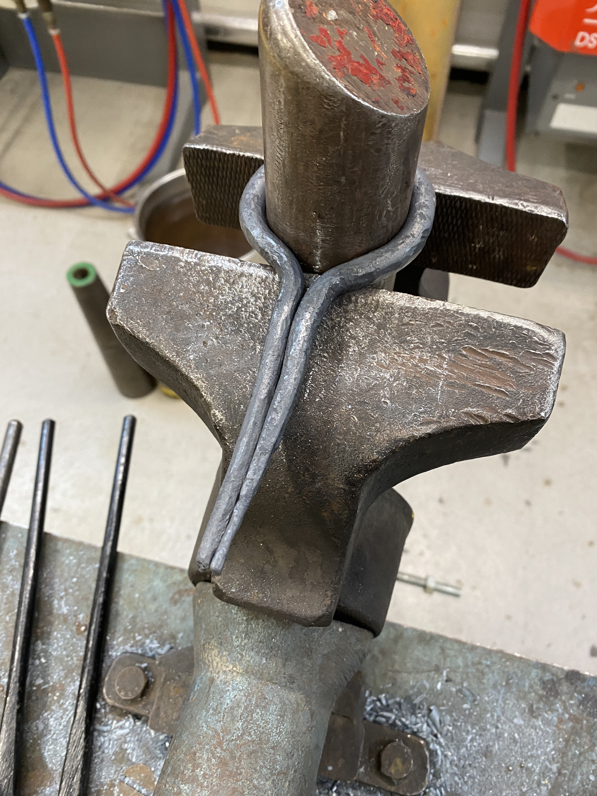
I bent the tapered arms outward using scrolling tongs and repositioned them with the vice and anvil. This stage proved challenging, as I usually rely on quenching areas of the piece I don’t want to move. However, this wasn’t feasible with copper, as the entire piece cooled too quickly to bend. I overcame this by working slowly and ensuring that the circle maintained contact with the stake at all times. Finally, I bent the arms to allow for the interlocking motion. I placed the piece in the vice and used a flat hand punch to ensure the bends were parallel and even before rounding the arms over a mandrel.
Overall, forging copper took significantly longer than I initially anticipated and required much greater care compared to working with steel. Additionally, the piece accumulated numerous imperfections during the forming process, which I will need to address with more attention to detail in the future.
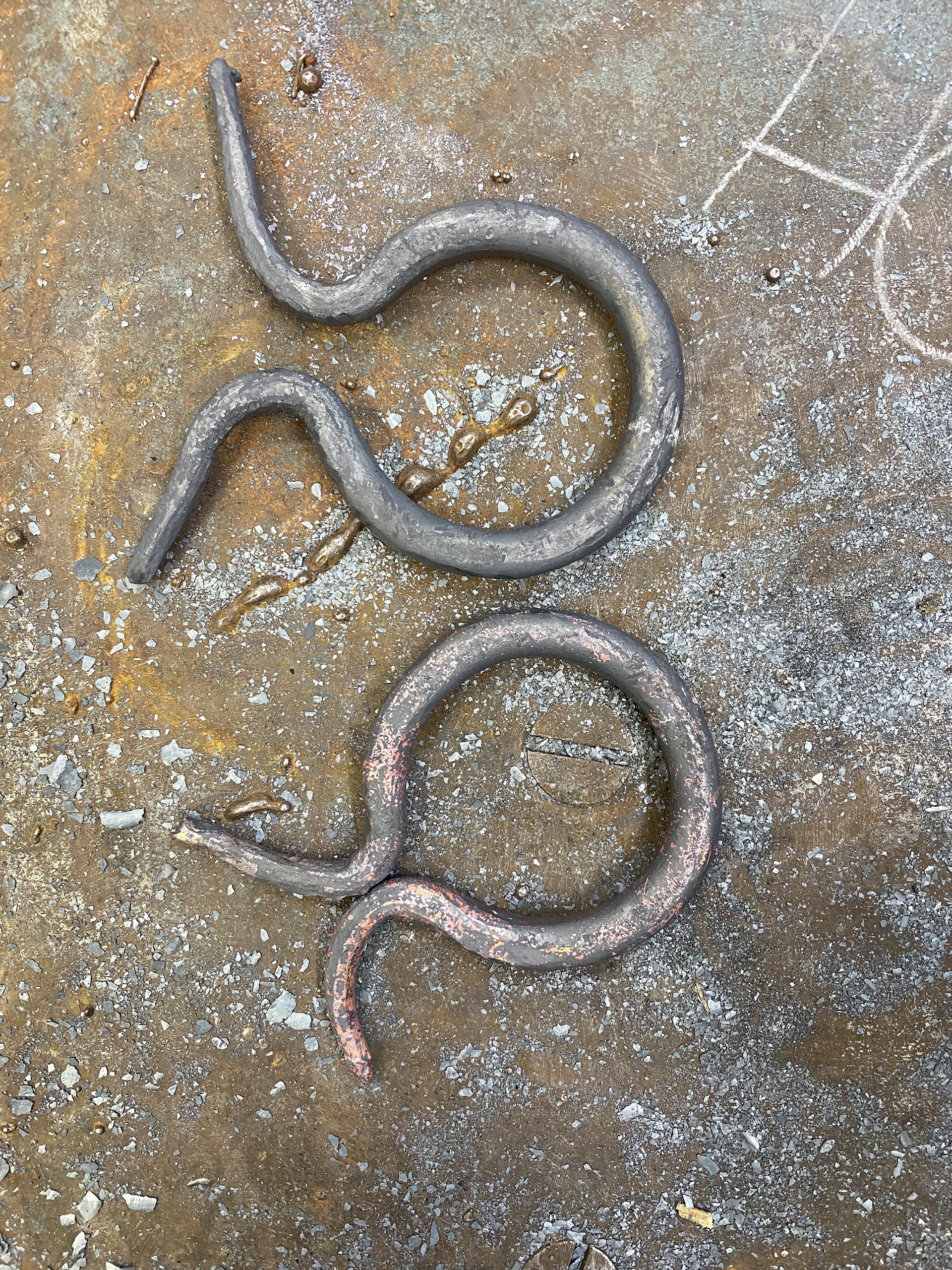
I then formed the loops that connect the clasp to the steel mail, using an 8mm mandrel to provide sufficient clearance. After completing this process for one side, I realized that I hadn't allowed enough material for the arms to stretch over the other piece. This issue come from my modelling technique; if I had used material with the same diameter as the final piece, I would have identified this problem before manufacturing it.
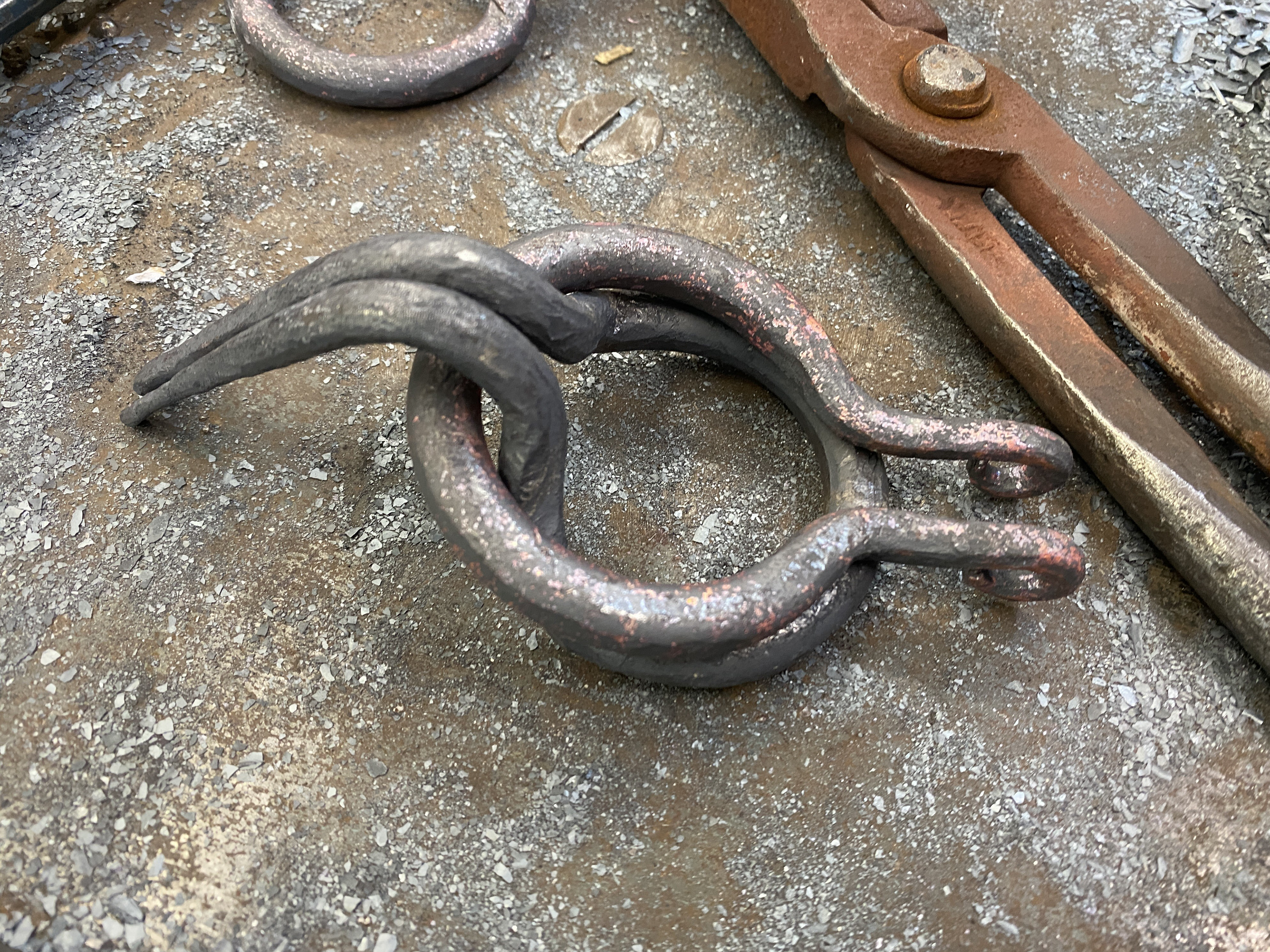
I needed to remake the side again and did so using the same processes as before, using a longer piece of stock. However, once I had bent the arms and loops, I felt that I had overcompensated the length required, producing an unbalanced design. Therefore, I cut the piece down slightly and re-bent it.
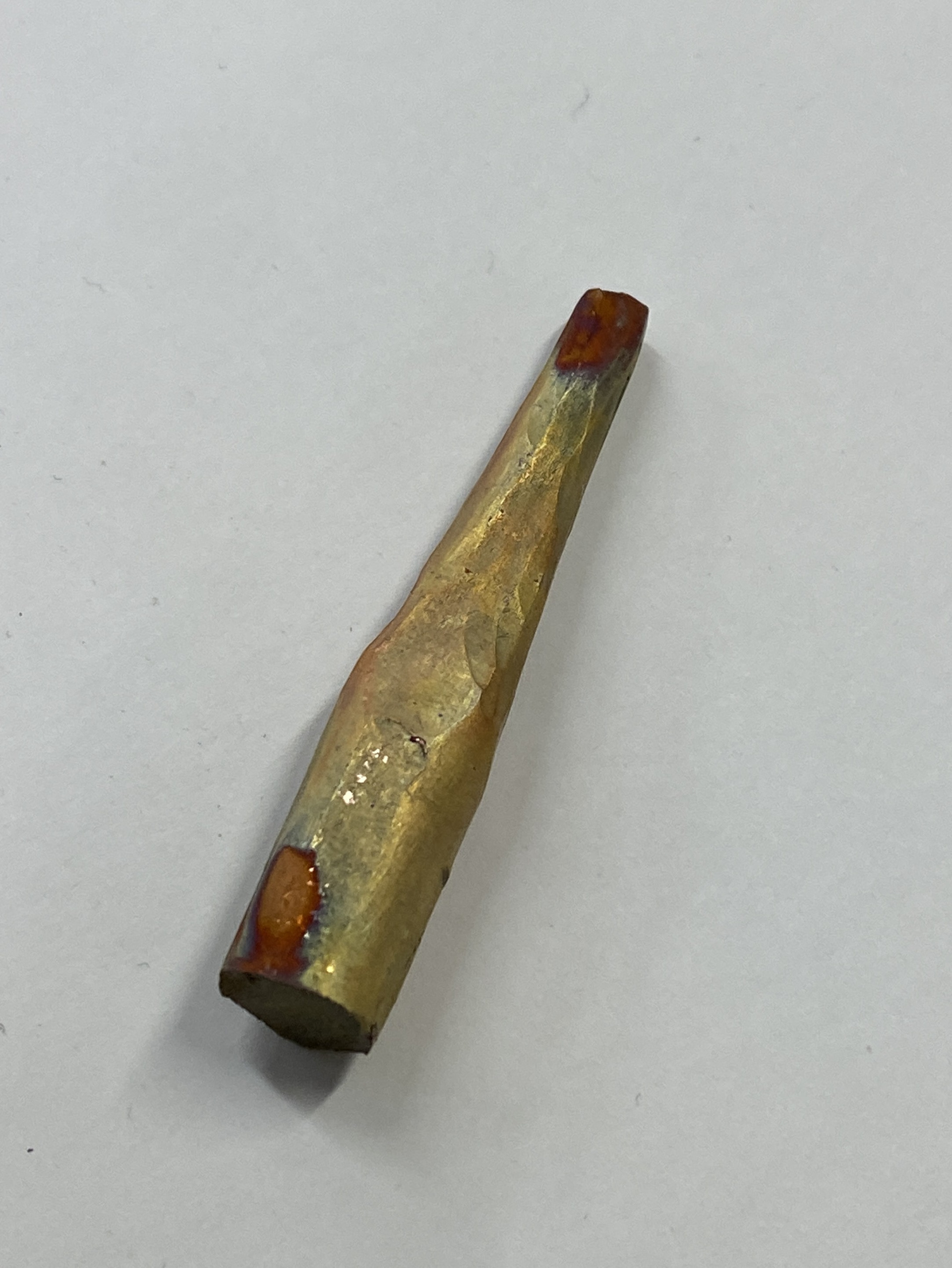
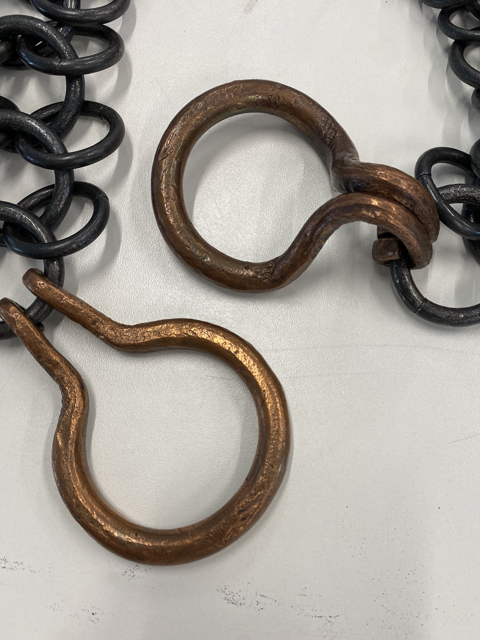
The last element to test was the surface finish of the clasps. I wanted the piece to stand out as the central focal point while preserving the colour of the copper. To achieve this, I tested some scrap stock by both polishing it in the tumbler and colouring it using a blowtorch. Based on these tests, I preferred the polished finish and applied this process to the final pieces. However, once completed, I realized the result did not meet my expectations. The highlights and shadows emphasized every imperfection, transforming the raw, handcrafted appearance into one that felt incomplete and messy. To address this, I experimented with reducing the contrast by applying liver of sulphur, which introduced darker hues and brought the finish closer to the overall aesthetic of the piece.